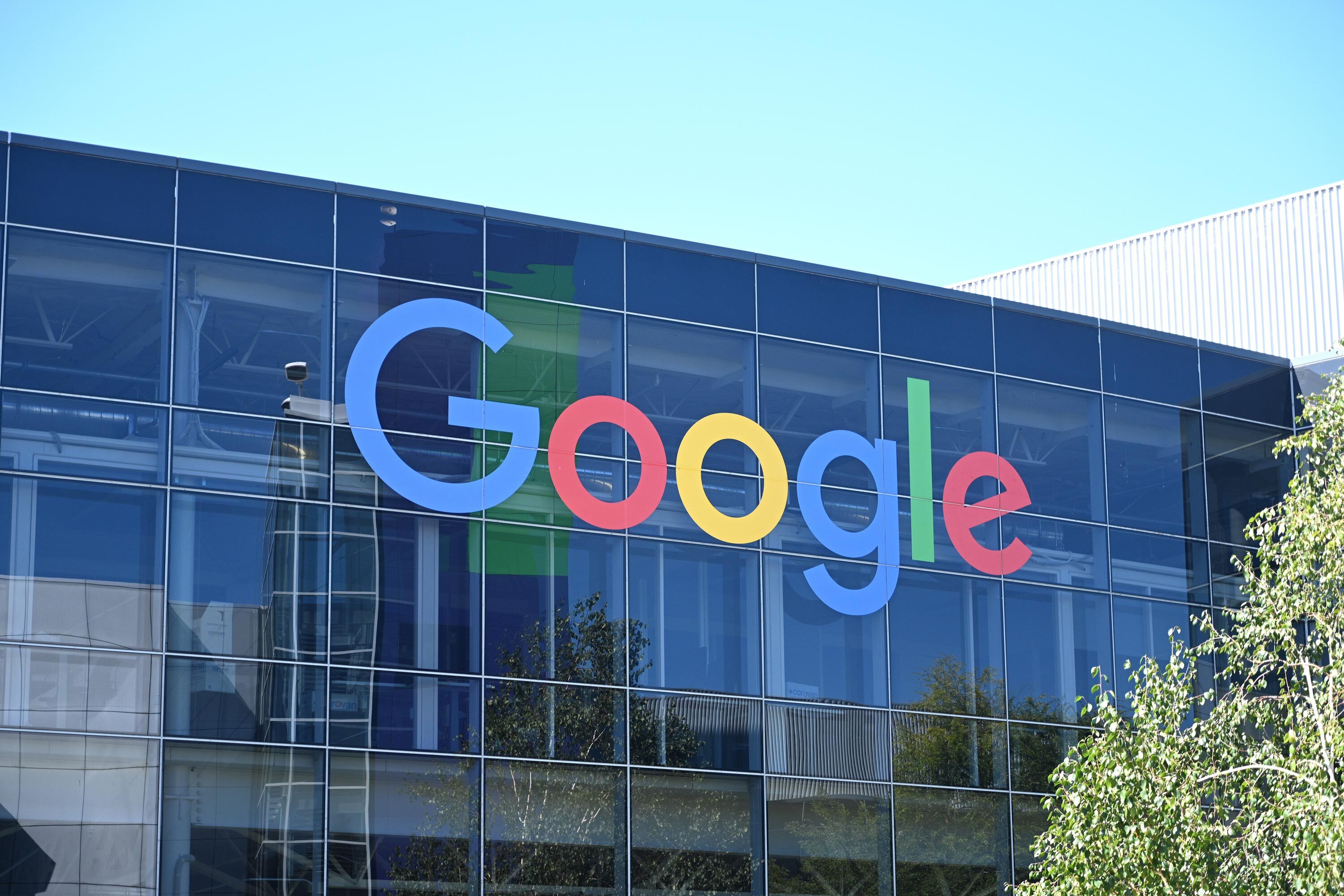
Google is the world's dominant search and advertising technology company, now extending its visual identity and design language across products to reflect an AI-first, Gemini-centred ecosystem.
- Founded
- 1998
- Industry
- Technology · Artificial Intelligence
- Headquarters
- USA
- Ownership
- Public company
- Parent company
- Alphabet Inc.
Key Facts
Put the user first. Speed is a virtue. Set audacious goals. Overweight the future. Embrace failure to break boundaries. Be uncompromising about people.
Techonomy: Google's Six Values for Business Leadership in the Age of ReimaginationTo organize the world's information and make it universally accessible and useful.
Google (About Google)Brand Chronology
Google introduces Neural Expressive for Gemini
2026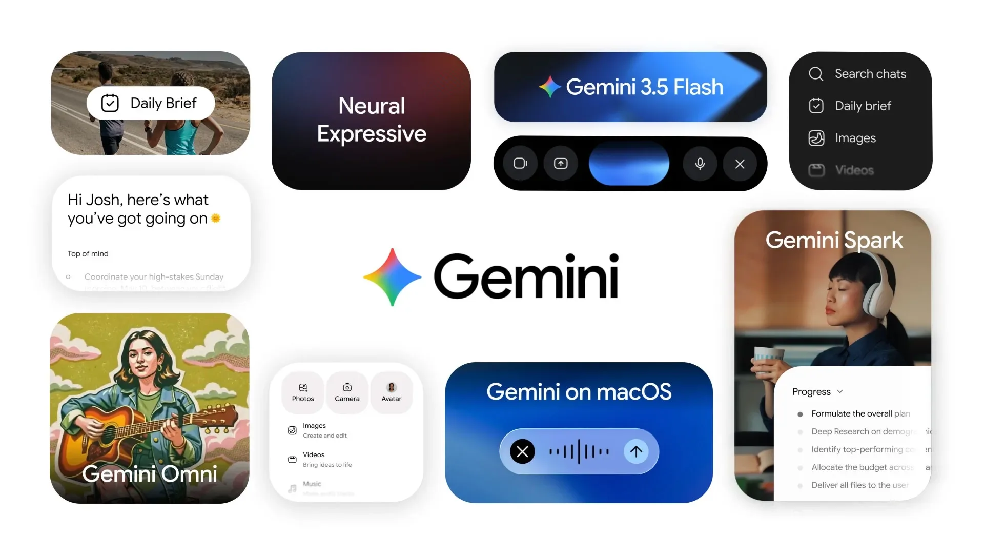
Google builds a flowing identity for NewFront 2026
2026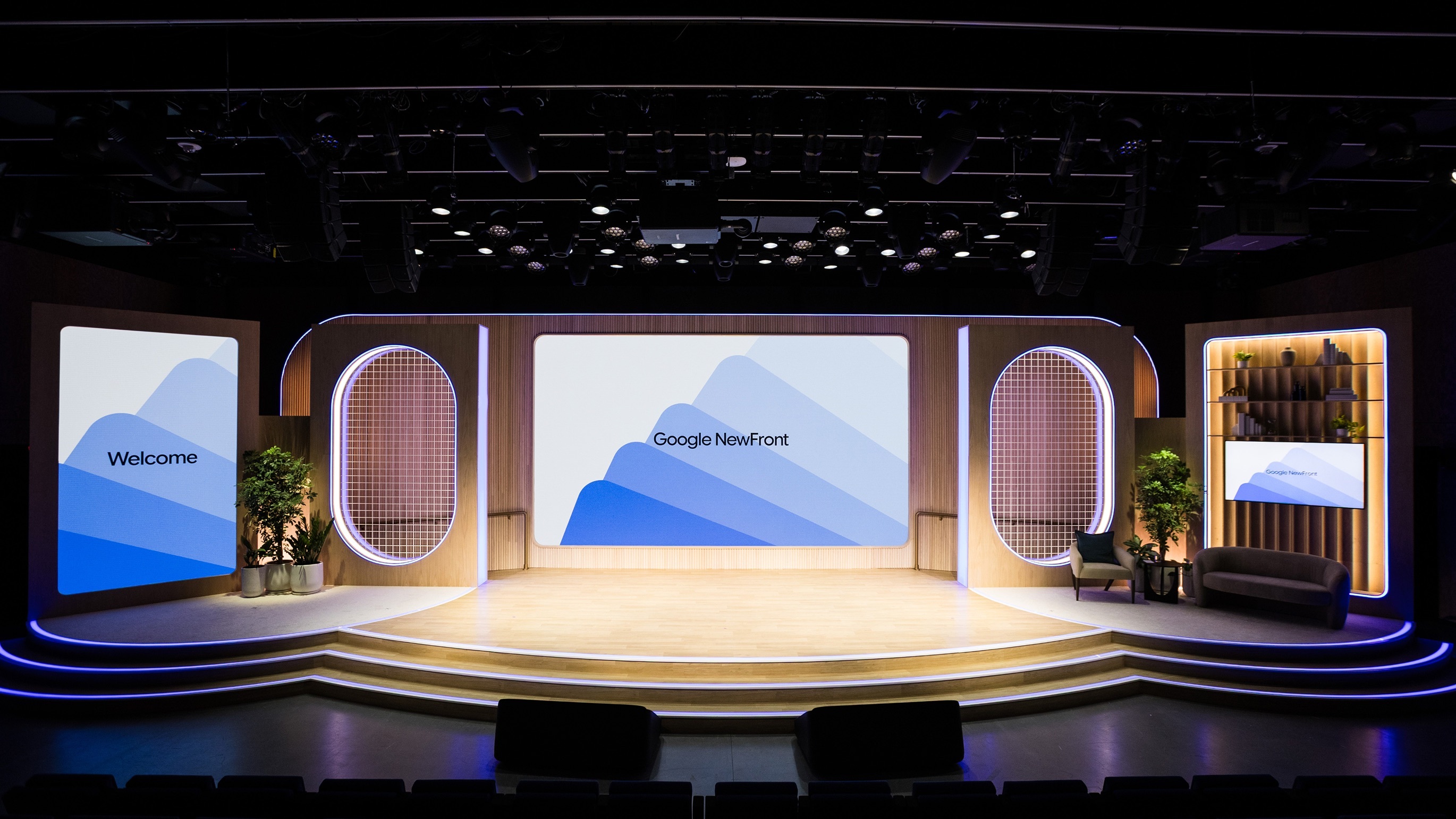
Logo Redesign
2025
On September 29, 2025, Google announced that the redesigned four-color gradient “G” would become the company’s universal symbol, replacing its previous role as a Search-specific icon. The refreshed mark retained Google’s signature blue, red, yellow, and green palette while introducing brighter colors and smooth gradient transitions, reflecting the company’s growing focus on AI-powered products.
Together with other visual initiatives, including the Neural Expressive interface language unveiled at Google I/O 2026, the gradient “G” marked a broader shift in Google’s identity—from the flat, minimalist aesthetic of the mobile era toward a richer, more dynamic visual system designed for AI-driven experiences.
Google renames Bard to Gemini
2024
Google closes Stadia after three years
2023
Loretta turns Google Assistant into a memory
2020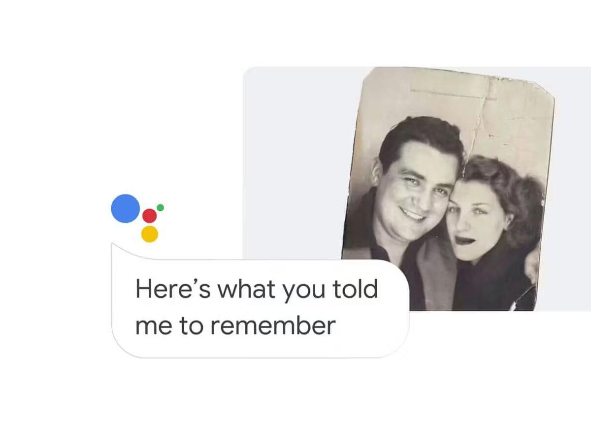
Google folds its home products into Nest
2019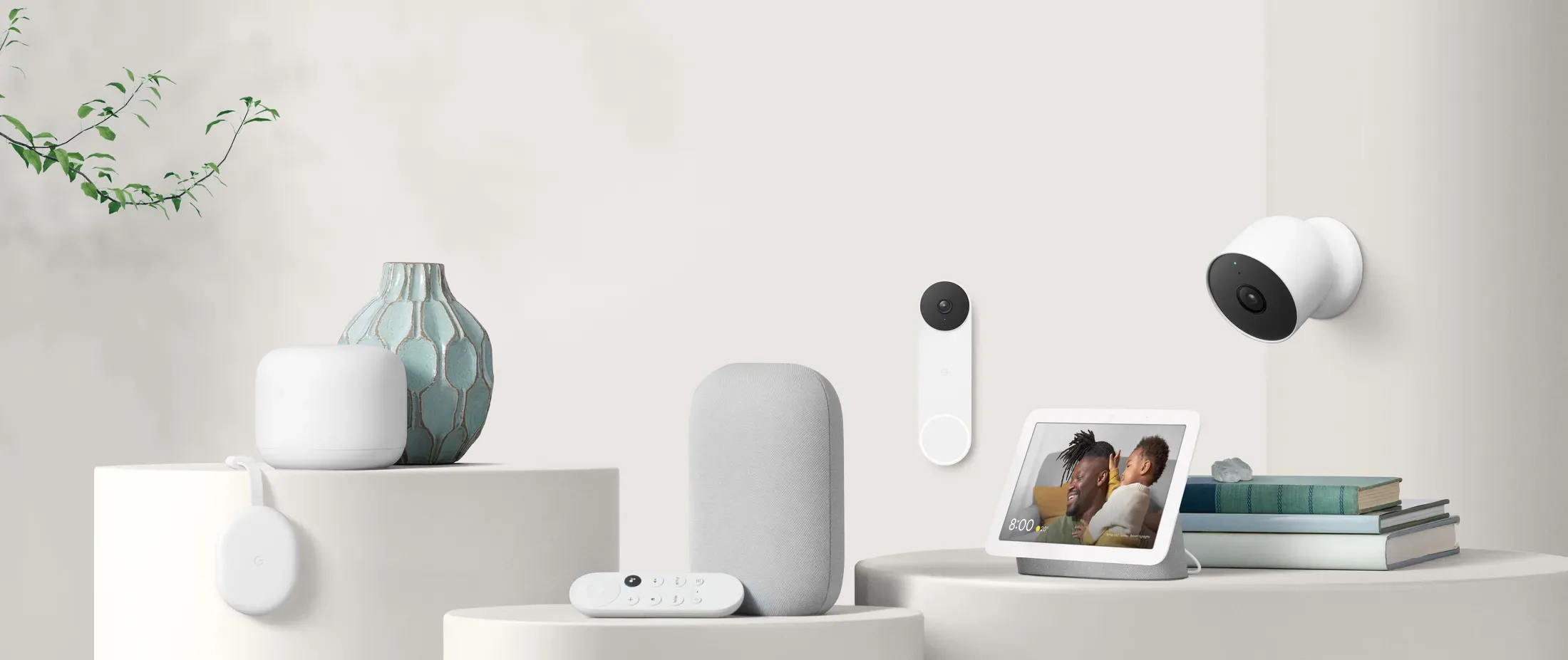
Google+ closes after eight years
2019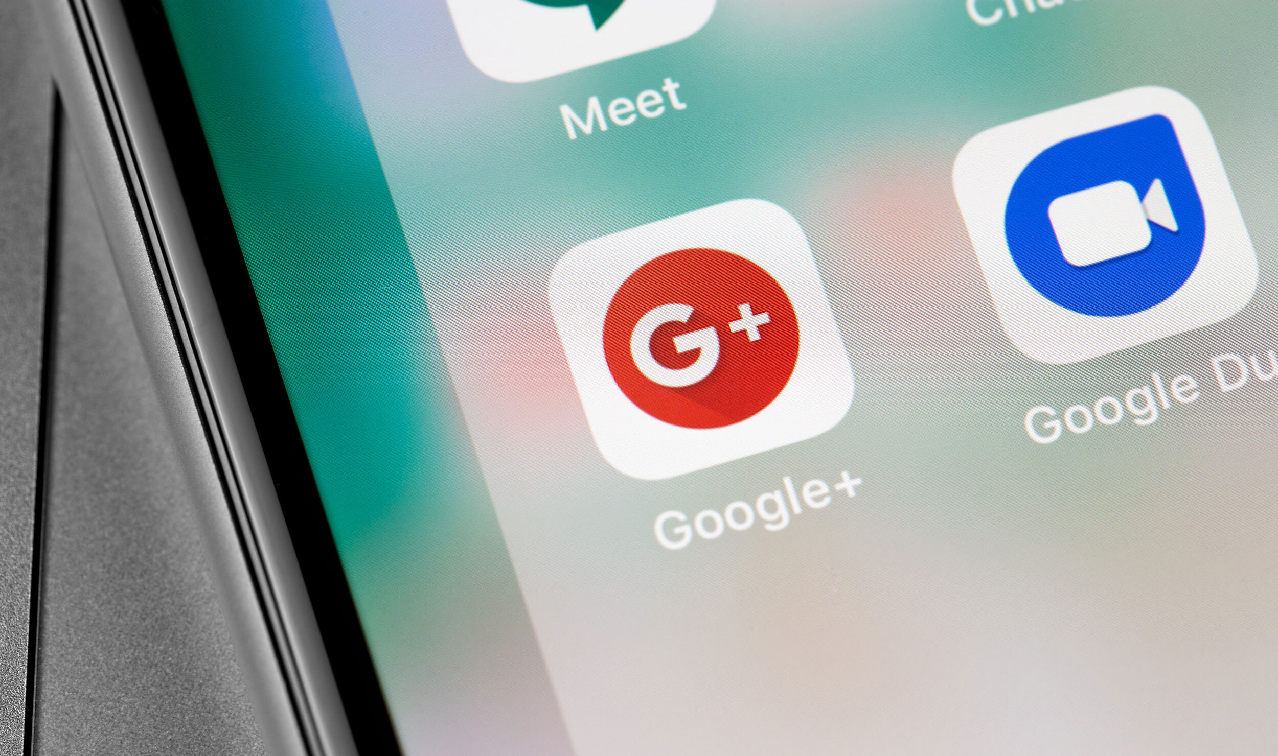
Pixel makes Google a consumer hardware brand
2016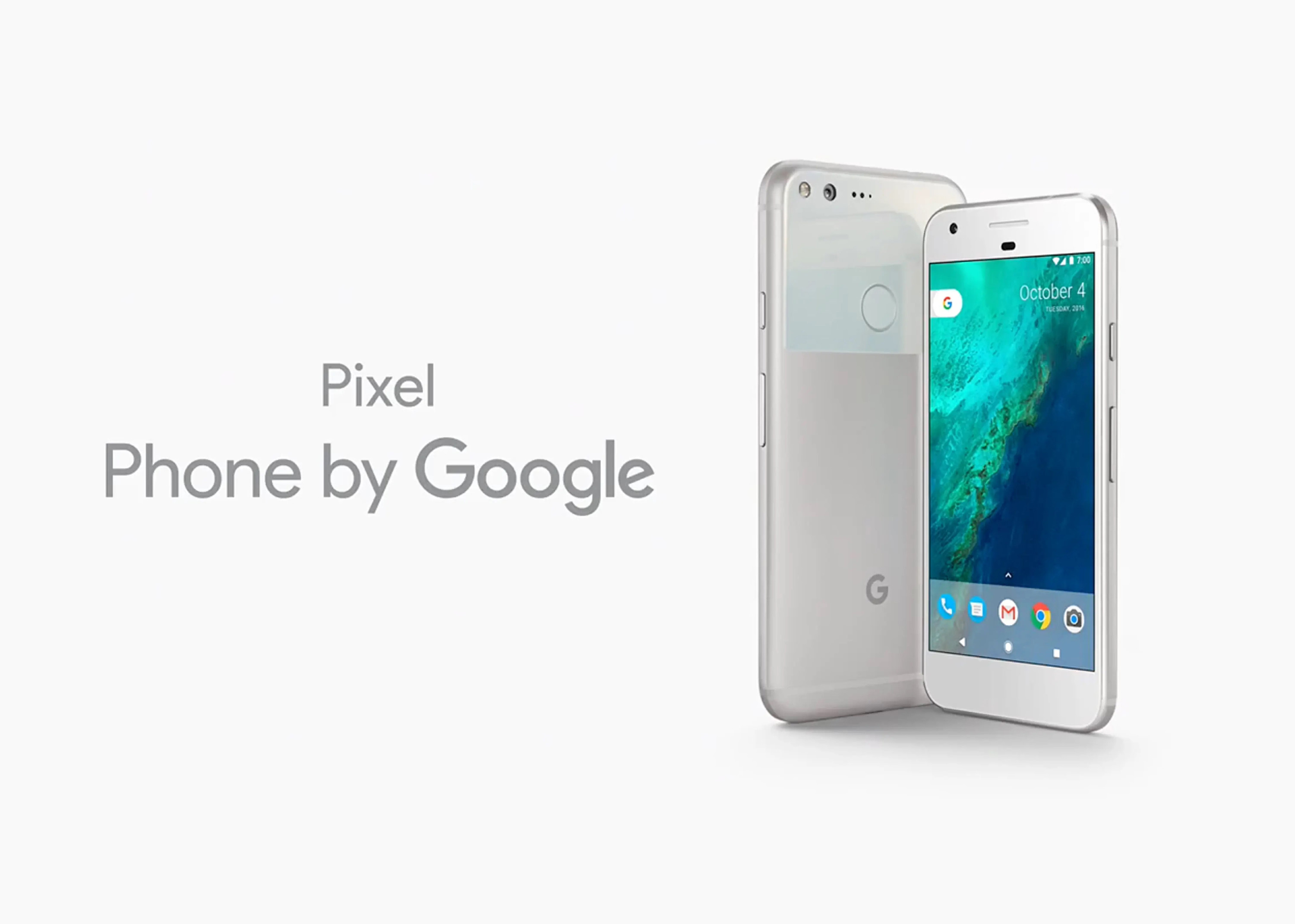
Alphabet and the restructuring of Google
2015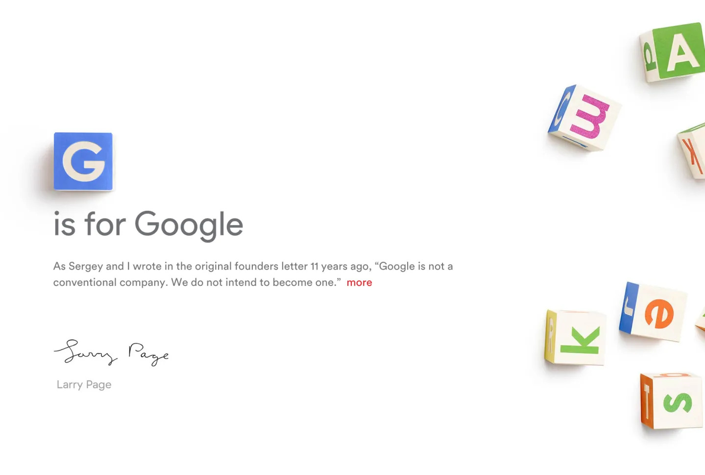
Logo Redesign
2015
In 2015, Google introduced a simplified logo as part of a broader visual identity update. The redesign replaced the previous serif typeface with a clean sans-serif style and refined the color tones, creating a more modern and versatile look suited to digital platforms. The new identity was developed collaboratively by Google’s in-house design team over the course of a week.
Material Design debuts as Google's design system
2014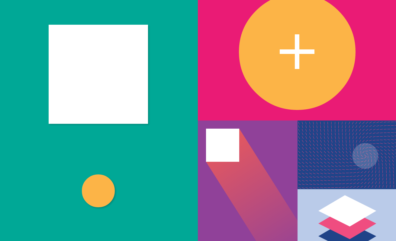
The Internship puts Google on the big screen
2013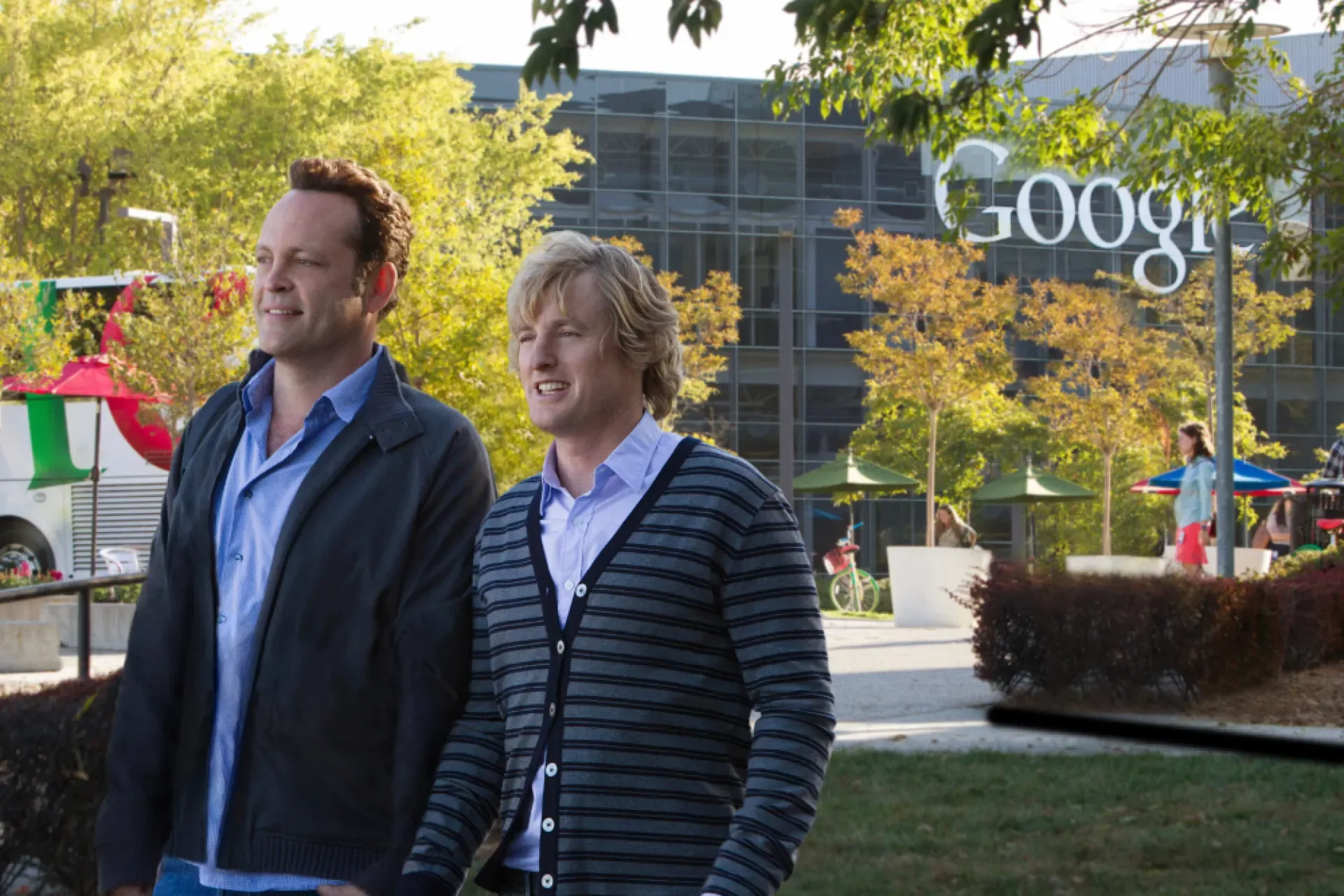
Logo Redesign
2013
In October 2013, Google refined its logo by adopting a flatter, two-dimensional appearance. The serifs were softened and simplified, creating a cleaner look that aligned with the company’s evolving visual language and anticipated the introduction of the Material Design design system.
Parisian Love takes Google to the Super Bowl
2010
Logo Redesign
2010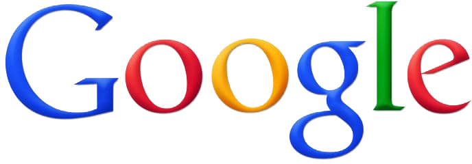
In 2010, Google subtly refined the logo originally designed by Ruth Kedar. While the typeface remained unchanged, the heavy shadows were removed, the gradient effect was softened, and the yellow “o” was adjusted to a warmer orange tone, giving the logo a cleaner and more modern appearance.
Google enters the browser market with Chrome
2008
Google acquires YouTube
2006
Google acquires Android
2005
Logo Redesign
1999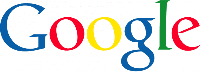
From May 1999 to September 2013, Google used a simplified wordmark that removed the exclamation mark and adopted a cleaner, two-dimensional appearance. The logo was set in the Catull BQ typeface, designed by Gustav Jaeger for Berthold Type Foundry in 1982. Its distinctive serif letterforms, inspired by classical Roman inscriptions, gave the brand a refined and timeless look.
How the Google Doodle became a brand ritual
1998
Logo Redesign
1998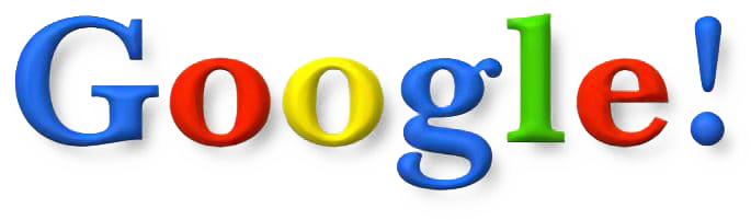
The first official logo of Google, introduced in September 1998, was used only briefly. A month later, it was replaced with an updated version featuring a blue uppercase “G” and an exclamation mark inspired by the branding trend popularized by Yahoo!. Stronger gradients and drop shadows gave the letters a three-dimensional appearance, creating a more vibrant and distinctive visual identity.
Founded
1998