Microsoft
Microsoft is a global technology corporation spanning operating systems, productivity software, cloud infrastructure, gaming, and consumer hardware, positioning itself as the platform layer for personal and organizational achievement.
Key-Facts
Brand Chronology
Microsoft Australia Turned a Social Moment Into a Copilot Campaign Led by Jane Lu
2025
Microsoft's Surface Studio film adopts the codes of Apple's product cinema
2016
Logo Redesign
2012On August 23 Microsoft introduced a new visual identity, marking a shift toward a cleaner, more modern look. The logo combined a wordmark with a simple graphic of four colored squares arranged in a 2×2 grid, representing key products: Windows (blue), Xbox (green), Office (yellow), and Bing (orange). Launched alongside Windows 8, the design emphasized unity across Microsoft’s ecosystem, with the colored grid symbolizing a diverse yet cohesive range of products.
Logo Redesign
2011In 2011, Microsoft briefly updated its corporate logo with a subtle modernization. This version was tied to the slogan “Be What’s Next,” reflecting the company’s focus on innovation and forward-looking strategy. Despite its intent, the logo had a very short lifespan—lasting only a few months before being replaced in August 2012. It was rarely used and never fully rolled out on Microsoft’s official website, making it the shortest-lived logo in the company’s history.
Microsoft’s $300 Million Campaign Tried to Reposition Windows by Humanising the PC
2008
Microsoft borrows the Rolling Stones to launch Windows 95
1995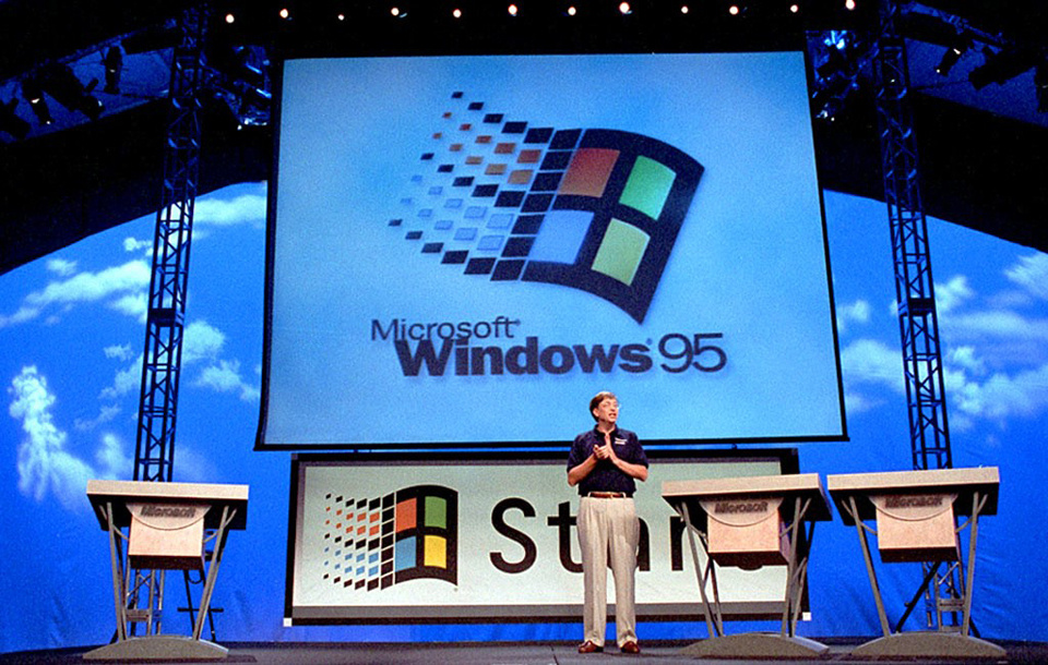
Microsoft Asked “Where Do You Want to Go Today?” to Humanize Personal Computing
1994
Logo Redesign
1987In 1987, Microsoft introduced a new logo designed by Scott Baker, based on a modified Helvetica Black Italic typeface. The slanted letters conveyed motion and progress, while a distinctive cut between the “o” and “s” added a sense of energy and technological edge. This logo proved highly durable, remaining in use for about 25 years across products and platforms, even after later updates. Its longevity and widespread presence made it one of Microsoft’s most recognizable and influential visual identities.
Logo Redesign
1982In 1982, Microsoft introduced a more modern, minimalist logo designed by David Strong. A key feature was the “O,” emphasized with horizontal lines that created a subtle sense of motion and technological dynamism. Although replaced in 1987, this logo remained in limited use for some materials, marking an important step in Microsoft’s shift toward a more rational and contemporary visual identity.
Logo Redesign
1980In 1980, Microsoft introduced a bold, dynamic logo based on a modified New Zelek typeface by Simon Daniels. The design emphasized movement and energy, reflecting the company’s growing technological ambitions. Although used for only about two years, the logo became memorable for its experimental, high-tech look. It was later revisited in 2023 as a nod to Microsoft’s early, more expressive design era.
Logo Design
1975In 1975, following the adoption of the name Microsoft, the company introduced its first logo, designed by Andrea Davis using the Aki Lines typeface. The lettering was arranged in a structured, evenly spaced row with repeated internal line patterns that gave the wordmark a rhythmic, network-like appearance.
Although used only until around 1980, the logo remained a notable part of Microsoft’s early identity and was later referenced in anniversary-related retrospectives as a symbol of the company’s beginnings.