An out-of-office message in a logo
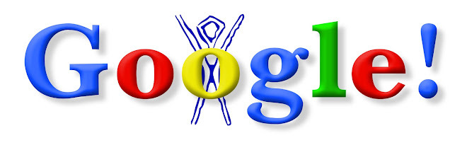
The first Google Doodle was not planned as a branding exercise. In the summer of 1998, before Google was even formally incorporated, Larry Page and Sergey Brin were preparing to attend Burning Man, the annual gathering in the Black Rock Desert of Nevada. To let users know they would be away, and unable to fix the servers if anything went wrong, the founders placed a small stick figure behind the second "o" of the Google logo on the homepage. The figure borrowed the silhouette of the Burning Man event's own symbol. It was, in effect, a visual out-of-office reply.
The gesture was informal, even self-deprecating, but it planted an idea. If the logo could be altered to communicate something, it did not have to be a fixed, untouchable asset. Over the following years, Google returned to that idea repeatedly, and what began as an in-joke became one of the most distinctive branding traditions on the internet.
From occasional to institutional
For the first couple of years, Doodles were sporadic and produced by outside help. The turning point came in 2000, when Page and Brin asked Dennis Hwang, then an intern working in a public relations role, to create a logo treatment for Bastille Day. The response was positive enough that Hwang was appointed Google's chief Doodler, a title that had not previously existed. In the years that followed he produced a large share of the company's Doodles, at times around fifty a year, and helped shape the visual language that would define the format.
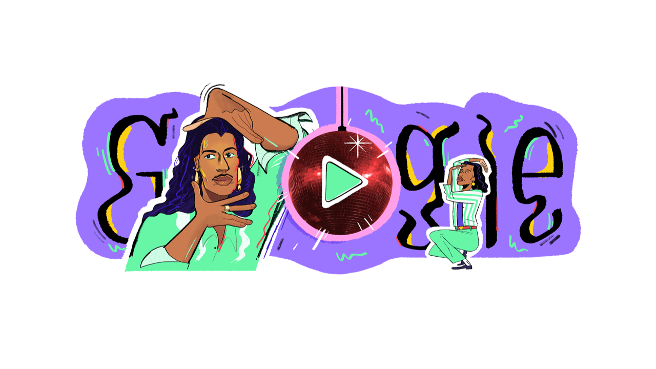
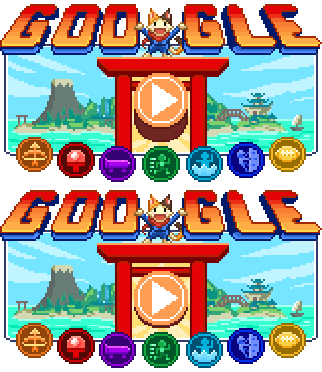
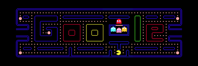
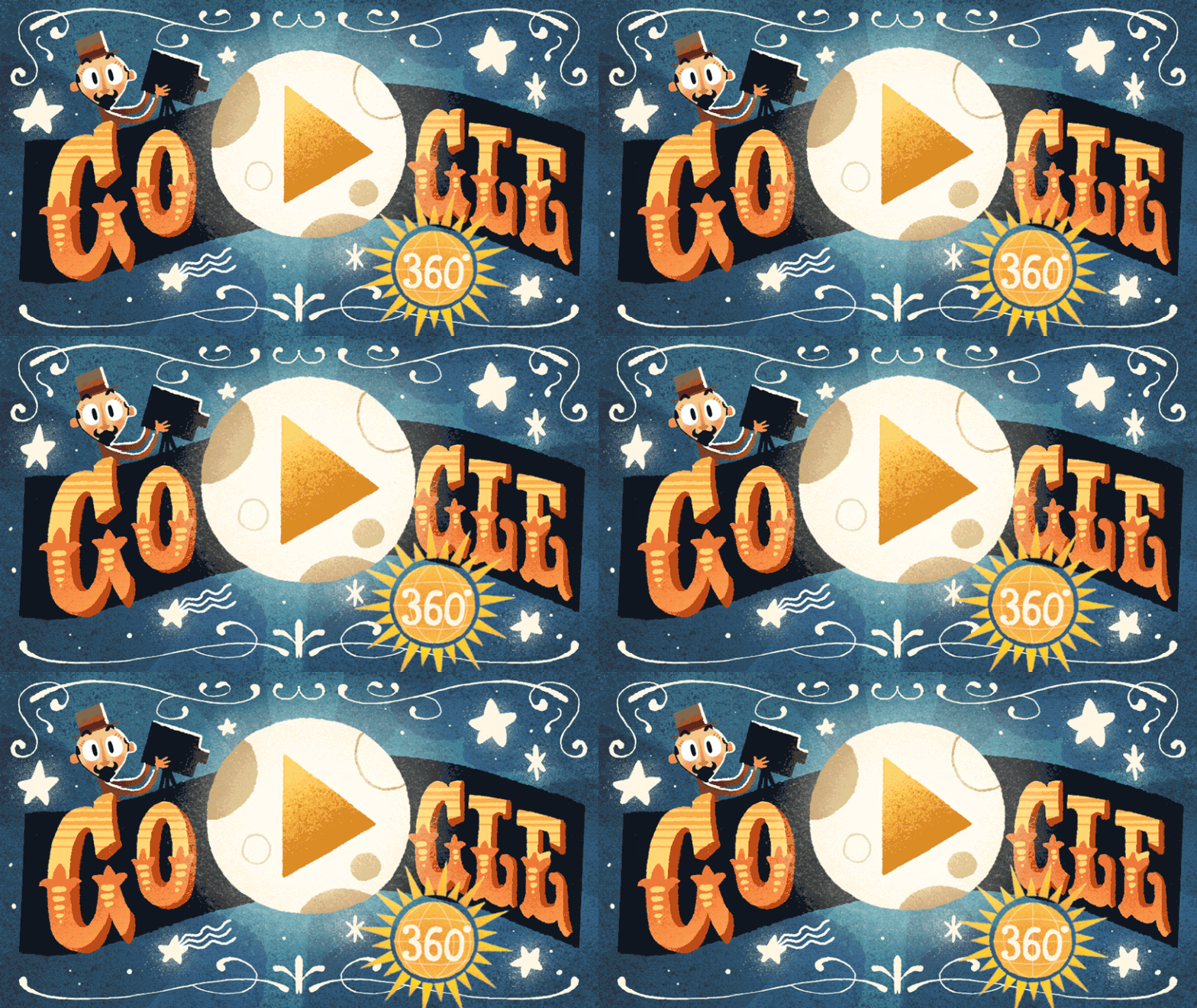
As demand grew, Google built a dedicated team of illustrators and engineers, known internally as Doodlers, to design the artwork and, increasingly, to build interactive and animated versions. The Doodle expanded from a static drawing over the logo into games, short films and playable instruments, all rendered within the familiar six-letter frame of the wordmark. A Doodle marking the anniversary of the Pac-Man arcade game, for instance, let users play a full level directly on the homepage.Why the format works as branding
The Doodle succeeds because it holds two opposing ideas together. On one side is consistency: the Google wordmark, its colours and its position on the page remain stable, so the brand is never in doubt. On the other side is constant variation: the artwork changes daily, celebrating national holidays, scientific milestones, artists, athletes and historical figures, often tailored to specific countries and regions. The result is a logo that feels alive without ever losing its identity.
That balance turns a piece of visual identity into a form of editorial. Each Doodle is a small act of storytelling, and because it appears on one of the most visited pages in the world, it reaches an audience few media brands can match. By choosing whom and what to commemorate, Google positions itself as a curator of culture and knowledge, reinforcing its stated purpose of organising the world's information in a way that is warm rather than purely mechanical.
A tradition that outlasted the serif
The Doodle also gave Google unusual freedom with its core mark. Because the logo was regularly redrawn, the company could treat it as a canvas rather than a locked artwork, which in turn made its formal identity changes feel less abrupt. When Google retired its long-standing Catull serif wordmark in 2015 in favour of the custom Product Sans typeface, the Doodle tradition simply carried on in the new letterforms. The brand had spent more than fifteen years teaching audiences that its logo could look different from one day to the next.
Today the Doodle is a fully institutionalised part of Google's identity, with an archive stretching across thousands of designs and a team that plans them far in advance. Some mark global events, others are highly local, celebrating a regional holiday or a national figure that most of the world would not recognise. What unites them is the founding instinct from 1998: that a logo can be more than a signature, and that a brand can speak through the small, daily act of redrawing itself.
For a company that has changed its typeface, restructured under a new parent and repeatedly refreshed its palette, the Doodle stands out as a rare constant. It is the one part of Google's branding that has always been designed to change, and that paradox is exactly why it has lasted.
Written with AI assistance, edited by a human. Find out more about our Use of AI.