Prime
The paid membership programme, since 2005; bundles shipping, Prime Video and more as a brand of its own.
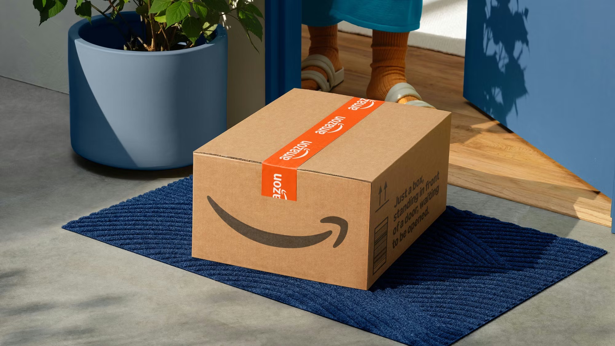
The world's largest online retailer and cloud computing provider, recognized globally by its Smile Arrow logo.
“Work hard. Have fun. Make history.”

We strive to be Earth's most customer-centric company, Earth's best employer, and Earth's safest place to work.
Amazon – About Us
The paid membership programme, since 2005; bundles shipping, Prime Video and more as a brand of its own.

Amazon Web Services, since 2006; the cloud-computing brand that became Amazon's profit engine.
The voice-assistant brand, since 2014; Amazon's interface for smart-home and ambient computing.
The e-reader and e-book brand, since 2007; built Amazon's hold on digital reading.

The private-label brand for everyday goods; Amazon's own-brand answer across commodity categories.

becomes CEO, succeeding Jeff Bezos
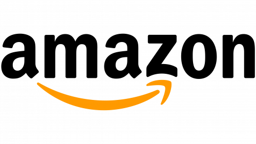
This version of the logo built on its predecessor to reflect the company’s rapid growth and broader range of offerings. The removal of the “.com” element marked a shift away from being seen solely as an online retailer, highlighting its evolution into a global brand. In its place, the simplified name “Amazon” became the central focus.

The new logo became a defining element of Amazon’s visual identity for years to come. It successfully captured the brand’s core values in a clear and memorable way.
At the heart of the design is a yellow-orange arrow shaped like a smile, stretching from the letter “a” to “z.” This detail symbolizes the vast range of products available on the platform, from A to Z. At the same time, the subtle smile reinforces a sense of customer satisfaction, making the mark both simple and highly expressive.

In 1998, Amazon introduced an updated logo that enhanced its recognizability and gave it a more contemporary feel. This moment coincided with a key phase in the company’s development, as it began expanding beyond its origins as an online bookstore into a broader retail platform.
The revised visual identity reflected this shift, helping to reposition the brand in the minds of consumers and support its emergence as a more versatile and ambitious marketplace.
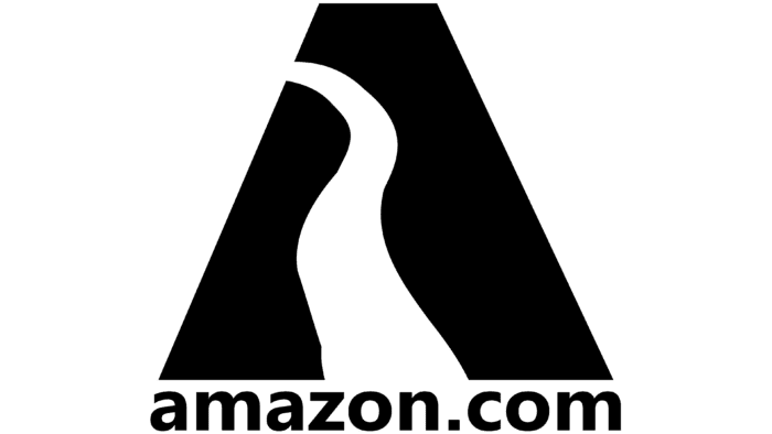
At the start of its second year, Amazon introduced its first distinctive logo, marking an important milestone in the development of its visual identity. The design featured a black triangle with a sharply angled peak, intersected by a white line running through its center. This line divided the shape in a way that formed an abstract representation of the letter “A,” subtly referencing the company’s name. Beneath the symbol, the full domain name appeared in lowercase letters, set in a uniform size.