Apple
Global technology company defining premium consumer electronics, software, and services through an identity built on simplicity, craft, and a tightly integrated ecosystem.
Key-Facts
Brand Chronology
Apple Marks 50 Years of Thinking Different with Global Celebrations
2026
Apple TV Retires the Plus Sign and Presents a New Identity
2025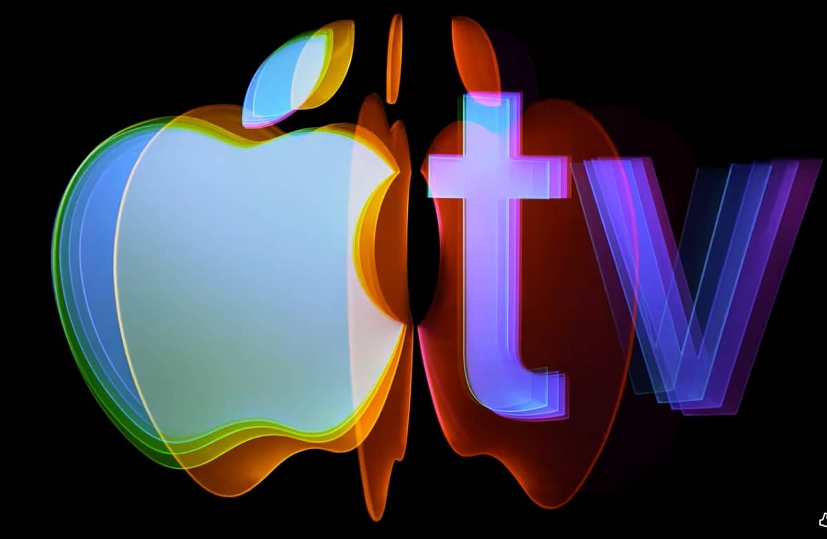
Apple’s “Design is how it works” campaign: reinforcing simplicity as a brand philosophy
2025
Apple Turns Privacy Into a Platform Claim
2019
Share Your Gifts: Apple’s 2018 Holiday Film Champions Creative Courage
2018
IKEA Place put the showroom inside the iPhone
2017
Apple’s “What Will Your Verse Be?” – turning technology into a tool for human expression
2014
Apple’s “Mac vs. PC” campaign: how humor reshaped tech advertising
2006
Logo Redesign
1998In 1998, Apple significantly refined its logo, moving away from the colorful rainbow design in favor of a monochrome version. This shift was driven by several factors. Minimalism was becoming increasingly influential in graphic design, and a simpler visual identity helped place greater emphasis on the brand’s association with innovative technology rather than decorative elements.
At the same time, the more restrained design highlighted the elegance and adaptability of Apple products, which were available in a wide range of colors.
Apple Repositions Itself With "Think Different"
1997
Apple’s “1984” Super Bowl ad: the commercial that redefined modern advertising
1984
Logo Redesign
1977The logo introduced in 1977 represented a clear departure from the earlier black-and-white identity of Apple, replacing complexity with simplicity and visual clarity. It was designed by Rob Janoff, a graphic designer who developed the concept after an initial briefing with Apple’s leadership.
The logo’s original color version included six horizontal rainbow stripes. This palette was intended to emphasize the introduction of color-capable computing systems and to present the brand as innovative and approachable.
First Logo
1976The emblem from this early period appears like a detailed illustration set within an elongated rectangular frame. It depicts a man seated beneath a broad tree, holding a book, with a large apple suspended above him.
The apple in the tree references the moment associated with Isaac Newton and the discovery of gravity, symbolizing scientific insight and intellectual discovery.
Created by Ron Wayne, one of Apple’s co-founders, it was intended to express the company’s intellectual and innovative foundations. However, it was soon replaced within a year by a far simpler and more modern identity that better matched the evolving direction of the company.
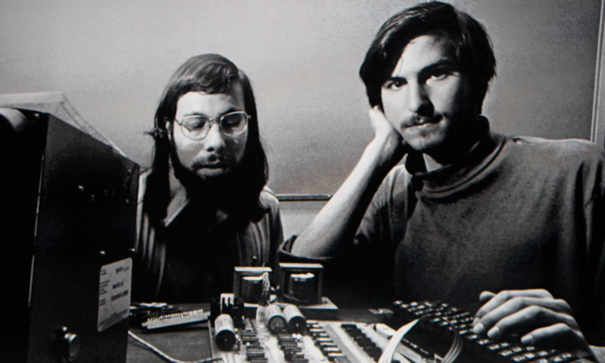
Founded
1976