
adidas Originals
The lifestyle line under the Trefoil, since 1972; carries the brand's heritage and street-culture side apart from on-field sport.

adidas is a German sportswear company built around the three stripes mark, pairing performance innovation with a heritage lifestyle line under the Trefoil that anchors its Originals division.
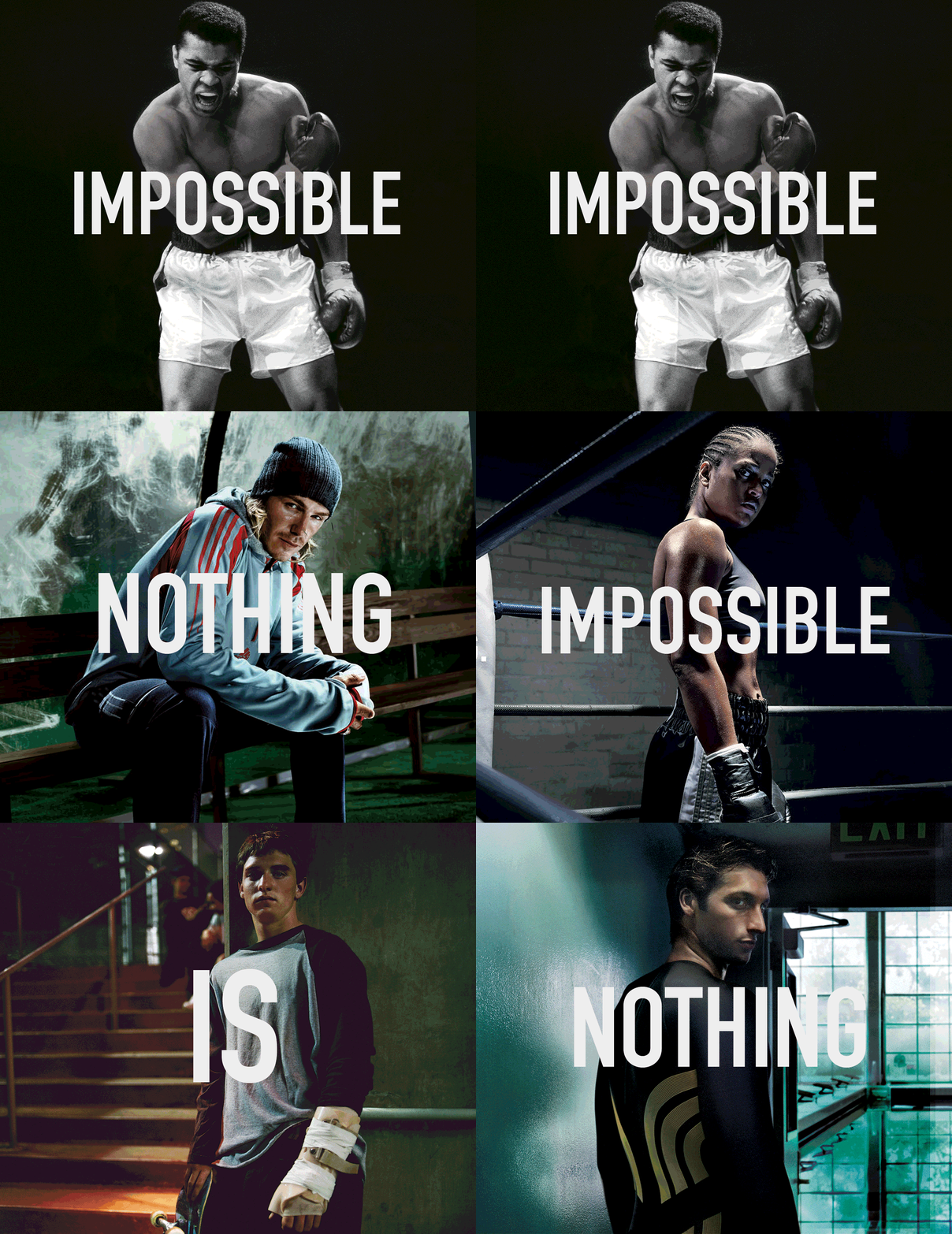
“Impossible Is Nothing”



Through sport, we have the power to change lives. adidas exists to help to expand the limits of human possibilities, to include and unite people in sport, and to create a more sustainable world.
Adidas Group Website – ProfileTo be the best sports brand in the world.
Adidas Group Website – Profile
The lifestyle line under the Trefoil, since 1972; carries the brand's heritage and street-culture side apart from on-field sport.
The outdoor and mountain-sport line; extends adidas into hiking, climbing and trail categories with its own identity.

The label made with Yohji Yamamoto since 2003; places adidas in high fashion with a distinct runway identity.



becomes CEO


In 2022, adidas Performance simplified its logo by removing the wordmark and retaining only the iconic mountain symbol introduced in 1991.
The standalone mark consists of three wide, ascending stripes that lean slightly to the left. Each stripe differs in length, with the right stripe being the longest and the left the shortest. By eliminating the text, Adidas made the mountain symbol the primary identifier of its Performance line, reinforcing its focus on sport and athletic achievement.

becomes CEO, succeeding Herbert Hainer



In 2005, adidas introduced a new corporate logo to unify its growing range of products and collections. The design featured three parallel black stripes separated by two white gaps, positioned beside the adidas wordmark in the brand’s Adineue Pro Bold typeface. This clean, minimalist emblem became the company’s primary corporate identity, representing the Adidas brand across its various product lines.


In the early 2000s, adidas expanded into high fashion with the launch of adidas Style. The line adopted a distinctive logo featuring three white curved stripes crossing a black circular background. The stripes swept diagonally across the sphere and ended in pointed tips, giving the symbol a dynamic appearance often compared to claw marks. Beneath the emblem, the familiar adidas wordmark remained unchanged, maintaining visual continuity with the brand’s other identities.

becomes CEO





On November 19, 1967, adidas introduced a new wordmark based on the Adineue Pro Bold typeface, developed by the MCKL studio. The redesign removed the dark background and presented the adidas name in bold, lowercase black sans-serif lettering.
Although similar to the previous version, the typeface featured subtle refinements, including a square dot above the “i.” This wordmark was later used for the Essentials and Neo product lines, which remained part of the Originals and Performance collections until they were consolidated into the Adidas Sportswear line in 2022.

In 1950, adidas adopted a new typographic logo, replacing earlier symbolic designs with a simple wordmark. The logo featured the white lowercase word “adidas” on a black rectangle with rounded corners. Set in a bold sans-serif typeface, the clean design emphasized the brand name and improved its visibility and recognition.
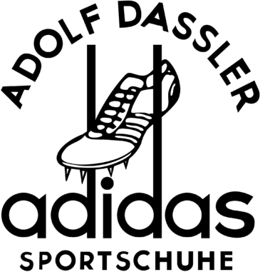
When Adolf Dassler founded Adidas in 1949, the first official logo emphasized both the founder’s name and the brand’s sporting heritage.
The emblem featured “ADOLF DASSLER” in bold uppercase letters above a track spike shoe positioned diagonally between two vertical lines. Below, the lowercase adidas wordmark appeared in a rounded sans-serif typeface, followed by the word “SPORTSCHUHE” (“sports shoes”) in uppercase letters.
The design reflected adidas’ origins in athletic footwear, particularly track and field. The track shoe symbolized performance, while the vertical lines reinforced the brand’s connection to competitive sport.
After the brothers parted ways in 1948, Rudolf established Puma, while Adolf launched adidas in 1949. The first logo marked the beginning of the company’s independent identity and its ambition to become a leader in sports footwear.
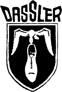
The earliest logo of Gebrüder Dassler Schuhfabrik dates to 1924, when brothers Adolf Dassler and Rudolf Dassler founded their shoe factory. This emblem marked the beginning of the company that would later give rise to both Adidas and Puma.
The logo featured the word “DASSLER” in a bold, geometric typeface above a black shield outlined in white. At the center was a stylized bird carrying a shoe in its beak, combining imagery of speed, lightness, and athletic performance. The design emphasized the company’s focus on sports footwear and established the visual foundation for two of the world’s most influential sportswear brands.