ASICS
A Japanese sportswear company whose corporate name is an acronym of a Latin sentence about a sound mind in a sound body, which it has turned from a founding anecdote into its operating brand platform, and which runs a second, separately managed heritage brand in Onitsuka Tiger.
- Founded
- 1949
- Industry
- Apparel · Footwear · Sports
- Headquarters
- Japan
- Ownership
- Public company
Key Facts
“Sound Mind, Sound Body”

Respect Rules. Be Courteous. Be Persistent. Work as One Team. Be Prepared. Learn from Failure.
ASICS CorporationCreate Quality Lifestyle through Intelligent Sport Technology
ASICS CorporationBrand Chronology
Onitsuka Tiger opens its largest store before the split
2026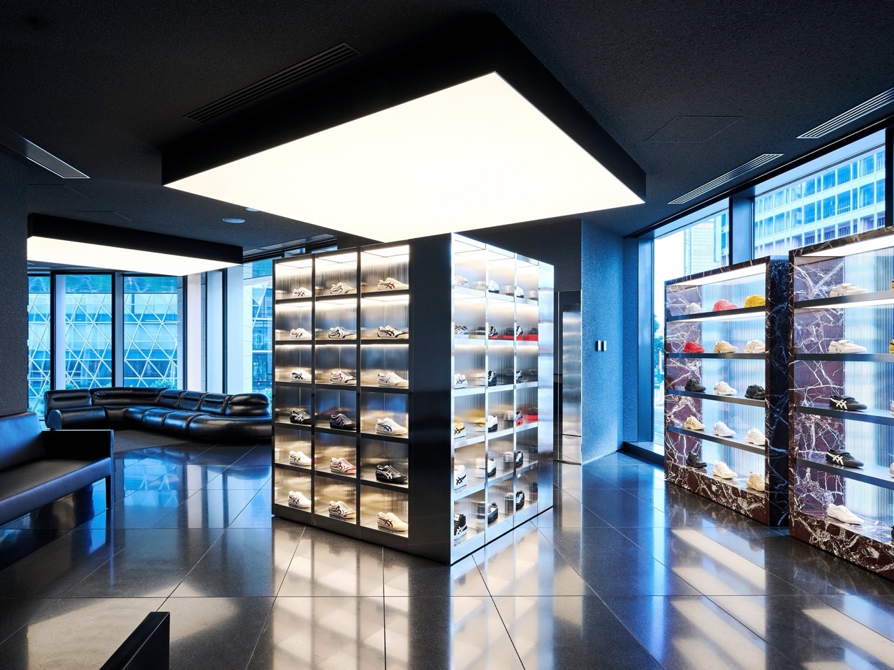
ASICS photographs faces straight after exercise
2026
ASICS licensed a song that only the runner hears
2026
ASICS compares 15 minutes with a wellness holiday
2025
ASICS signs a dog as a brand ambassador
2025
ASICS put a movement break into the employment contract
2024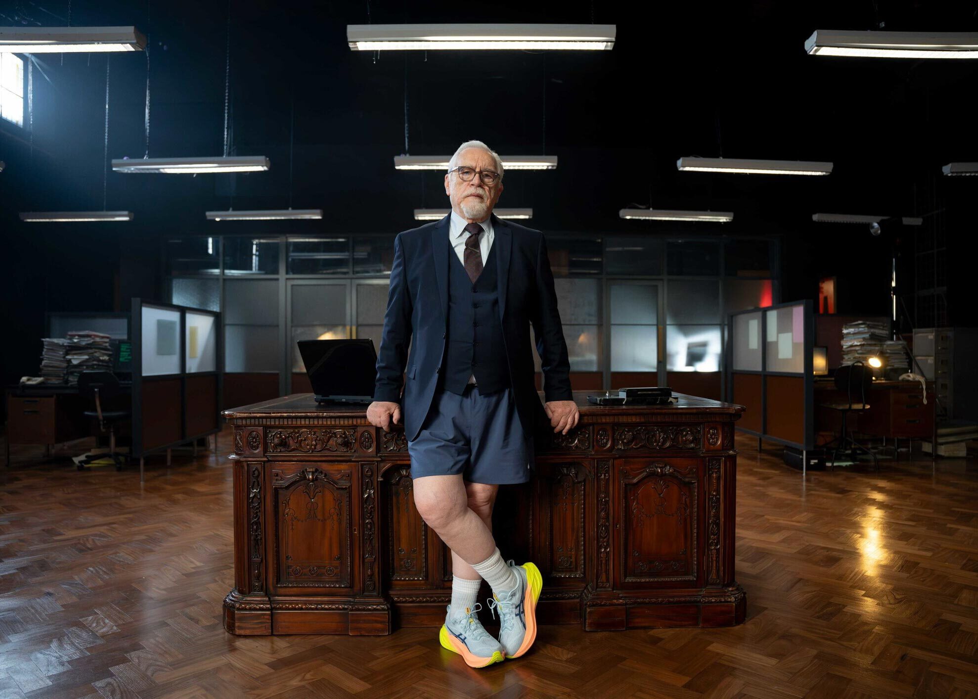
ASICS surveys 26,000 people in 22 markets
2024
ASICS turned its own name into a research programme
2021
ASICS bought an app and ended up owning the race
2016
ASICS ran two heritage brands and quietly retired one
2015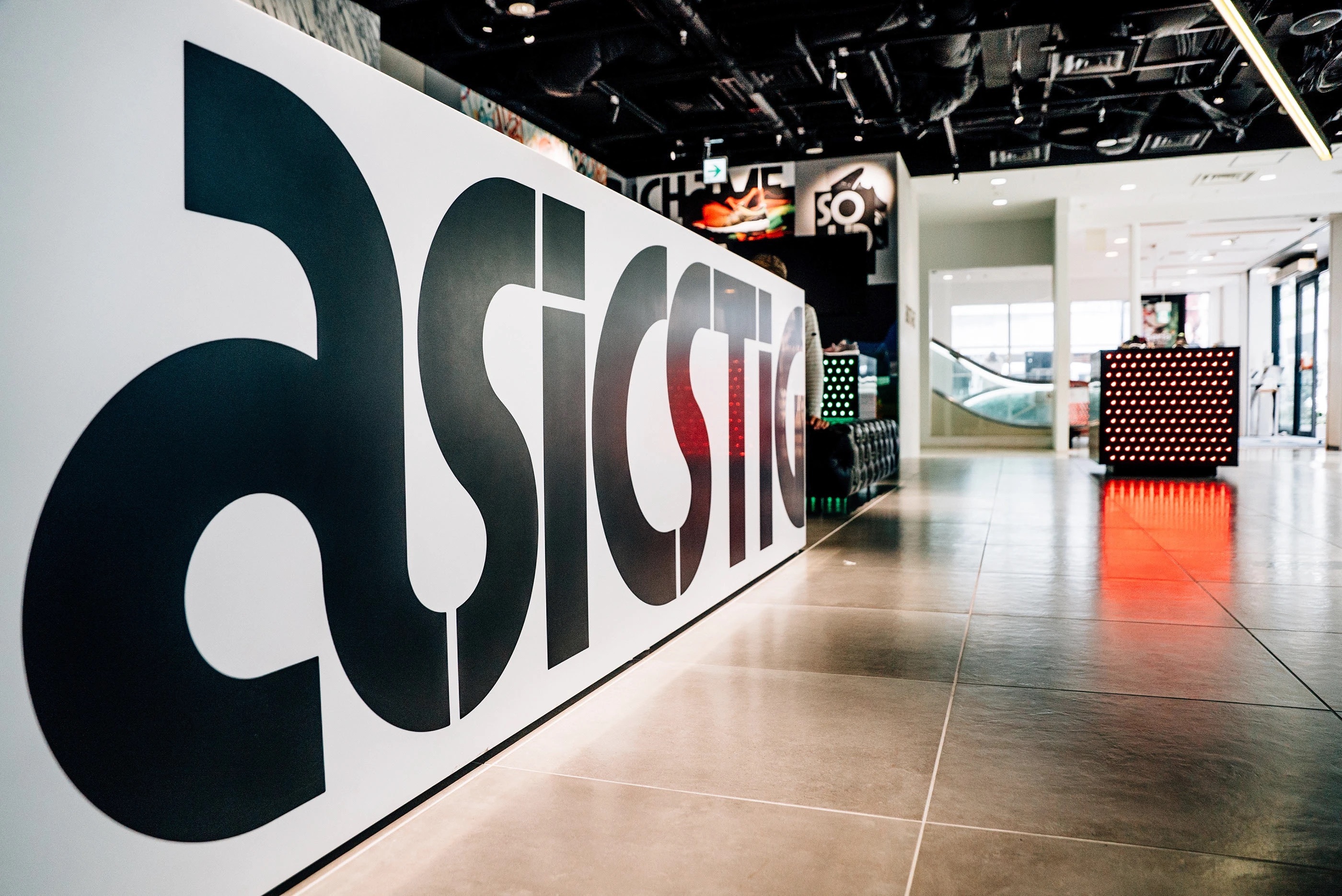
ASICS: Logo Redesign
2007
In 2007, ASICS introduced a refined version of its logo, although the updated design had already appeared on the Japanese website in December 2005. The redesign retained the familiar symbol-and-wordmark structure but gave the identity a more compact and contemporary appearance.
The entire logo was rendered in a deep navy blue. The spiral symbol on the left was slightly flattened along its upper edge, while its characteristic flowing curves remained intact.
The most significant change was the ASICS wordmark. A new custom typeface replaced the previous lettering, featuring wider, heavier lowercase characters with a subtle rightward slant. Despite the increased weight and density, the rounded forms and smooth lines were preserved, maintaining continuity with the brand’s established visual identity.
Onitsuka Tiger: Logo Redesign
2002
When the heritage brand was officially revived in 2002, they standardized the current primary corporate wordmark. It features a clean, blocky, capitalized sans-serif typeface
ASICS: Logo Redesign
1992
In 1992, ASICS expanded its visual identity by adding a distinctive spiral symbol to the existing wordmark. The lettering, originally created by Herb Lubalin in 1987, remained unchanged, preserving the narrow lowercase forms and rounded proportions.
The new symbol was placed to the left of the wordmark and featured a large, curved oval resembling both a running track and a stylized letter A. Originally developed for ASICS’s BEZA sportswear line by Nippon Design Center, the graphic was later adopted as the company’s primary corporate symbol.
Its flowing shape conveys movement and athletic performance, while the track-like form reinforces associations with running, speed, and continuous progress. Combined with the established wordmark, the symbol created a more distinctive and recognizable ASICS identity.
ASICS: Logo Redesign
1987
In 1987, ASICS celebrated 10 years since its merger by updating its logo. The changes were subtle. The appearance of the wordmark remained the same, with the five lowercase Latin letters keeping their tight spacing and smooth contours. The main update affected the line thickness. The previously heavy strokes became thinner and more refined, giving the symbol a lighter, airier feel.
At the same time, the primary color was changed. Instead of ultramarine, the logo adopted a bright blue tone that emphasized the brand’s athletic character. The typeface retained its original style, while visually moving closer to experimental versions of Eurostile Rounded.
The updated mark reflected continuity with the established visual style while highlighting the brand’s readiness to evolve with the times.
ASICS took its name from a line Juvenal never wrote
1977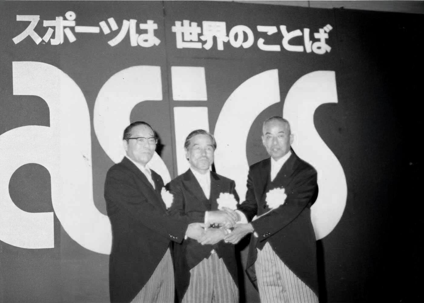
ASICS: Logo Design
1977
In 1977, the ASICS logo drew inspiration from the distinctive tiger stripes found on the sides of the company’s footwear. These stripes were paired with the five-letter lowercase wordmark, “asics,” set in a bold custom typeface with uniform strokes and smoothly rounded forms. The tightly connected letters created a continuous visual shape, with each character flowing naturally into the next.
Kabel was used on product packaging to reinforce the brand’s sporty and energetic character. Although created in 1977, the logo continued to appear in ASICS Sportstyle collections and was later revived in 2015 for the ASICS Tiger line, alongside the newer symbol featuring a lowercase “a.”
Onitsuka Tiger's stripes outlived the brand itself
1966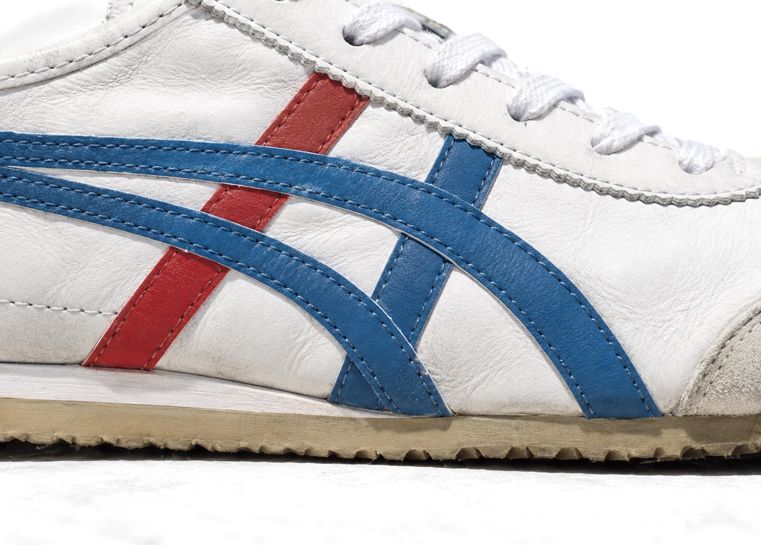
Onitsuka Tiger: Logo Design
1965
With the official name change in 1965, the company introduced a clean, minimalist text logo for corporate use. It featured a bold, sans-serif block typeface that simply read ONITSUKA TIGER. This text layout was heavily featured on shoeboxes, tracksuits, and marketing catalogs at the tim
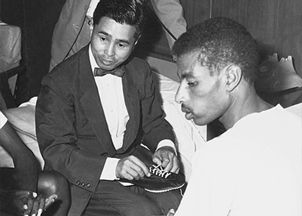
Nike's founder sold Onitsuka Tiger before he sold Nike
1964
Founded
1949