
A container on the Ku'damm in one colour
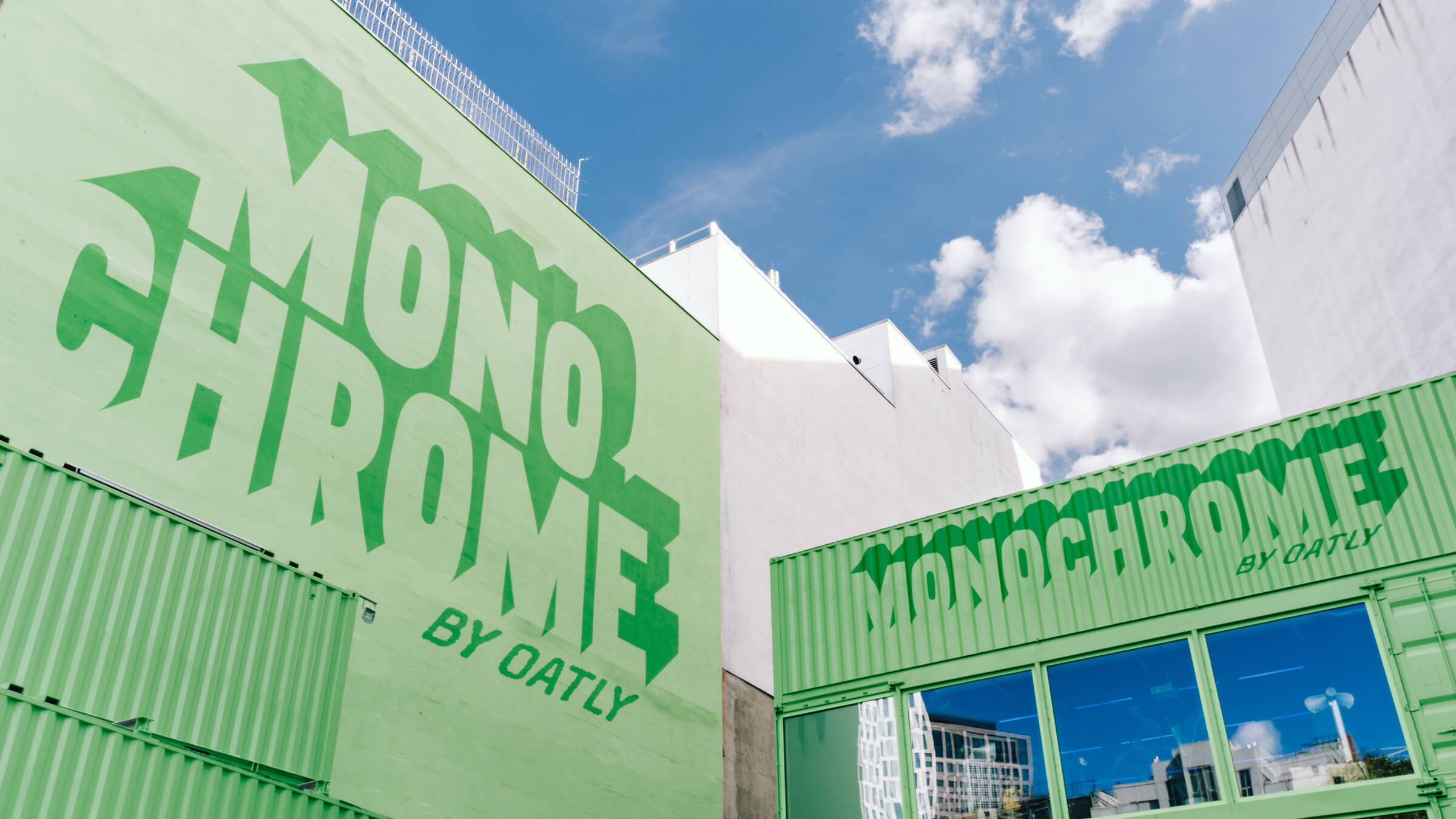
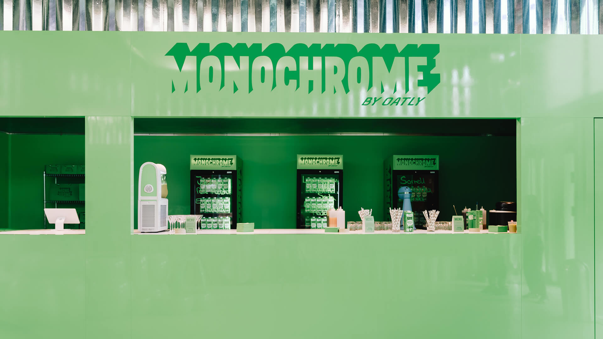
From 25 to 29 August 2026, Oatly ran Monochrome by Oatly, a pop-up at THE SPACE Kudamm on Kurfürstendamm in Berlin, built around its matcha oat drink.2, 3 The space was designed by the Berlin studio Cee Cee Creative, which starts from a question about the product rather than the logo: how to make matcha tangible in real life and "create maximum shareable moments along the way".1 The studio's answer, in its own words, was "radically consistent: the greenest of green".1
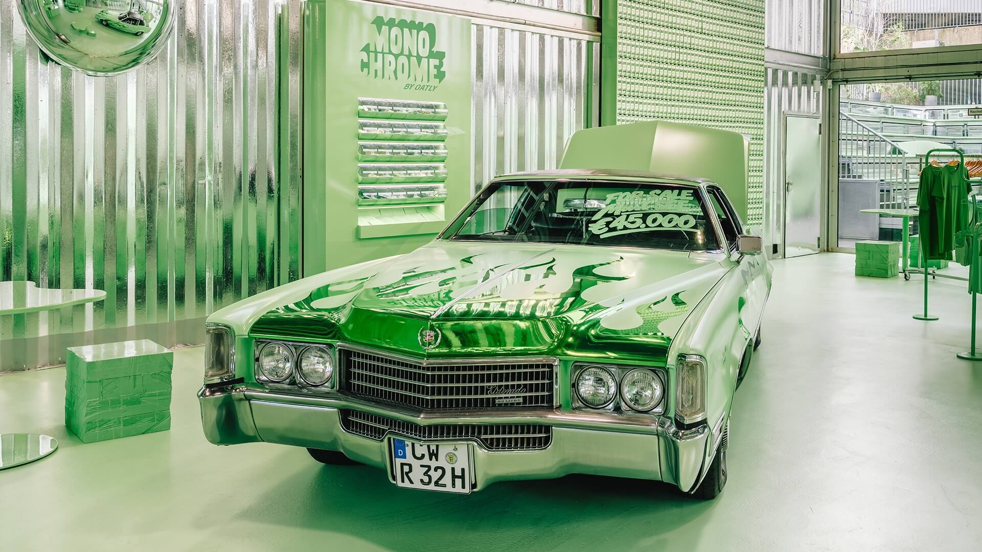
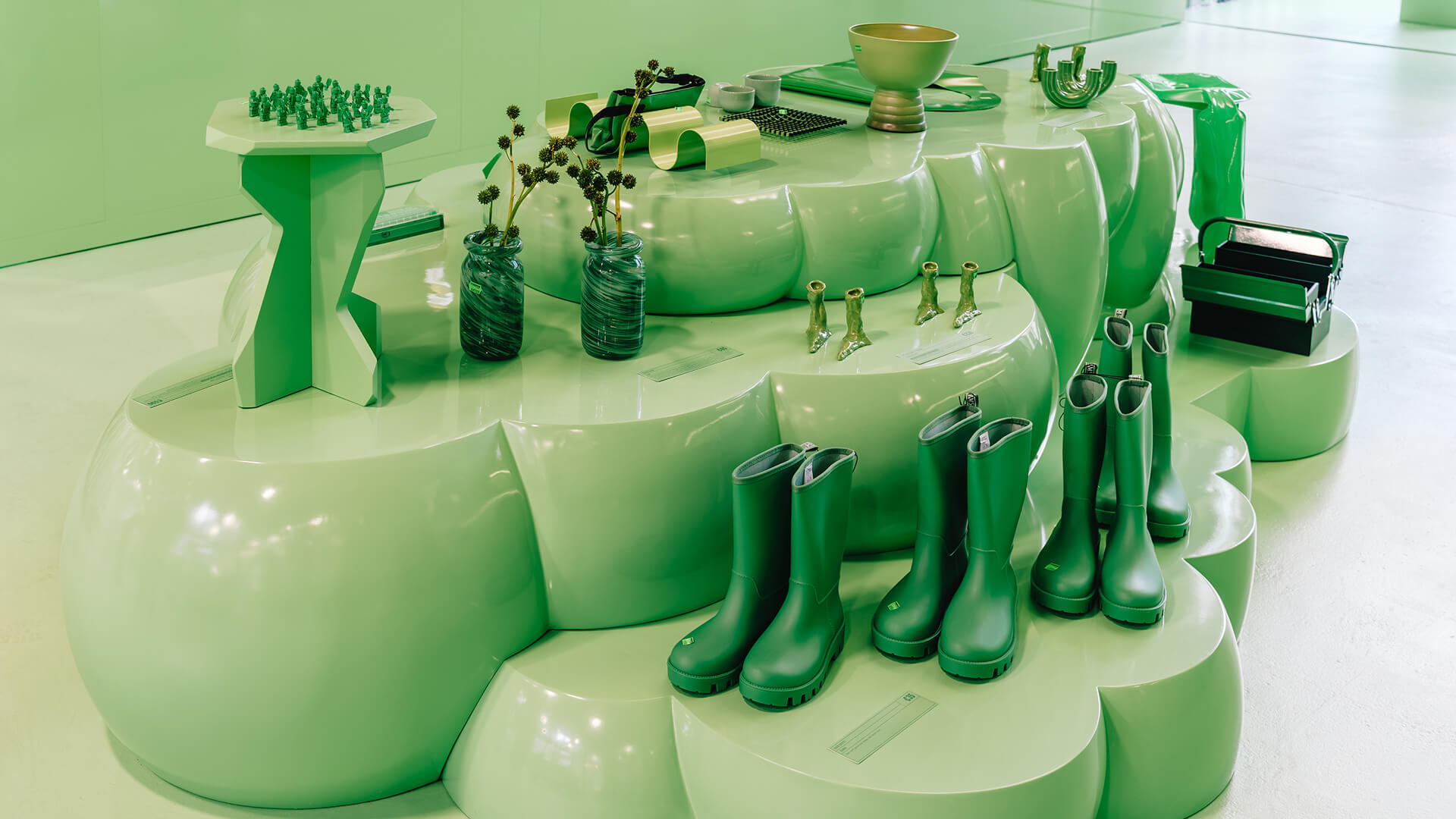
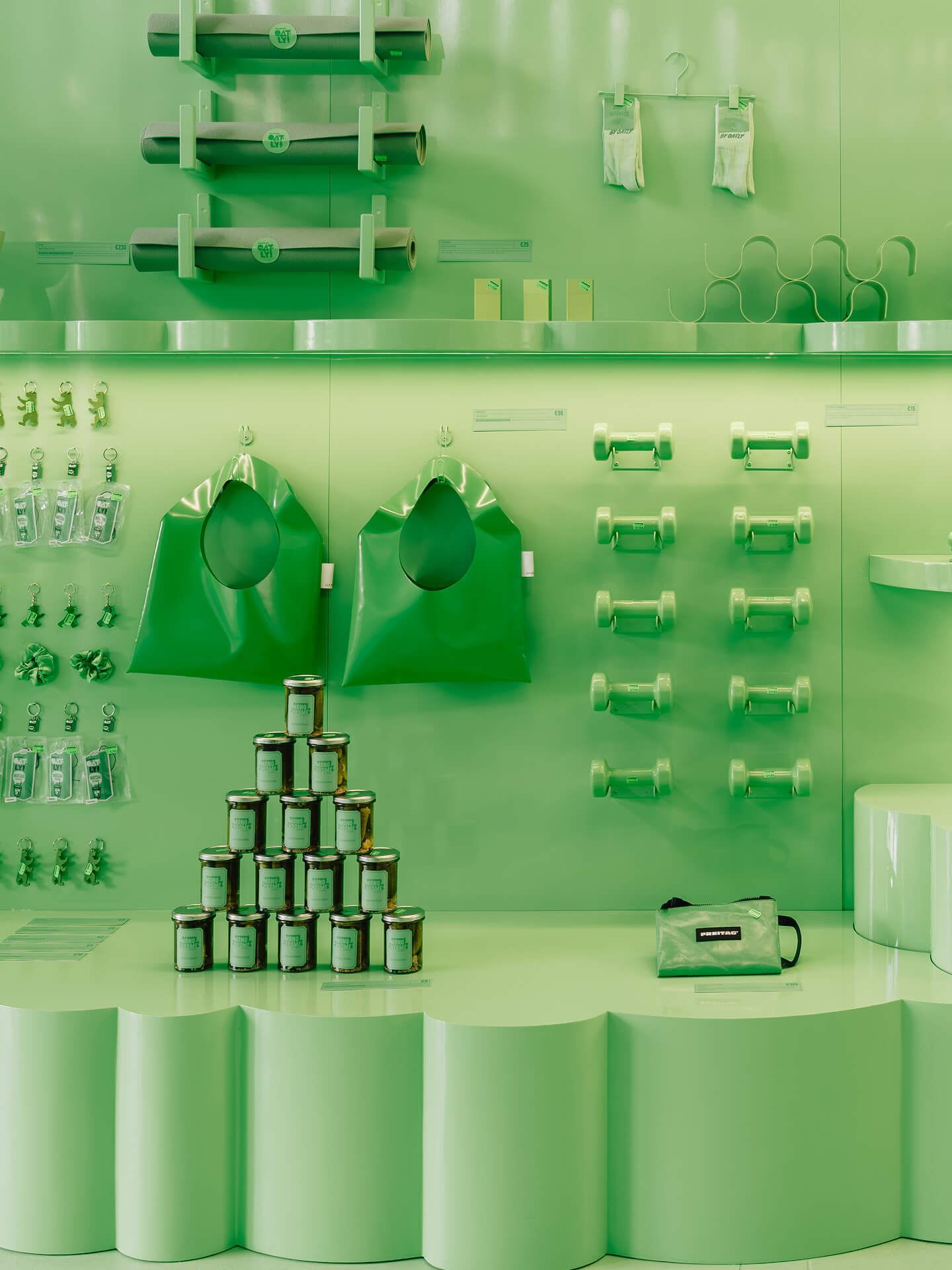
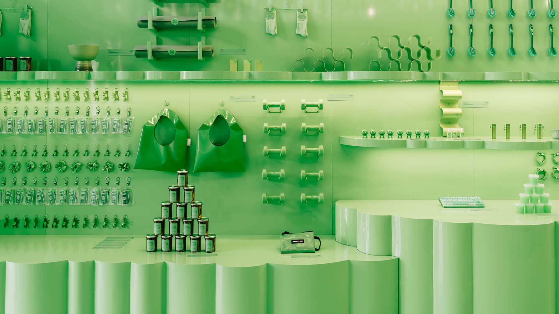
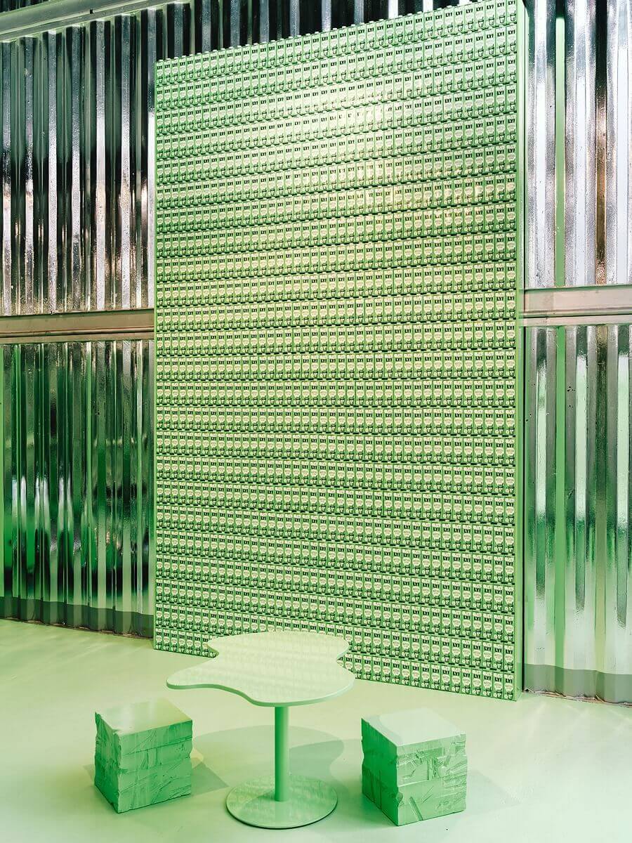
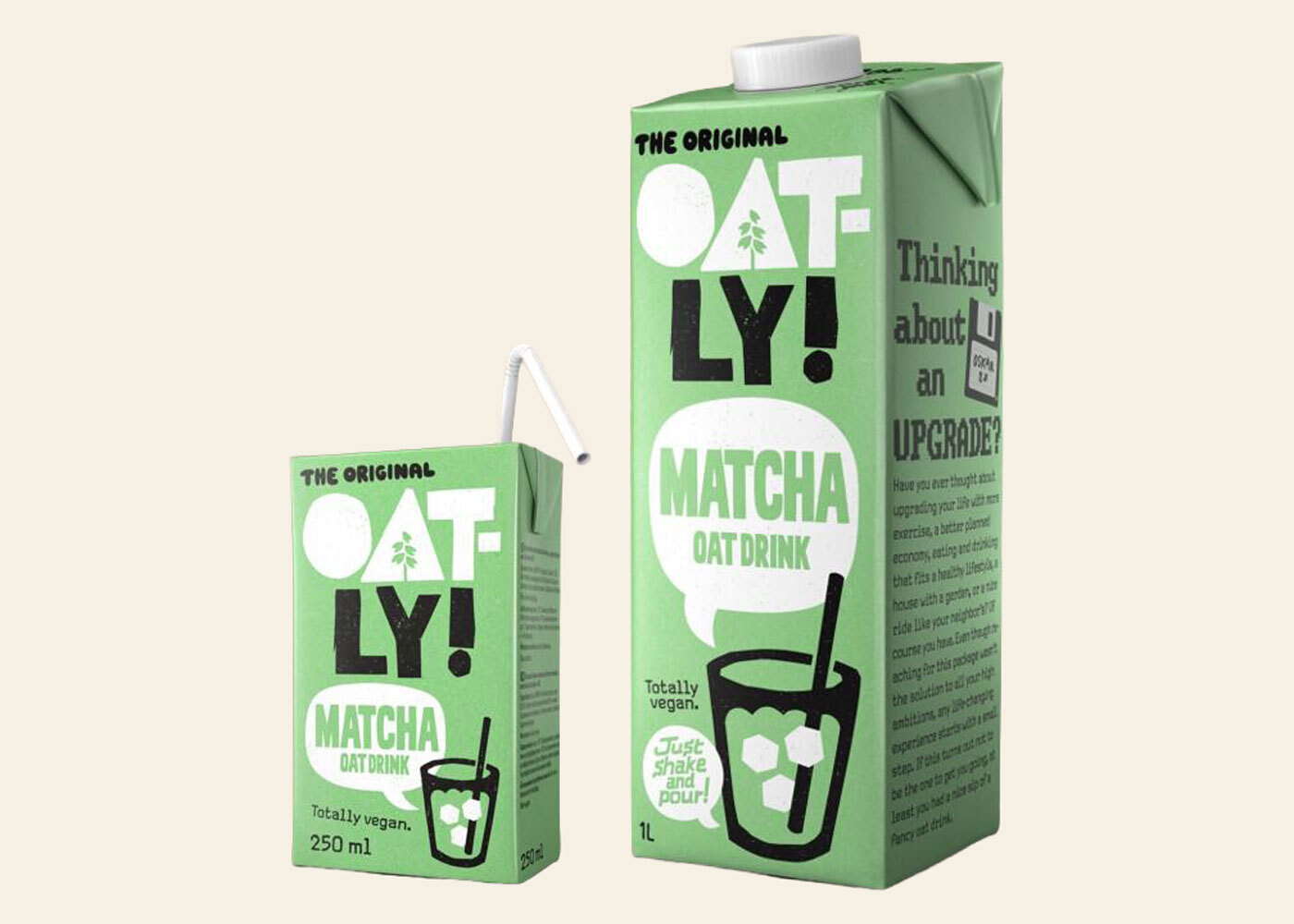
Every surface and object in the stacked shipping containers carries the green of the Oatly Matcha carton, worked as a curated set of shades rather than one flat tone, with a darker green reserved for lettering.2 Scalloped plinths, a convex mirror wall, a cloud-shaped plinth, green cube stools and a drinks counter with branded fridges share the room with a changing room for apparel and a vintage Cadillac Eldorado, painted green with green flames.2 On sale are the Oatly Oatdrink Matcha and three matcha sodas in jasmine, Earl Grey and lemongrass, next to green socks, rubber boots, toothbrushes and churro-shaped candlestick holders.1, 2, 3
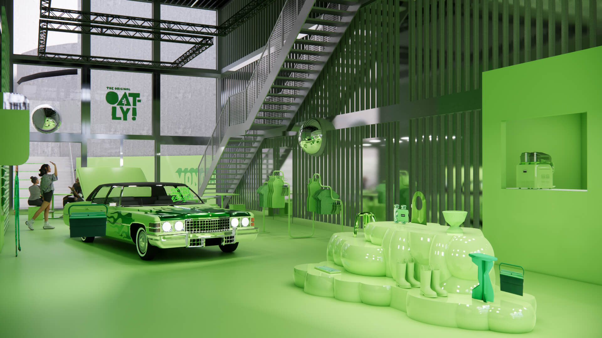
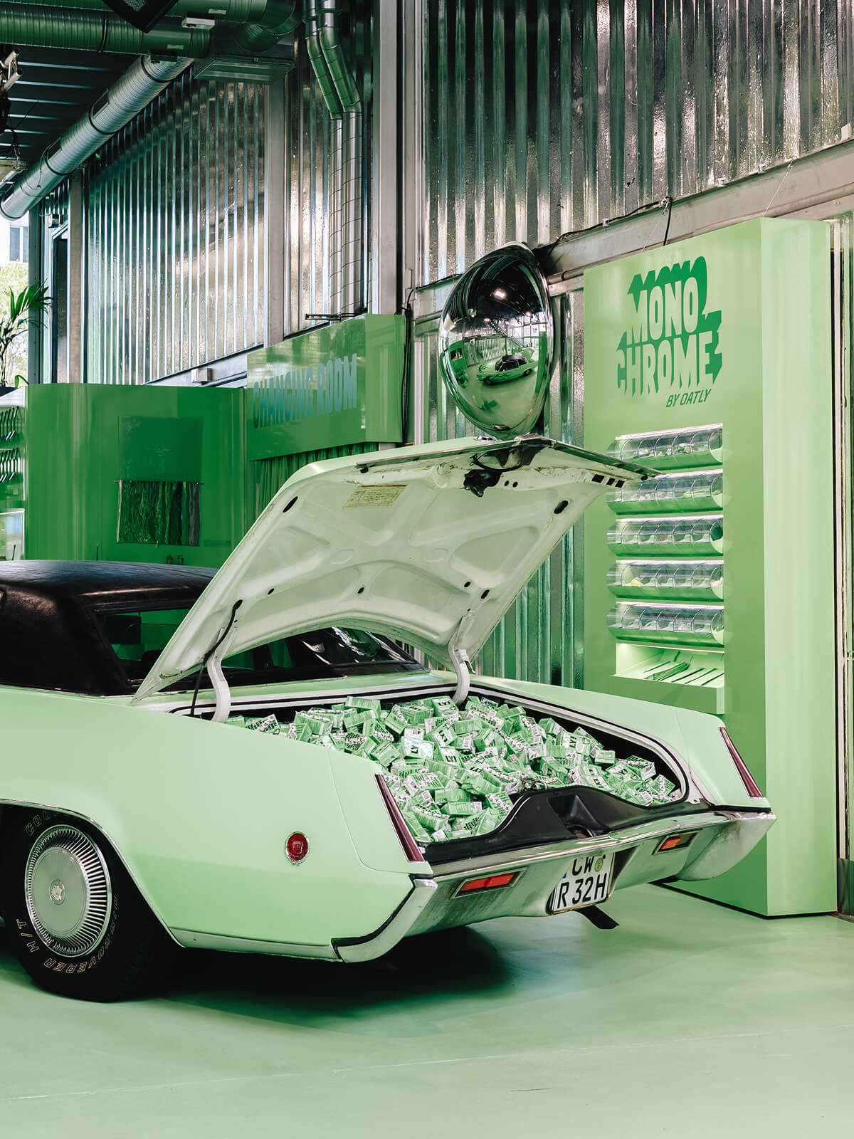
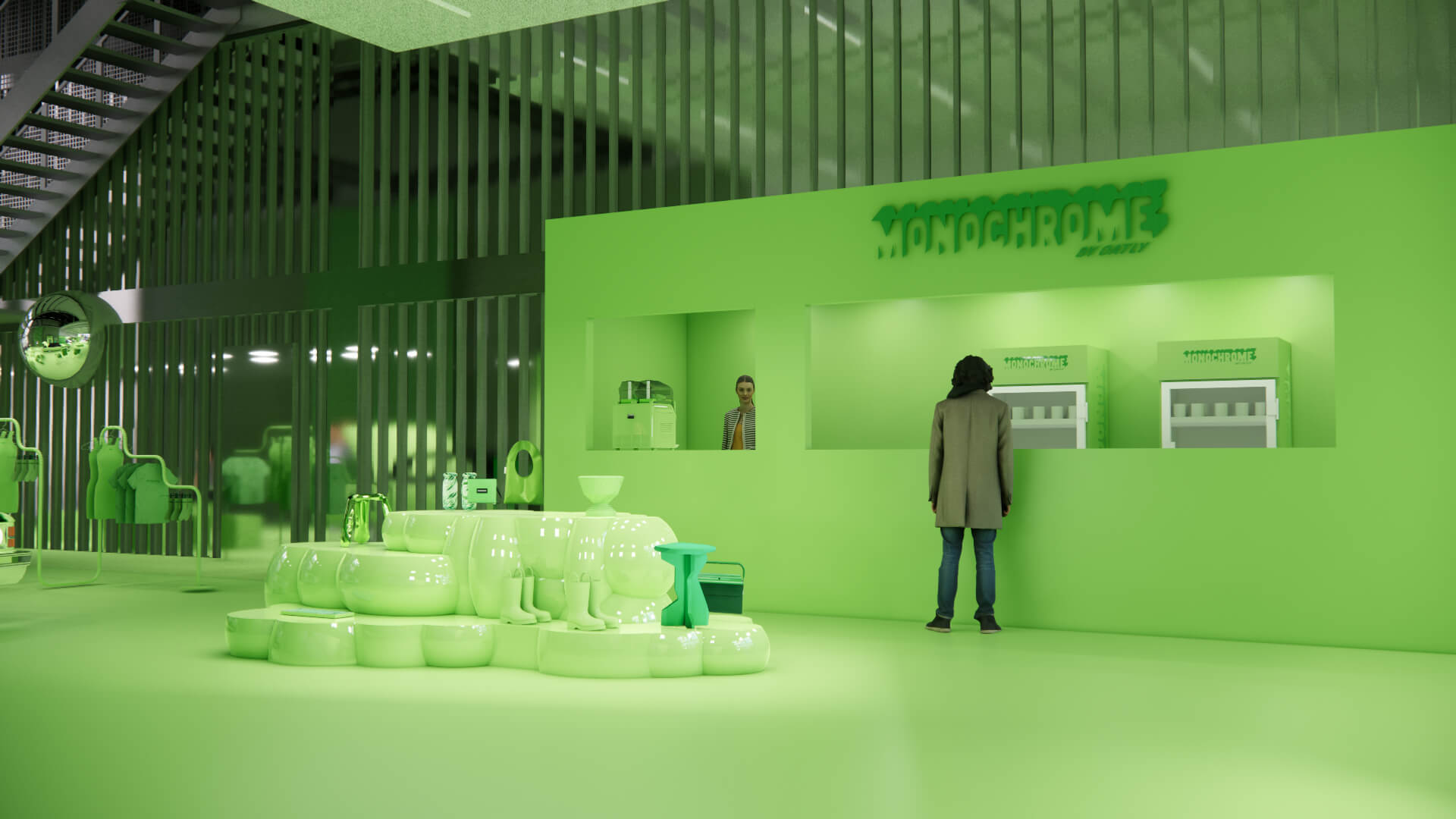
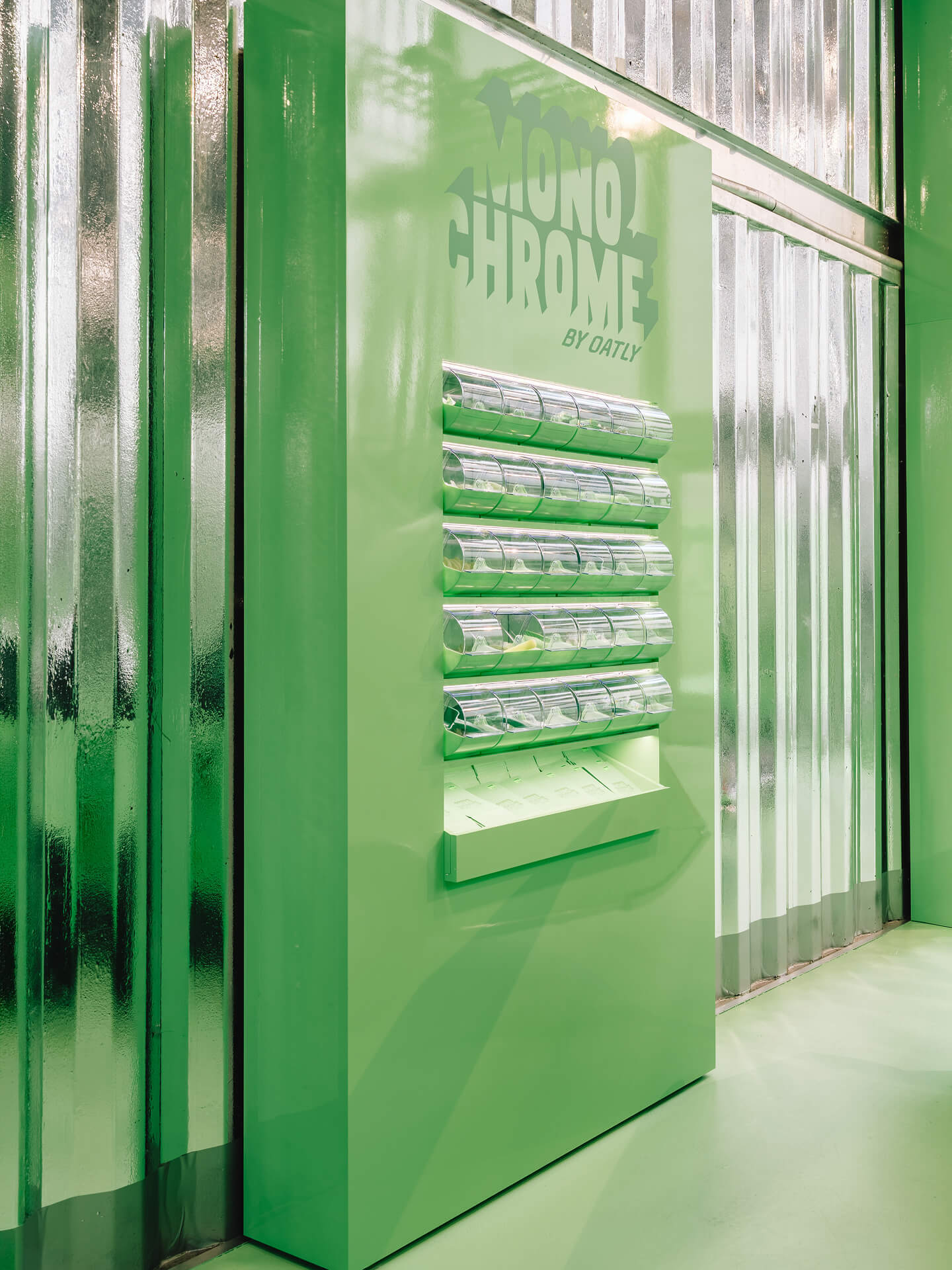
Recognition before the logo
The organising idea is that the colour does the work usually given to the wordmark. "You can recognise an Oatly Matcha before the logo even comes into play," the studio says.2 On its project page Cee Cee Creative draws the wider conclusion that "when design concept and product identity are thought through together, a logo becomes optional."1
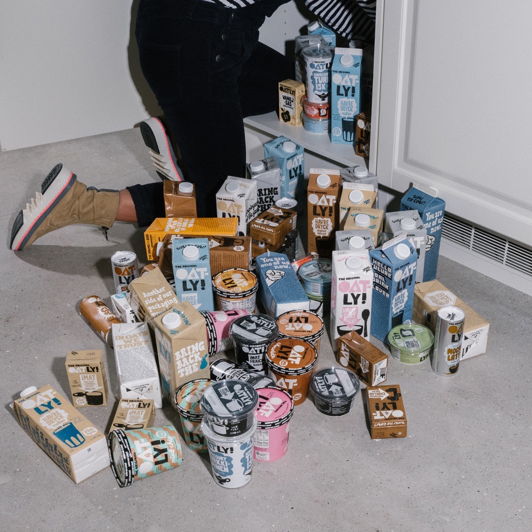
For Oatly the premise is a notable one. This is a brand known for talking, on its cartons and in its advertising, most visibly in the 2021 Super Bowl spot in which chief executive Toni Petersson sings a jingle he wrote himself. Monochrome by Oatly removes almost all of the words and keeps a single shade. The pop-up treats the matcha carton's green as an asset strong enough to identify the brand on its own, and it assigns that asset to one product line rather than to the company as a whole.
What the approach buys is a signature that works without language. A shade of green needs no translation between Berlin and London, and it turns every sock, keychain and stool into a small brand carrier that does not have to show a logo to be read. The condition it depends on is equally specific: matcha green is the colour of a whole category, so the concept holds only as long as this particular green stays recognisably Oatly's.
A shop built to be photographed
The second principle is that the room is designed for the camera from the start. According to the Cee Cee Creative team, social media is not added to the design afterwards, because "the space itself becomes the content".2 Campaign Germany headlined its report on the opening as a "Matcha-grünes Content-Paradies", a matcha-green content paradise.4
That changes what a five-day pop-up is measured against. Footfall on the Ku'damm is limited by the calendar, while the photographs are not. A visitor who posts a mirror selfie or the green Cadillac carries the colour, not the name, into their feed, which repeats the recognition test of the concept with every share.
The city is part of the palette as well. Cee Cee Creative gave preference to items by Berlin-based designers and creatives, alongside objects tied to the city's visual identity.1, 2 Campaign Germany lists keychains in the shape of the Berlin bear and of the Ampelmännchen, the traffic-light figure from the city's pedestrian crossings, all in green.4 The local objects give the installation a reason to be discussed as a Berlin event rather than as a product campaign that happens to be in Berlin.
A format rather than a single event
Five days after Berlin closes, Monochrome by Oatly opened at the Goodhood store in Shoreditch, London, from 3 to 13 September 2026, with ceramics by Liam Owen and, in its first week, colour analysts who recommend a shade to each visitor before baristas match a matcha drink to it.5 Rob Godfrey, Head of Brand at Oatly, describes the thinking behind the series:5
"The idea behind Monochrome by Oatly was to explore how an entire creative world could be inspired by a single colour: the distinctive green of our Matcha Latte carton."
The second edition confirms that the colour, not the venue, is the constant. Berlin adds local design objects, London adds a personal colour consultation, and both are held together by one shade that each city can adapt without changing the brand behind it.
The pattern fits Oatly's recent activity, which keeps borrowing the grammar of another category: a fashion lookbook for its recipe collection at the London Coffee Festival in May 2026, the American drive-thru rebuilt as a bike-thru in Amsterdam-Noord the same month, and now the monochrome concept store. Each format arrives with a reason to be talked about before anyone has tasted the product. Monochrome by Oatly adds a version in which the brand says almost nothing and lets one colour be the subject of the conversation.
Written with AI assistance, edited by a human. Find out more about our Use of AI.
1. Cee Cee Creative, "Monochrome by Oatly Pop-up", project page, 2026, read 25 September 2026, for the brief of making matcha tangible and creating "maximum shareable moments", for "Our answer was radically consistent: the greenest of green", for the preference given to Berlin-based designers, for the rubber boots among the objects on display, and for the sentence "when design concept and product identity are thought through together, a logo becomes optional". The opening question on the page joins its two halves with a dash; only the second half is quoted. https://www.ceeceecreative.com/work/monochrome-by-oatly-pop-up-berlin
2. urdesignmag, "Cee Cee Creative Turns Oatly's Berlin Pop-Up All Green", 16 September 2026, read 25 September 2026, for the venue THE SPACE Kudamm at Kurfürstendamm 229, the five-day run, the curated range of greens and the darker green for lettering, the fit-out of the stacked shipping containers, the Cadillac Eldorado, the drinks on sale, the objects by Berlin-based designers and creatives, and for the quotations "You can recognise an Oatly Matcha before the logo even comes into play" and "the space itself becomes the content". The second quotation is preceded in the original by "Social media isn't added to the design afterwards", joined with a dash. https://www.urdesignmag.com/cee-cee-creative-turns-a-berlin-container-into-an-all-green-pop-up-store-for-oatly-matcha/
3. RetailBoss, "Oatly Brings Matcha Magic to Berlin With Its Monochrome Green Experience", 31 August 2026, read 25 September 2026, for the dates 25 to 29 August 2026 and for the green socks, toothbrushes and churro-shaped candlestick holders on sale. https://retailboss.co/oatly-brings-matcha-magic-to-berlin-with-its-monochrome-green-experience/
4. Saika Nowak, "Matcha-grünes Content-Paradies: Oatly eröffnet Pop-up Space in Berlin", Campaign Germany, 1 September 2026, read 25 September 2026, for the headline and for the green keychains, in the original "Schlüsselanhänger in Bären- und Ampelmännchen-Form". https://campaigngermany.de/news/beitrag/4040-matcha-gruenes-content-paradies-oatly-eroeffnet-pop-up-space-in-berlin.html
5. Green Queen, "Oatly Opens Immersive Matcha Pop-Up Ahead of London Fashion Week", 4 September 2026, read 25 September 2026, for the London edition at Goodhood in Shoreditch from 3 to 13 September 2026, the ceramics by Liam Owen, the colour analysts and matched drinks, and for the quotation from Rob Godfrey, Head of Brand at Oatly. https://www.greenqueen.com.hk/oatly-matcha-latte-goodhood-commune-pop-up-london-fashion-week/