Starbucks
Starbucks is the world's premier coffeehouse brand, dedicated to the craft of coffee and the concept of the third place between home and work.
Key-Facts
Positioning
Brand Chronology
Starbucks Celebrates the Craft of Espresso in New Film by David Gelb
2026
Starbucks Reframed the Festive Rush With “Drink In, Breathe Out” as a Moment of Calm
2023
Starbucks Used “What’s Your Name” to Turn a Simple Gesture Into a Story of Identity and Acceptance
2020
Starbucks Turned Global Stores Into a Storytelling Stage With “Meet Me at Starbucks”
2016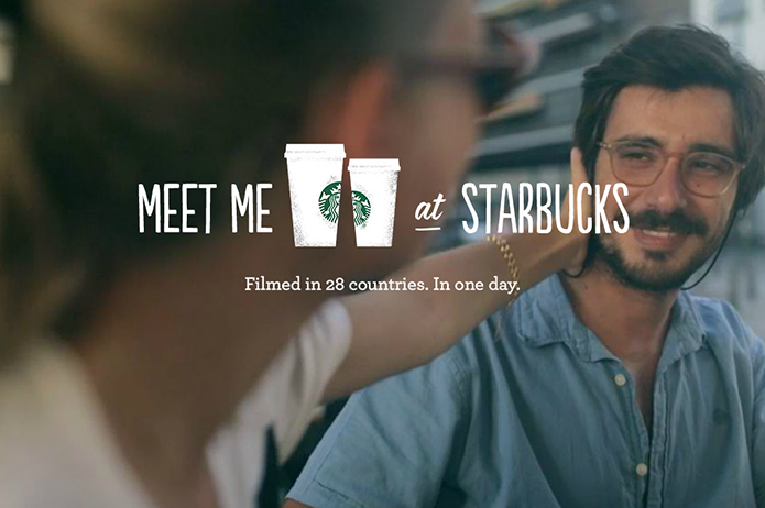
Logo Redesign
2001In 2011, Starbucks simplified its logo as part of a broader brand update. The outer circular ring and text (“Starbucks Coffee”) were removed, leaving only the central Siren on a green background.
The redesign followed a general trend toward minimalism in corporate identity, making the logo more flexible across digital and global applications. The simplified mark improved recognition at small sizes and reduced visual clutter, while retaining the core symbolic figure of the brand.
Starbucks Became a Pop-Culture Punchline in “Austin Powers,” Even Featuring Dr. Evil’s Space Needle Café
1999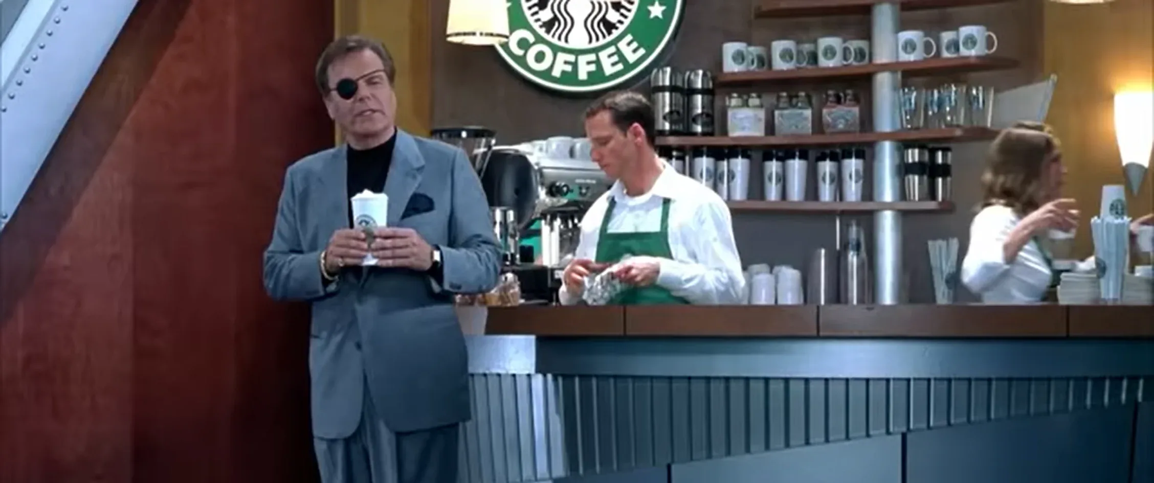
Logo Redesign
1992In 1992, the owners of the thriving coffeehouses were again forced to change the emblem’s design under public pressure; the mermaid’s bare navel troubled conservative citizens. This was done radically: the lower part of the Siren was cut off, thereby enlarging the rest of the image.
Logo Redesign
1987In 1987, the emblem was modified. The siren’s image became more stylized due to strong discontent among Seattle’s Puritan residents. By then, Starbucks had a large network of coffeehouses, branded paper cups, and branded coffee delivery vehicles. City authorities received complaints about small children seeing the mermaid’s bare chest. The owners decided not to provoke the public, making the mermaid more modest: her seductive bust was covered by wavy hair. The crown on her head became clearer and bigger, and a five-pointed star was placed in the center. The inner circle remained almost black, while the outer one became green. The Starbucks name was enlarged, leaving only the word coffee at the bottom, separated by stars.
Logo Design
1971The original 1971 Starbucks logo closely followed a woodcut-style illustration of a Siren with two tails, shown within a circular frame. The composition used concentric rings, with “Starbucks” at the top and “Fresh Roasted Coffee” at the bottom. The white Siren figure was set against a dark background, emphasizing contrast and detail, and reflected the brand’s early focus on coffee roasting rather than cafés.