From Niche Product to Cultural Challenger
Before its transformation, Oatly had operated as a relatively unknown Swedish oat drink company targeting a small niche audience, primarily people with lactose intolerance. Its branding followed industry conventions and failed to stand out on shelves.
This changed fundamentally after new leadership repositioned the company. Instead of competing within the existing plant-based category, Oatly redefined itself as a challenger to the entire dairy industry, expanding its audience from necessity-driven consumers to a broader, lifestyle-oriented market.
A Complete Break From Industry Conventions
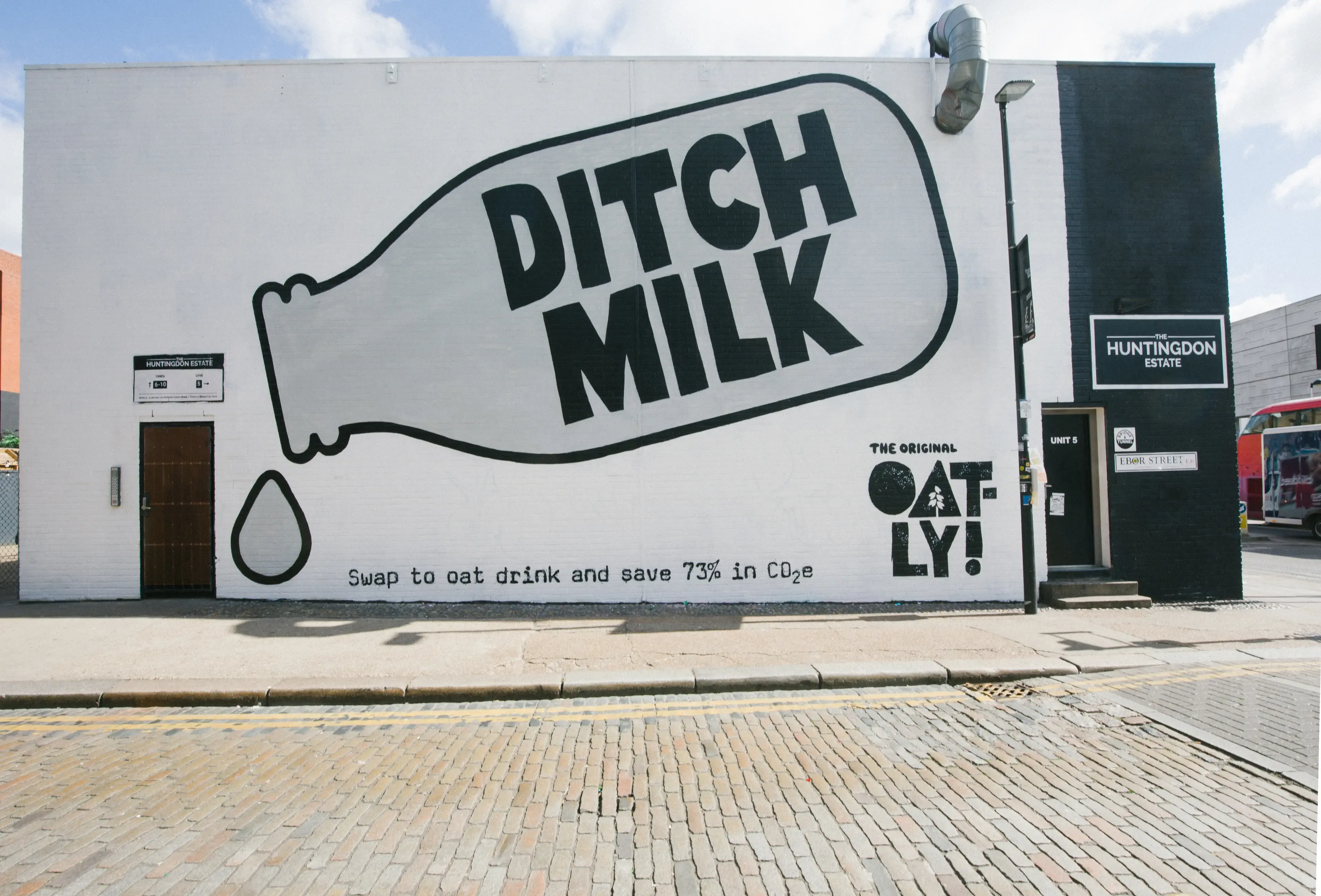
The rebrand did not evolve the existing identity but replaced it entirely. Oatly deliberately rejected standard design codes used in both dairy and plant-based categories, which typically relied on neutral colors, clean layouts, and product-focused imagery.
Instead, the company introduced a disruptive visual system built on bold typography, asymmetrical layouts, and unconventional color use. The packaging appeared raw, handmade, and intentionally imperfect, creating a strong contrast to competitors.
This approach ensured that Oatly products stood out immediately in retail environments, turning shelf presence into a primary competitive advantage.
Packaging as the Primary Media Channel
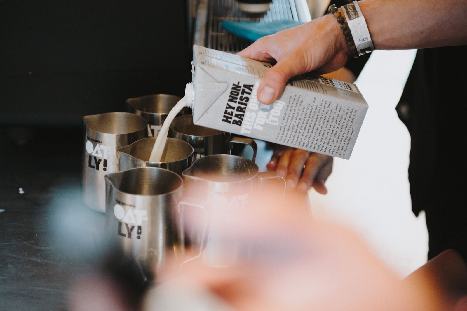
A defining element of the rebrand was the decision to treat packaging not as a container, but as the brand’s main communication platform. With limited advertising budgets, Oatly used every surface of the carton to deliver messaging, storytelling, and personality.
The packs featured conversational, provocative copy such as “Wow, no cow” and “It’s like milk, but made for humans,” replacing traditional product descriptions with opinionated statements.
This strategy effectively turned each product into an advertisement, allowing the brand to communicate directly with consumers at the point of purchase.
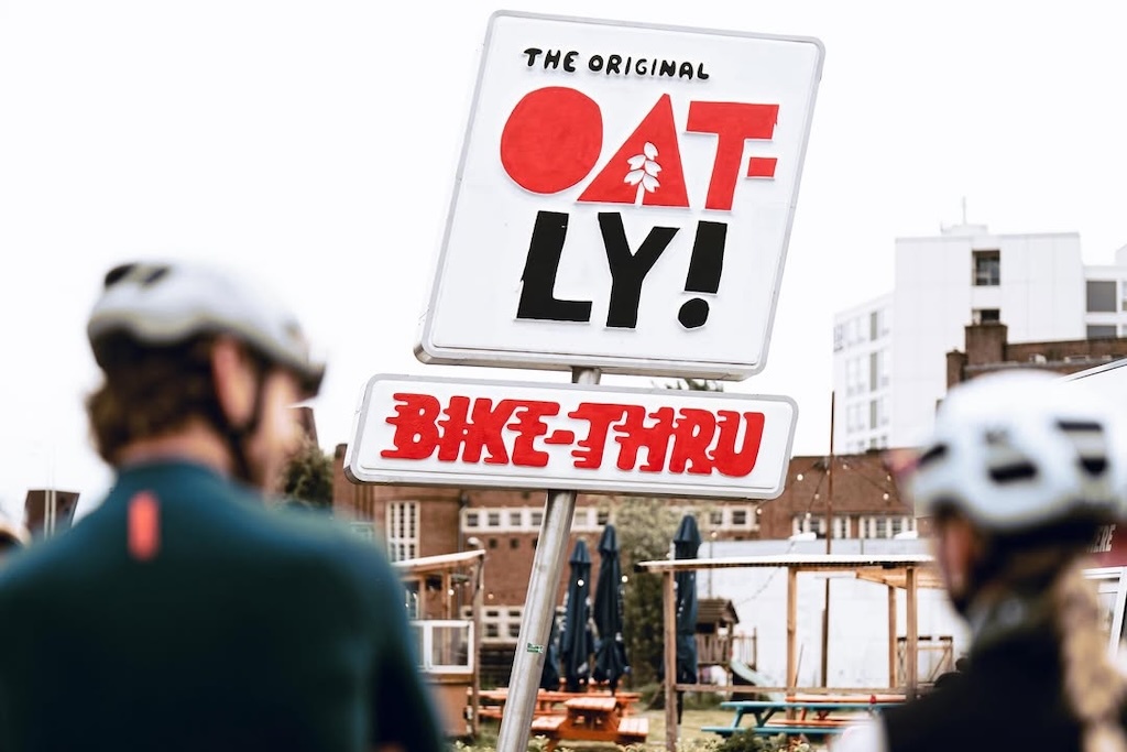
A Distinctive Brand Voice
Alongside visual changes, Oatly developed a unique tone of voice that was informal, self-aware, and often humorous. The brand spoke directly to consumers in a conversational style, breaking with the polished and corporate language typical of the category.
Every panel of the packaging became part of this narrative, encouraging consumers to read, engage, and interact with the product before even trying it.
This voice extended beyond packaging into all communications, creating a consistent and recognizable identity across markets.
Purpose-Driven Positioning
The rebrand also introduced a broader mission. Oatly positioned itself not just as a beverage company, but as part of a movement toward a more plant-based society.
This purpose connected health, environmental concerns, and cultural trends, allowing the brand to engage in larger societal conversations rather than focusing solely on product benefits.
Industry Impact and Market Transformation
The rebrand had measurable commercial and cultural impact. Demand increased dramatically, and the brand expanded from niche distribution into global markets, including mainstream retail and coffee chains.
More importantly, Oatly reshaped the competitive landscape. Its approach forced other plant-based brands and even traditional dairy alternatives to rethink their packaging, messaging, and positioning.
The company demonstrated that branding alone, without changing the core product, could redefine an entire category.
Redefining What a Brand Can Be
Overall, Oatly’s rebrand represented a full transformation rather than a visual update. It aligned product, communication, design, and purpose into a single, coherent system.
By turning packaging into media, adopting a distinctive voice, and positioning itself as a cultural challenger, Oatly moved from obscurity to global relevance and established a new model for how brands could compete through identity rather than scale.