Levi's
The originator of the blue jeans, building cultural authority through music, film, and the enduring symbol of the red tab since 1873.
Key-Facts
Brand Chronology
Levi's and Barbour launch first joint collection
2025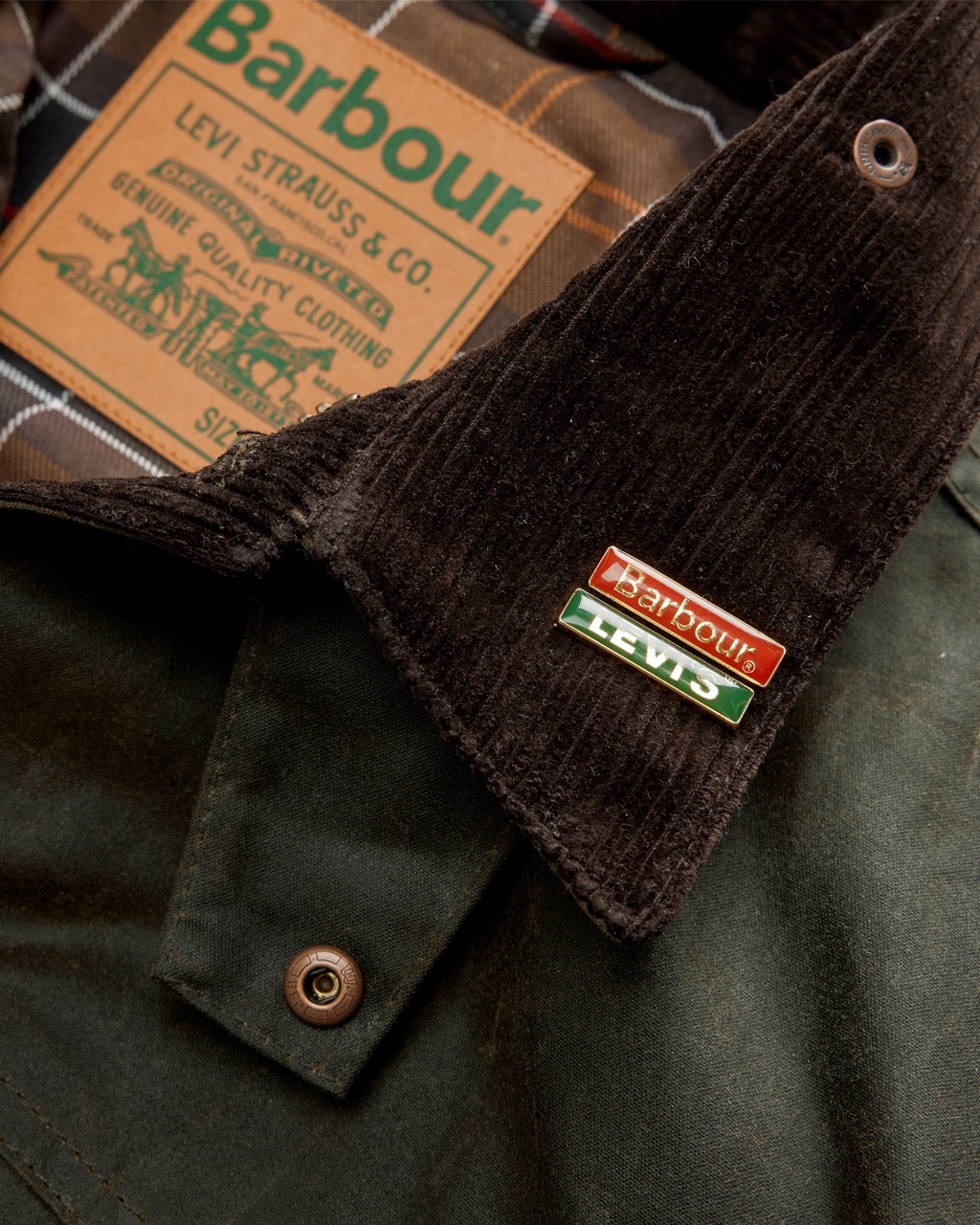
Levi’s Reimagined Its Cultural Legacy With a Beyoncé-Led Global Campaign
2024
Levi’s Celebrated 150 Years of the 501 Jean With a Global Cultural Campaign
2023
Levi’s “Live in Levi’s” Campaign Turned Everyday Moments Into Global Brand Storytelling
2014
Levi’s “Live Unbuttoned” Campaign Positioned the 501 as a Global Symbol of Self-Expression
2008
Handel on the Run: Jonathan Glazer's "Odyssey" for Levi's Engineered Jeans
2002
Logo Redesign
1999By the early 2000s, the Levi’s logo was already widely recognizable. In 1999, Turner Duckworth refined it with subtle changes: the red background deepened toward burgundy and the lettering became tighter and more compact. In 2011, the design was further simplified to improve clarity at small sizes. The bat-wing-like silhouette remained, but letter strokes were slightly thickened and spacing reduced to create a more unified mark. Overall, the logo kept its original proportions and clean sans-serif style, with the distinctive lowercase “e” still standing out as a key feature.
Levi’s “Launderette” Ad Transformed a Struggling Brand Into a Cultural Icon
1985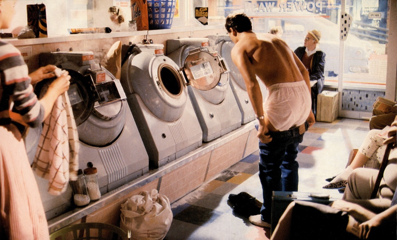
Logo Redesign
1966In 1966, Levi’s introduced the “batwing” logo, developed by Landor Associates, which is still used on some products today. It consists of a red trapezoid with the white Levi’s wordmark. The shape has a straight top edge, tapering sides, and a bottom formed by two curved lines resembling wings. The wordmark uses a bold sans-serif typeface, mostly in uppercase, with a distinctive rounded lowercase “e.” In 1968, a revised version refined the curves and slightly elongated the lettering while keeping the same core design. Both versions were used in parallel for some time.
Logo Redesign
1954Red remained a core element of Levi’s visual identity, marking a new stage for the brand. The updated emblem kept the LEVI’S name and added the descriptor “VINTAGE CLOTHING,” while the background shifted from bright red to a deeper burgundy tone. Inside the rectangular label, the top line features “LEVI’S” in bold white uppercase lettering, reinforcing its strong, workwear-inspired presence. Beneath it, “VINTAGE CLOTHING” appears in a smaller, simpler typeface, creating a clear visual hierarchy. The addition of “VINTAGE” highlights the brand’s heritage and long-standing roots. This red label became one of Levi’s most enduring visual signatures.
Logo Redesign
1943The next Levi’s logo iteration introduced a light yellow background, signaling a new visual phase for the brand. Centered on it were large dark-blue “LEVI’S” letters in a clean sans-serif typeface. Compared to earlier versions, the wordmark became narrower and more vertically proportioned, giving it a more streamlined appearance. Beneath it appeared the phrase “AMERICA’S FINEST OVERALL,” set in a thin, elongated green typeface, reinforcing the brand’s heritage positioning.
Logo Redesign
1925By 1925, Levi Strauss jeans were already widely established, reducing the need for a detailed emblem to communicate quality. The company simplified the design into a universal label used across its products. The updated label focused on the bold red “LEVI STRAUSS” wordmark, set in large, rounded sans-serif letters with a black outline for added contrast and visibility. Earlier designs featuring imagery such as horses and descriptive text were phased out. The brand name itself became the primary symbol of quality and durability, making the label more versatile and easier to apply across garments.
Logo Design
1892When Levi Strauss & Co. introduced its riveted jeans, the company needed to clearly communicate durability, especially to customers who might not read English. As a result, it used a highly visual emblem that became part of its early identity. The black-and-white mark placed the brand name at the top, followed by “SAN FRANCISCO, CAL” in rounded sans-serif type. The central illustration showed two horses pulling jeans in opposite directions, demonstrating the fabric’s strength. Despite the amount of text, the image carried the core message: Levi’s jeans were exceptionally durable, using visual storytelling to build trust before the brand achieved global recognition.
Staple items: Why every category has its brand-defining product
2026