Samsung
Samsung positions itself as a maker of essential design, one system of typography, form and material across phones, screens and the home.
- Founded
- 1938
- Industry
- Technology · Hardware
- Headquarters
- South Korea
- Ownership
- Public company
Key Facts

Human experiences, Progressive innovation, Defiant optimism, Integrity and transparency, Social betterment
Samsung Brand StoryWe exist to create human-driven innovations that defy barriers to make a better world for all.
Samsung Brand StoryWe will devote our human resources and technology to create unrivalled products and services, thereby contributing to a better global society.
Samsung Corporate Citizenship, Our Mission for a Better WorldBrand Chronology
Samsung builds a brand sound from six notes
2026
Samsung reframes Bespoke as a home companion
2026
Galaxy gets one visual identity system
2023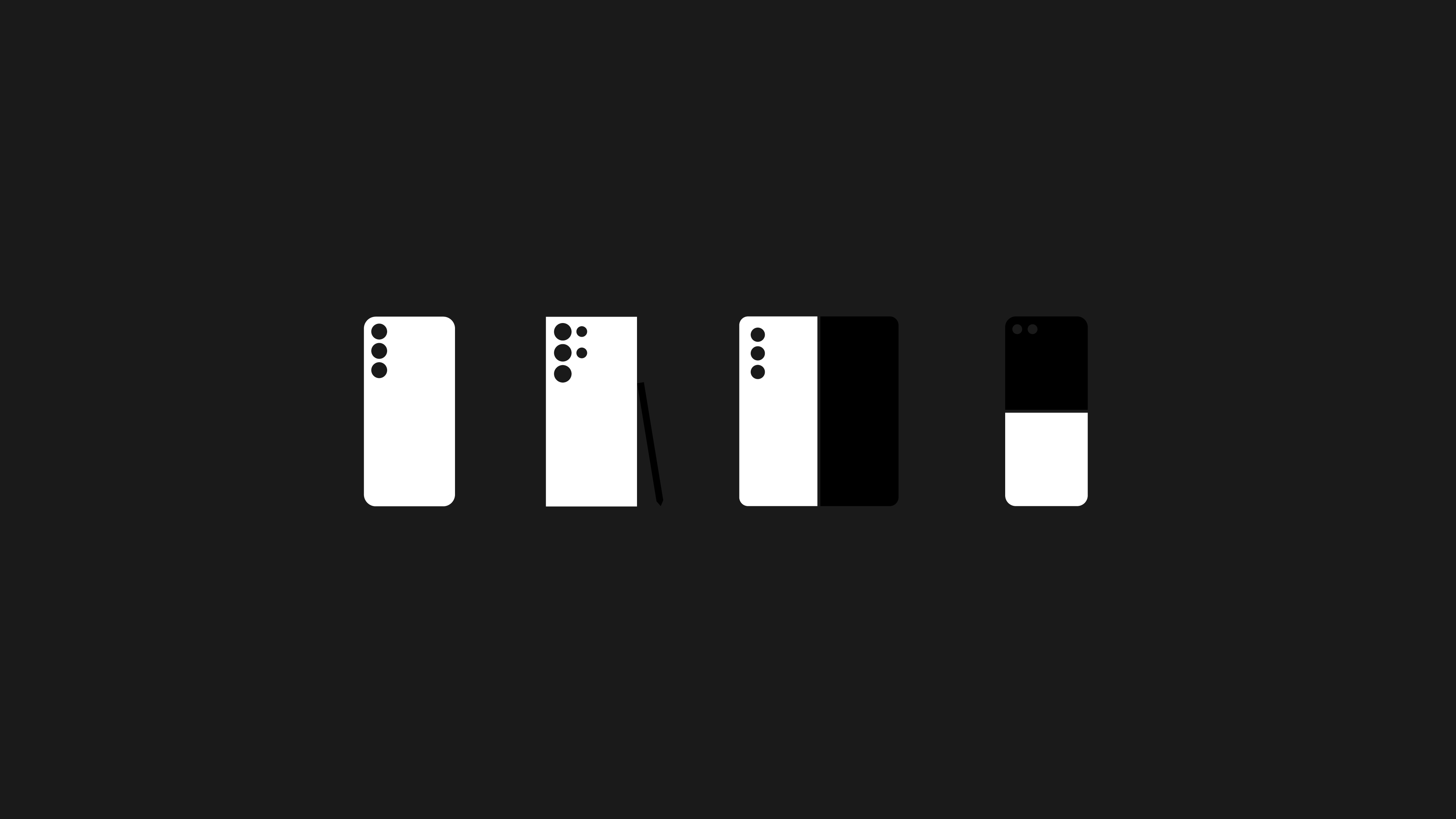
Samsung reorders the Galaxy naming system
2020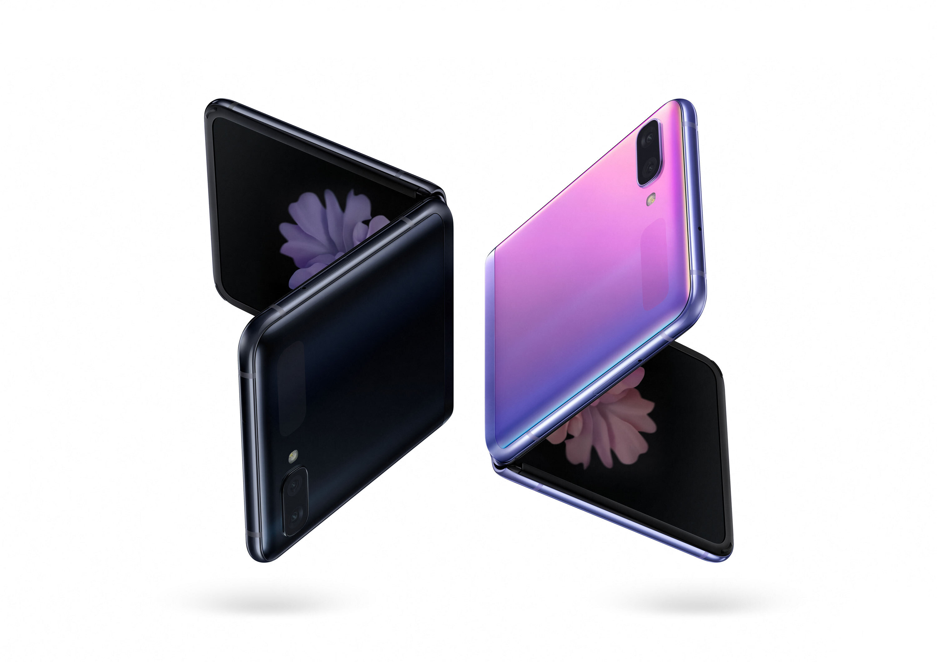
Samsung takes the Galaxy Z Flip to New York Fashion Week
2020
Logo Redesign
2020
In January 2020, Samsung Electronics adopted a monochrome version of its logo, replacing the familiar blue with a black-and-white color scheme. The design itself remained unchanged, retaining the streamlined wordmark introduced in 2015. The updated logo debuted at Consumer Electronics Show and subsequently became the primary visual identity of Samsung Electronics.
Samsung takes flight with the Ostrich film
2017
SamsungOne, a typeface for 400 languages
2016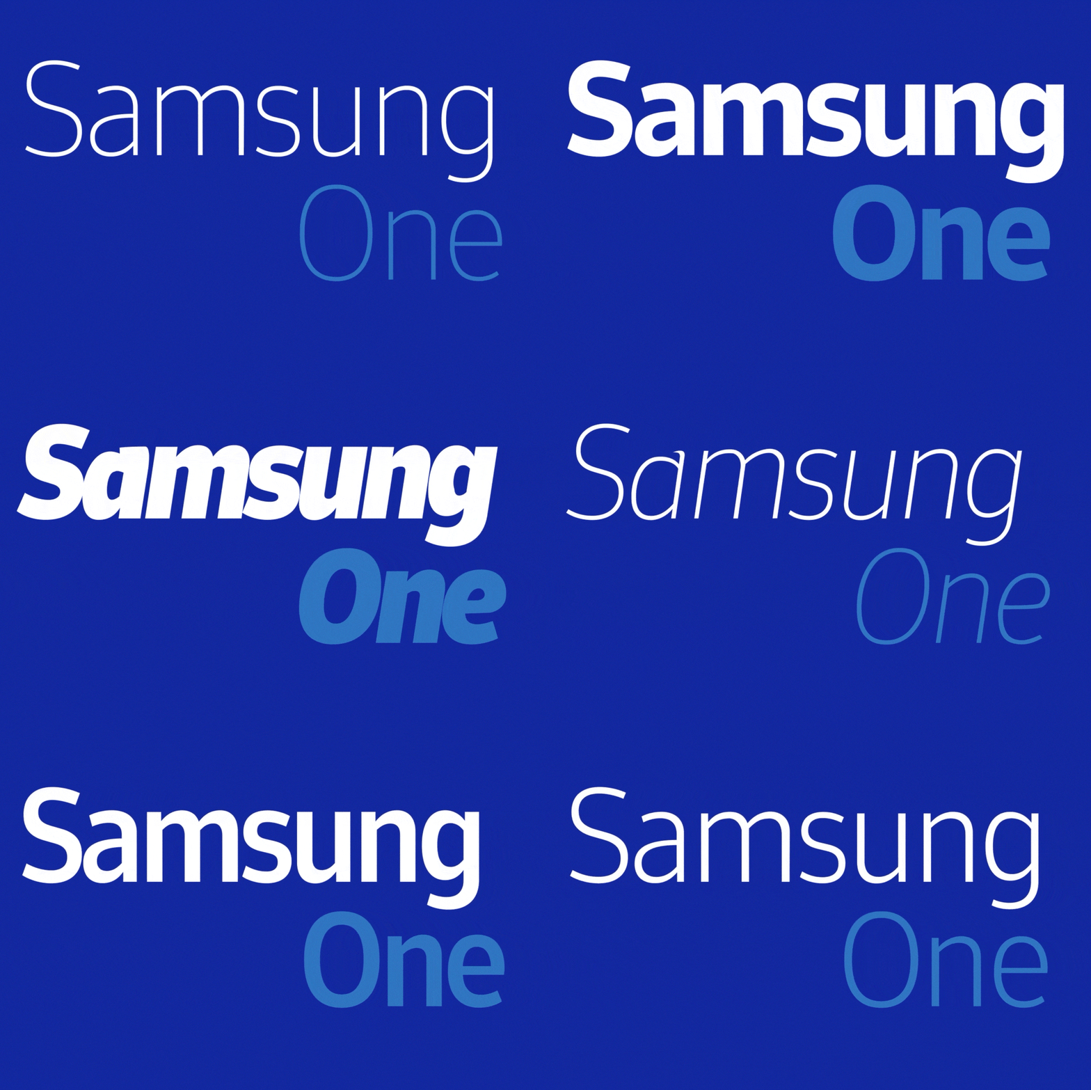
Logo Redesign
2015
The Samsung logo unveiled at Consumer Electronics Show marked a shift toward a cleaner, more understated visual identity. Created by the Brandstream team, the redesign removed the familiar oval frame, leaving only the Samsung wordmark in the company’s signature blue.
Following its debut in 2013, the standalone wordmark gradually became the centerpiece of Samsung Electronics’s visual identity and was officially adopted as the company’s primary logo in June 2015. Meanwhile, the oval emblem continued to be used by Samsung Group and several of its affiliated businesses.
Samsung launches The Next Big Thing Is Already Here
2011
Logo Redesign
2005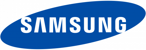
In June 2005, Samsung Electronics simplified its logo by removing the word ELECTRONICS, leaving only the SAMSUNG name inside the familiar blue oval. The diagonally stretched ellipse was retained, with the brand name displayed in white uppercase letters. The logo continued to use a refined version of the Linotype Univers 820 Condensed Black typeface. By this stage, the Samsung name had achieved strong global recognition, making the additional descriptor unnecessary.
Samsung's Frankfurt declaration and new management
1993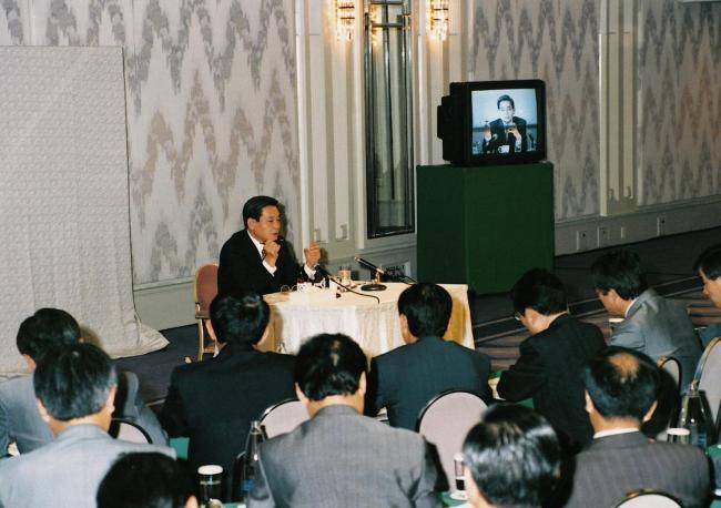
Logo Redesign
1993
As Samsung Electronics expanded into international markets and strengthened its focus on technology, the company introduced a new visual identity. The logo featured the SAMSUNG wordmark in white inside a blue, diagonally tilted oval resembling a capsule. The streamlined shape reflected the company’s technological ambitions while subtly referencing the star motif used in earlier identities. Beneath the oval, the word ELECTRONICS appeared in narrow blue uppercase lettering, reinforcing the company’s focus on consumer electronics. The redesigned logo presented a cleaner, more modern image that aligned with Samsung’s transformation into a global technology brand.
Logo Redesign
1980
The updated logo of Samsung retained the three red geometric shapes on the left, each containing a white star. These elements carried forward the star motif from the previous identity without altering their overall form. To the right, the SAMSUNG wordmark appeared in black uppercase letters using a bold, sans-serif typeface similar to a modified Helvetica Black. The color palette remained unchanged, combining the red-and-white emblem with a black wordmark. By preserving the familiar symbol while refining the typography, the redesign created a cleaner, more balanced identity that improved legibility while maintaining continuity with Samsung’s earlier branding.
Logo Redesign
1979
At the end of 1979, the company updated the logo again. The founder considered the previous version outdated and ordered a redesign. The white circle was removed, and the three red stars were separated and spread apart. Each star was placed inside its own hexagonal shape.
The left side of the mark underwent a makeover. The symbol was assembled from three separate hexagons. Inside each shape were white elements forming diamond-like four-pointed stars.
To the right of the symbol was a black SAMSUNG wordmark. The typeface was also updated. Dense uppercase letters without serifs or decorative elements were used. The wordmark appeared heavy and business-oriented.
The company aimed to look more modern and to emphasize its focus on activity beyond the domestic market.
Logo Redesign
1978
In 1978, Samsung updated its logo to reflect its expansion beyond food products into industries such as real estate and insurance. While the company retained elements of its original identity, the new design presented a more corporate and internationally oriented image.
The emblem on the left featured a red square containing a white circle with three stylized four-pointed red stars. Beneath the stars appeared the Korean name 삼성, preserving a visual link to the company’s heritage.
For the first time, the SAMSUNG name was displayed in English. Positioned to the right of the emblem, the wordmark was set in bold uppercase sans-serif lettering, signaling the company’s growing international ambitions and establishing a cleaner, more business-focused identity.
Logo Design
1969
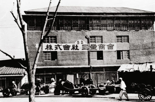
The earliest logo of Samsung reflected the company’s original business, long before it became known for electronics. In its early years, the emblem appeared on products such as noodles, dried fish, rice, and alcoholic beverages.
The design featured a red square containing a white circle with three stylized four-pointed stars. These stars referenced the company’s name: Samsung is the international form of the Korean name Samseong, where sam means “three” and seong means “star.” Over time, the three stars also came to symbolize strength, longevity, and ambition, with some interpretations linking them to founder Lee Byung-chul’s vision for a lasting global enterprise.
Beneath the emblem appeared the company name 삼성 in Korean, while the Chinese characters 三星 were also used in early branding to represent the company name. The lettering was executed in a traditional brush-calligraphy style, reinforcing Samsung’s Korean heritage. This emblem marked the beginning of the company’s evolution from a local trading business into one of the world’s leading technology companies.
Founded
1938