
One typeface for a company that sells everything
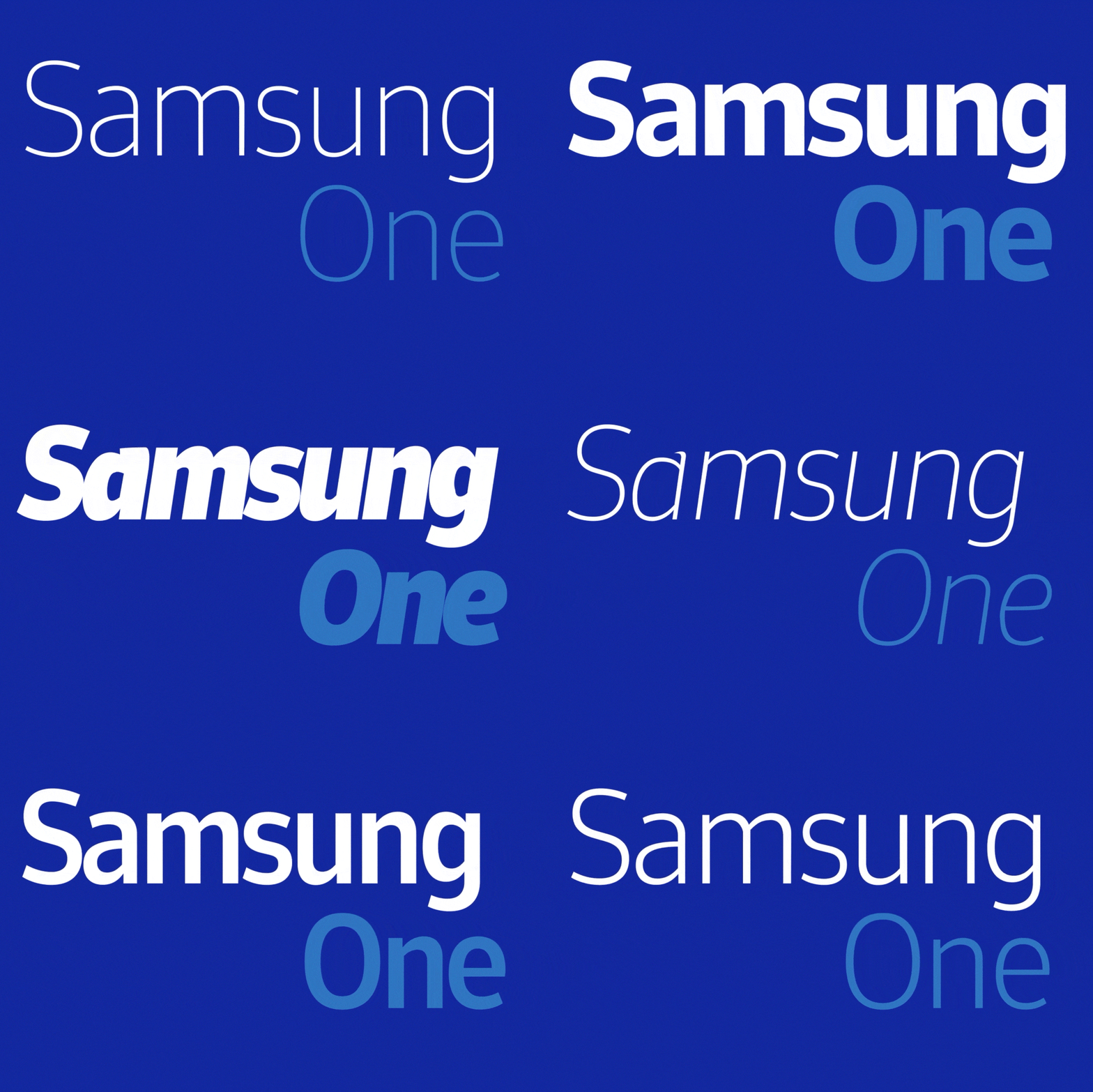
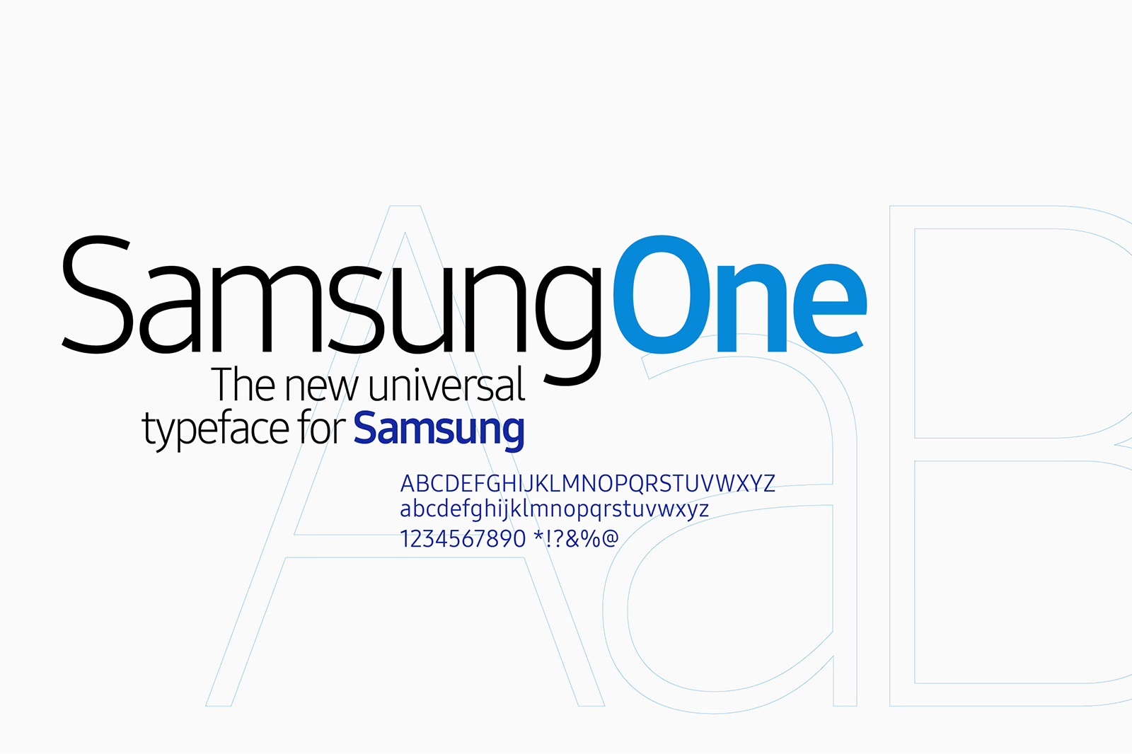
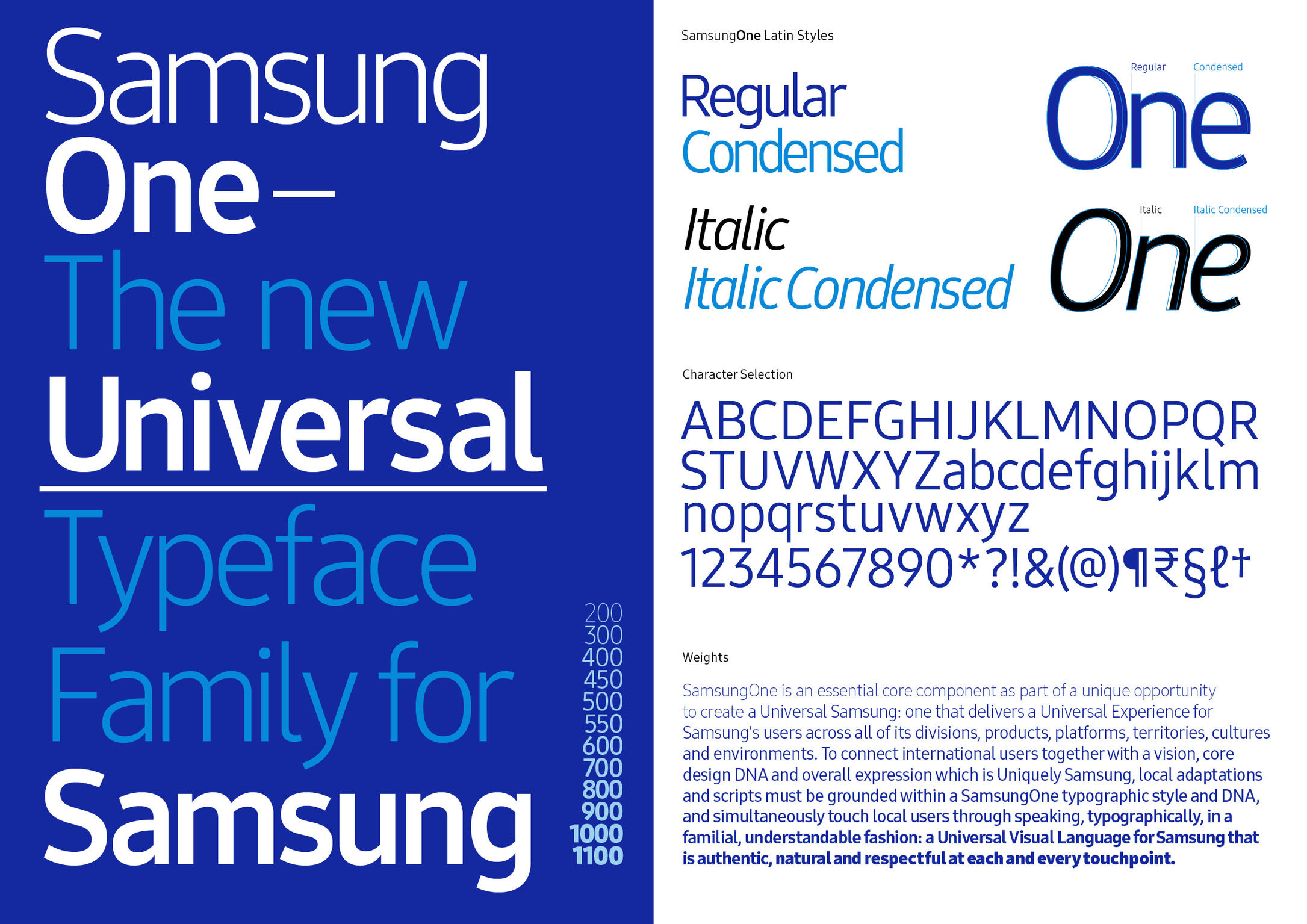
In July 2016, Samsung presented SamsungOne, a custom typeface built to serve as the company's single voice in text. The brief was unusually broad even by the standards of corporate type commissions. Samsung sells phones, televisions, laptops, refrigerators, washing machines and semiconductors, in markets that use scripts with almost nothing in common. The company needed one system that could set a product name on a phone screen, a warning label on an appliance and a headline on a billboard in Seoul, Riyadh or São Paulo.
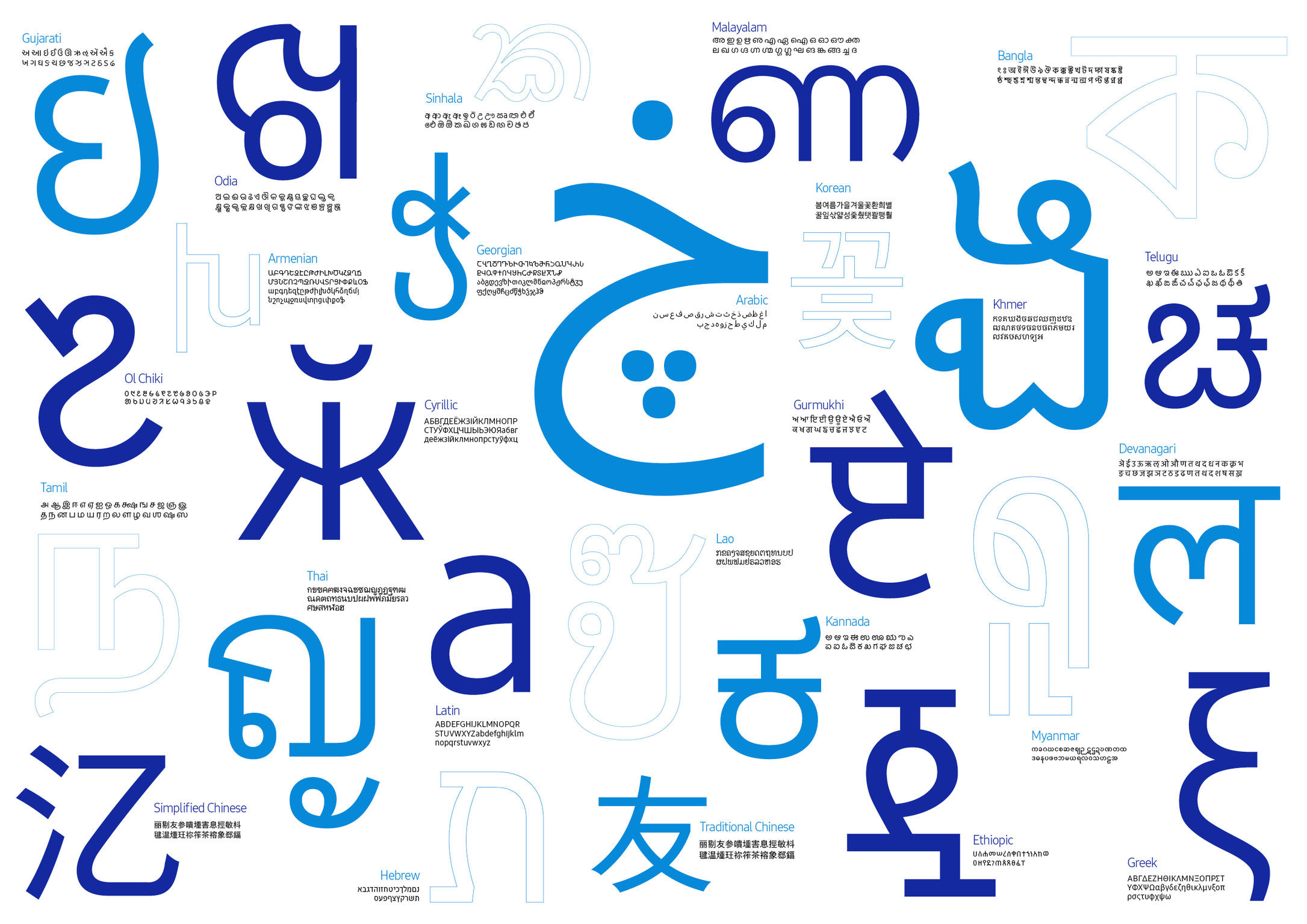
The finished family covers 26 writing systems, more than 400 languages and over 25,000 glyphs. Samsung describes it as sitting at the heart of the company's visual language, and as the building block of what it calls a universal Samsung experience. The typographer Neville Brody was involved in the project, and Samsung published an interview with him alongside the launch.
Five principles, one compromise
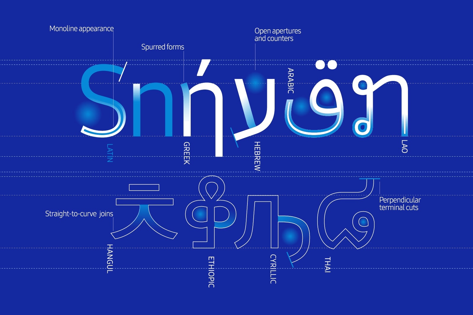
Samsung set out five design principles for the family, and they read as a direct response to the range of jobs the type has to do. The first is humanist: SamsungOne mixes simple strokes with calligraphic detail rather than resolving into pure geometry. The second is distinctive, achieved mainly through dynamic angles where arcs meet stems, a small move that gives the letterforms a recognisable joint without adding decoration.
The third principle, universal, is the difficult one. Each script is localised to its own conventions while retaining shared DNA across the family, so that Latin, Hangul, Arabic and Devanagari settings of the same sentence look like they come from one company rather than four. The fourth, expert, refers to the precision work of optical adjustment across those scripts. The fifth is legibility and scalability, with the type engineered to hold up both at caption size on a phone and at architectural scale.
That third principle describes a compromise rather than a solution. A Latin sans serif and a Hangul face are built from different components and judged by different conventions, and there is no shared skeleton that satisfies both. Type designers working on multi-script families therefore match perceived qualities rather than shapes: stroke contrast, apparent weight, the openness of counters, the rhythm of a line of text. SamsungOne's claim was that a paragraph in Korean and the same paragraph in Arabic should feel as though they were spoken by the same person, even though almost nothing about the letterforms is shared.
Samsung frames the same ambition in four brand values attached to the typeface: reliable and accessible, contemporary and innovative, human and enduring, integrated and expert. The pairing of terms is deliberate. Each puts a functional requirement next to a tonal one, which is a fair summary of what a corporate typeface has to negotiate.
Why type carries the weight at Samsung
Samsung's identity gives typography more to do than most. The company's logo, since the corporate identity adopted alongside the New Management programme in 1993, is a wordmark rather than a symbol. There is no abstract mark to place on a product, no shorthand emblem that reads at a glance without the name. Samsung's current brand guidance states the position plainly: the logo is composed of the English brand name.
A brand built on a wordmark depends on letterforms in a way that a brand built on a symbol does not. Everything from the product name on a box to the interface labels on a television participates in the identity. Before SamsungOne, that work was distributed across licensed typefaces that varied by market and by product category, which meant the company's voice changed depending on where you encountered it. A single family removed that variance, and also removed a recurring licensing and localisation cost.
Part of a wider shift
The commission sat inside an industry-wide move. Through the 2010s, large brands went from licensing typefaces to commissioning their own, for reasons that were partly aesthetic and partly operational. Custom type removes per-device licensing, guarantees script coverage in markets where licensed families are thin, and gives design teams a fixed reference point across a growing number of screens. Apple released San Francisco in 2015, Google developed Product Sans, and Netflix followed in 2018 with Netflix Sans, drawn with Dalton Maag. Samsung's version of the decision was among the most demanding, because few brands have to serve 26 writing systems at once.
SamsungOne also established the pattern the company has followed since. Samsung has continued to develop its type system for interface use, with Samsung Sans deployed across One UI on Galaxy devices and documented in the company's developer design system. The underlying decision, that Samsung owns its letterforms rather than renting them, dates to 2016.
Written with AI assistance, edited by a human. Find out more about our Use of AI.