
A portfolio that had outgrown its packaging
By 2023 the Galaxy range has stopped being a line of phones. It covers bar phones, two distinct folding formats, tablets, watches, earbuds and a stylus, each with its own product design logic and each arriving in packaging designed largely on its own terms. Samsung's answer is the Galaxy Visual Identity System, set out publicly in an interview the company publishes in August 2023 with Henry Hongmin Kim, vice president and head of the design strategy group in the mobile experience business.1
Kim's description of the system is short. The Galaxy Visual Identity System, he says, unifies various product designs and form factors into one cohesive identity.1 The system is first applied to Galaxy S23 packaging and then extended to the Galaxy Z Flip5 and Z Fold5.1
From words to symbols
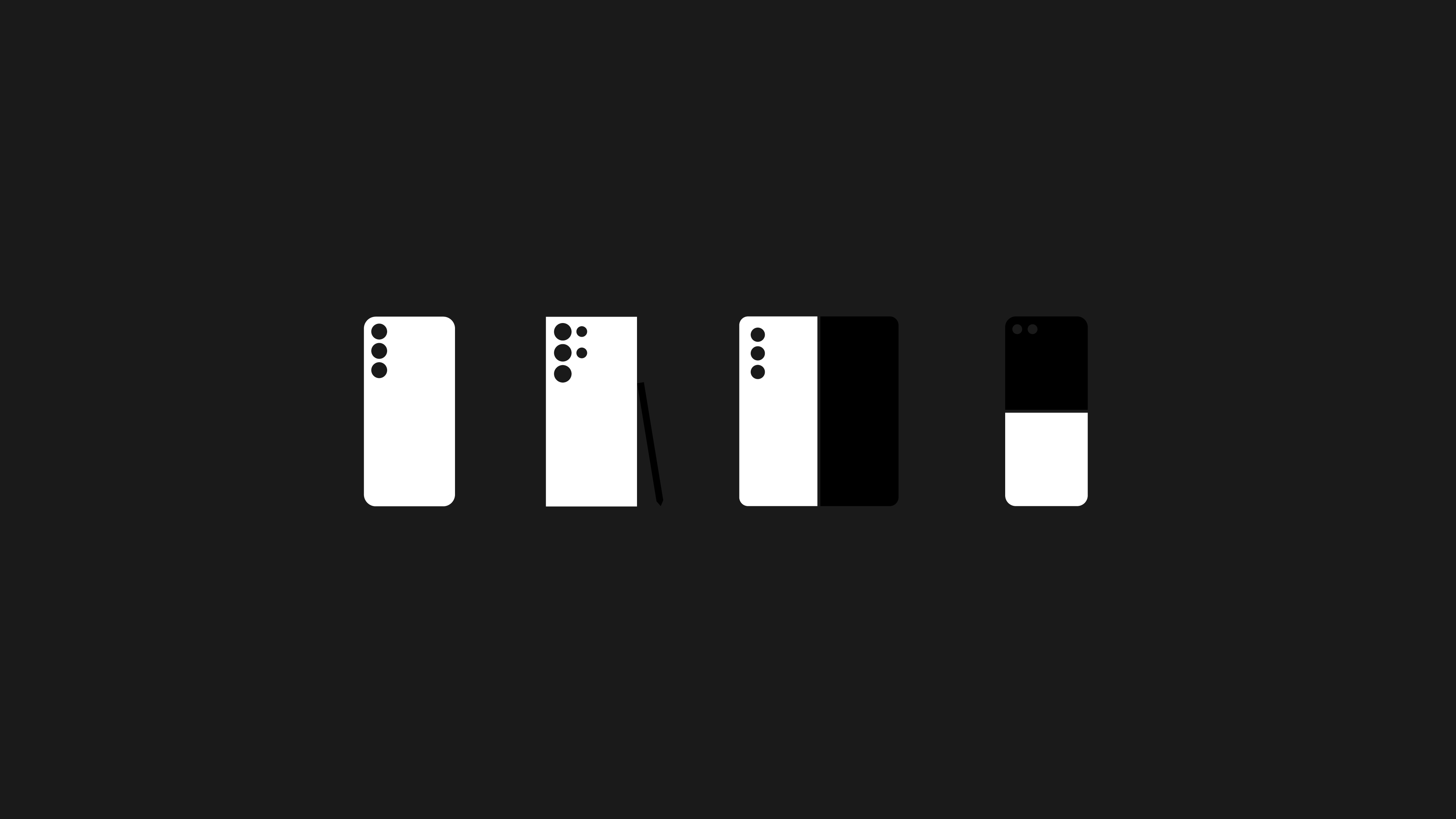
The substantive change is a move away from typographic packaging graphics toward symbolic ones. Where earlier Galaxy boxes leaned on the product name and a rendered device, the new system uses line illustrations that abstract each product's shape, so that the silhouette of a folding phone or a watch case does the identifying work before any text is read.1
Kim frames this within what Samsung calls Essential Design. "Design is thinking made visual," he says. "In this process, it's important to strip away any unnecessary elements and communicate the main idea concisely."1 Applied to packaging, the principle produces graphics that are close to diagrammatic. The device is represented rather than depicted.
The execution adds tactile and material layers to the flat marks. Samsung uses three-dimensional embossing on craft paper to give the line illustrations physical texture and to signal the material choice at the same time.1 Glass and metal are rendered to communicate colour, material and finish across the range, the discipline Samsung refers to internally as CMF.1 Braille graphics appear as a symbol of inclusion, and outer space imagery expresses the brand's wider identity.1
Source: 삼성전자 뉴스룸 [Samsung Newsroom] Youtube
Symbolism against scalability
Samsung sets out three qualities the system has to deliver. It has to be symbolic, meaning each mark ties to the specific competitive edge of the device it represents. It has to be scalable, holding together across colourways and across the different experiences a product offers. And it has to be dynamic, adaptable to products that do not yet exist.1
Those three requirements pull in different directions, and the resolution is what makes the system worth studying. Symbolism argues for specificity, a mark that could only mean this device. Scalability and adaptability argue for generality, a grammar loose enough to accept whatever ships next. Samsung's answer is to fix the drawing method rather than the drawing: a consistent line weight, a consistent degree of abstraction, a consistent relationship between mark and surface. The rules govern how a symbol is made, not which symbols exist.
That last requirement matters for a company releasing new form factors on a regular cadence. A system built on photography of current devices needs rebuilding each time the hardware changes. A system built on abstracted line marks absorbs a new shape without a new rulebook.
Samsung also builds a layer of concealed detail into the launch material. The accompanying video hides an S Pen silhouette in a window scene, disguises device initials as numerals on a watch face, and uses game board blocks to stand for four Galaxy models.1 These are Easter eggs rather than identity components, but they indicate the register Samsung wants: a system that rewards attention rather than announcing itself.
Restraint of this kind carries a cost, and Samsung accepts it openly. A box that shows an abstracted outline rather than the product tells a shopper less at the shelf than a photograph would. The system trades immediate legibility for coherence across a range, which is a defensible bet only for a brand whose products are already known before the buyer reaches the shelf.
Where it sits in Samsung's design programme
The Galaxy Visual Identity System continues a long consolidation. Samsung presented its custom typeface SamsungOne in 2016 to give the company one voice in text across 26 writing systems.2 The Galaxy system does the equivalent job in the visual register, giving one grammar of marks and materials to a portfolio that spans several product categories.
Both projects respond to the same underlying condition. Samsung's identity rests on a wordmark rather than a symbol, which leaves no compact emblem to carry recognition on a box or a screen. The company has therefore built recognition out of systems rather than out of a single mark: consistent letterforms, consistent line language, consistent material treatment. The Galaxy Visual Identity System is the point at which that approach is formalised for Samsung's most visible product family, and it remains the reference for how Galaxy products are packaged and presented.
Written with AI assistance, edited by a human. Find out more about our Use of AI.
1. Samsung Global Newsroom, "[Interview] Beyond the Surface: Discover Samsung's Design Philosophy Through Galaxy Visual Identity System", 28 August 2023, for the interview itself and its August 2023 date, for Henry Hongmin Kim, there titled Vice President and Head of Design Strategy Group, Mobile eXperience (MX) Business at Samsung Electronics, for the description of the system as one that unifies various product designs and form factors into one cohesive identity by expressing each model in a simple, symbolic manner, for the first application to the Galaxy S23 package design followed by the packaging of the Galaxy Z Flip5 and Z Fold5, for the earlier Galaxy packaging graphics having been built on typography representing each series, for the line illustration that opens the launch video, for the three-dimensional embossing effect illustrating the texture of craft paper, for glass and metal representing the CMF, that is colour, material and finish, of each product line, for the Braille graphic symbolising accessibility and inclusion and the outer space visual expressing Galaxy's brand identity, for Essential Design as the stated philosophy of Galaxy Design, for the three qualities named on the page as symbolism, scalability and dynamism and for Galaxy's competitive edge as what the new packaging graphics set out to communicate, and for the hidden details in the video, the Galaxy Ultra S Pen silhouette in the window scene, the initials of Galaxy S, Flip, Ultra and Fold placed on the numbers of the digital watch face, and the game board whose blocks represent the four Galaxy models. The passage quoted in this verse stands in the page's closing paragraph, which reads: 'Design is thinking made visual.' In this process, it's important to strip away any unnecessary elements and communicate the main idea concisely. This is what makes Essential Design truly effective. The page puts only the first of those sentences in quotation marks and attributes neither to anyone by name; Samsung Newsroom introduces the piece as an interview with Kim and his team of designers, whose answers are given in the first person plural. https://news.samsung.com/global/interview-beyond-the-surface-discover-samsungs-design-philosophy-through-galaxy-visual-identity-system
2. Samsung Global Newsroom, "[Design Story] SamsungOne, the New Universal Typeface for Samsung", 22 July 2016, for SamsungOne as the custom typeface Samsung presented in 2016 and for its reach across 26 writing systems, the page reading "It is a family of scripts covering 26 writing systems, more than 400 languages, and over 25,000 glyphs, creating a truly global typeface." Added during the footnote retrofit of 19 September 2026, because no source listed for this verse covered the typeface. https://news.samsung.com/global/design-story-samsungone-the-new-universal-typeface-for-samsung