Volkswagen
German mass-market automotive brand and core marque of the Volkswagen Group, defined historically by accessible, well-engineered cars for the broad middle of the market and currently by the transition from the combustion era to a fully electric line-up under the Way to Zero programme.
Key-Facts
Brand Chronology
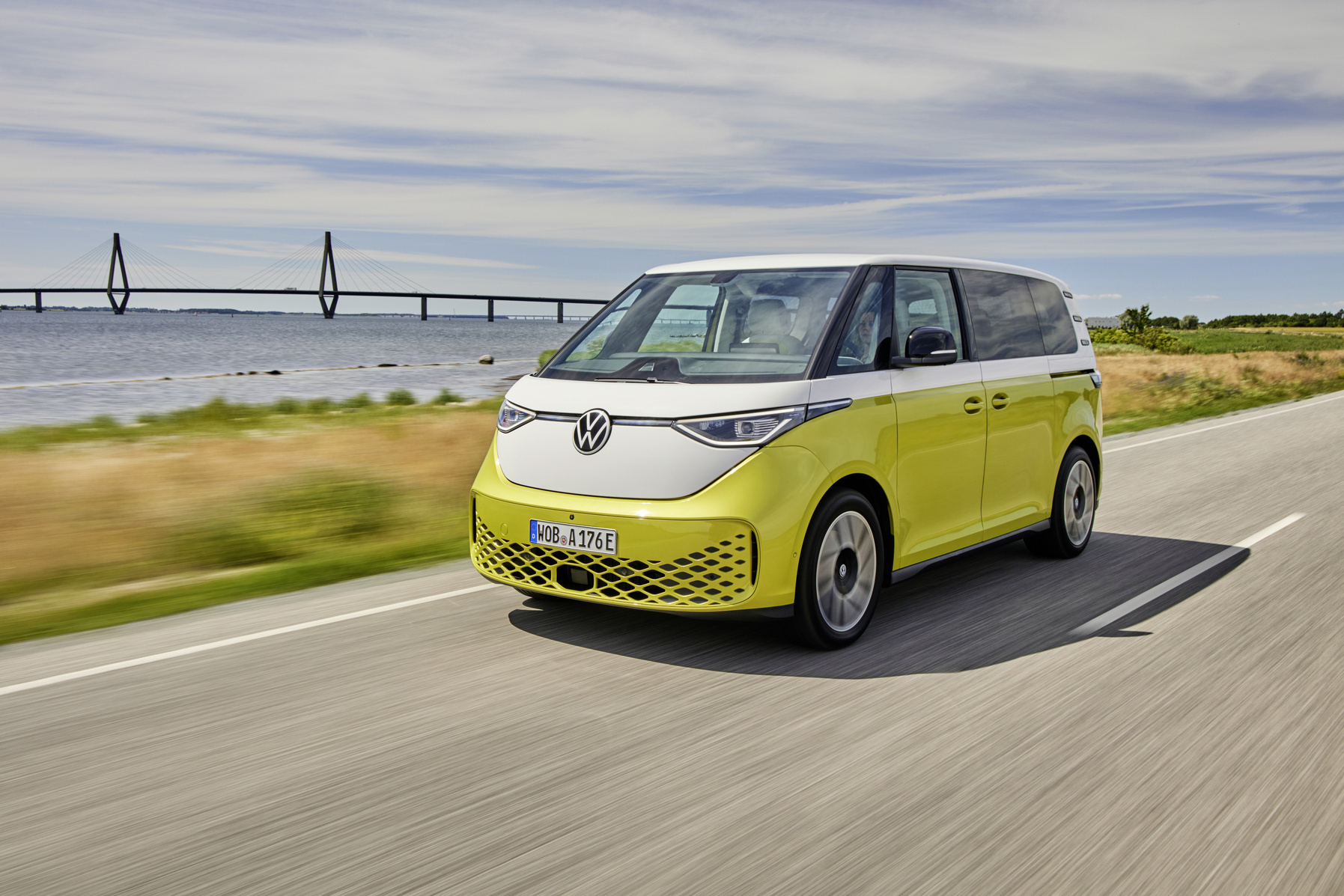
Volkswagen reframes driver assistance as parental instinct in The Parents
2026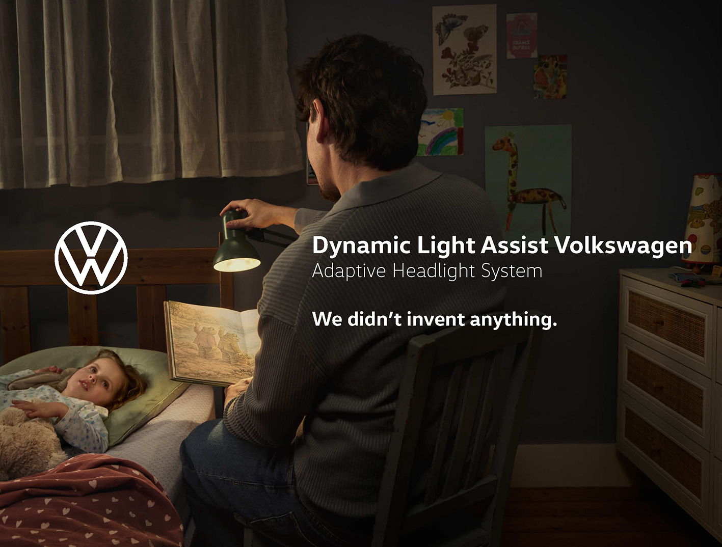
Volkswagen reactivates Drivers Wanted in Super Bowl LX
2026
Logo Redesign
2020After a major rebranding, Volkswagen returned to a design inspired by its 1967 logo. The updated emblem featured thinner lines, a separated lower “W,” and a flat, minimalist style without 3D effects. The redesign reflected the broader industry trend toward cleaner digital-friendly branding and was introduced first in Europe, then in Asia, and later in the Americas.
Volkswagen new brand design: a flat mark for an electric era
2019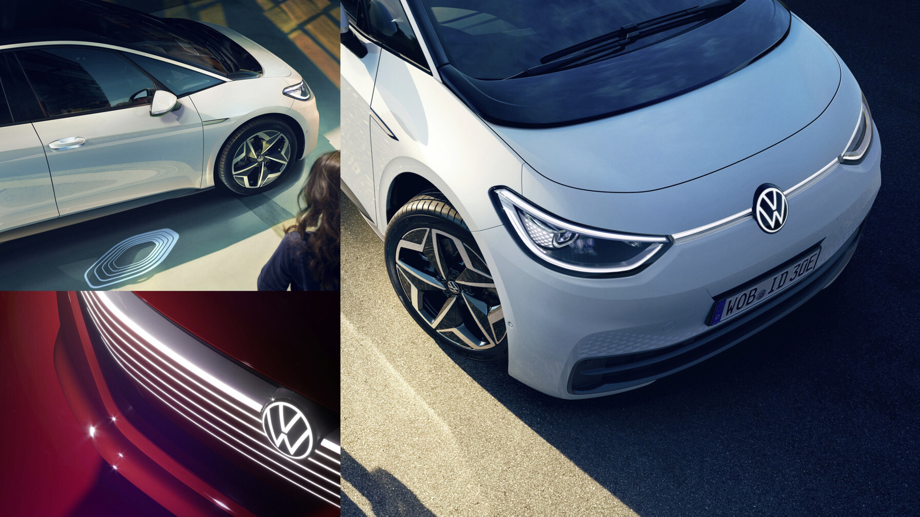
Volkswagen retires Das Auto and lets the brand name stand alone
2016Logo Redesign
2012Volkswagen has approved a new logo with shiny metallic lettering. Due to the side stripes, they acquired volume. This version was first used in September 2012 at the Berlin presentation of the Golf Mk7.
Volkswagen and Deutsch LA release The Force at Super Bowl XLV
2011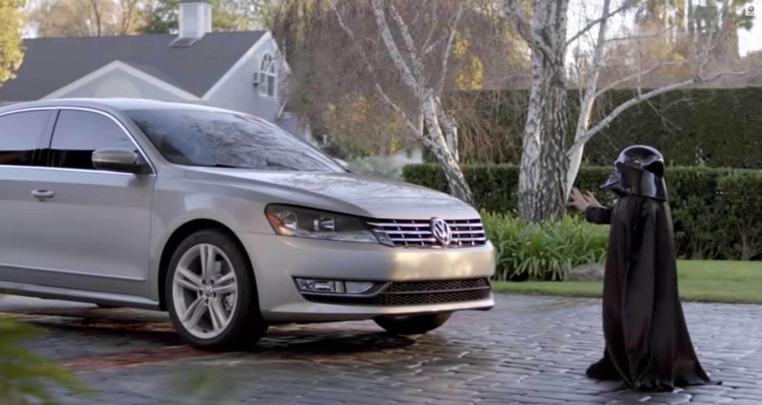
Gene Kelly breakdances for the new Volkswagen Golf GTI
2005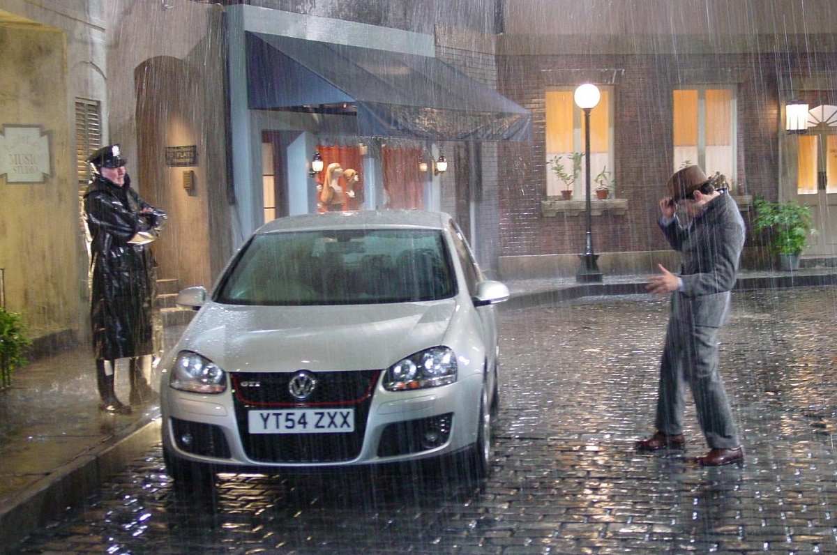
Logo Redesign
2000Designers updated the Volkswagen logo with a stronger 3D appearance to match contemporary design trends. The emblem gained a double-edged circular frame with layered outlines, a richer blue gradient, and silvery lettering that emphasized depth and metallic styling.
Pink Moon takes the Volkswagen Cabrio under the stars and revives Nick Drake
1999
Volkswagen Da Da Da: how Arnold tuned the brand for irony
1997
Drivers wanted resets Volkswagen of America for a decade
1995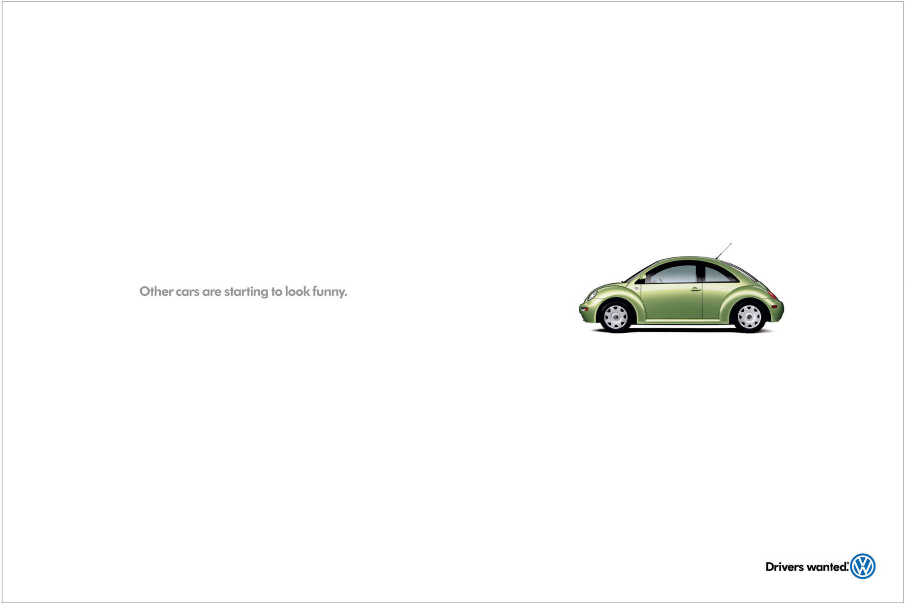
Logo Redesign
1995In 1995, Volkswagen returned to a logo based on its 1978 design. The main change was a deeper dark blue color, replacing the earlier brighter neon tone.
Logo Redesign
1989The emblem of that period was a circular Volkswagen logo with a blue outer frame and a wide white inner ring. The “V” and “W” letters were connected at the center on a light blue background, creating a colorized evolution of the 1945 design.
Logo Redesign
1978Volkswagen redesigned its logo again to match modern design trends. The update inverted the colors, turning the previously dark elements white and the white areas blue. The palette also became more intense, introducing a bright cobalt-blue version with a defined outer border.
Logo Redesign
1967During this period, the only major change to the Volkswagen logo was its color: the original black design was replaced with a sky-blue version.
Snow Plow carries the DDB Volkswagen voice from print into television
1964
Lemon turns a rejected Beetle into a print advertising touchstone
1960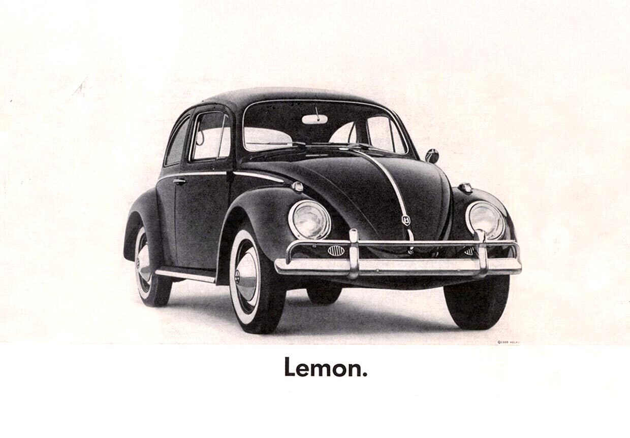
Logo Redesign
1960In 1960, Volkswagen redesigned its emblem with a more geometric appearance. The colors were inverted, turning white areas black and black areas white. The outer border was removed, and all lines were standardized to the same thickness, creating a cleaner and more balanced design.
Volkswagen and Doyle Dane Bernbach introduce Think Small for the Beetle
1959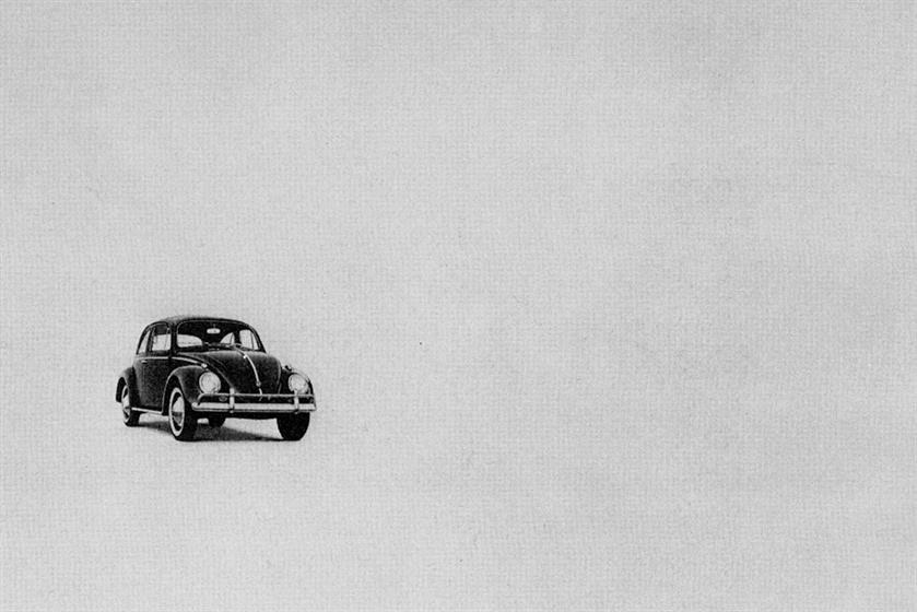
Logo Redesign
1948The updated Volkswagen logo continued the earlier design with several refinements. The emblem returned to a monochrome black-and-white style, while the outer border became thicker. Designers also connected the legs of the “W” to the circle and moved the “V” closer, giving the symbol a more compact and unified appearance.
Logo Redesign
1945After World War II, Volkswagen redesigned its emblem to distance the brand from its wartime associations. The black cogwheel and angular details were removed, replaced by a beige circle with dark brown edging and matching lettering. The upper part of the “V” connected to the outer ring, while the “W” remained separate. A red background was also introduced, giving the logo a warmer and less militaristic appearance.
Logo Redesign
1939Before World War II, Volkswagen revised its logo to remove elements associated with Nazi symbolism. The redesign retained the central initials and gear wheel but adopted a more practical, industrial appearance. The updated emblem emphasized engineering and technical identity rather than political associations, giving the brand a stronger automotive character.