Volkswagen new brand design: a flat mark for an electric era
On 9 September 2019, at the Internationale Automobil-Ausstellung in Frankfurt, Volkswagen retired its three-dimensional chrome emblem and presented a flat two-dimensional logo as the centrepiece of a complete brand redesign. The reveal preceded the public debut of the ID.3 by three days and marked the formal start of Volkswagen's electric era. The flatness of the new mark mattered less than the strategic decision it carried. The company was repositioning itself for a digital, electric, and post-Dieselgate future, and the visual identity was the most legible signal of the underlying turn.
The mark
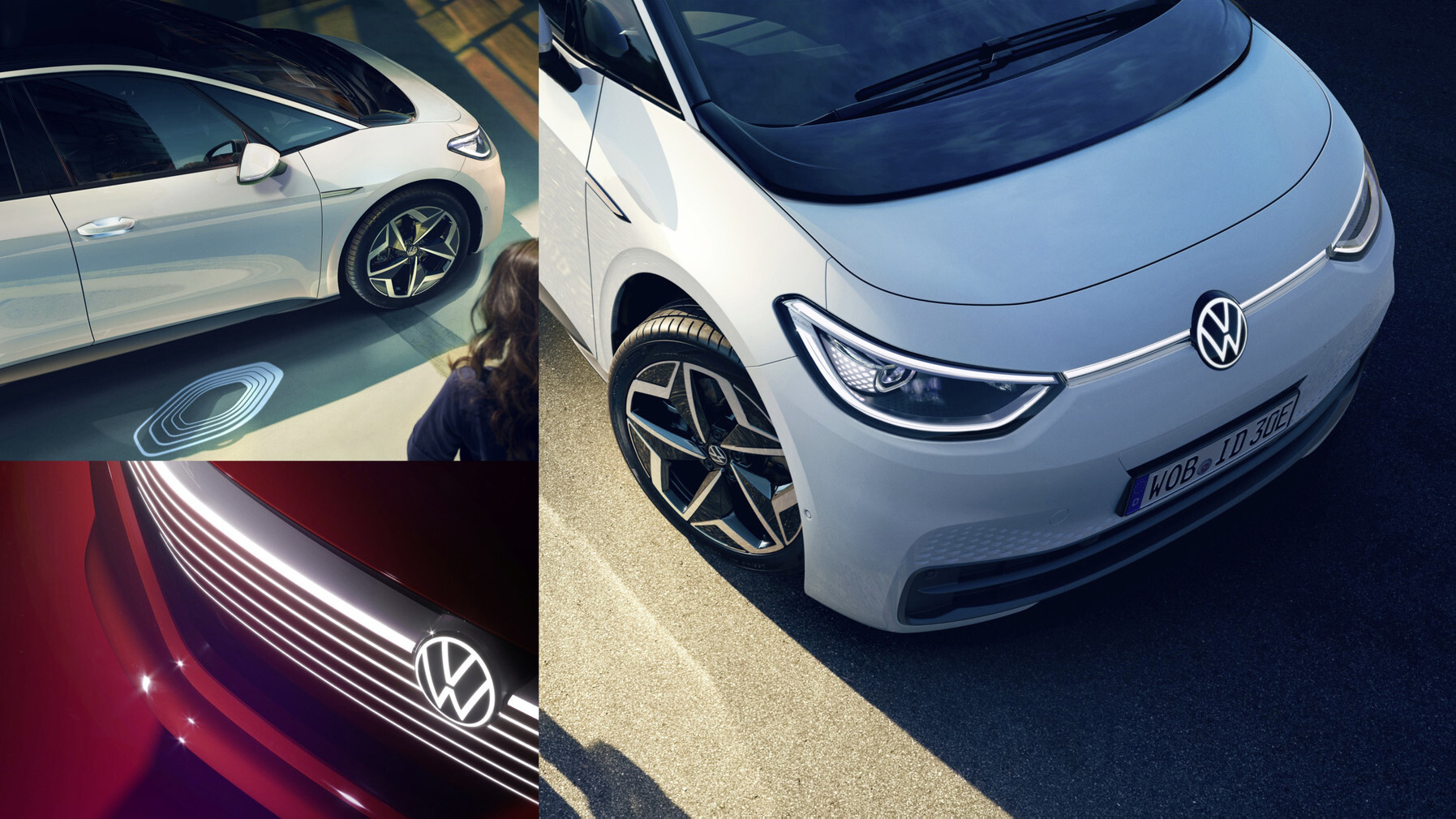
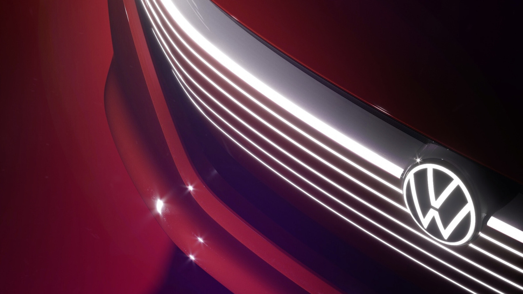
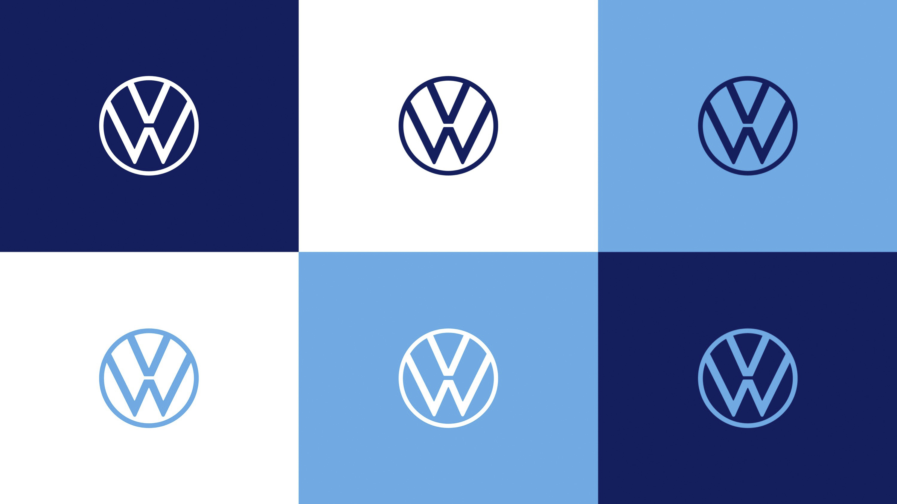
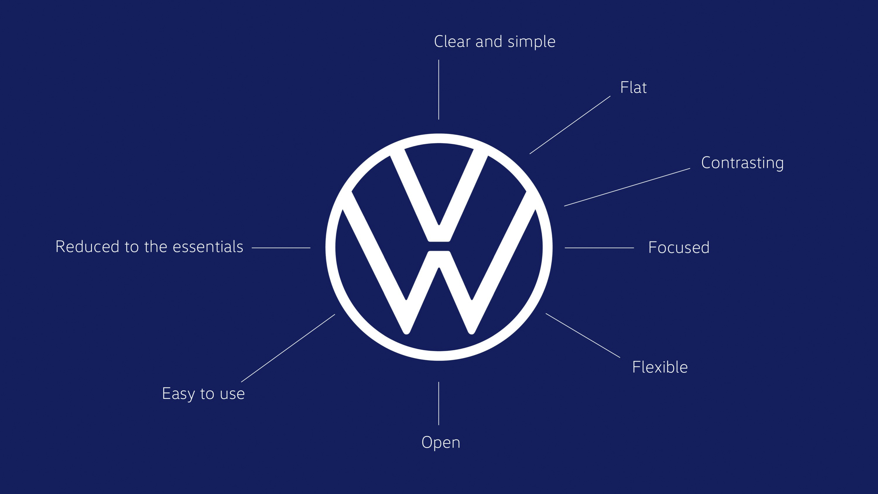
The redesigned logo retained the interlocked V and W inside a circle, the basic structure unchanged since 1937. The volume disappeared. The chrome shading, gradient depth, and ringed border of the 2000 emblem were replaced by a single weight of dark blue line on a white field. The interior negative space was widened. The V and W received slightly thinner strokes to balance the openness. The mark could now be reproduced flat across every surface, from a 16-pixel browser favicon to a 12-metre dealership facade, without the gradient information that the 2000 version had required.
The complete redesign
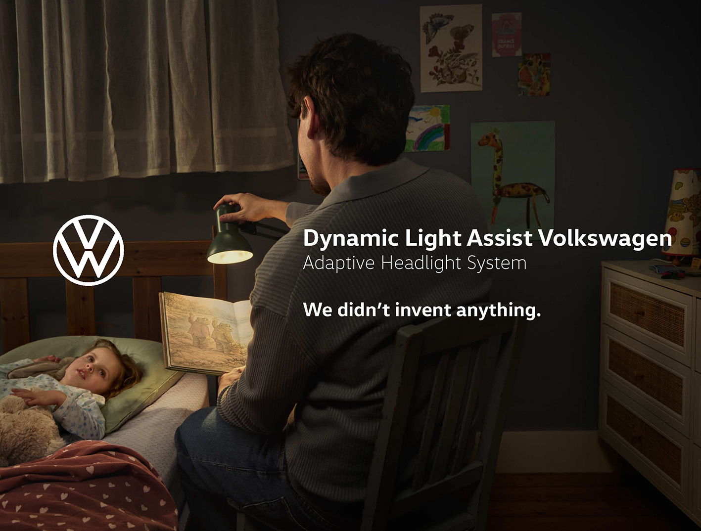
The new logo sat inside a wider brand design system. A custom sans-serif typeface, "Volkswagen Head" and "Volkswagen Text," replaced the previous Futura-derived corporate face. A new colour palette anchored on a dark Volkswagen Blue, with secondary accents in light blue, white and grey, replaced the older silver and chrome-dominated palette. Photography moved away from clinical studio product shots towards documentary-style imagery of vehicles in everyday situations, with people consistently in frame. A sound logo, the first in the company's history, replaced the retired Das Auto verbal signature. The four-note sequence was designed to function as a sonic mnemonic across radio, television, in-car notifications and digital touchpoints. A brand-led tonal position, summarised internally as "more human, more lively," translated the visual changes into language and behaviour.
The process
The redesign was led from inside the company by a joint Volkswagen Design and Marketing team, with the implementation distributed across nineteen internal departments and seventeen external agencies. MetaDesign, the Berlin and San Francisco-based agency that had partnered with Volkswagen for more than twenty years on the brand system, served as the principal external creative partner across the typography, colour and design language. The development cycle ran for nine months from initial brief to public reveal. Klaus Bischoff, then Head of Volkswagen Design, supervised the visual decisions. Jochen Sengpiehl, who had joined as Chief Marketing Officer in 2018, drove the strategic frame. The flat mark was Sengpiehl's first major signal that Volkswagen Marketing intended to operate in a different register from the engineering-led communication of the previous fifteen years.
Implementation
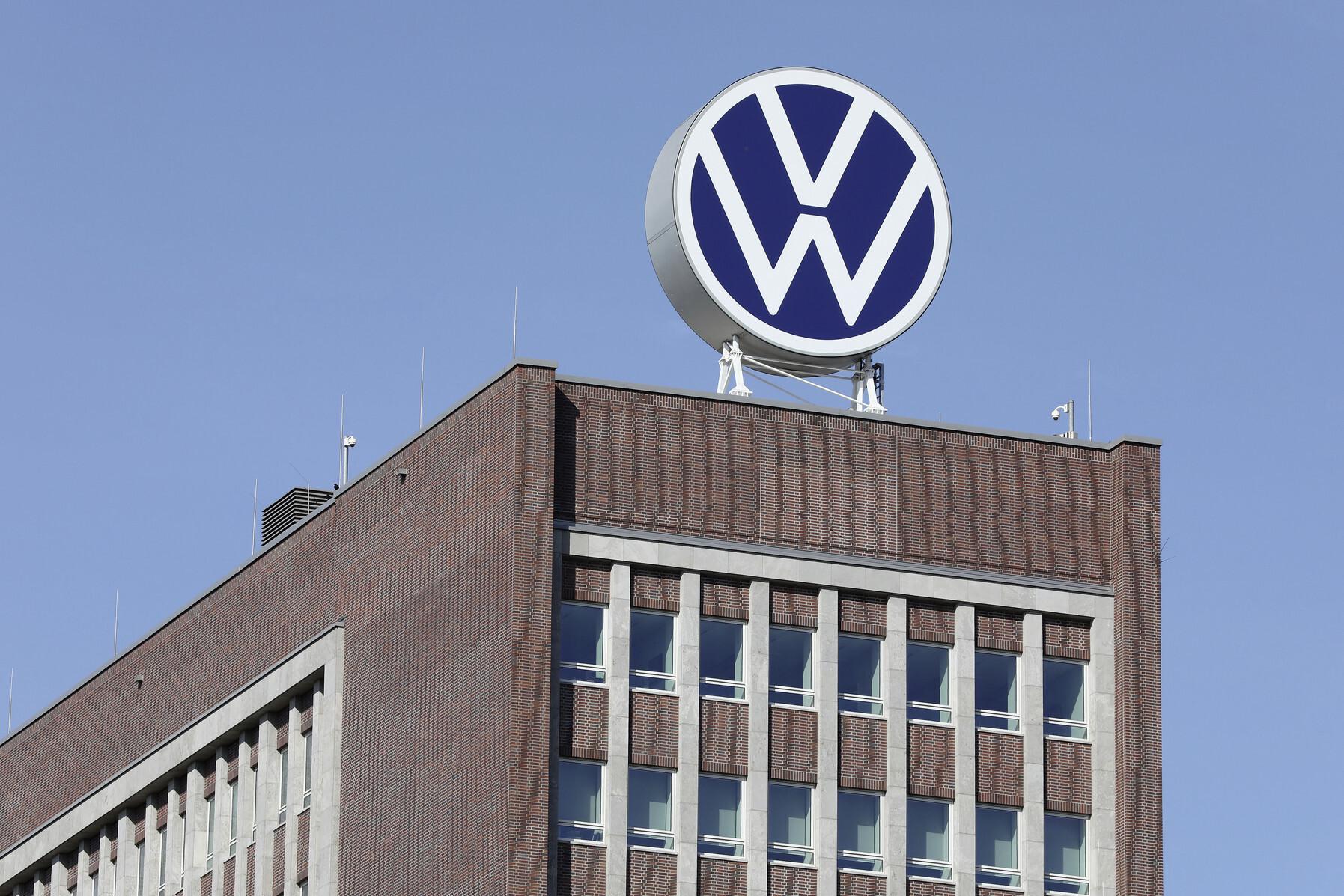
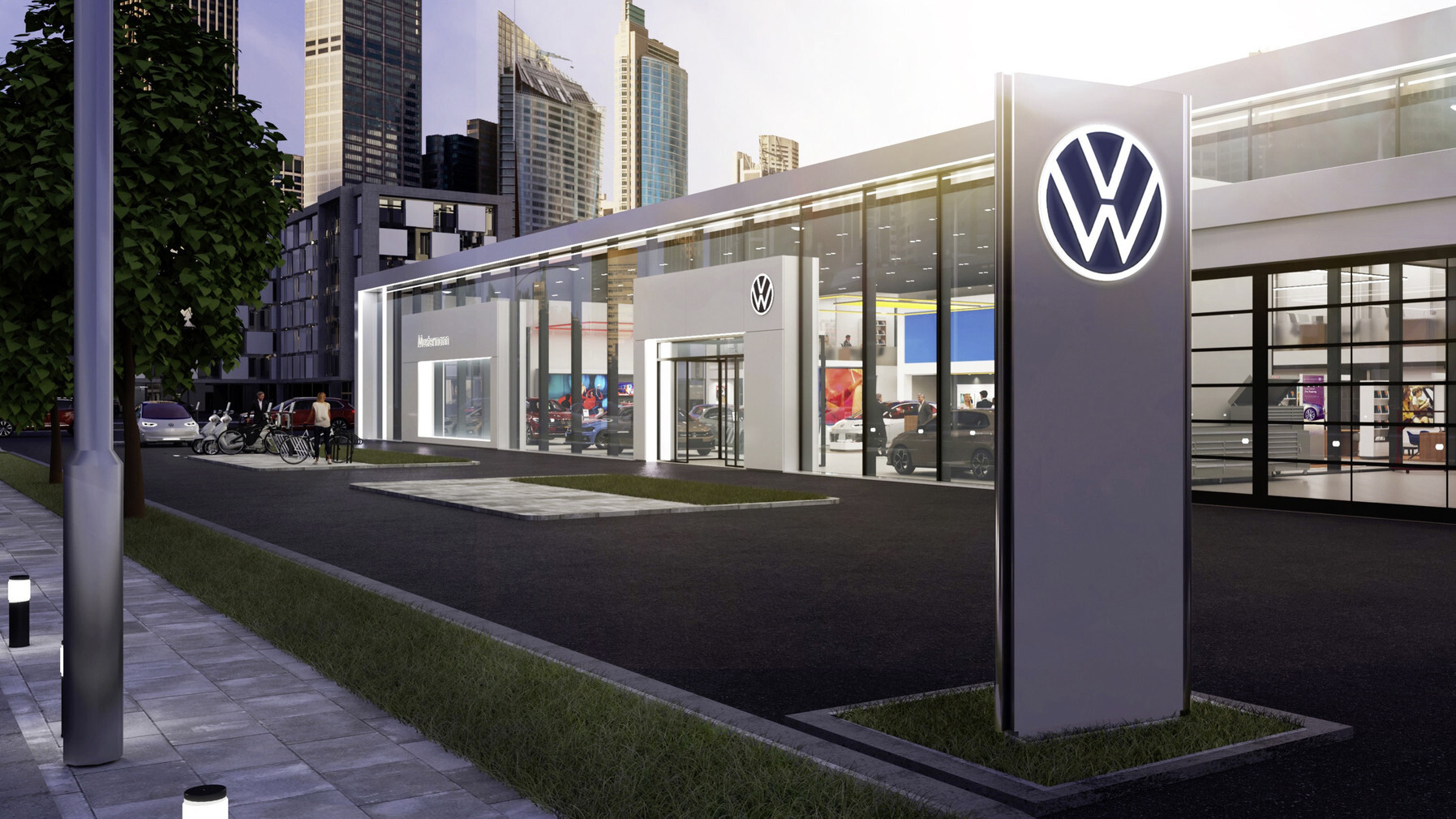
Approximately 70,000 individual logos required physical replacement across the global network. The figure included roughly 10,000 dealerships and service centres across more than 150 countries, plus signage on assembly plants, supplier facilities, training campuses and corporate buildings. The replacement programme ran across 2019 and 2020. The first production vehicle to wear the new mark was the ID.3, which entered the European market in summer 2020. The chrome emblem remained on the vehicles themselves as a three-dimensional badge, while the flat 2D mark was reserved for digital, print, sound, and architectural applications. The dual treatment preserved the badge equity on the cars without compromising the digital flexibility of the new mark.
Strategic context
The redesign carried three pressures at once. The first was the electric transition. The ID.3 launch in September 2019 represented the largest single product investment in the company's history, with the MEB platform underwriting a planned 15 electric models by 2025. The brand needed visual coherence with the new product architecture. The second was Dieselgate. The September 2015 emissions scandal had damaged the company's American and European brand trust, with Volkswagen's brand value falling roughly 19 percent in the immediate aftermath. The Das Auto claim was retired in 2015. The 2019 redesign closed the four-year gap with a replacement system. The third was platform competition. Tesla, with its own minimalist visual identity and direct-to-consumer model, had set a new benchmark for digital-native automotive branding. Volkswagen needed an answer at the brand level.
Editorial reading
The 2019 Volkswagen redesign was the earliest major automotive flattening of the late 2010s. Pepsi flattened in 2008. Apple removed gradient skeuomorphism in 2013. Google rebuilt its logo in 2015. Volkswagen's 2019 mark sat in the same architectural lineage and predated the subsequent flat-2D moves by Mercedes-Benz (2025), BMW (2020 mark, used selectively) , Porsche (refreshed 2023) and Pepsi (refreshed 2023). The legibility advantage of the mark across digital surfaces was clear at launch. The strategic significance only became visible later, when the rest of the industry followed. The flat Volkswagen circle is now the most-applied automotive logo on the road and the visual anchor for the brand's electric and digital portfolio.

Written with AI assistance, edited by a human. Find out more about our Use of AI.