McDonald's
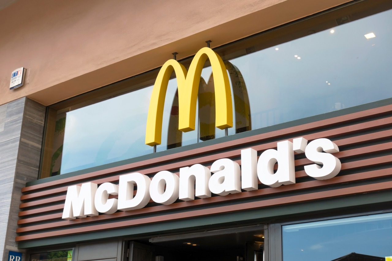
Founded in San Bernardino in 1940 by Richard and Maurice McDonald, and incorporated as McDonald's Corporation in 1955 by Ray Kroc, McDonald's is the largest fast-food restaurant company in the world by revenue, operating more than 40,000 restaurants in over 100 countries under a master brand built around the Golden Arches.
Key-Facts
Brand Chronology
McCafé refreshes its visual identity for a broader drinks portfolio
2026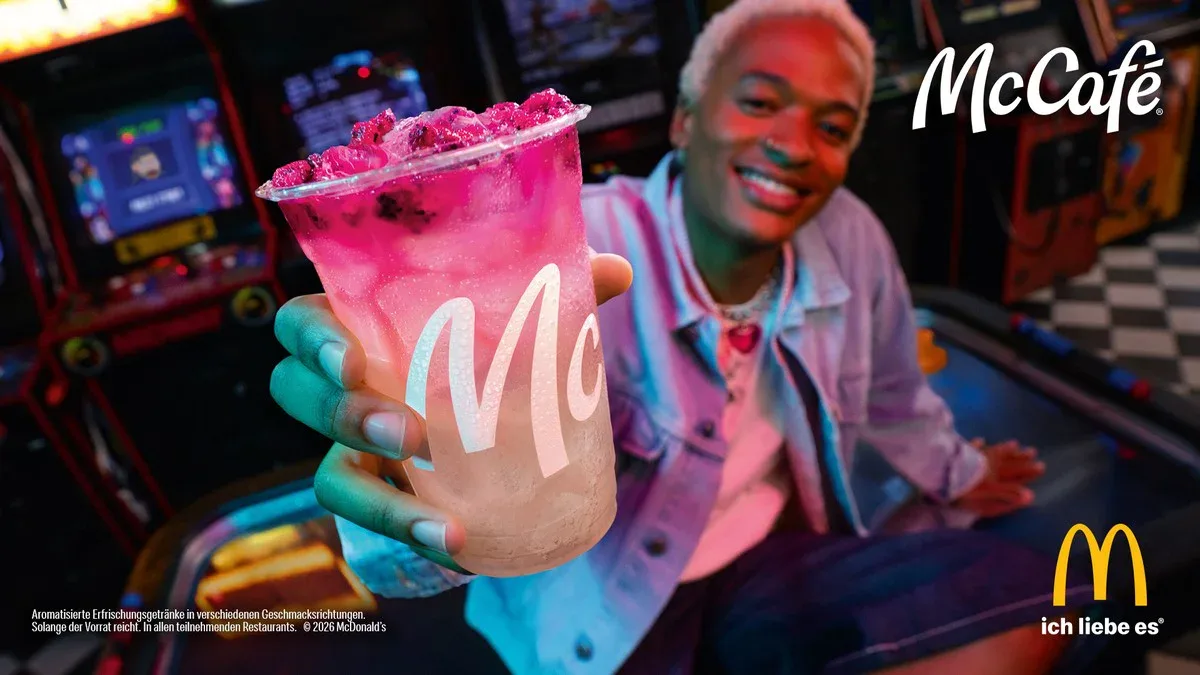
Happy new year to you, too
2026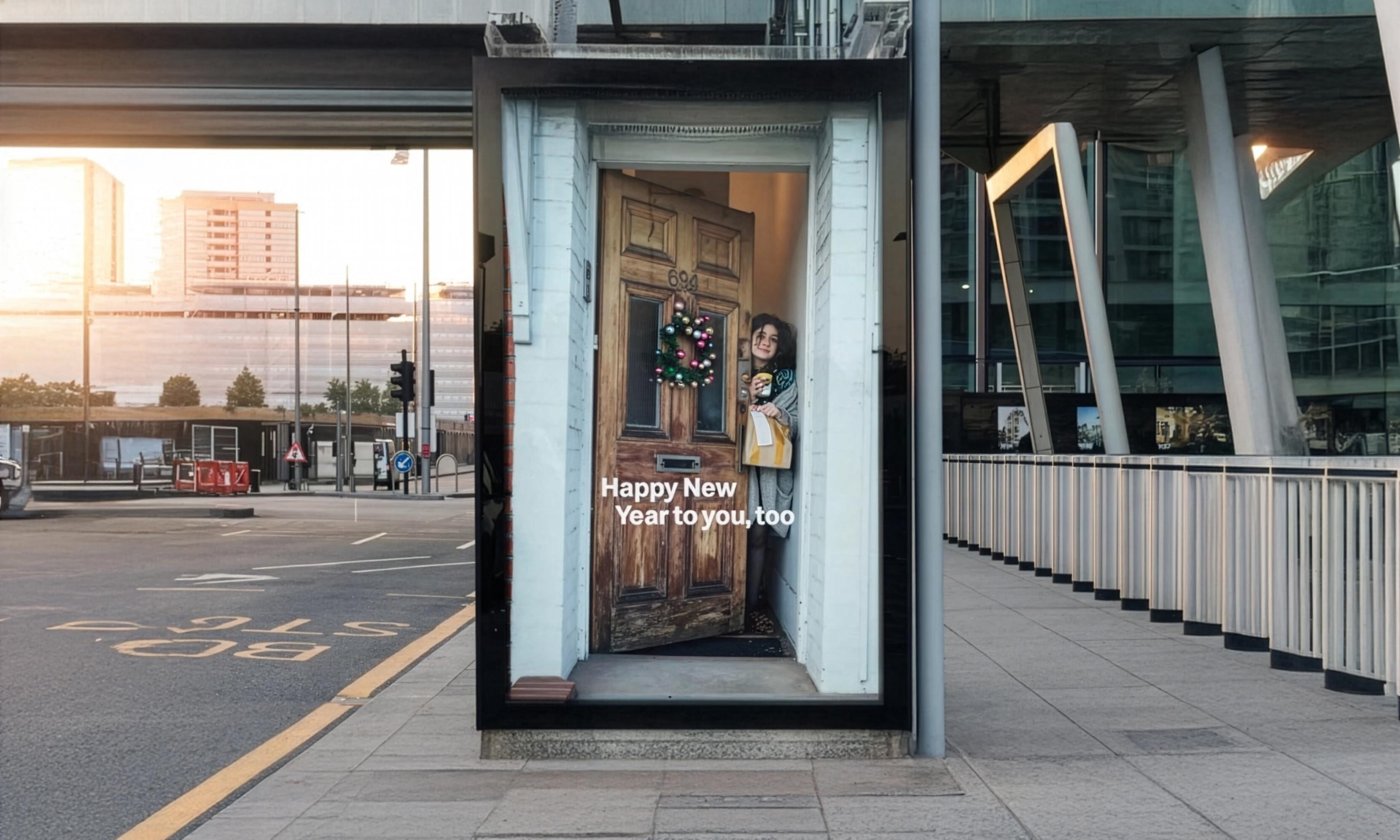
McDonald's raises the arches into eyebrows
2023
Famous orders and the Travis Scott meal
2020
McDonald's adopts the Speedee custom typeface
2018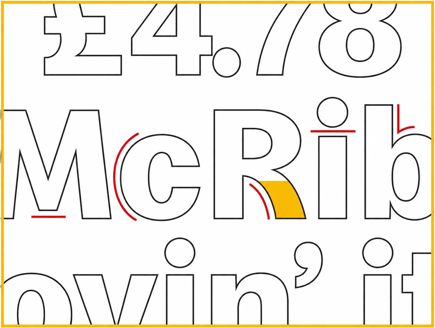
Cossette turns the arches into directional arrows
2018
The Founder retells McDonald's origin on screen
2017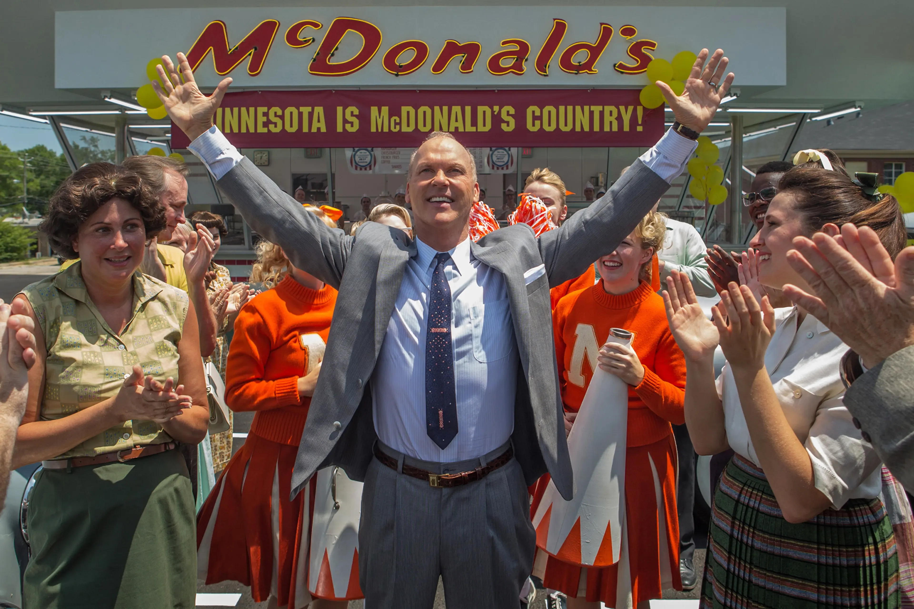
McDonald's Repaints Its Arches Green Across Europe
2009
Logo Redesign
2006On September 28, 2006, McDonald’s launched its “Forever Young” redesign campaign and updated its logo. The brand kept the iconic yellow “M” arches but simplified the design with thinner, softer lines and removed extra text and background elements.
The company also refreshed its typography, using Akzidenz Grotesk Bold from 2006 to 2014 before switching to Lovin’ Sans, which later appeared across restaurant interiors, signage, and advertising.
i'm lovin' it
2003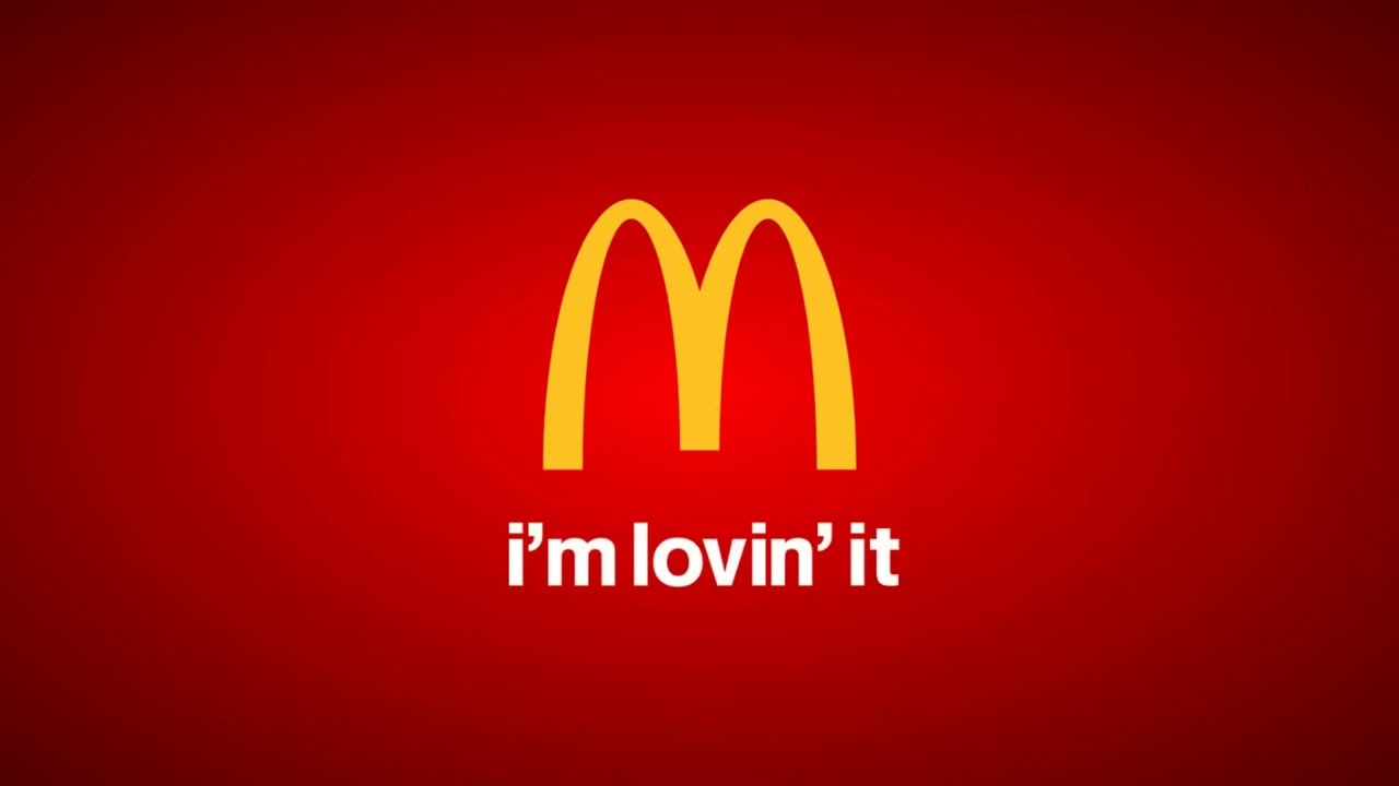
Logo Redesign
2003In 2003, McDonald’s launched its global “I’m Lovin’ It” campaign and introduced an updated version of the Golden Arches, developed by the German agency Heye & Partner.
The arches retained their iconic yellow color and shape but became thicker and more prominent. The logo was simplified to the arches alone, without additional backgrounds or frames. As part of the rebrand, Neue Helvetica 75 Bold was adopted across advertising and brand communications.
Did somebody say McDonald's reframes the brand
1997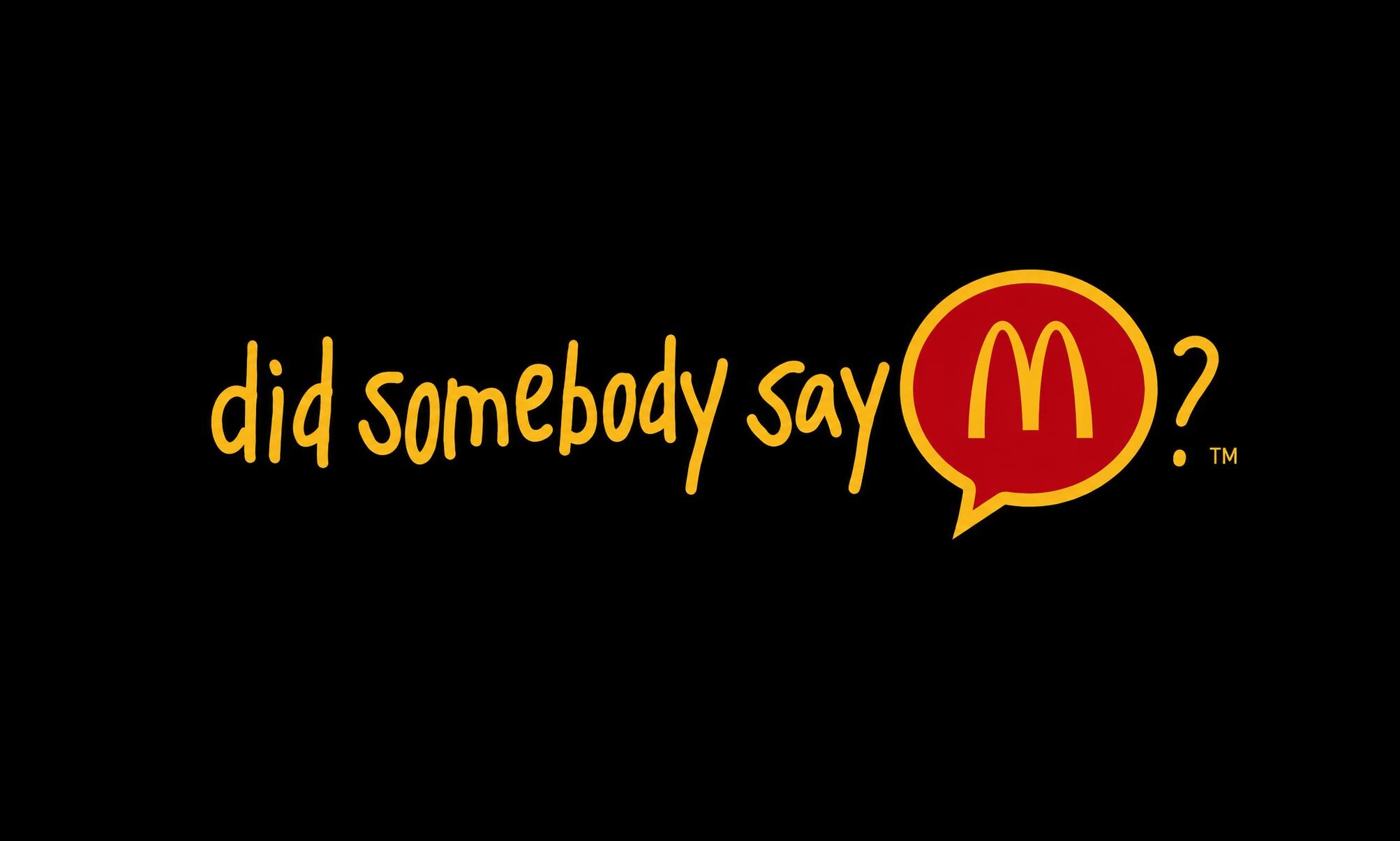
McDonald's Showdown pits Jordan against Bird
1993
Logo Redesign
1993In the mid-1990s, McDonald’s modernized its logo by removing the wordmark and adding a shadow to the Golden Arches. The symbol retained its familiar “M” shape but gained a three-dimensional appearance.
First introduced on some products in the early 1990s, the shadowed arches became more widely used after the 1995 packaging redesign. This version coexisted with the 1982 logo for nearly a decade and remained in use in some markets until 2010.
You deserve a break today
1971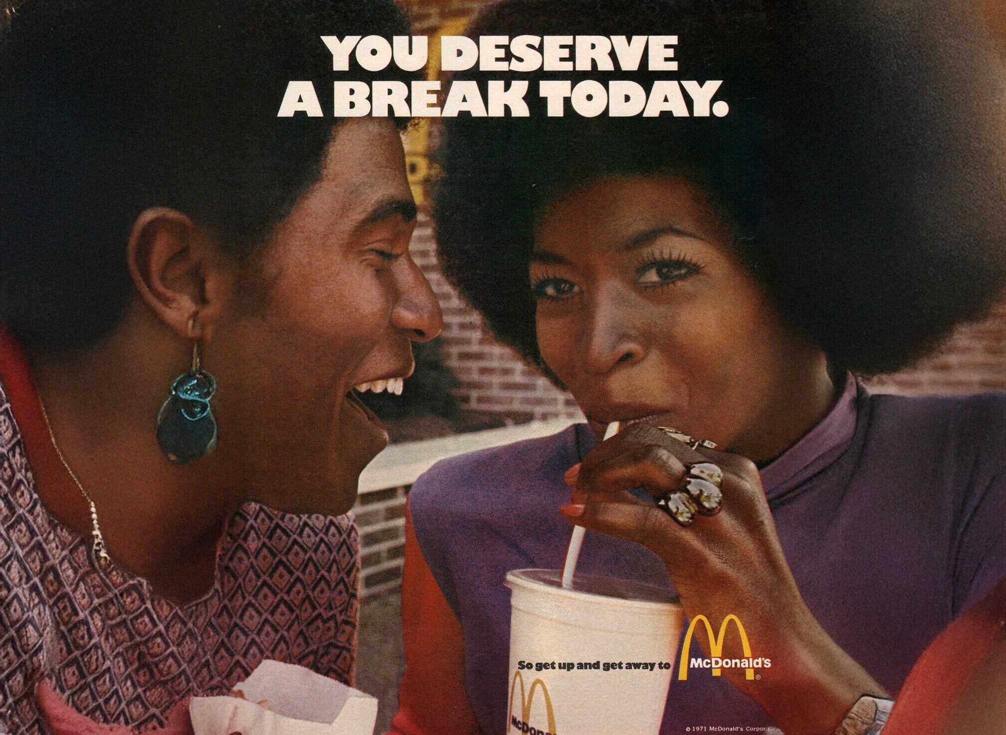
Logo Redesign
1968In 1968, McDonald’s introduced a new logo concept by Paul Schrage that combined the Golden Arches with the brand name in a single design.
The right side of the arches was opened to accommodate the “McDonald’s” wordmark, which ran horizontally through the lower portion of the symbol. The logo used a bold sans-serif typeface, with the “M” and “D” slightly larger than the other letters, and a yellow-and-black color scheme.
This version became one of McDonald’s most recognizable identities, appearing on packaging, advertising, and restaurant signage for decades. It remained on many restaurant facades until 2006 and is now regarded as a classic symbol of the brand’s history.
Ronald McDonald, born in a Washington franchise
1963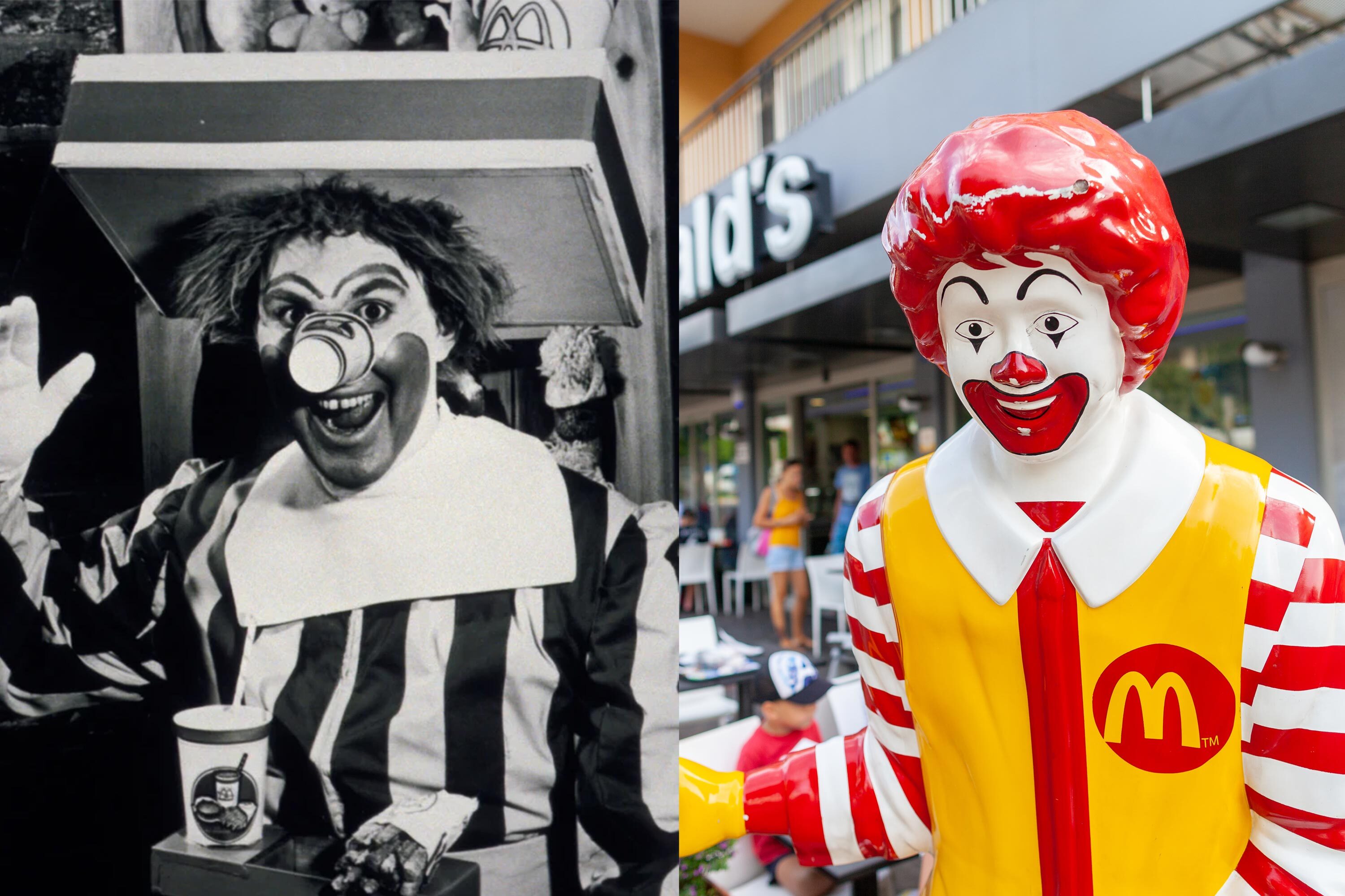
The golden arches become a logo
1962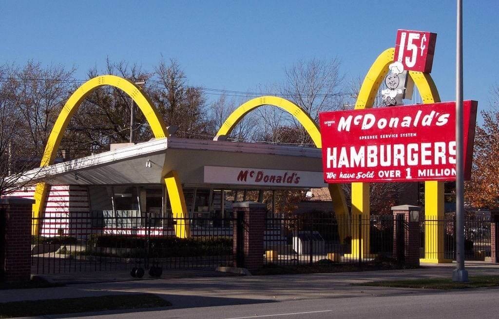
Logo Redesign
1961On September 13, 1961, McDonald’s registered a new logo under the leadership of Ray Kroc. Designed by Jim Schindler, the mark introduced the iconic Golden Arches that would become synonymous with the brand.
The logo featured two connected yellow arches forming the letter “M,” outlined in red and crossed by a diagonal yellow stripe. The entire symbol was enclosed within a light-blue circular frame. Beneath it appeared the McDonald’s name in a bold, rounded sans-serif typeface.
First used at a restaurant in Phoenix, the design quickly spread throughout the chain. Its distinctive diagonal crossing and interlaced arches set it apart from later versions. Although replaced in 1968, this original Golden Arches logo remains preserved at the historic McDonald’s restaurant in Downey and is remembered as the symbol that accompanied the brand’s early international expansion.
Logo Design
1953By 1953, the McDonald brothers simplified the restaurant’s name to McDonald’s, reflecting a new stage in the business’s development. The updated logo, later adopted officially when the corporation was incorporated in 1955, featured a more relaxed and approachable design.
Although replaced in 1961, the logo continued to appear in some advertising materials through the late 1960s. It later reappeared on commemorative packaging in Japan and at the company’s headquarters in Chicago, serving as a tribute to McDonald’s early history and its transition from a local family business to a global brand.
Logo Design
1948By the end of 1948, McDonald’s had shifted its focus from barbecue to hamburgers, leading to a new name: McDonald’s Famous Hamburgers. The updated sign reflected this strategic change and was designed to attract a growing mass-market audience. This sign marked the beginning of McDonald’s transformation into a modern fast-food business.