From architecture to mark
In 1962, McDonald's Director of Engineering and Design Jim Schindler transposed the two parabolic arches that framed the 1953 Phoenix drive-in into a single, intersected M that became the company's logo. The mark consolidated almost a decade of architectural identity into a flat, reproducible asset suited to franchise signage, packaging, advertising and corporate stationery. By the time Ray Kroc bought out the McDonald brothers' interest in 1961, the company needed a brand mark that could travel beyond the buildings that had carried it. Schindler drew that mark.
The architecture before the mark
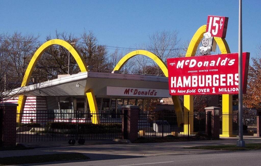
The first Golden Arches were not a logo. They were a load-bearing architectural detail attached to the second McDonald's restaurant, opened in Phoenix, Arizona, in 1953. Dick McDonald had commissioned the Fontana, California architect Stanley Meston to design a new restaurant building that would carry the brothers' Speedee Service System on its exterior the way the building carried the kitchen on its interior. Meston produced the elevation. Dick McDonald, drawing on a Coronado airport sign concept he had seen earlier, added the two yellow arches that rose through the roofline.
The arches functioned at three registers. They held the roof. They marked the building from the side of the road at speed. And they performed for the customer as identity before the brothers had a logo on the wall. Sign engineer George Dexter, who fabricated the first Phoenix arches in neon-lit sheet metal, attributed the final architectural form to a 1952 conversation with Richard McDonald.
The mascot before the mark
From the late 1940s into the early 1960s, the brand carried a character mascot called Speedee, a winking chef with a hamburger for a head and the brothers' Speedee Service System on his cap. Speedee appeared on signs, on packaging and on the back of the brothers' first kitchen manuals. He carried the system; he did not represent the architecture. By 1961, with franchise expansion under Kroc accelerating, the system Speedee stood for had moved past him. McDonald's Corporation needed a mark that could anchor signage in markets that did not yet have a building, that could appear on a paper cup without an illustration, and that could be reproduced across a national newspaper buy without losing recognition.
The 1962 drawing
Schindler joined McDonald's in 1961 from the Henry Stedman sign company. His mandate, given by Kroc and by chief marketer Bernie Loomis, was to consolidate the brand on the buildings and the brand off the buildings into a single visual system. He drew the two architectural arches as a single overlapped letterform: the left arch and the right arch crossed at the top, and a diagonal line, representing the original roofline that ran through the architecture, intersected the two arches a third of the way down. The mark read first as the letter M and second as the architecture from which it was abstracted.
The 1962 mark was used in print and in stationery from the year of its introduction. It appeared in Kroc's annual letters, in the corporate identity that Schindler rolled out across franchisee documentation, and on packaging. The architectural arches stayed on the buildings; the M sat on the print. The two surfaces fed each other. A customer who drove past the arches on Saturday and read the M in the Sunday paper carried a single identity across both encounters.
The 1968 simplification
In 1968, the diagonal roofline was removed. The mark became the unintersected M that has carried the brand without major redrawing across the half-century since. The decision is attributed to McDonald's marketing director at the time and to research-based legibility work commissioned for the new mansard-roof restaurant building, which had no diagonal element to refer to. The 1962 mark had carried the bridge from architecture to letterform. The 1968 mark released the letterform from its architectural source. Both marks, taken together, hold the shift from a building-led identity to a brand-led identity in a single decade.
The brand reading
The 1962 Schindler mark is one of the cleanest documented examples in modern brand history of identity translation from architecture to logotype. The translation worked because the architecture had already done the cognitive labour. By the time Schindler drew the M, the parabolic arches had been on roadside buildings for nine years. American drivers recognised them at speed and at distance, without text. Schindler's mark inherited that recognition and ported it into print, paper, broadcast and stationery without re-teaching the audience what the form referred to. The buildings continued to instruct the public; the M consolidated the instruction.
The mark also anchored a brand-architecture decision that has held since. McDonald's chose to stand for a single, abstract letterform built from a single architectural reference, rather than for a mascot, a product silhouette or a wordmark. That choice freed the company to add products, sub-brands, formats, languages and markets across six decades without reopening the question of what the brand looks like. McCafé, Happy Meal, McDelivery, MyMcDonald's Rewards and the Turner Duckworth identity system rolled out from 2018 all sit beneath the M. The mark Schindler drew in 1962 is the load-bearing column the rest of the system leans on.