McDonald's repaints its arches green across Europe
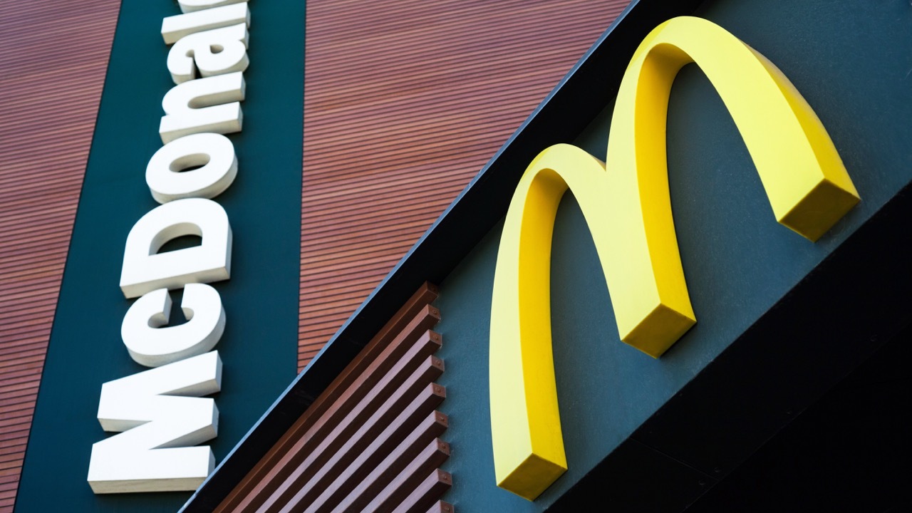
In November 2009, McDonald's began rolling out a redesigned exterior identity for its European restaurants. The familiar red background behind the Golden Arches was replaced with a deep forest green, while the M itself remained the yellow specified in the company's corporate identity. The change first appeared on signage in Germany, where about 100 restaurants converted by the end of the year, and was scheduled to extend across additional locations during subsequent refurbishment cycles.
A Europe-wide initiative
Although the rollout drew most public attention in Germany, McDonald's framed the move as a coordinated European programme rather than a national experiment. The company's spokespeople in Germany told reporters at the time that the change was "not only a German initiative, but a Europewide initiative." By the time the German redesign was first reported in late November 2009, the green livery had already begun appearing on restaurants in France and Great Britain, where franchise operators had been adopting the new colour scheme through ongoing refurbishment cycles. McDonald's corporate headquarters confirmed that the colour shift formed part of a broader European modernisation programme that combined exterior signage with interior remodels emphasising natural materials and softer lighting.
The reasoning behind the colour change
McDonald's positioned the green identity as a visual signal of environmental responsibility. The company stated that the new colour scheme accompanied a set of operational changes including the recycling of used cooking oil into biodiesel fuel for its delivery fleet, the introduction of more energy-efficient kitchen equipment, and a shift toward refrigeration systems with reduced environmental impact. Officials in Germany described the green colour as a way of clarifying the company's "responsibility for the preservation of natural resources" rather than as a piecemeal cosmetic update.
The decision also reflected the cultural context of the European market. Surveys cited by McDonald's at the time indicated that consumers in countries such as Germany, France, the United Kingdom, and the Nordic markets placed significantly higher importance on a brand's environmental positioning than counterparts in the United States. Independent observers, including environmental groups, viewed the colour change as a deliberate communicative gesture toward those audiences.
Continuity within the master brand
Despite the visible recolouring, the Golden Arches themselves remained unchanged in form. The M continued to use the proprietary yellow specified by McDonald's corporate identity, ensuring that the central asset of the brand retained its global continuity. The shift therefore operated as a regional adaptation of the supporting palette rather than as a rebranding of the master brand. Restaurants in the United States, Asia, and other regions continued to use the long-established red field, and the corporate logo lockup on documents, packaging, and digital communications remained anchored in red and yellow.
For the European market, the green livery was applied initially to exterior building bands, the panels behind freestanding pole signs, and elements of in-store wayfinding. Interior refurbishments that accompanied the colour change frequently introduced timber surfaces, leather seating, and warmer light temperatures, completing what the company referred to as a more "premium" environment for European customers.
Reception and longer-term effect
The change drew attention beyond the foodservice press. Coverage by NBC News, NPR, CBS News, and PotatoPro all reported on the symbolic and strategic implications of a brand so closely associated with red adopting a colour conventionally linked to nature and sustainability. Marketing commentators noted that the move marked one of the first large-scale colour-driven repositioning efforts by a global quick-service restaurant chain.
Over the following years, the green field remained the standard exterior colour for newly built and refurbished McDonald's restaurants across much of continental Europe. The contrast with markets that retained the original red palette made McDonald's Europe one of the most visible examples of regional colour adaptation within a single global brand identity, and it remained in place as part of the company's European visual standards through the 2010s and into the 2020s.