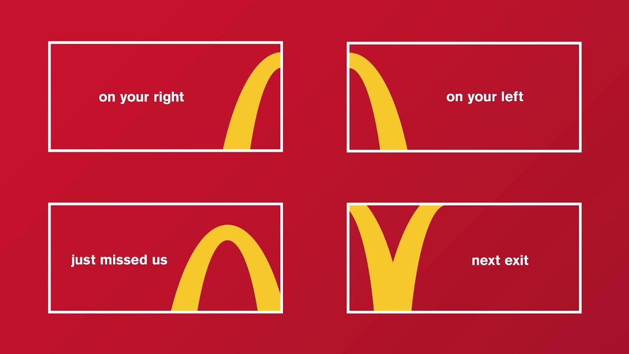
A logo that points the way to itself
In February 2018, McDonald's Canada and its lead creative agency Cossette Toronto launched a four-piece outdoor platform that cropped the brand's golden arches into directional arrows. The four executions, titled "Next Exit," "Just Missed Us," "On Your Left" and "On Your Right," ran as billboards across the Greater Toronto Area and along major Canadian highway corridors. Each board carried a single fragment of the McDonald's arches, sliced in such a way that the curve of the M pointed the driver toward the nearest restaurant. No additional copy or brand asset appeared on the boards beyond the cropped mark and the short location-cue headline.
The Follow the Arches platform was awarded the Outdoor Lions Grand Prix at the Cannes Lions International Festival of Creativity in June 2018, sharing the prize that year with Comedy Central's Daily Show Presents: The Donald J. Trump Presidential Twitter Library. The Outdoor Lions jury, chaired by Chris Garbutt, then global chief creative officer at TBWA Worldwide, described the work as "pure and iconic." The award sat alongside Cannes Grands Prix in Print and Publishing, Design and Outdoor for adjacent McDonald's executions that summer, making the brand the most decorated single advertiser of the 2018 festival.
The agency and the brief
Cossette had held the McDonald's Canada brand assignment since 2014, replacing Cossette's own previous regional rotation as a single agency relationship. Peter Ignazi and Carlos Moreno served as joint chief creative officers at Cossette in the period the platform was developed. The brief, according to subsequent agency case statements, was to replace the franchise-level inconsistency of place-marking billboards (where individual operators had commissioned signage from local sign companies on uncoordinated visual standards) with a national outdoor system that worked from a single distinctive brand asset.
The agency response was to take the brand's most visually distinctive element, the curve of the M arch, and to use it as a wayfinding device. The arch fragment functioned simultaneously as logo recognition and as direction signal. The boards required no McDonald's wordmark because the cropped fragment carried the brand identification on its own. The headline carried the location cue. The colour palette held to the brand's red and yellow, with each board presenting a single curve against a single field of colour.
The strategic move underneath
Follow the Arches sits inside a wider strategic shift that McDonald's Corporation had been working through during the 2010s. The brand, under the global creative stewardship of Turner Duckworth from 2017, was moving away from menu-led communication and toward identity-led communication. The Cossette platform was the Canadian expression of this shift. The work treated the brand's distinctive visual asset as a self-sufficient communication tool rather than as a logo to be applied to other content.
The principle that underlies the work is the distinctive-brand-asset logic articulated by Jenni Romaniuk and the Ehrenberg-Bass Institute. A brand asset reaches its highest commercial value when it can be recognised in fragment, partial cropping, or single-element extraction. The McDonald's arches qualify on that test more comprehensively than almost any other contemporary commercial mark. Cossette's contribution was to find a single category, wayfinding outdoor, in which the fragmentary recognition produced not only brand identification but a directly useful customer service: getting hungry drivers to the nearest restaurant.
The follow-on across markets
The Toronto campaign was extended by McDonald's Corporation into adjacent markets across 2018 and 2019. Adaptations of the four executions were licensed for use in the United States, the United Kingdom, France, Germany and the Netherlands, with each market commissioning its own production from its local lead agency. The system worked across markets because the brand asset was constant. The cropped curve looked the same in Manchester and Munich as it had on the Don Valley Parkway in Toronto.
The platform also extended beyond outdoor. Cossette and the McDonald's Canada in-house team developed a parallel print, in-restaurant and digital expression of the same logic. McDonald's drive-thru entry markers, in-app navigation cues and trucker-stop fuel-station partnership signage all adopted variants of the cropped-arch wayfinding system. Restaurant-finder maps inside the McDonald's mobile application used a fragmentary arch as the location pin. The platform translated from a four-board outdoor pitch into a brand-level wayfinding system that lived inside the brand's operational signage architecture.
Follow the Arches has held its place in the McDonald's case-study canon as a clear demonstration of how a heritage brand asset, in this case the Golden Arches mark first standardised by Jim Schindler in 1962, can carry a contemporary platform without translation. The arches did not need to be modernised to perform the wayfinding role. The Cossette intervention was to recognise that the asset was already strong enough to do the work, and to give it permission to do so without the rest of the brand's typical signal architecture surrounding it.
Source: LLLLITL Youtube