
The shift to a broader drinks brand
McDonald's is refreshing the global visual identity of McCafé, its in-store coffee sub-brand, to support a broader beverage portfolio.1 The work is led by long-standing creative partner Turner Duckworth, with the new lettering developed in collaboration with type designer Alec Tear.2 The chain announced the refresh on 4 May 2026, two days before the rollout of new menu items in the United States.3
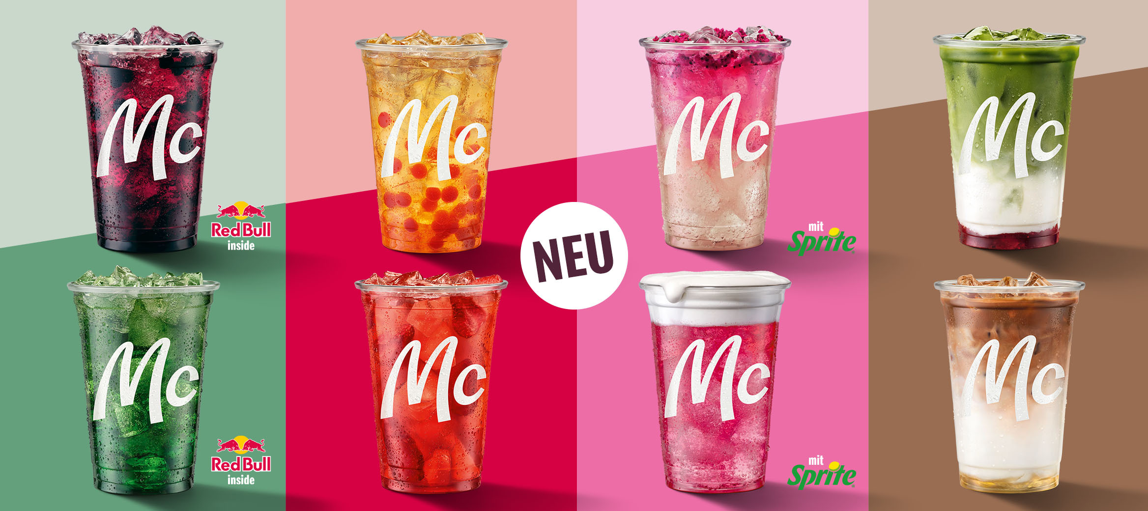
The redesign accompanies the introduction of three new beverage categories under the McCafé umbrella: Refreshers, Crafted Sodas, and Energizers.1 These additions move the sub-brand away from a pure coffee proposition toward a wider drinks offer, drawing on insights from the chain's CosMc's beverage concept and a 500-restaurant pilot conducted across the United States in 2025.3
A wordmark drawn from the Golden Arches
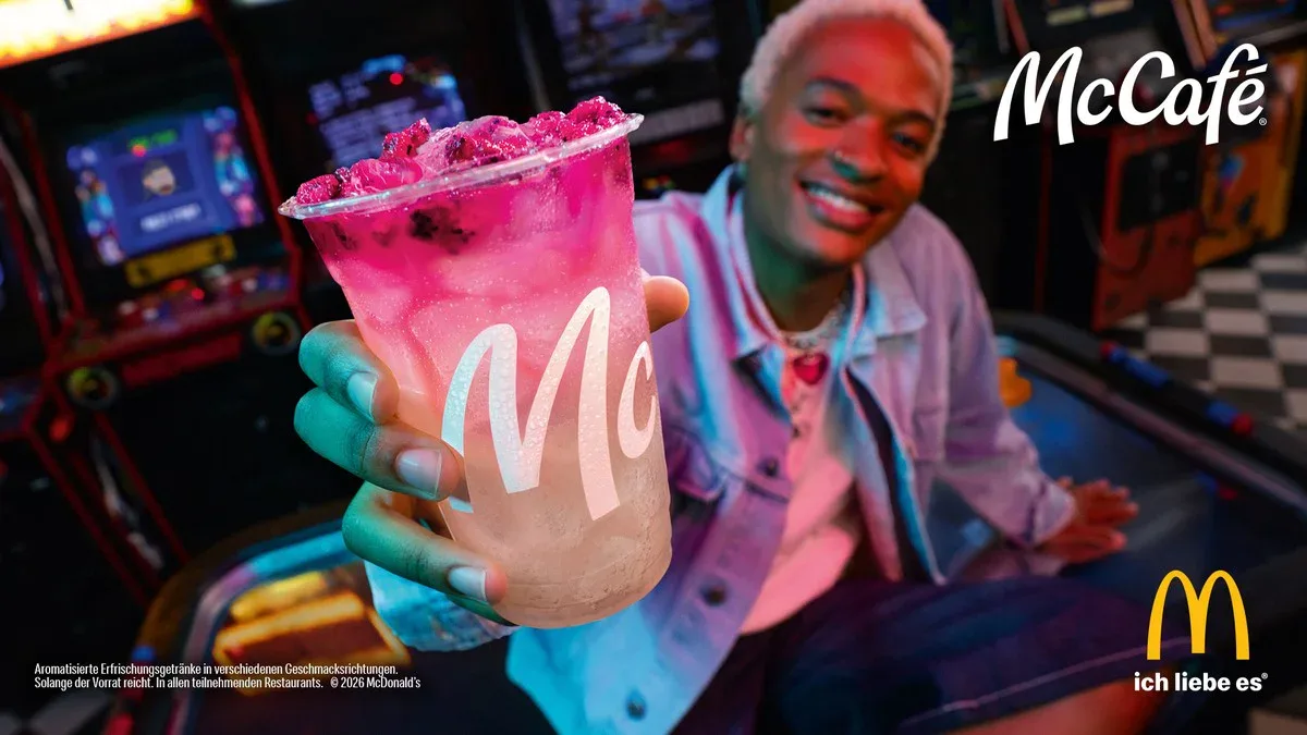
The updated McCafé wordmark is, according to McDonald's, "drawn from the same pen as the Golden Arches themselves."1 Type designer Alec Tear, who collaborated on the lettering, helped tighten the visual relationship between McCafé and the master McDonald's identity that Turner Duckworth has been shaping since the agency began working with the chain in 2017.2, 4 Where the previous McCafé wordmark sat as a stylistically separate label, the new one is designed to belong to the same family as the engineered curves of the Speedee custom typeface and the Archery logo system that govern the wider McDonald's brand world.5
The colour palette pairs a refined gold with a new primary tone called coffee cherry, named after the fruit that surrounds a coffee bean.1 A secondary palette of brighter, more saturated colours reflects the new drinks lineup, and the system extends to packaging patterns and food photography that read as more playful and youthful than the previous café-led look.1
Source: McDonald's Corporation Youtube
From café experience to fast-format drinks brand
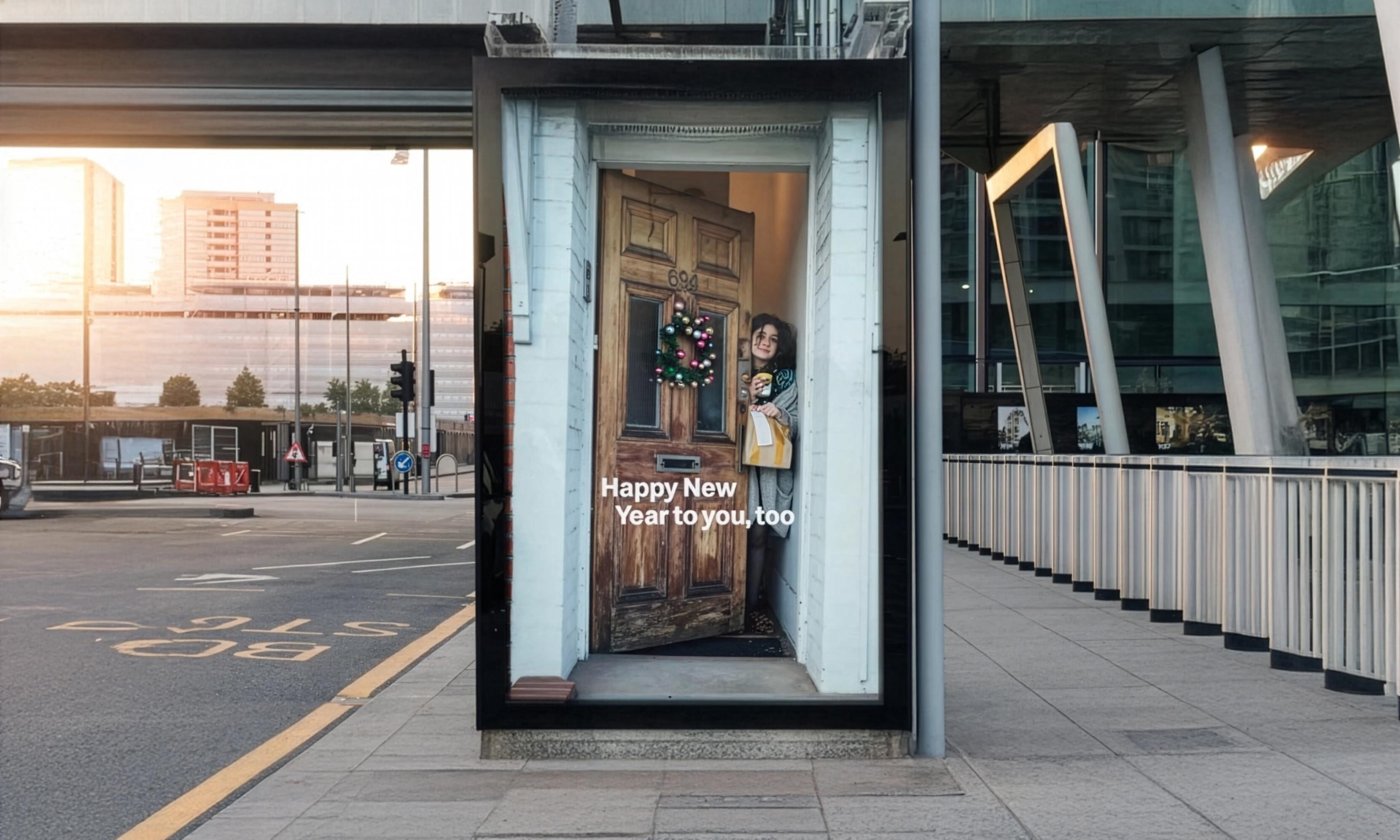
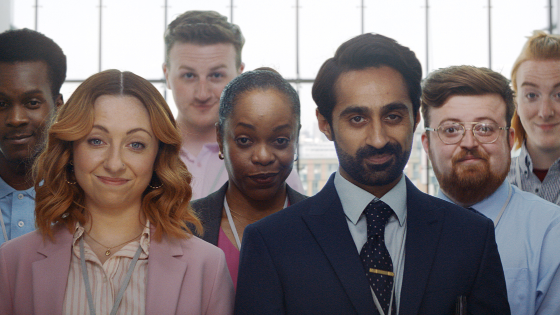
The earlier McCafé identity centred on the café experience, with warmer, coffee-house tones aimed at signalling a slower, more considered moment within the McDonald's environment.2 The new framework repositions McCafé as a sub-brand (a brand operating under a parent identity) of light, mood-driven beverages designed to be ordered quickly and consumed on the move. The campaign tagline, "What's your favourite emotional support beverage?", frames drinks not as functional menu items but as everyday rituals that lift the mood.2
In a statement on the corporate website, McDonald's said the company "had to reimagine the McCafé sub-brand to reflect this modernised portfolio, making it more fun, youthful, playful and colourful, just like the new drinks themselves."1 Jill McDonald, executive vice president and global chief restaurant experience officer, said the company applied learnings from its CosMc's pilot to shape the new beverage range.3 In testing, the drinks drove incremental visits across snack, dinner, and evening dayparts, and lifted average check, supporting the case for treating McCafé as a portfolio rather than a coffee line.3
Rollout and competitive context
In the United States, Refreshers and Crafted Sodas launch on 6 May 2026, with Energizers scheduled for later in the year.3 Customers in Canada, Germany, and Australia receive the new lineup across spring and summer 2026.1 McDonald's notes that the refreshed framework offers "a more consistent way to present McCafé globally while allowing room for some local flexibility," reflecting the chain's reliance on regional menu adjustments.1
The McCafé refresh forms part of a wider Turner Duckworth-led identity programme for McDonald's that began with the 2018 redesign of the master brand and has since extended to Happy Meal packaging, the MyMcDonald's Rewards loyalty platform, and global retail communications.4, 6 The latest update places the chain in more direct competition with specialist drinks brands such as Starbucks and Dunkin' on a category that has historically been peripheral to its burger business. By tightening the visual link between McCafé and the master McDonald's brand while expanding the menu beneath it, the company is treating beverages less as an adjacent line and more as an integrated portfolio with its own design language.

Written with AI assistance, edited by a human. Find out more about our Use of AI.
1. McDonald's Corporation, "McDonald's Refreshes McCafé Brand Visual Identity", dated 1 May 2026 on the page and reported by the trade press as a post of Monday 4 May 2026, for the refresh of the McCafé sub-brand ahead of a broader beverage portfolio, for the three new subcategories Refreshers, Crafted Sodas and Energizers, for the wordmark described as "drawn from the same pen as the Golden Arches themselves", for the new primary colours of a refined gold and "coffee cherry" inspired by the fruit that coffee beans come from, for the secondary colours reflecting the vibrancy of the new drinks together with the more playful food photography and packaging patterns, for the company statement that it "had to reimagine the McCafé sub-brand to reflect this modernized portfolio, making it more fun, youthful, playful and colorful", for the launch markets of the United States, Canada, Germany and Australia in spring and summer 2026, and for the sentence "The updated framework gives us a more consistent way to present McCafé globally while allowing room for some local flexibility." The body renders both quotations in British spelling. https://corporate.mcdonalds.com/corpmcd/our-stories/article/mcdonalds-refreshes-mccafe-brand-visual-identity.html
2. Design Compass, "McCafé, from calming coffee to lively beverages", listed in the verse sources as 14 May 2026 and carrying no visible date on the page, off whitelist and used for corroboration only, for Turner Duckworth having handled the project with the lettering created in collaboration with Alec Tear, for the previous McCafé having had a strong image centred on coffee and the café experience, and for the campaign slogan, given there as "What's your favorite emotional support beverage?" and rendered in the body in British spelling. This is the only source found for the Alec Tear credit and for the slogan. https://designcompass.org/en/archive/mccafe/
3. Restaurant Dive, Julie Littman, "McDonald's updates McCafé branding ahead of beverage expansion", 4 May 2026, off whitelist as a trade title and used for corroboration only, for the refresh having been posted on the company's website that Monday, for the United States launch of Refreshers and Crafted Sodas on 6 May 2026 with Energizers expected later in the year, for the test of drinks inspired by the defunct CosMc's concept across 500 restaurants in 2025, for the job title of Jill McDonald, executive vice president and global chief restaurant experience officer, and her statement on a February earnings call that "those learnings have been applied to how we've decided to set up this new beverage range", and for the tested drinks driving incremental occasions across the snack, dinner and evening dayparts and leading to a higher average check. https://www.restaurantdive.com/news/mcdonalds-updates-mccafe-logo-branding/819171/
4. Turner Duckworth, "McDonald's", undated agency case study, consulted on 17 September 2026, for the sentence "In 2017 we embarked on a creative and strategic partnership to help McDonald's reach a new generation of fans", for the master brand identity system built from the Golden Arches and its custom typeface, for the new assets having debuted at the World Wide Convention in 2018, and for the programme extending to sub-brands, the Happy Meal redesign, the MyMcDonald's Rewards loyalty platform and retail. https://turnerduckworth.com/work/mcdonalds
5. It's Nice That, Jenny Brewer, "Behind the McDonald's redesign: from the Speedee typeface to the Archery logo system", 25 July 2019, for the Speedee custom typeface, developed with Dalton Maag and drawing its forms from the Golden Arches, the McDonald's wordmark and the typography of the 1971 "You deserve a break today" campaign, and for Archery as the system that governs how the arches are used across the wider McDonald's brand world, including oversized, cropped, angled and implied applications. https://www.itsnicethat.com/articles/turner-duckworth-redesign-mcdonalds-branding-visual-identity-graphic-design-250719
6. Ad Age, "McDonald's new visual identity aims to make every brand interaction a feel-good moment", 18 July 2019, for the Turner Duckworth identity programme having started in late 2017 with the first elements debuting in 2018, for its three phases of decluttering, highlighting what is already standout about the brand and identifying latent opportunities, and for Speedee having been consolidated as the single global typeface in three weights. https://adage.com/creativity/work/mcdonalds-new-visual-identity/2184596/