
A typeface drawn from the arch
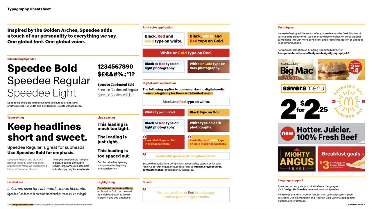
In 2018, McDonald's Corporation introduced its first custom typeface, named Speedee after the brand's original 1948 service system mascot. The typeface was developed at the London type foundry Dalton Maag, on commission from the global design agency Turner Duckworth, which had held the McDonald's global creative and strategic account since 2017. Speedee replaced Lovin' Sans, the previous standardised brand font, and became the typographic anchor of the McDonald's global visual identity system that rolled out across more than 100 markets from 2018 onward.
The typeface family launched in three weights, with a single set of custom display alternates. The letterforms were drawn from the curve of the Golden Arches mark and from the typographic register of the 1971 Needham, Harper and Steers campaign "You Deserve a Break Today." Dalton Maag and Turner Duckworth published the typeface as a single coherent system: a working text family for menus, signage, packaging and digital interfaces, and a display alternate set carrying brand-led headline applications.
The design system around the type
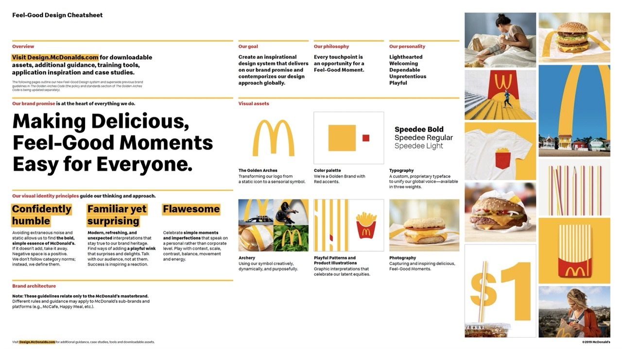
Speedee was the central typographic component of a broader rebuild of McDonald's visual identity that Turner Duckworth led from 2017. The system, internally referred to as Archery, redefined the relationship between the McDonald's wordmark, the Golden Arches symbol and the brand's photography and colour conventions. The Archery framework gave the brand permission to use the M arch as a self-sufficient asset (the cropping and fragmentation logic later seen in Cossette's Follow the Arches 2018 platform), while holding the wordmark in reserve for endorsement and master brand applications.
The system was deployed across 120 countries, more than 35,000 restaurants and a multitude of creative partner agencies working in every regional market. To make this scale workable, Turner Duckworth and McDonald's Corporation built a parallel toolkit called the McDonald's Design Hub, developed by Reach Creative. The Hub functioned as an online bank of brand assets, inspirational reference imagery and live brand-application examples. Alongside the Hub, the brand published Cheatsheets, a compact set of pages spelling out the new identity for franchise marketers and external agencies without requiring extended guideline reading.
The typographic decisions
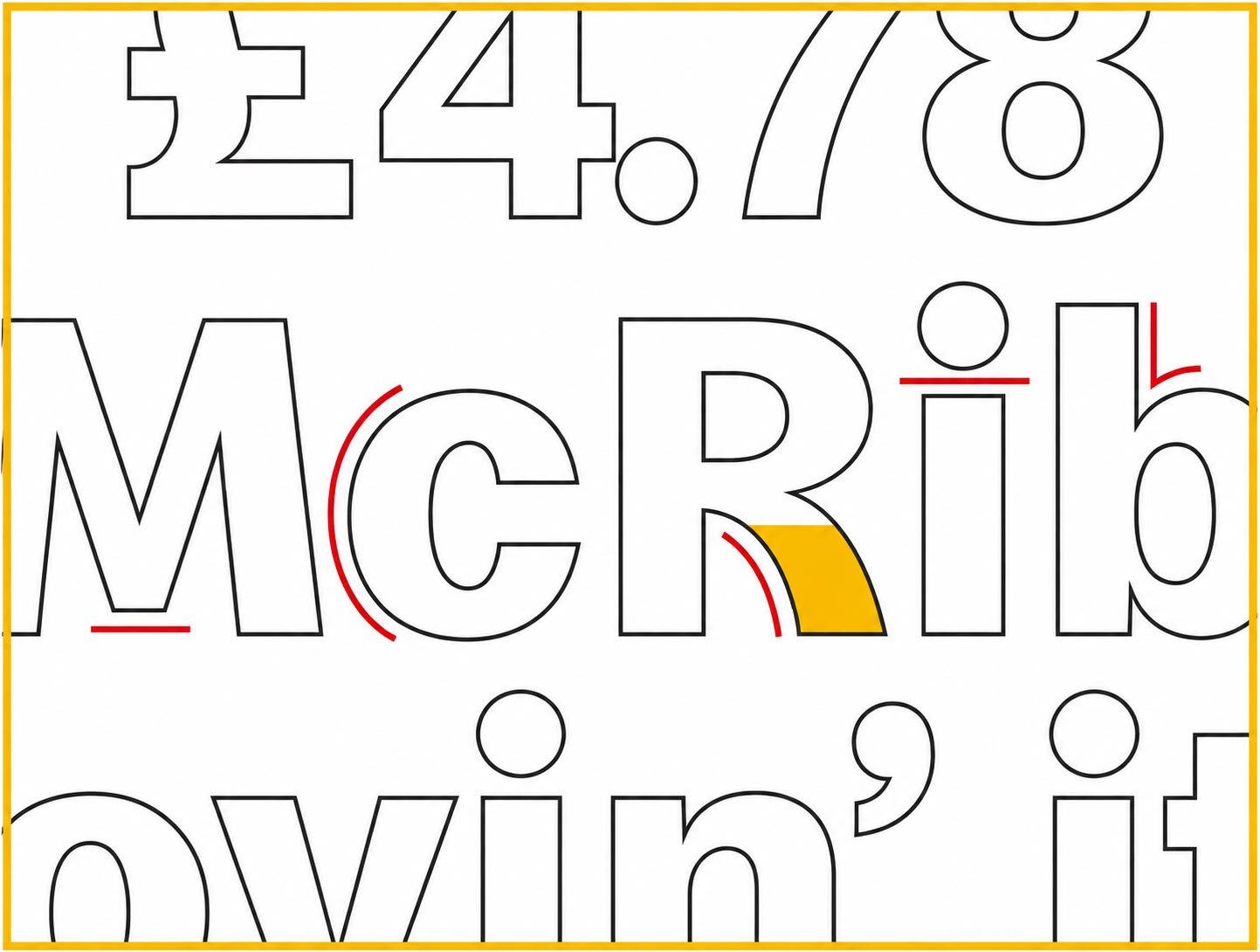
Speedee carries a small set of decisions that distinguish it from the generic sans-serif text faces used by quick-service competitors. The lowercase a is drawn with the same curve as the right arm of the Golden Arches M, with the inner counter held open at the top to echo the gap between the two arches in the mark. The lowercase e carries a similarly subtle curve at the spine. The lowercase t terminates in a straight cut at the foot, rather than in a curved exit, in order to read cleanly in small sizes on packaging and on screen.
The capital letters were drawn with a low contrast and a moderate apex height, optimised for legibility under fluorescent in-restaurant lighting and on small-format mobile screens. Dalton Maag and Turner Duckworth ran extended legibility testing across 14 languages, including Cyrillic and Greek extensions, before finalising the cuts. The family supports more than 200 languages in its final form, with diacritic systems built to McDonald's franchise-market requirements.
The transition from Lovin' Sans
McDonald's had used Lovin' Sans, a brand-customised variant of a commercial sans-serif drawn by an external foundry, since the early 2010s. Lovin' Sans had carried the brand's communications under the "i'm lovin' it" platform launched in 2003 by Heye and Partner. The typeface was workable for European market communication but did not extend cleanly to non-Latin scripts, and it carried no distinctive design relationship with the Golden Arches mark. The Turner Duckworth review of the brand identity in 2017 concluded that the brand needed a single, owned typographic asset that connected back to the visual core of the brand and could be deployed across all markets without licensing renegotiation.
The transition to Speedee was completed in stages between 2018 and 2020. New packaging deployments adopted the typeface from late 2018. In-restaurant menu boards, drive-thru signage, mobile application interfaces and the McDelivery brand system followed in 2019. National advertising executions in major markets had completed the transition by mid 2020. The brand's launch announcement carried no headline event; the typeface was integrated into the live design system without a separate brand-launch campaign.
The decision to name the typeface Speedee anchors the system in the brand's own history. Speedee the character, a winking chef with a hamburger for a head, was introduced in 1948 as the mascot of the Speedee Service System, the high-volume operational model that Dick and Mac McDonald had developed in San Bernardino. Speedee the character was retired in 1962 in favour of the Ronald McDonald clown and the simplified single Golden Arches mark. Speedee the typeface returns the name to active duty inside the brand's typographic toolkit, sixty years after its first retirement, and connects the brand's contemporary identity system to its original operational identity.
Written with AI assistance, edited by a human. Find out more about our Use of AI.