Visa
A global payments network whose brand rests on acceptance, told through Everywhere you want to be, the Olympic Games and its sound, motion and haptic cues.
- Founded
- 1958
- Industry
- Financial Services
- Headquarters
- USA
- Ownership
- Public company
Key Facts
“Everywhere you want to be”


Lead courageously; Obsess about customers; Collaborate as one Visa; Execute with excellence
Visa, "Visa Leadership Principles" (corporate site)Our purpose is to uplift everyone, everywhere by being the best way to pay and be paid.
Visa, About Visa, "What we do" (corporate site)Our mission is to connect the world through the most innovative, convenient, reliable and secure payments network, enabling individuals, businesses and economies to thrive.
Visa, "Visa Fact Sheet" (corporate site)Brand Chronology
Visa redraws its identity for the small screen
2026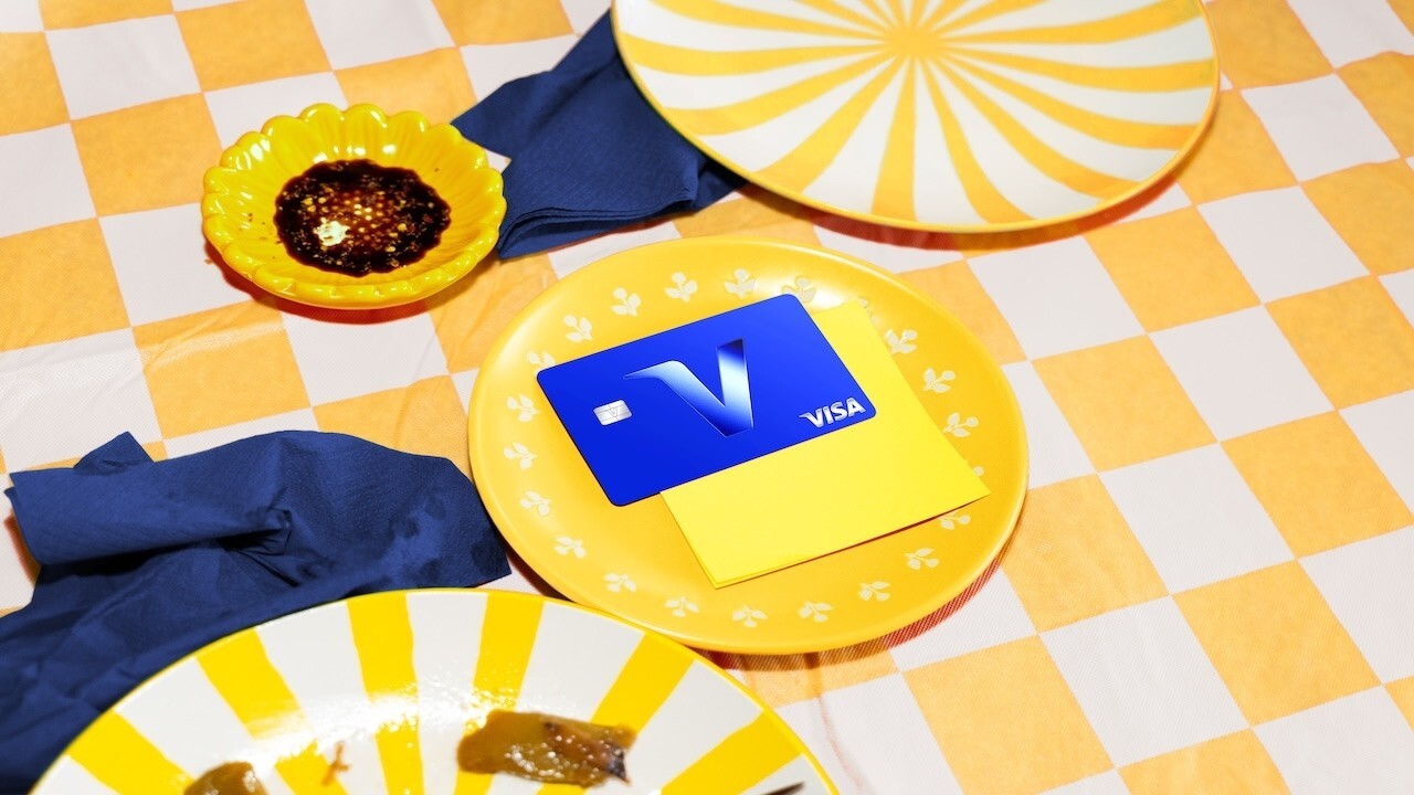
Visa and Jason Sudeikis tap in for the World Cup
2026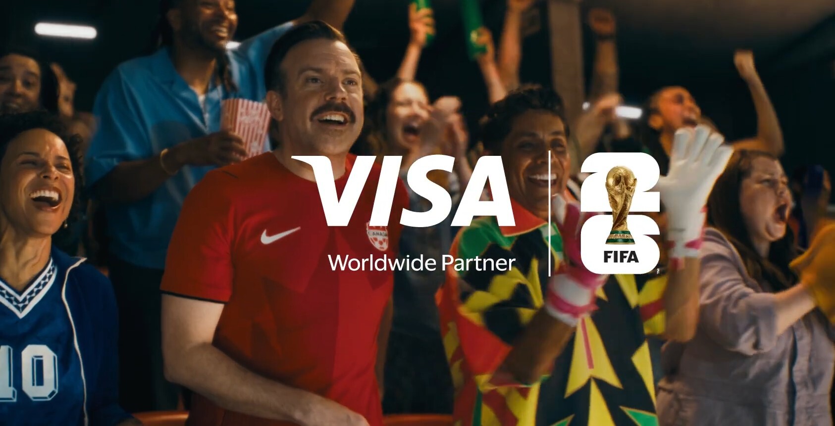
A million wait for Trade Republic's mirror card
2024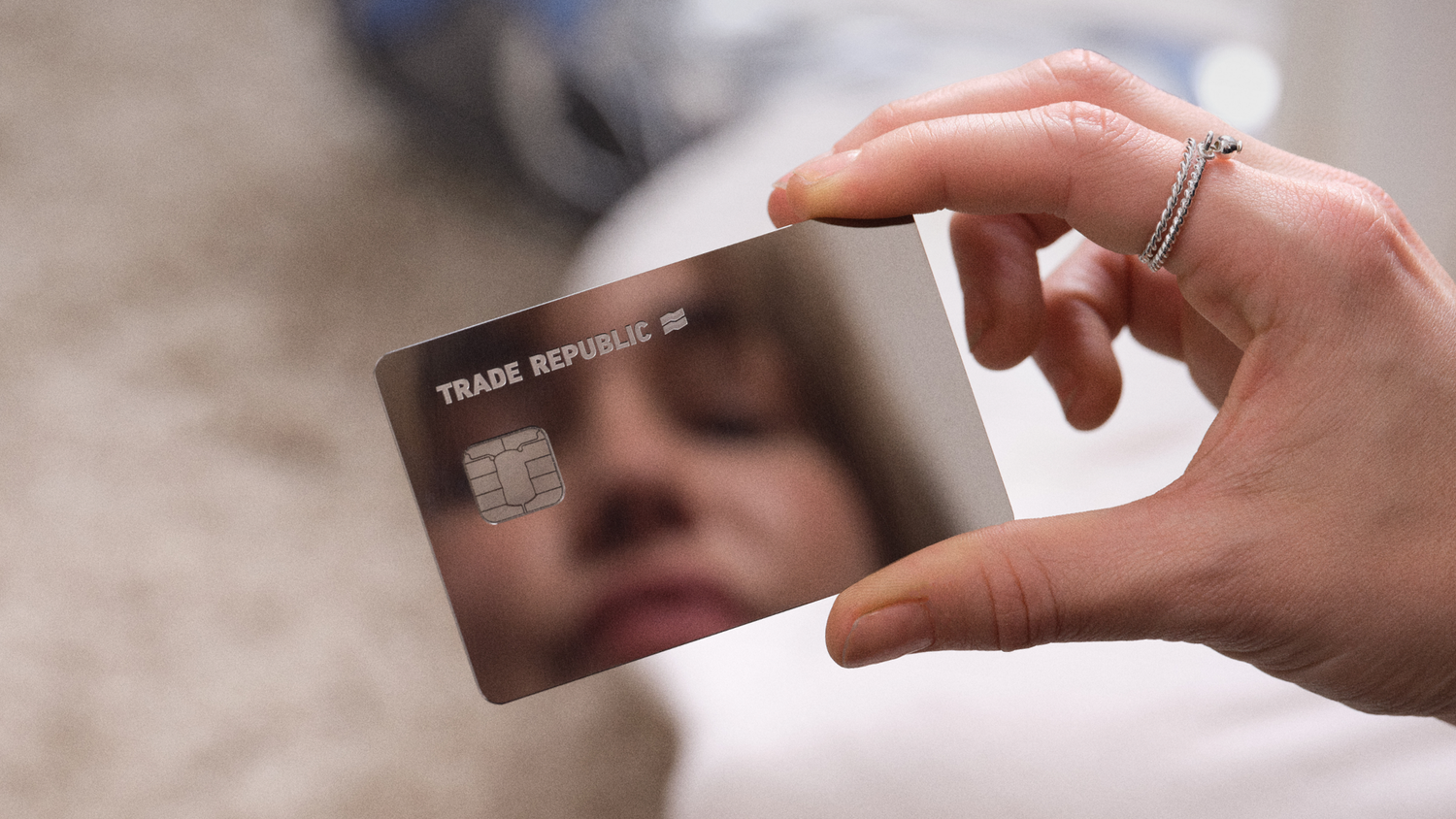

Ryan McInerney
becomes CEO, succeeding Alfred Kelly
Visa redesigns its brand to be more than a card
2021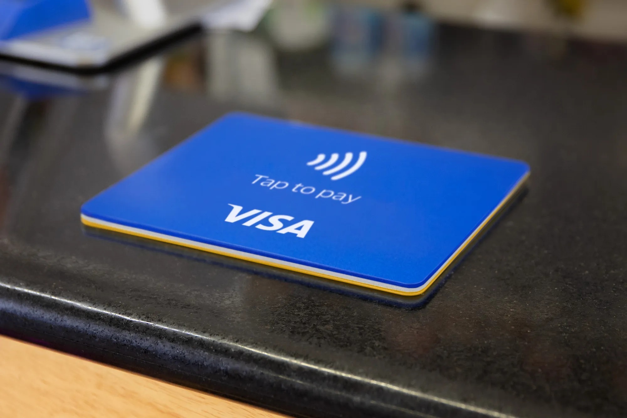
Logo-Redesign
2021
Working with design studio Mucho and agency Wieden+Kennedy, Visa drops the gradient for a solid, brighter blue and a custom typeface. The familiar italic wordmark stays, but it is rebuilt for a digital-first world of apps, wallets and tap-to-pay rather than the plastic card, giving the brand a flexible system across every screen.
Visa takes its payment sound to 25 countries
2019

Alfred F. Kelly Jr.
becomes CEO, succeeding Charlie Scharf
Visa brings back Everywhere you want to be
2014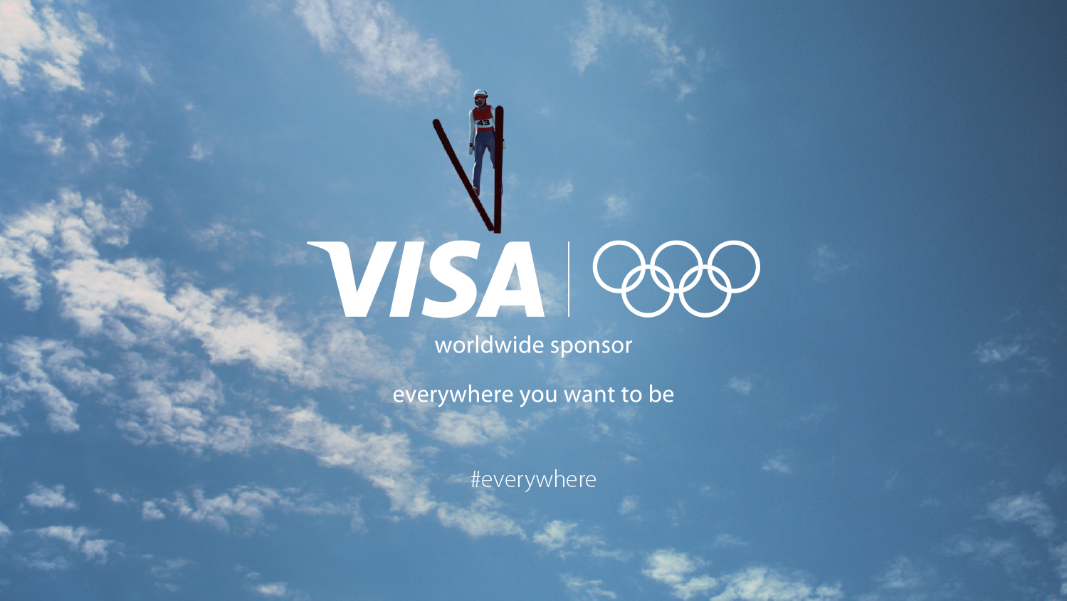
Logo-Redesign
2014
Visa retires the gold entirely. The wordmark moves to a single blue, finished with a subtle gradient, and the mark is pared back to the brand's most essential asset — the name itself — so it reads cleanly on screens as well as cards.

Charles W. Scharf
becomes CEO, succeeding Joseph Saunders
Morgan Freeman becomes the voice of Visa
2008
Joseph W. Saunders
becomes the first CEO of Visa Inc
Visa replaces its 20-year slogan with Life takes Visa
2006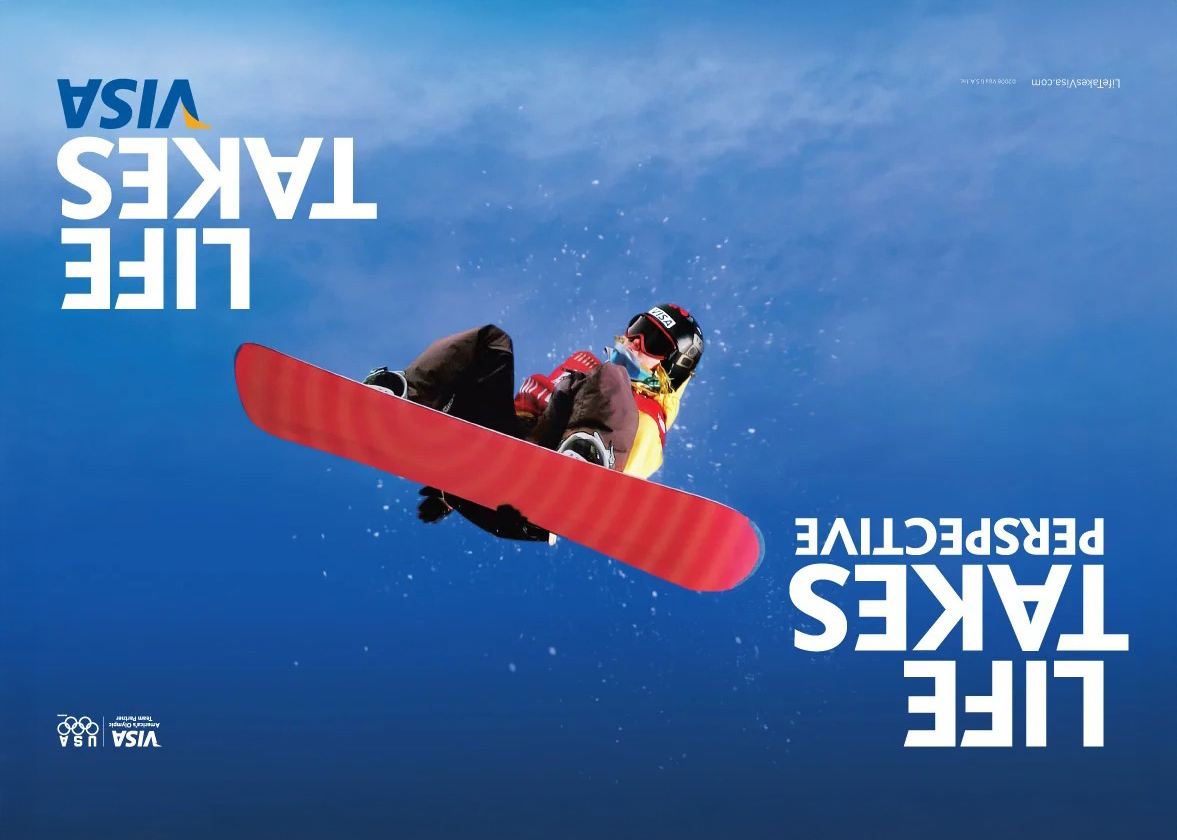
Logo-Redesign
2006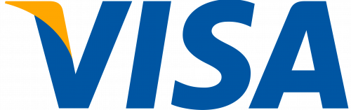
Visa makes its biggest break yet, dropping the card-shaped frame and the colour bands to leave only the italic Visa wordmark. A gold flash on the tip of the V keeps a trace of the old palette. Freed from the rectangle, the logo becomes far more flexible across digital and physical surfaces.
Logo-Redesign
2000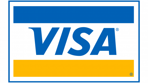
The wordmark is refined again, with more open letter spacing and a gentler slant on the V. The adjustments modernise the type while preserving the banded card that cardholders and merchants had recognised for decades.
Logo-Redesign
1992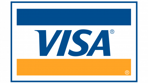
Visa refreshes the mark for a more vivid look: the palette is brightened, the frame's rounded corners are squared off, and the blue band is widened. The changes stay incremental, keeping the three-band structure intact while making the logo read more cleanly at card and terminal scale.
Visa becomes the only card at the Olympic Games
1986
Visa promises it's everywhere you want to be
1985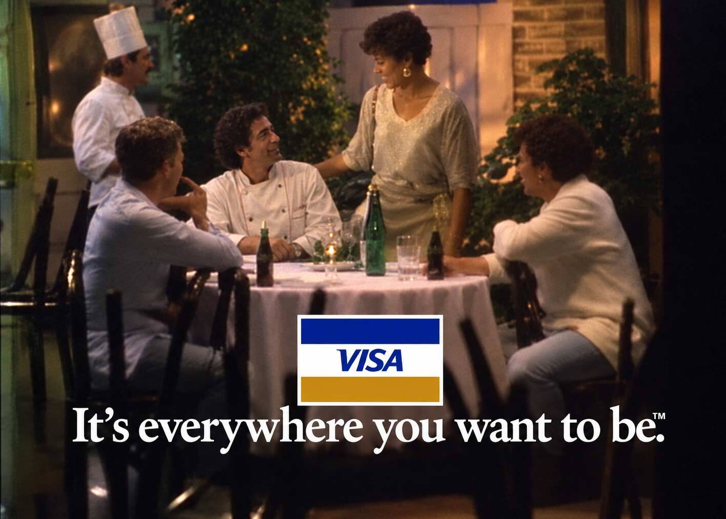
BankAmericard takes the name Visa worldwide
1976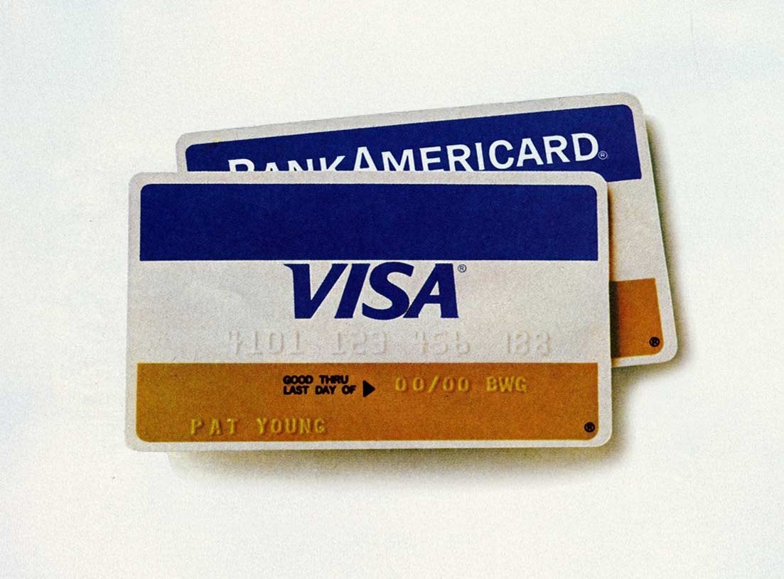
Logo-Redesign
1976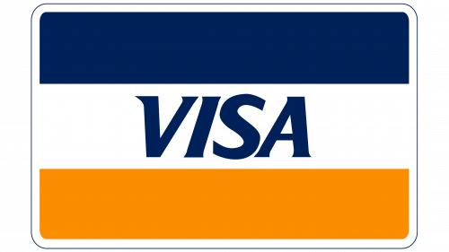
BankAmericard is renamed Visa to give the growing international network a single, language-neutral name. The card keeps the familiar blue-white-gold bands and card shape, but the wordmark becomes an italic Visa with a slanted, serif-tipped V, carrying the equity of the old mark into the new name without resetting its recognition.
Visa starts with 60,000 cards mailed to Fresno
1958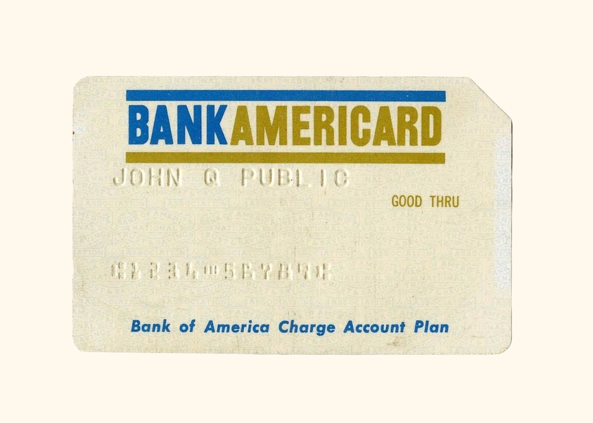
Logo-Redesign
1958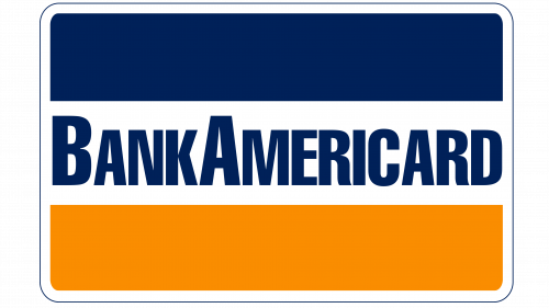
Bank of America launches BankAmericard in Fresno, California, on a card-shaped emblem with rounded corners and horizontal bands of blue, white and gold. The name sits in bold uppercase, the B and A raised slightly above the other letters. These three colours — later read as sky, a snow-capped peak and a field of gold — become the brand's visual foundation for the next half-century.