A card company that wants to be read as a network
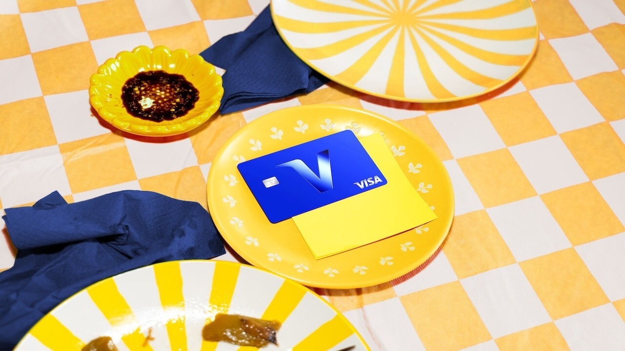
On 21 July 2021, Visa presents the first phase of what it calls a multi-year brand evolution. It opens with a global campaign, "Meet Visa", by Wieden+Kennedy, and previews a visual identity developed with the brand design firm Mucho: refreshed colours for digital use, a custom typeface and an updated brand symbol meant to express the purpose behind the organisation.1 Over the course of 2021, the release says, the identity is to become visible in all 200+ countries and territories where Visa operates.1
The release states the aim in one line. "We are on a mission to ensure that Visa is seen as more than a credit card company," says Lynne Biggar, Executive Vice President and Global Chief Marketing Officer.1 Visa wants to be understood as a trusted global network that moves money and widens economic access.1 Mucho's brief put it in design terms: reposition Visa as the network that moves a transaction from point A to point B, whether a payment between friends, a remittance across a border or a real-time payout to a gig worker.2 The complete identity system follows in January 2022.3
The mark stays, the card comes off it
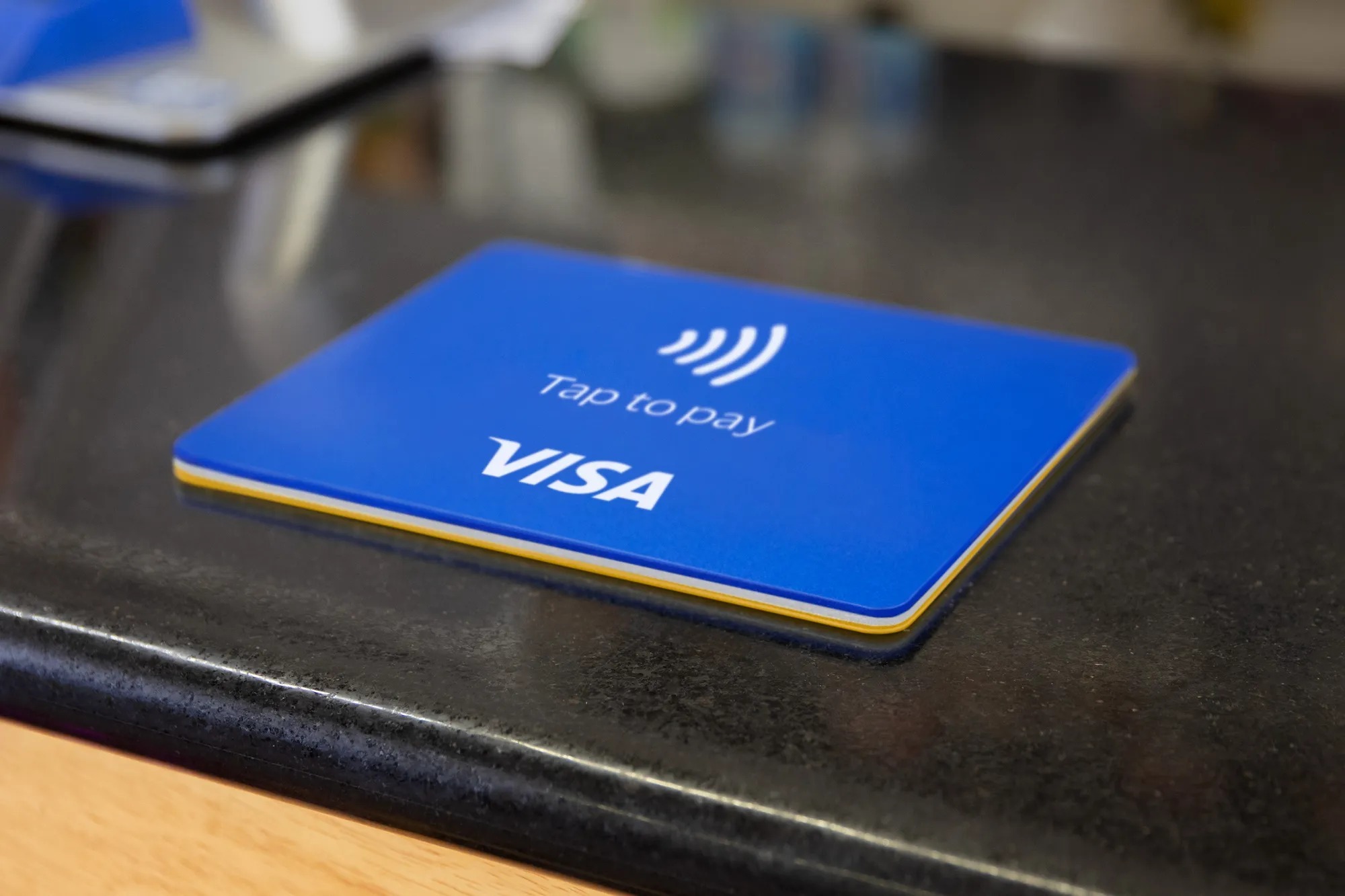
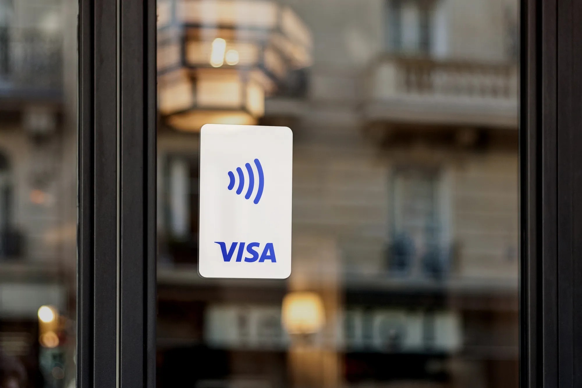
The primary brand mark keeps its shape. Only its colour changes, to a brighter blue meant to hold up on small mobile screens.2 The larger change sits next to it. For nearly three decades the wordmark had sat inside the blue, white and gold bands that Visa kept when BankAmericard took the Visa name in 1976, until a 2005 redesign removed the stripes.5 According to Rob Duncan, Creative Director at Mucho, that Acceptance Mark, "although highly recognisable, wasn't working at point of sale, especially within digital scenarios."4
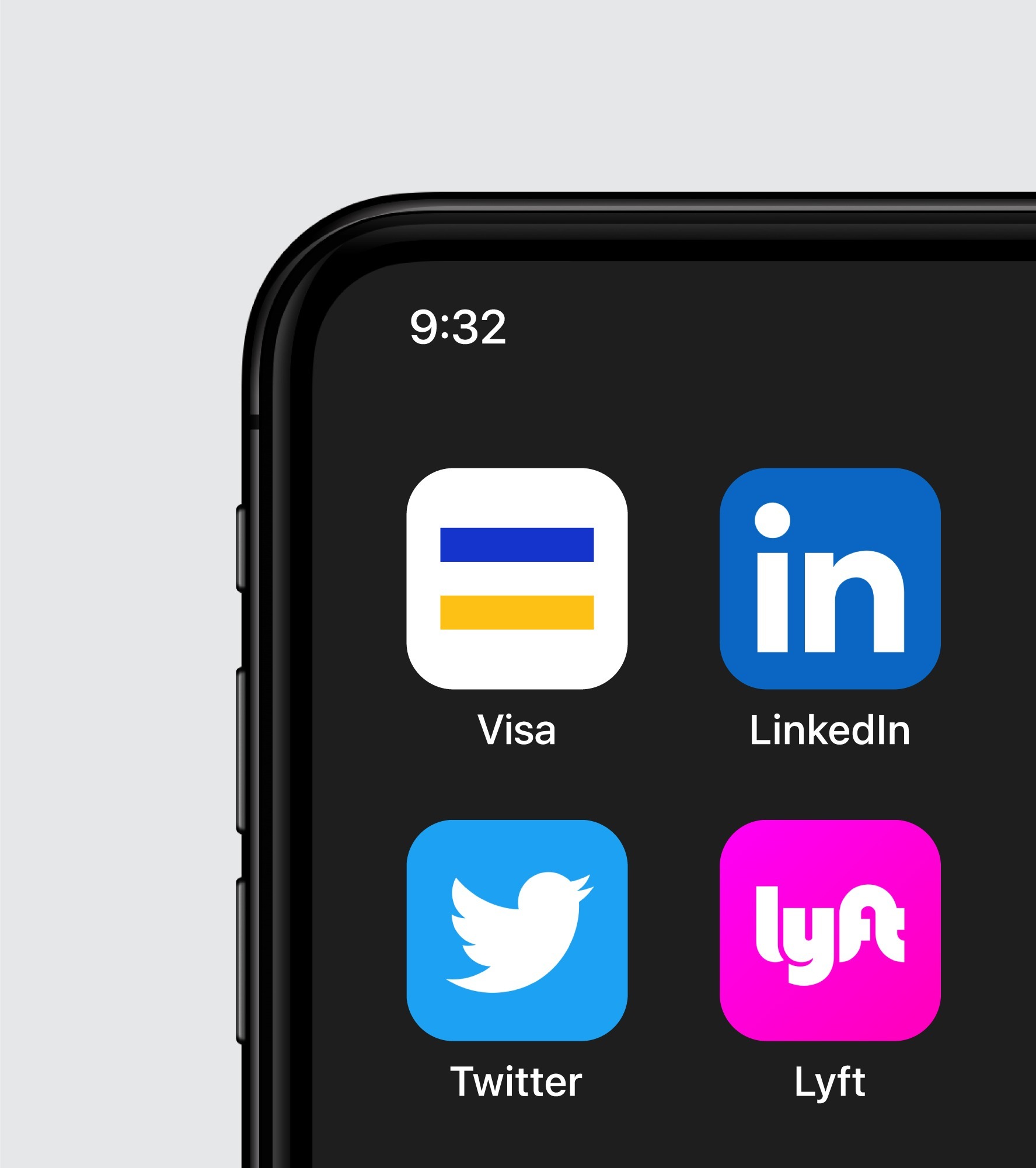
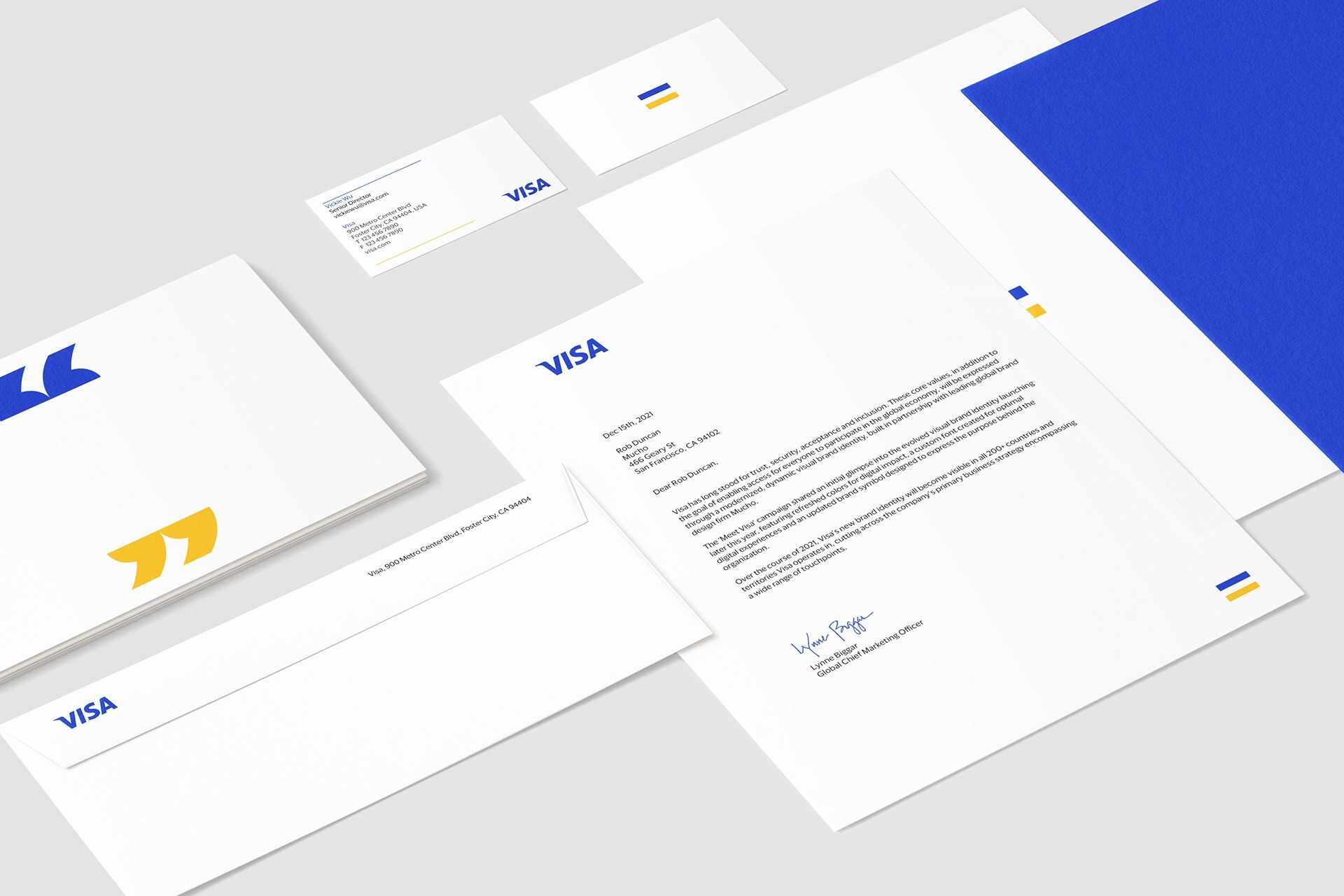
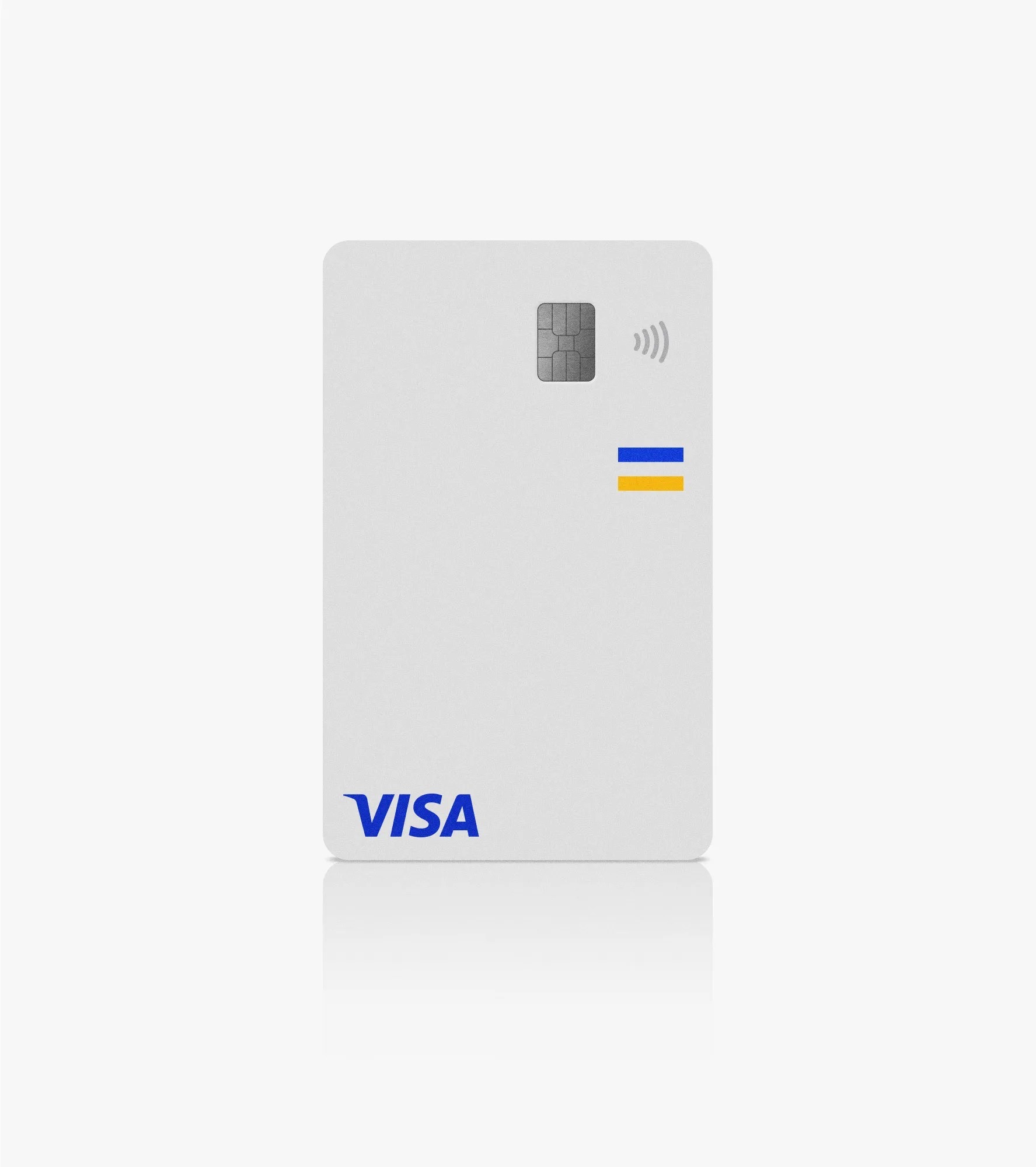
Mucho separates the two. With the wordmark taken out of the bars, what remains reads as an equals sign.3,4 Wordmark and tricolour symbol now work as separate assets, and Visa assigns the three colours the meanings of access, equality and inclusion.6 The bands were once the flag on the face of a card. As a free symbol they no longer describe a piece of plastic. They describe a principle the network claims for itself.
A purpose written before it was drawn
The symbol rests on a strategy document. Over 200 hours of conversation with stakeholders across several markets produced a Brand Blueprint and a mission statement: "We believe that economies that include everyone everywhere, uplift everyone everywhere."2 Mucho describes the symbol as the carrier of that sentence and of the equity Visa has built at the point of sale over more than 60 years.2 "A core part of the new identity was honoring the Visa visual heritage," Duncan says, and the symbol "champions their values of access and equality".2
On the client side, Freddie Covington, credited by Mucho as SVP, Chief Brand at Visa, names the same goal: "We wanted to evoke a sense of access and our belief in economic inclusion", and to show that Visa is "so much more than a credit card company."2 Heritage and purpose arrive in one shape. The brand does not have to drop what people recognise in order to say something new about itself.


A system built in thirds
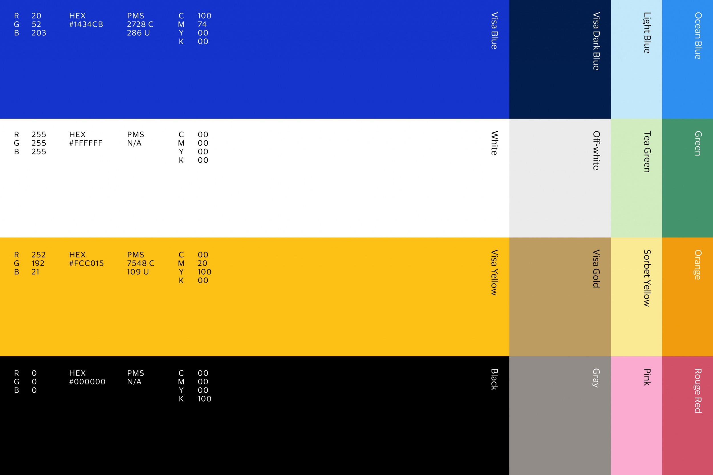
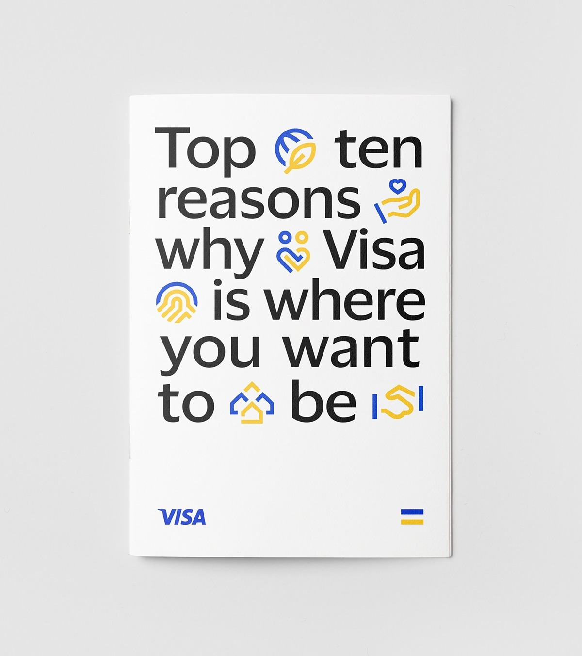
From the symbol's proportions Mucho derives a simple rule of thirds, a grid meant to flex across any canvas.2,7 Six design principles guide the teams and agencies rolling the brand out; one of them is "include everyone everywhere".7 Colour becomes a one-colour system built on blue, white and yellow, with a secondary palette for different audiences and initiatives.2
Type carries the global claim. Visa commissions Commercial Type to draw Visa Dialect, a custom humanist sans for multiple languages, with low stroke contrast, loose spacing and open counters for legibility at small sizes.2 The colour ratio of the symbol extends into a modular icon system that scales into illustration. Photography centres on customers, combining the cutout portraits of the "Meet Visa" campaign with full-bleed editorial images, and sponsorship work such as the NFL applications sets Visa Dialect large and cropped against photography.2 Motion assets made with the studio Field.io extend the system into business communication.3 Each of these elements lets the brand appear where no card is shown: on an app icon, in a sponsorship, in a presentation to a bank.
From an object to an infrastructure
It's Nice That describes the project as Visa's first facelift since 2014,4 when the company revived "Everywhere you want to be" with a refreshed logo in a solid blue gradient.5 That earlier change concerned the mark. This one moves the weight from the mark to a system, and from the card to what Mucho calls infrastructure that moves a payment from point A to point B.4
For the brand, the gain is a vocabulary that does not depend on plastic. A symbol of equality, a grid derived from it and a typeface for many languages can speak to a remittance customer, a fintech partner or a government in the same voice. It also sets a measure. An identity built on economic inclusion invites the brand to be read against that promise, and every application now carries the claim along with the four letters.
Written with AI assistance, edited by a human. Find out more about our Use of AI.
1. Visa, "Meet Visa: Reintroducing the Iconic Visa Brand to Everyone, Everywhere", press release, 21 July 2021, read 18 October 2026, for the first phase of a multi-year brand evolution, the Meet Visa campaign by Wieden+Kennedy, the identity with brand design firm Mucho, refreshed colours, custom font and updated brand symbol, the rollout to 200+ countries and territories over 2021, the positioning as a trusted network for money movement and economic access, and the quotation from Lynne Biggar, Executive Vice President and Global Chief Marketing Officer, Visa. https://usa.visa.com/about-visa/newsroom/press-releases.releaseId.18156.html
2. Mucho, "Visa", case study, undated, read 18 October 2026, for the brief (point A to point B, person-to-person payments, cross-border remittances, real-time payments for gig workers), the unchanged mark with brighter colour, over 200 hours of stakeholder conversations, the Brand Blueprint and mission statement, the symbol's link to 60+ years of point-of-sale heritage, the thirds-based grid, the one-colour system and secondary palette, Visa Dialect by Commercial Type, icons, photography, NFL sponsorship applications, and the quotations from Rob Duncan, Creative Director, Mucho, and Freddie Covington, SVP, Chief Brand at Visa. https://wearemucho.com/work/visa
3. Creative Review, "Visa launches new brand identity system", 14 January 2022, read 18 October 2026, for the full identity system launched in January 2022 after early stages the previous summer, the equals-sign symbol extracted from the bars used in the Visa logo lock-up before 2005, and the B2B motion assets made with Field.io. https://www.creativereview.co.uk/visa-brand-identity-system/
4. Liz Gorny, It's Nice That, "Mucho rebrands Visa with simplified two-bar symbol", 14 January 2022, read 18 October 2026, for the launch of the full identity, the first facelift since 2014, the equals symbol created by separating the brand mark from the bars, the infrastructure that moves a payment from point A to point B, and the quotation from Rob Duncan on the Acceptance Mark. https://www.itsnicethat.com/news/mucho-visa-rebrand-graphic-design-140122
5. Wikipedia, "Visa Inc.", read 18 October 2026, for the blue, white and gold flag retained at the 1976 renaming, the removal of the horizontal stripes in 2005, and the solid blue gradient logo of 2014. https://en.wikipedia.org/wiki/Visa_Inc.
6. Design Week, "Visa undergoes brand refresh as company looks to cashless future", July 2021, read 18 October 2026, for the wordmark and tricolour brand symbol as separate assets and the three symbol colours representing access, equality and inclusion. https://www.designweek.co.uk/issues/19-25-july-2021/visa-brand-refresh-mucho
7. Design Week, "Visa unveils new brand identity system following logo reveal", January 2022, read 18 October 2026, for the six design principles including "include everyone everywhere" and the rule of thirds derived from the symbol. https://www.designweek.co.uk/issues/10-16-january-2022/visa-new-brand-identity-system