A brand drawn for the phone
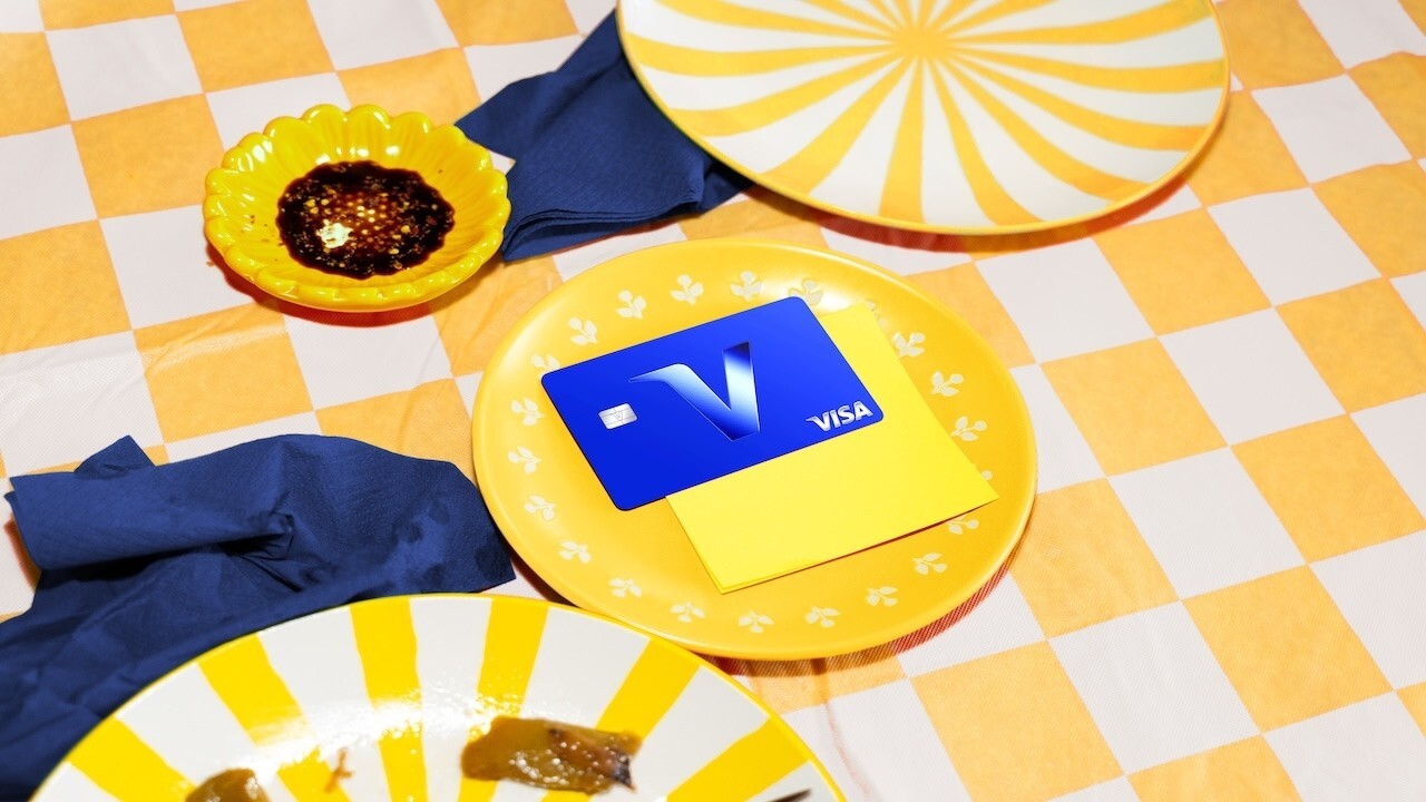
On 21 October 2026, Visa begins to let a single letter stand in for its name. From that day a "V" appears on some credit cards and on the company's digital properties, Visa told Business Insider in an exclusive report.1 According to the report, the change is meant to stand out more on small screens as people conduct more of their lives on mobile devices.1 The same day Visa published a 58-second film, "Introducing the Next Chapter of the Visa Brand", on its YouTube channel.2
The film's description sums up the brief in one sentence: "As commerce continues to evolve, Visa is refreshing its Brand Identity to remain familiar, relevant and trusted."2 The refreshed identity, it continues, "brings greater flexibility and consistency to every experience, while staying unmistakably Visa."2
What changes and what stays
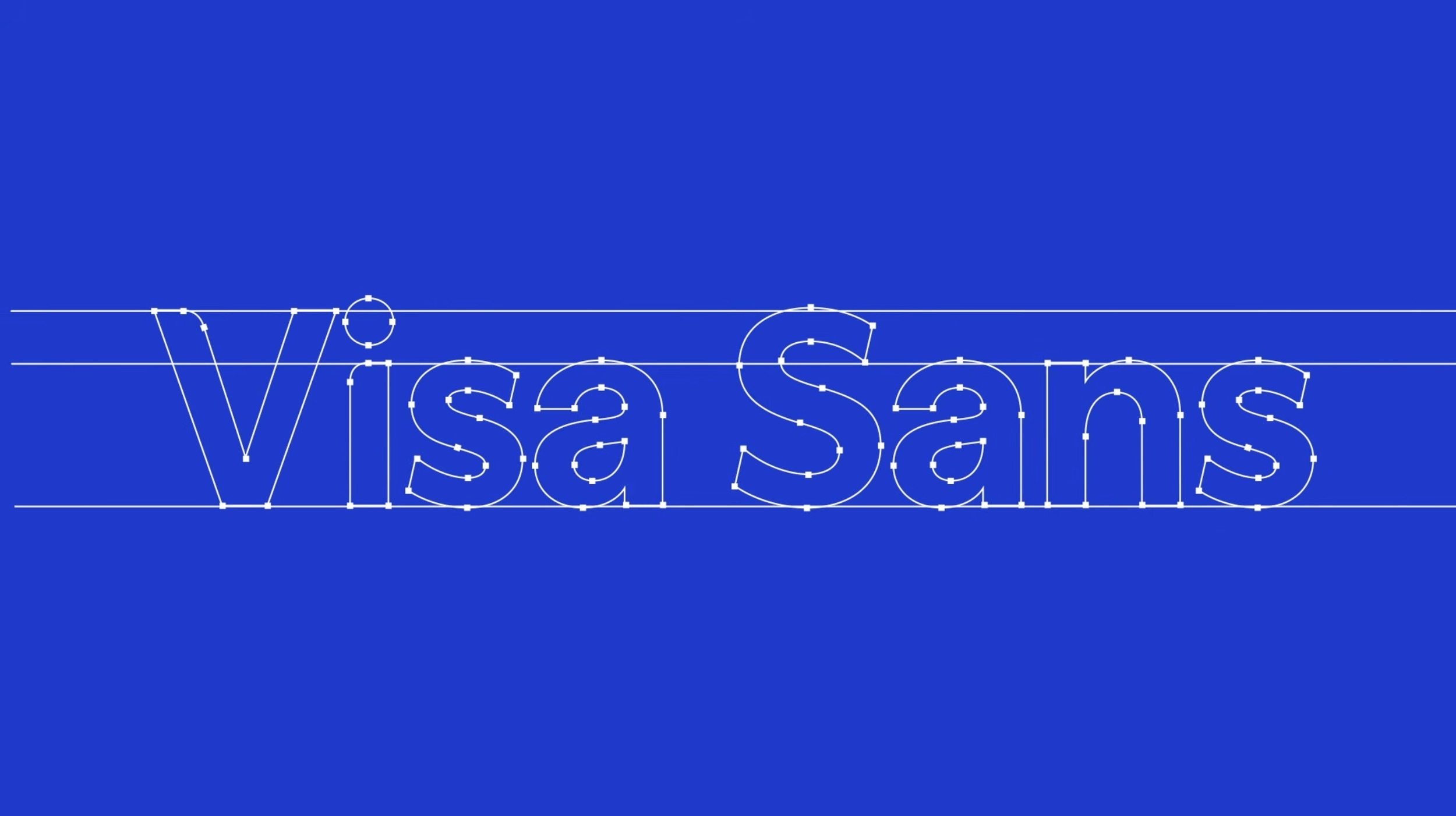
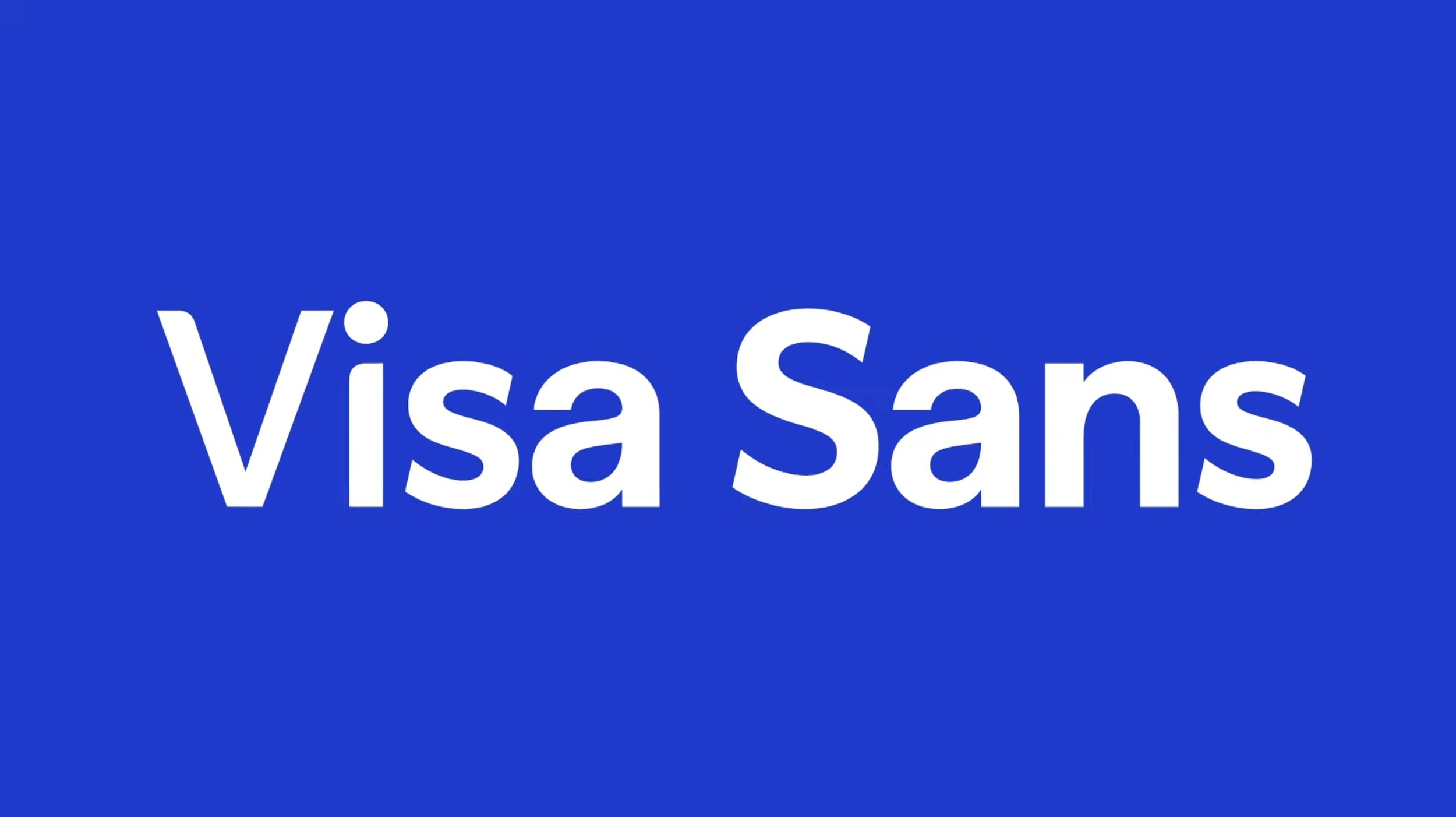
The Visa name and the wordmark do not change.1 Two elements are new. The first is the "V" itself, which can now represent the brand on its own.1 The second is a typeface called Visa Sans, which, in Business Insider's description, drops the serif on the first letter of "Visa".1 One element leaves: the blue, white and yellow, flag-like brand symbol introduced in 2021 goes away with the arrival of the "V".1 The work was developed by Visa's in-house creative studio together with Base Design, and Frank Cooper III, Chief Marketing Officer of Visa, says the process took about a year.1
The 2021 identity had already been shaped by digital use. When Visa presented the first phase of that brand evolution on 21 July 2021, it announced refreshed colours for digital use, a custom typeface and an updated brand symbol.3 Mucho, the design firm behind it, kept the primary mark and changed only its colour, to a brighter blue meant to hold up on small mobile screens.4 Where the 2021 work adjusted the colour of the mark for the phone, the 2026 refresh adds a sign compact enough to carry the brand at the size of an icon.1
A kit of parts
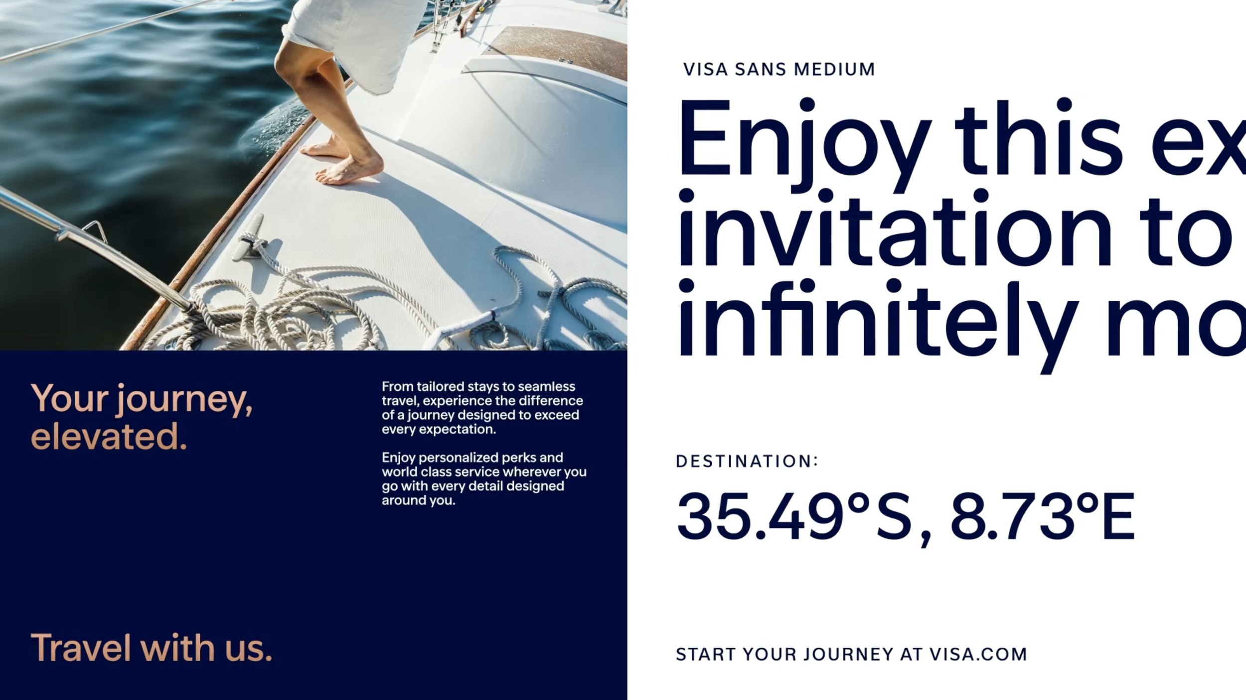
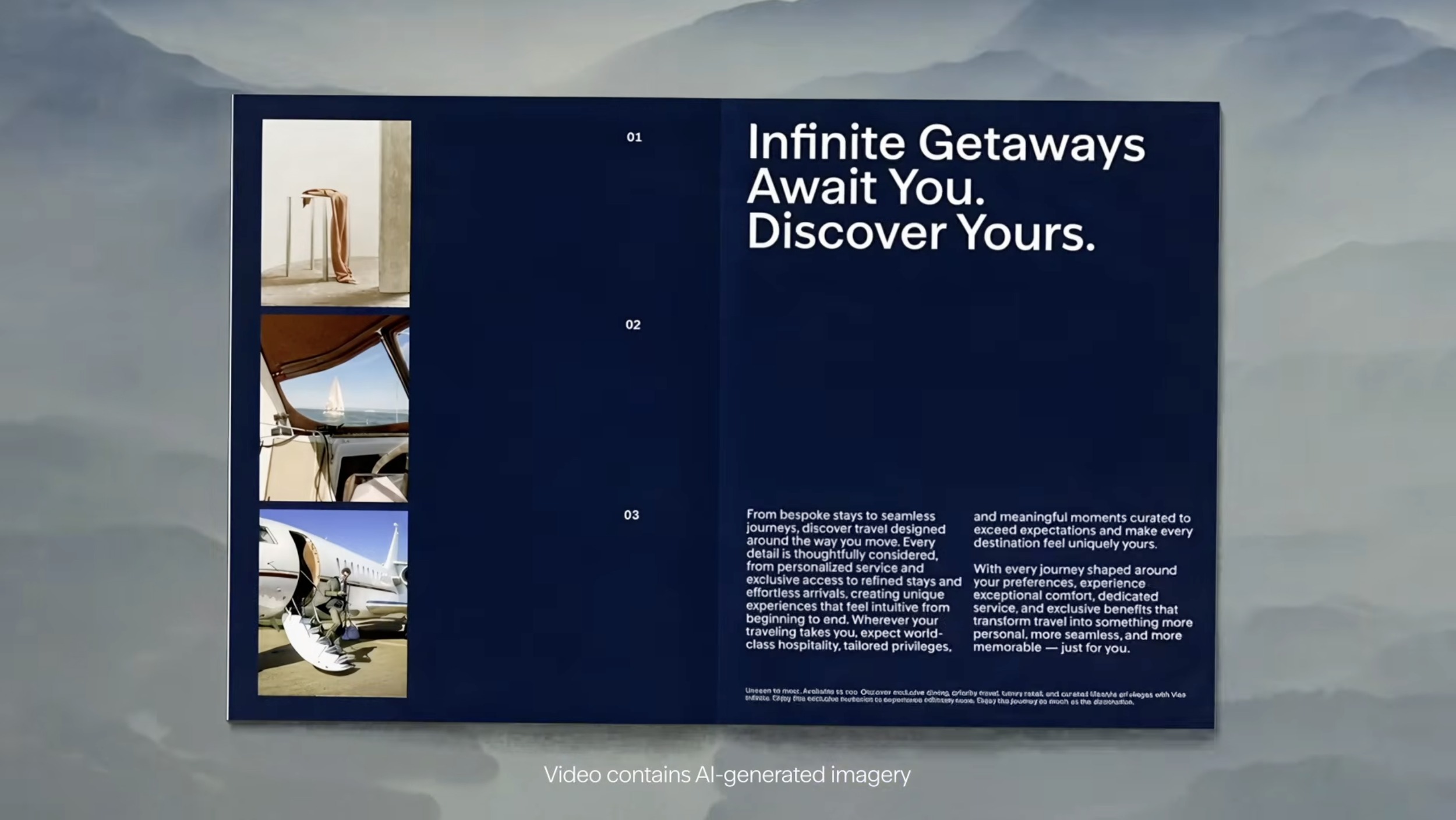
The film presents the refresh as a set of components. It opens on the line "An icon is never finished", moves through "And as commerce evolved, so did Visa" to "And now, a refreshed visual identity", and then sets the words Visa Sans in large type on blue.2 A grid of pictograms follows. The wordmark then appears on a blue band laid across photographs, in phone-sized social layouts, beside a coordinates line for Cape Town and on a dark card that carries the "V".2 A repeating Visa pattern and the line "Everywhere you want to be", running as a ticker, lead to the closing card: "The next chapter of an icon."2
The same logic of reusable parts already runs through Visa's digital products. In April 2025 the company opened its Visa Product Design System to outside developers, designers and partners, including fintechs and banks, for the first time.5 Built internally in 2018, it offers accessibility-tested components and patterns, design tokens that store colours, typography and spacing for Figma and code, and support for Angular, Flutter, React and HTML/CSS.5 Robb Nielsen, Global Head of Design at Visa, called the resource "both a toolkit and a trust signal."5
Source: Visa Youtube
From name to letter
Business Insider reads the step as a statement of recognition: after 50 years of using the name, Visa feels it is known well enough to be represented by one letter.1 Cooper frames it as a matter of trust rather than reach. "We do not have an awareness issue. We have deep trust. Playing around with the brand positioning is no light matter," he told the publication.1 The aim, he says, was to "make it feel fresh, particularly for the next generation of consumers."1
The report places the move among brands that rely on symbols for visibility on small screens. Mastercard dropped its name from its logo in 2019, and Google introduced a sans-serif logo with a four-colour "G" icon in 2015.1 Dan Nicholas, design director at the creative studio Super Okay, compares the single V with the one-letter icons of Verizon and The New York Times, and notes that the simplification could also weaken recognition.1 "What remains to be seen in the rollout is how Visa manages this new equity," he says. If it is executed and invested in over the next few years, he adds, the mark could become "a strong way for the brand to express itself."1
The screen and the slogan
Visa sees the visual changes as a companion to its effort to connect the brand with culture and aspiration, from the "Power of Small Steps" campaign with Pharrell Williams to a FIFA World Cup partnership that runs through 2030.1 This year's World Cup campaign promoted contactless payment to show that the long-running line "Everywhere you want to be" means more than a physical destination.1 "We see that phrase now as representing both a physical destination and a personal aspiration," Cooper says.1 For now the "V" starts on selected cards and on Visa's own digital properties.1
Written with AI assistance, edited by a human. Find out more about our Use of AI.
1. Lucia Moses, Business Insider, "Visa's CMO is giving the brand a new look and betting that less is more", 21 October 2026, read 22 October 2026, for the "V" on some credit cards and digital properties from 21 October 2026, the aim to stand out on small mobile screens, the 50 years of the name, the Visa Sans typeface without the serif on the first letter, the unchanged name and wordmark, the in-house creative studio and Base Design, the retirement of the 2021 flag-like symbol, the one-year process, the Mastercard 2019 and Google 2015 comparisons, the Power of Small Steps campaign with Pharrell Williams, the FIFA World Cup partnership through 2030 and this year's contactless World Cup campaign, and the quotations from Frank Cooper III, Chief Marketing Officer, Visa, and Dan Nicholas, Design Director, Super Okay. https://www.businessinsider.com/visa-is-giving-bank-pared-down-look-for-mobile-2026-10
2. Visa, "Introducing the Next Chapter of the Visa Brand", YouTube, 21 October 2026, 58 seconds, viewed 22 October 2026, for the video description quoted, the on-screen lines, the Visa Sans title card, the pictogram grid, the blue band, the card with the "V", the pattern and the "Everywhere you want to be" ticker. https://www.youtube.com/watch?v=skT_VgxCHs0
3. Visa, "Meet Visa: Reintroducing the Iconic Visa Brand to Everyone, Everywhere", press release, 21 July 2021, read 18 October 2026, for the first phase of the 2021 brand evolution with refreshed colours for digital use, a custom typeface and an updated brand symbol. https://usa.visa.com/about-visa/newsroom/press-releases.releaseId.18156.html
4. Mucho, "Visa", case study, undated, read 18 October 2026, for the unchanged 2021 mark recoloured in a brighter blue for small mobile screens. https://wearemucho.com/work/visa
5. Robb Nielsen, Visa Perspectives, "Visa's design system: Build better payments experiences", 23 April 2025, read 22 October 2026, for the public opening of the Visa Product Design System, its internal start in 2018, its components, patterns, design tokens and supported platforms, and the quotation from Robb Nielsen, Global Head of Design, Visa. https://corporate.visa.com/en/sites/visa-perspectives/company-news/visa-design-system-build-better-payments-experiences.html