Ferrari
Italian luxury sports car manufacturer building exclusive, performance-focused vehicles in Maranello, anchored in Formula 1 heritage and a defined annual production ceiling.
- Founded
- 1939
- Industry
- Automotive · Luxury
- Headquarters
- Italy
- Ownership
- Public company
Key Facts

Individual & Team. Tradition & Innovation. Passion & Achievement.
FerrariPositioning
Brand Chronology
Ferrari presents Luce, its first electric car, designed with Jony Ive
2026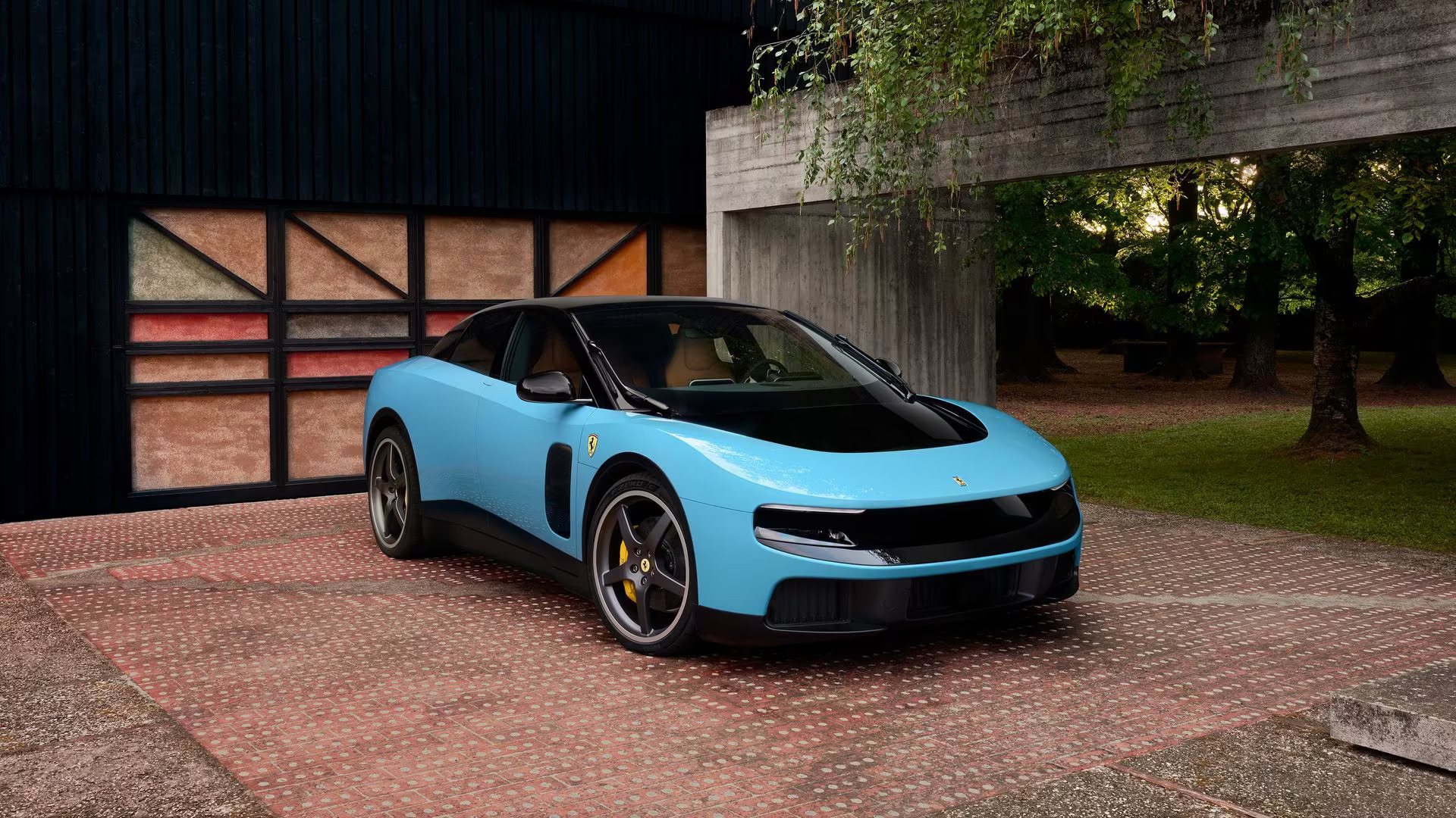
Ferrari names its F1 team Scuderia Ferrari HP
2024
Ferrari Purosangue and the refusal to say SUV
2022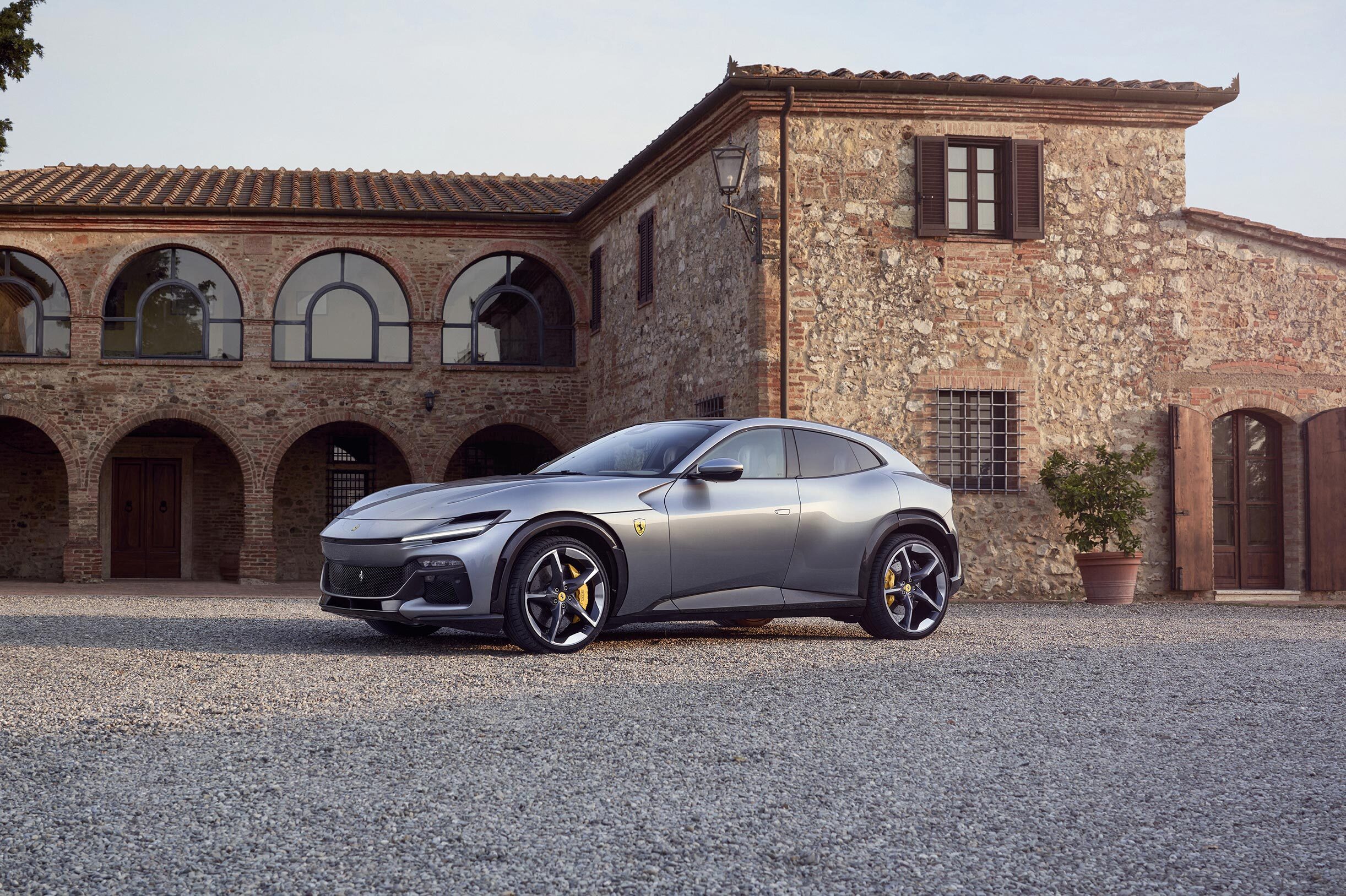
Ferrari steps into fashion with Rocco Iannone
2021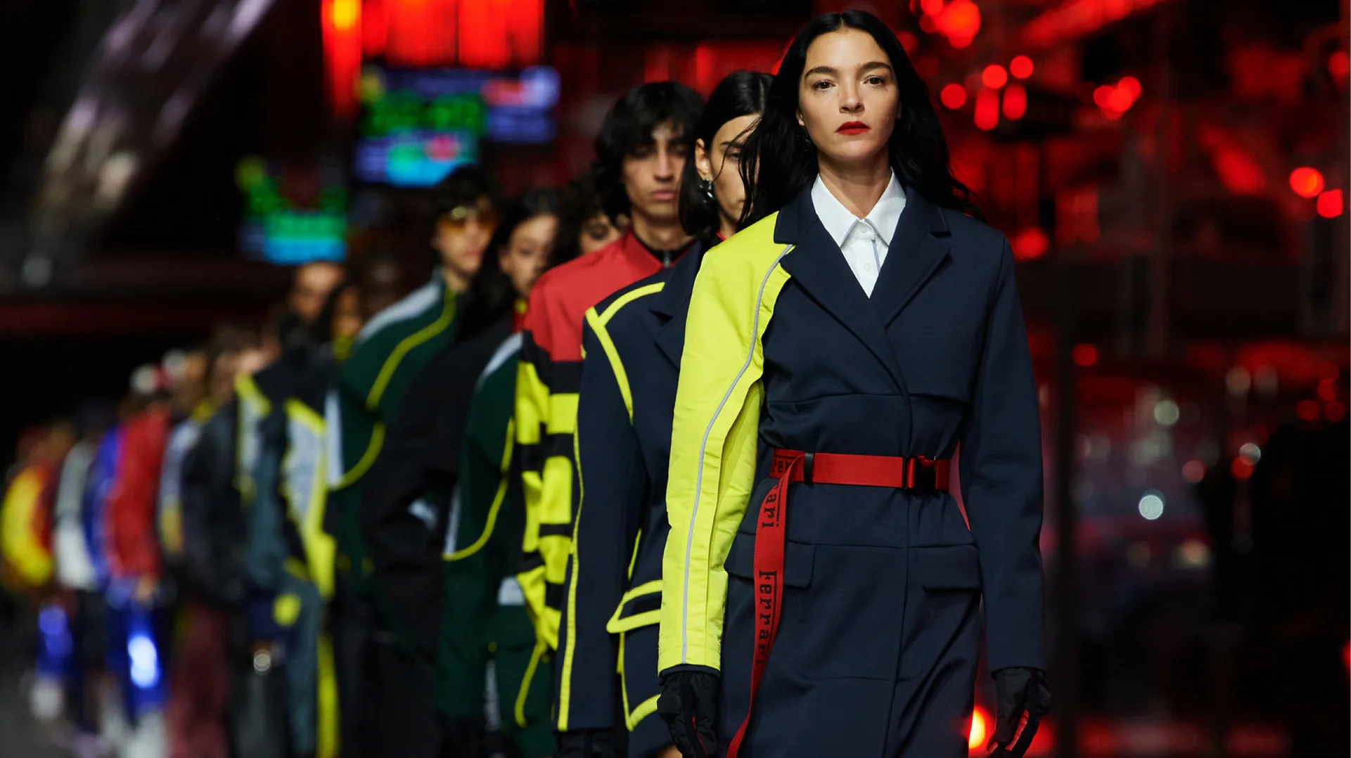
Scuderia Ferrari - Logo Redesign
2018
Beginning in 2018, Scuderia Ferrari returned to a classic version of its emblem. The logo once again featured the traditional shield with the prancing horse at its center, flanked by the initials “S” and “F.”
The black Ferrari wordmark was retained outside the shield, while the tricolor element representing the Italian flag was redesigned in a triangular form. This update reinforced the team’s heritage while preserving the iconic visual identity associated with Ferrari.
Ferrari, scarcity and the most powerful brand
2014
Ferrari World and the licensed theme park
2010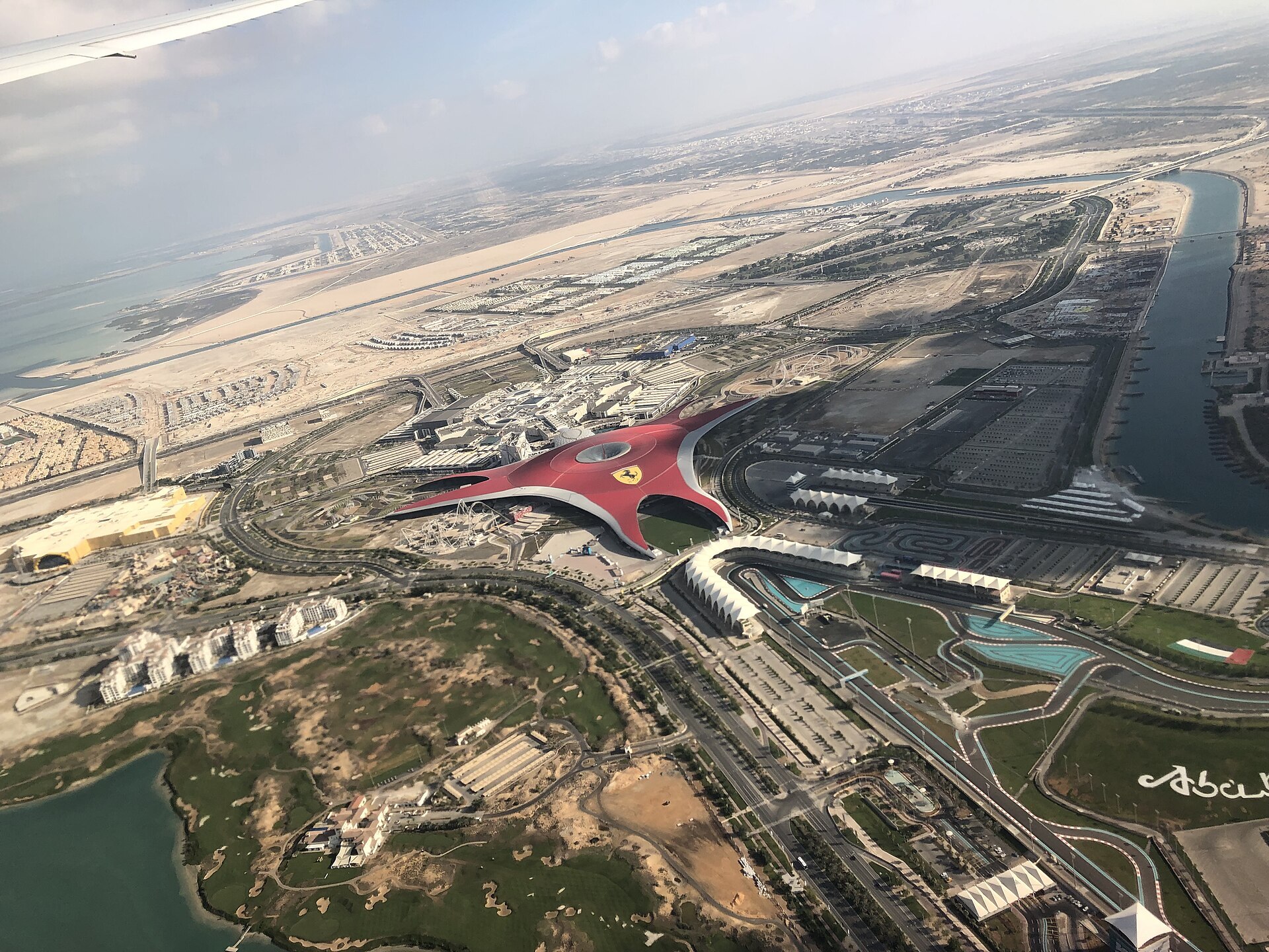
Logo Redesign
2002
This period marked one of the most significant redesigns in the history of Ferrari. The update focused on subtle refinements rather than a complete overhaul.
The yellow background became richer and more vibrant, while the colors in the upper section were unified by removing the separating line. The iconic prancing horse was also revised, appearing more muscular and dynamic. Its right front leg was raised slightly higher, making it fully visible instead of being partially obscured by the left leg.
Logo Redesign
1994
This year marked the official emergence of Ferrari in its modern form. The company adopted the iconic prancing black horse as its emblem, placing it on a bright yellow shield.
Above the horse appeared three thin stripes in green, white, and red, representing the colors of the Italian flag and emphasizing the brand’s national heritage. Beneath the shield, the Ferrari wordmark was rendered in a custom serif typeface. A distinctive feature of the logo was the elongated top stroke of the capital “F,” which extended across the word toward the flattened dot of the “i.” The earlier italic initials “S” and “F,” associated with Scuderia Ferrari, were removed.
Logo Redesign
1981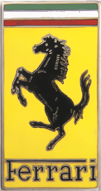
After the redesign, the iconic prancing horse in the Ferrari logo appeared visually heavier, with less pronounced muscular detail. The rectangular frame was enhanced with a silver gradient, adding a more three-dimensional effect, while the remaining colors were adjusted in both intensity and shade to create a refined, modern appearance.
Logo Redesign
1951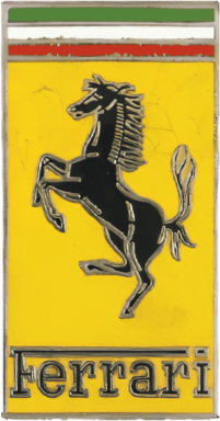
In 1951, Ferrari updated its emblem by modifying the prancing horse so that it no longer overlapped with the inscription below. The logo’s base was redesigned as a classic vertical rectangle and adopted a richer yellow color.
The tricolor elements at the top were also reshaped into horizontal rectangles, reinforcing the logo’s structured and balanced appearance while preserving its connection to Italy through the green, white, and red stripes.
Logo Redesign
1947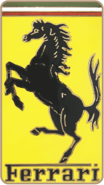
In 1947, Ferrari introduced the first rectangular version of its logo, replacing the earlier triangular shield format. The new emblem featured rounded corners and retained a pale yellow background.
The enlarged black prancing horse was positioned facing left, taking advantage of the expanded space. One of its legs rested on a horizontal line extending from the top stroke of the capital “F,” while the remaining letters of the Ferrari wordmark appeared below in a bold serif typeface. Above the horse, the green, white, and red colors of the Italian flag were displayed, and all elements were enclosed within a gold outline, emphasizing the brand’s prestige and heritage.
Ferrari's colours, Rosso Corsa and Giallo Modena
1947
Ferrari and the origins of the prancing horse
1932
Logo Design
1932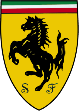
The original logo of Scuderia Ferrari featured a yellow shield bearing the iconic black prancing horse. Flanking the horse were the italicized initials “S” and “F,” standing for Scuderia Ferrari. At the top of the shield appeared three stripes in the colors of the Italian flag.
This emblem was first used in 1932 on cars competing in the Spa Grand Prix. Since then, the prancing horse has remained closely associated with Ferrari and eventually became the primary symbol of Ferrari. Over the years, the emblem underwent several refinements while preserving its essential elements and historical significance.
Founded
1939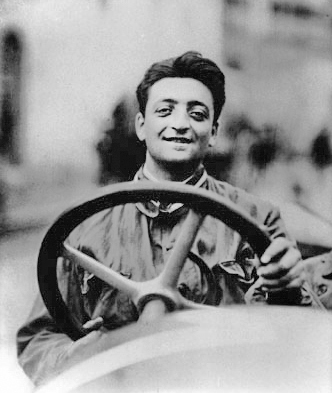
Using his settlement, Ferrari founded a new company called Auto Avio Costruzioni, headquartered in the former Scuderia Ferrari facilities in Modena. Due to a non-compete agreement with Alfa Romeo, he was prohibited from using the Ferrari name for four years, forcing the new company to operate under a different identity during its early years.


Why electric cars look like science fiction
2026