
Porsche
Founded in 1931 by Ferdinand Porsche in Stuttgart, the Maison combines a 75-year history of sports-car engineering with a heraldic identity drawn from the coats of arms of Württemberg and Stuttgart.
Key-Facts
Brand Chronology
Porsche launches Driven by Dreams for its 75th anniversary
2023
Porsche refines its crest for the 75th anniversary
2023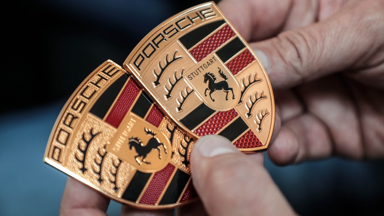
Crest-Redesign
2023
While the Porsche crest remains instantly recognizable, recent refinements add a more contemporary feel without altering its core identity. The surface texture has been smoothed, reducing the prominence of the bronze knurling and allowing the “PORSCHE” lettering to stand out more clearly. At the center, “Stuttgart” appears in bold black, emphasizing the brand’s origins in Stuttgart.
The inner shield combines traditional red stripes with a modern honeycomb pattern, subtly evoking carbon-fiber aesthetics and signaling technological progress.
Porsche returns to Super Bowl advertising with The Heist
2020
Crest Redesign
2014The new Version of the Porsche Crest conveyed luxury through a refined shield with a smooth, dynamic shape. A three-dimensional effect was created using metallic gradients, textured gold and red sections, and matte black contrasts. At the center, the horse—taken from Stuttgart—symbolized strength and energy. The overall design reflected a balance of innovation, precision, and performance.
Crest Redesign
1994After the 1963 redesign, a modernized version of the Porsche logo appeared. The shield became more tapered and gained subtle 3D elements, with gold replacing yellow. The horse was refined with more elegant features, bright red stripes shifted to burgundy, and the central shield was outlined with a thin black line. The top of the crest was also slightly arched, enhancing its overall balance and sophistication.
There is no substitute, the Fallon McElligott print campaign for Porsche
1989
Porsche renamed the 901 to 911 after a Peugeot trademark objection
1964
Crest Redesign
1963In 1963, alongside the launch of the iconic Porsche 911, Porsche refined its logo toward its modern form. The crest became more dynamic: the top band arched, the bottom sharpened, and the deer antlers were shortened. The central Stuttgart emblem was simplified, while the horse was made more elegant with finer details. Yellow shifted to gold, reinforcing a sense of luxury, and subtle gradients and textures created a three-dimensional, polished look—reflecting performance, prestige, and technological progress.
Porsche launched Christophorus, one of the world's first customer magazines
1952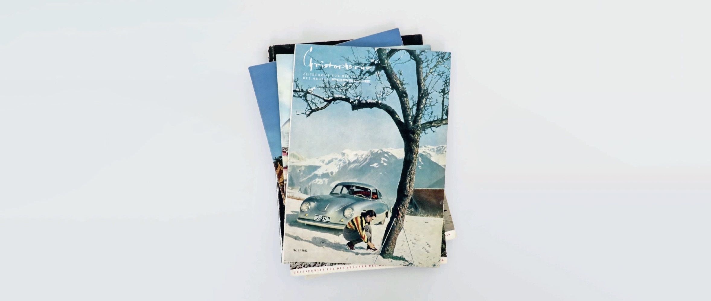
Crest Design
1952The original Porsche emblem made its first appearance 1952 and combined two heraldic sources: the coat of arms of Württemberg and the city of Stuttgart. Designers merged these elements by placing the Stuttgart horse at the center of a larger shield divided into heraldic sections with antlers and stripes. The word “Porsche” appeared on the upper band, while “Stuttgart” was added on a smaller internal panel. This composition established the brand’s identity by directly linking its automotive image to regional history and heraldry.