Netflix
Netflix positions itself as the world's leading entertainment service, built on storytelling that travels across every border.
- Founded
- 1997
- Industry
- Entertainment
- Headquarters
- USA
- Ownership
- Public company
Key Facts
Impact, Communication, Judgement, Curiosity, Courage, Honesty, Selflessness, Passion, Innovation
The BalanceTo entertain the world.
Netflix Website – About NetflixBecoming the best global entertainment distribution service. Licensing entertainment content around the world. Creating markets that are accessible to filmmakers. Helping content creators around the world to find a global audience.
The BalanceBrand Chronology
Netflix builds a tarot-inspired identity for 2026
2026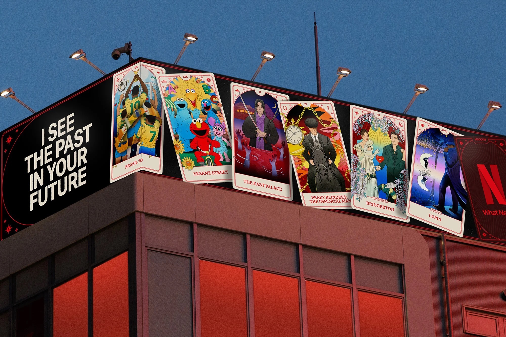
Netflix House opens its doors in Philadelphia
2025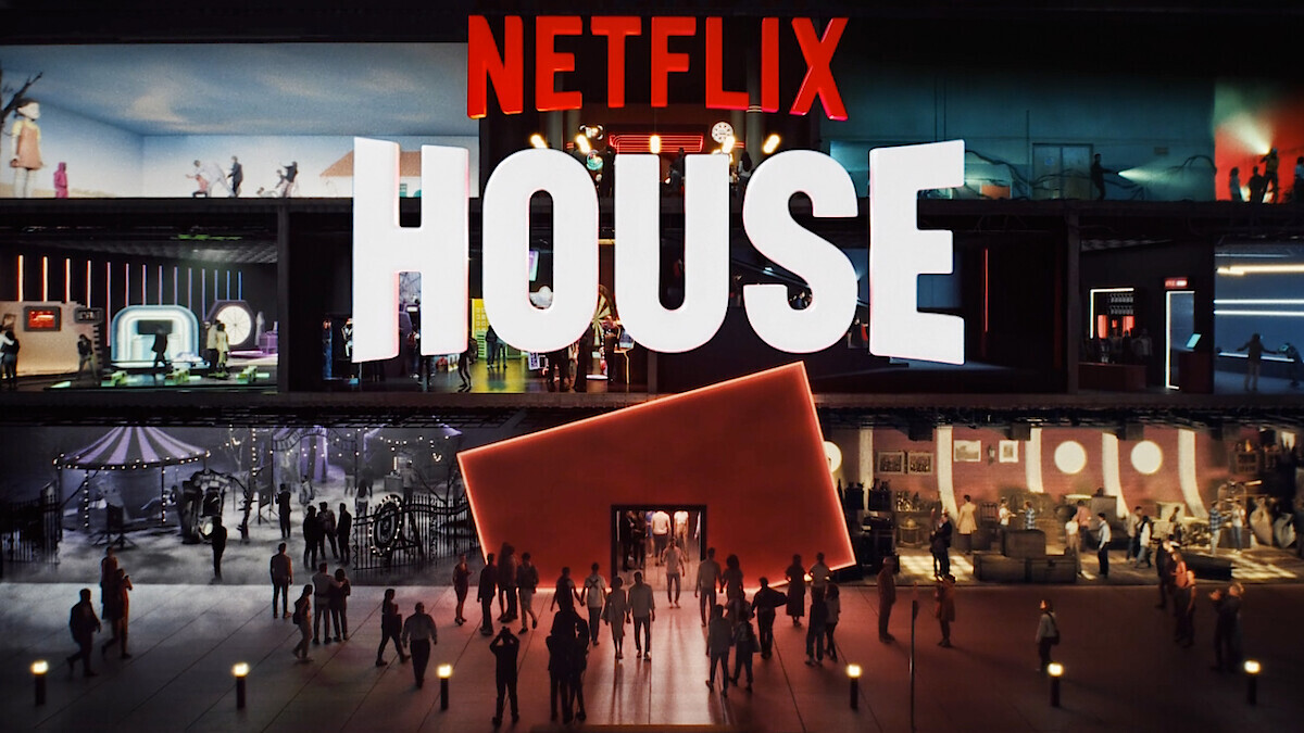
Netflix Sans, a custom typeface with Dalton Maag
2018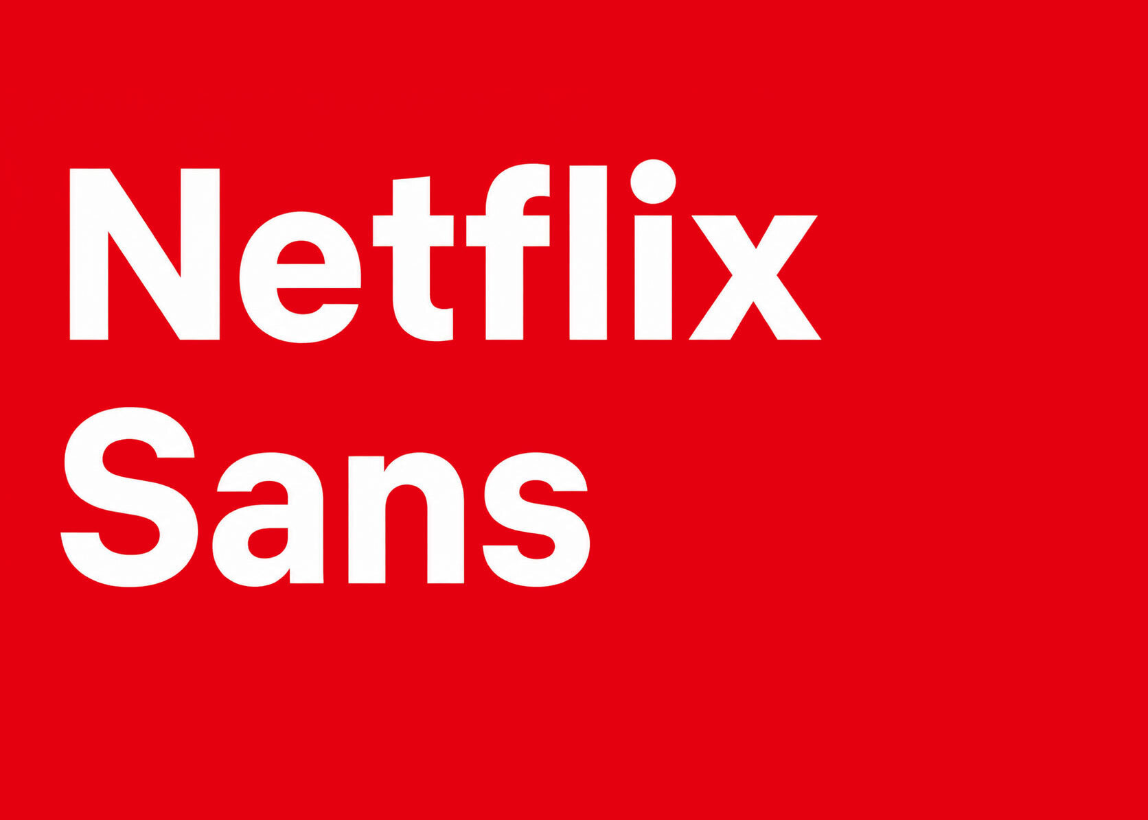
Netflix turns two knocks into its sonic identity
2015
Logo Redesign
2014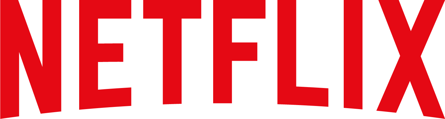
In June 2014, Netflix introduced a new visual identity as part of a global rebranding led by the New York design studio Gretel. The redesign modernized the platform’s branding and website interface with a cleaner, more streamlined look.
The updated logo removed the heavy shadows used in the previous version, leaving only the bold red Netflix wordmark on a plain background. The custom lettering was based on the Gotham Book and Gotham Bold typefaces, resulting in a simpler, more contemporary identity that improved legibility across digital platforms.
House of Cards turns Netflix into an originals brand
2013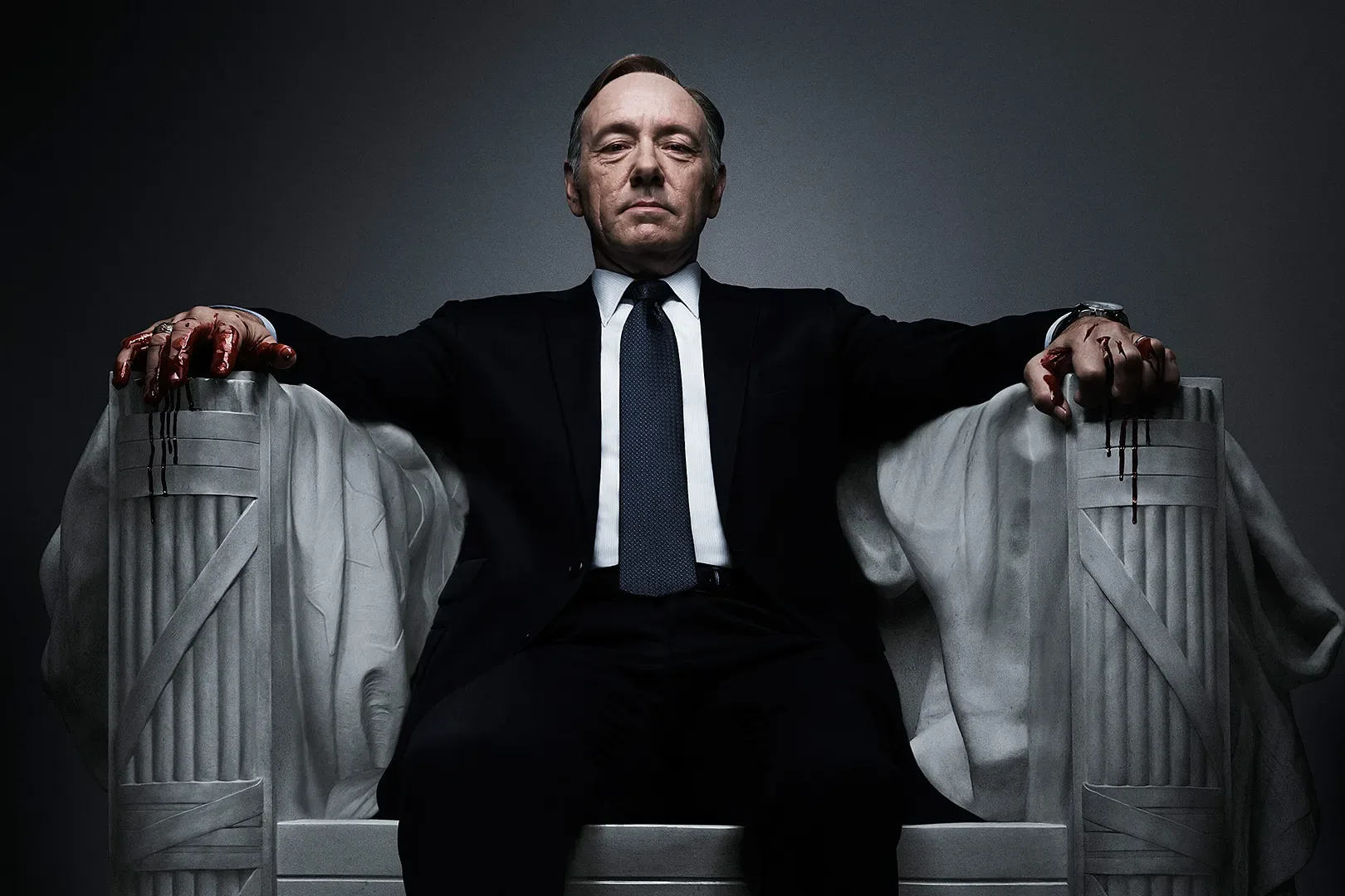
Netflix makes the leap from DVD mail to streaming
2007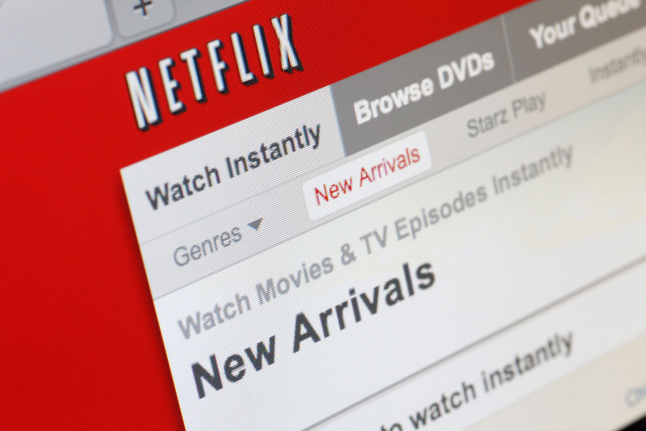
Logo Redesign
2000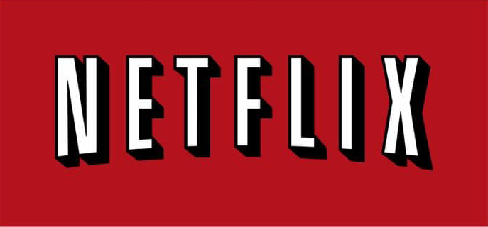
In 2000, Netflix introduced a redesigned logo featuring a more cinematic wordmark. The Netflix name was arranged in a gentle upward arc inspired by the classic CinemaScope style, reinforcing the brand’s connection to film and entertainment.
The logo used bold white sans-serif lettering outlined in black with subtle shadowing, creating strong contrast against a bright red background. This combination gave the wordmark greater visual impact and became one of Netflix’s most recognizable identities during its DVD rental era.
Logo Design
1997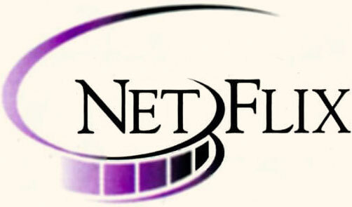
The debut logo is characterized by some “disarray.” Visually, it is divided into several fragments. Even the letters in the word “Netflix” are arranged in groups: the uppercase “N” and “F” are larger than the lowercase “E,” “T,” “L,” “I,” and “X,” which are also written in uppercase. This is specifically done to distinguish the parts Net and Flix.
Another symbolic element is the film strip. It is outlined around the first half of the word and dissolves into a white background. The black-purple gradient gives the drawing dynamism. The custom-designed font enlivens the logo with thin, elongated lines and sharp serifs.