
Disney
Disney is one of the world's largest entertainment companies, combining animation, live-action studios, theme parks, and streaming under a unified narrative brand built on storytelling and family-oriented imagination.
Key-Facts
Brand Chronology
Disney premieres 'Through Time' to open its 2026 brand campaign
2025
Steamboat Willie passes into public domain as Disney safeguards modern Mickey
2024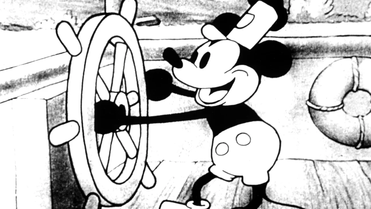
Disney marks its centennial with a new studio logo and 100 Years of Wonder identity
2023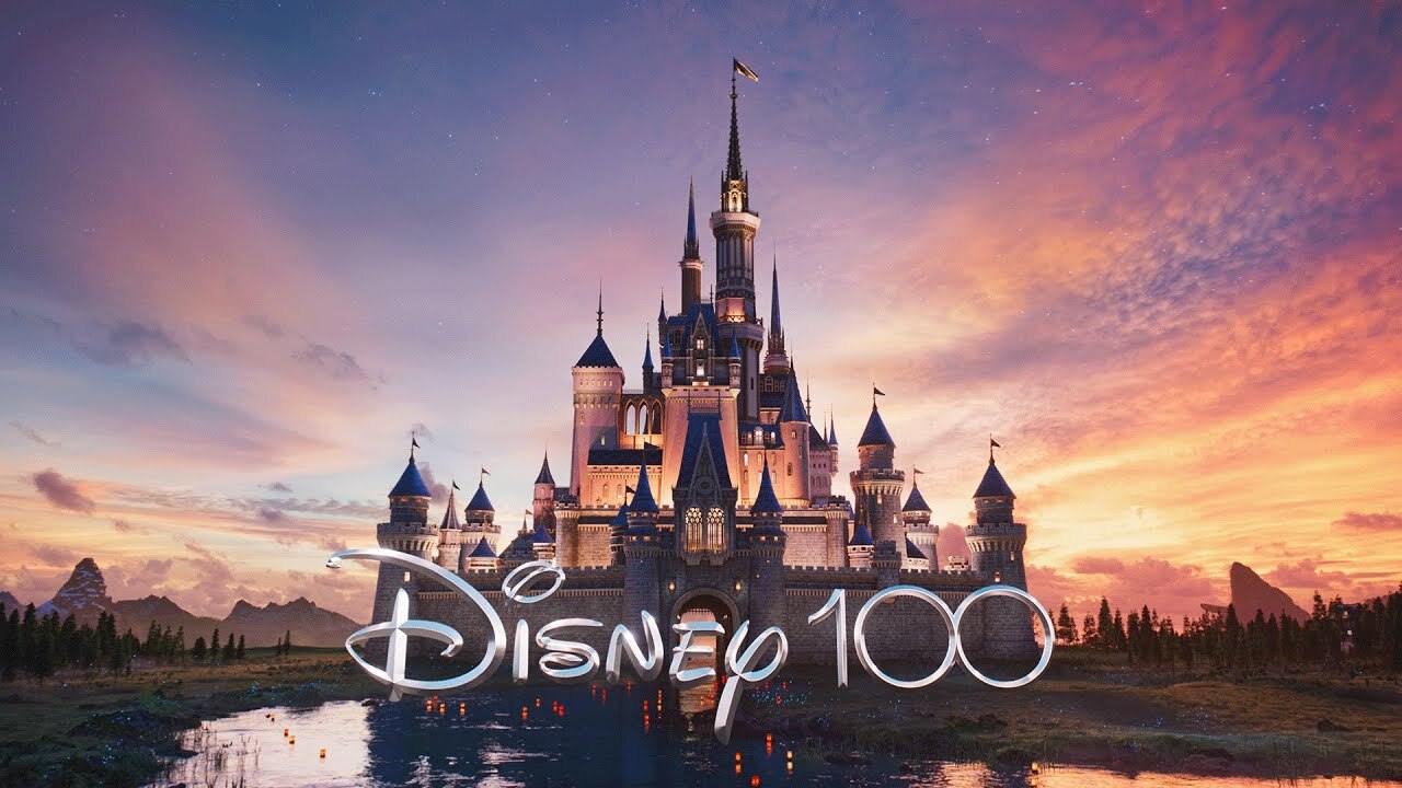
Walt Disney World stages an EARidescent 50th anniversary
2021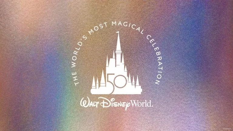
Disney+ launches with a flexible identity by Trollbäck+Company
2019
Disneyland Paris presents 'The Little Duck' by BETC
2018
Disney-Pictures: Logo Redesign
2011The current Disney logo is similar to earlier versions but uses only the shortened name “Disney,” referencing the company’s founder. The emblem features a detailed castle with towers, windows, flags, and balconies. A shooting star arcs over it, leaving a glowing trail, while added elements like fireworks and clouds enhance the sense of magic. The castle itself symbolizes fantasy, romance, and storytelling. O
Disney-Pictures: Logo Redesign
2006In 2006, Disney introduced a more detailed, cinematic logo centered on a realistic castle. The earlier abstract stripes were removed in favor of richer architectural detail, including open gates and a shooting star, reinforcing the idea of wish fulfillment and magic. The typography was also refined: “Walt Disney” became slightly thinner, while “Productions” was minimized and set in a softer cursive style, creating a more elegant and modern composition.
Disney-Pictures: Logo Redesign
1985In the mid-1980s, Disney enhanced its wordmark by adding a graphic element—a stylized castle above the “Walt Disney” text. The castle was rendered in simple horizontal stripes, framed by a solid arch, with small triangular flags atop each tower.
Disney-Pictures: Logo Redesign
1979The version of the Disney wordmark most familiar today appeared in the early 1970s. By then, it had diverged significantly from Walt Disney’s original signature. The most notable change was the stylized “D,” with exaggerated upper and lower curves and an off-center vertical stroke, often described as being influenced by golden ratio proportions. This gave the logo a more distinctive, balanced, and instantly recognizable form.
Source: creativebloq.com
1973One of the most recognizable Disney symbols is the Walt Disney wordmark itself—based on Walt Disney’s signature and still used across the brand today, from theme parks to Disney+. While its exact introduction date is debated, it is commonly associated with the 1937 release of Snow White and the Seven Dwarfs. The early version already featured the distinctive flowing, looping script that defines the brand. Over time, the signature-style wordmark was refined through several updates, but it has consistently retained its elegant cursive form and strong association with Disney’s identity.
Logo Design
1929Walt Disney was directly involved in creating some of the studio’s earliest branding. One version of the logo featured a walking Mickey Mouse, already an established symbol of the animation studio. The design used a distinctive, largely custom lettering style across its elements, giving the early logo a dense but structured, trademark-focused appearance.