A deck of cards for a year of releases
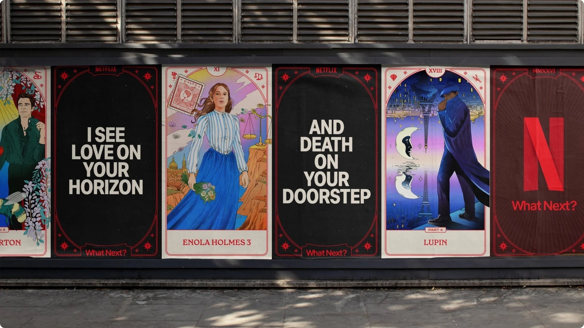
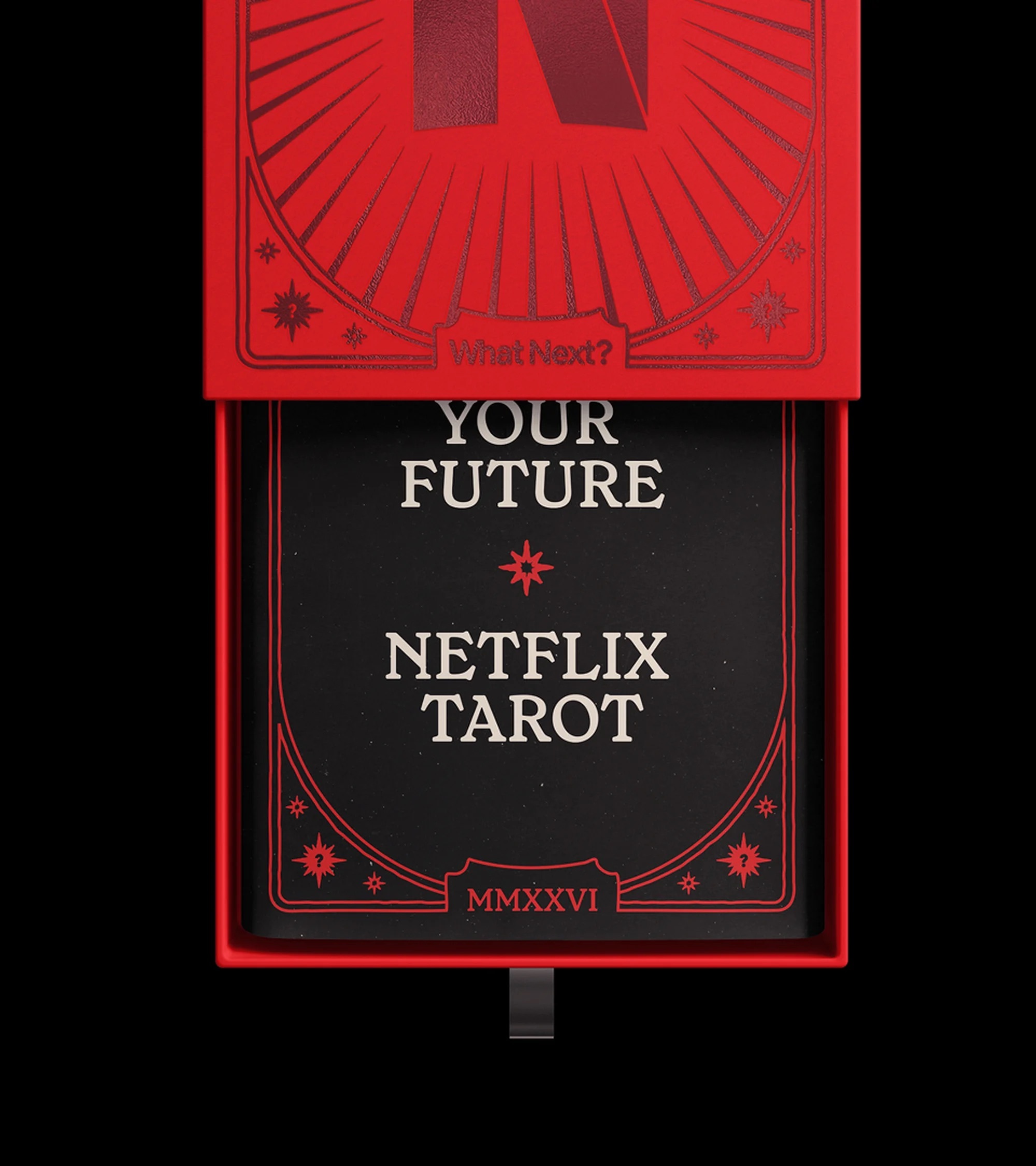
Netflix opens its 2026 slate with a brand identity that borrows its visual language from the tarot. On 13 January 2026, the streaming service launches What's Next, a global campaign system built around a bespoke deck of 50 custom-illustrated cards, each one acting as a visual portal into an upcoming Netflix title.1 The concept originated inside Netflix, and creative company Los York developed the system and brought it to scale across markets.1
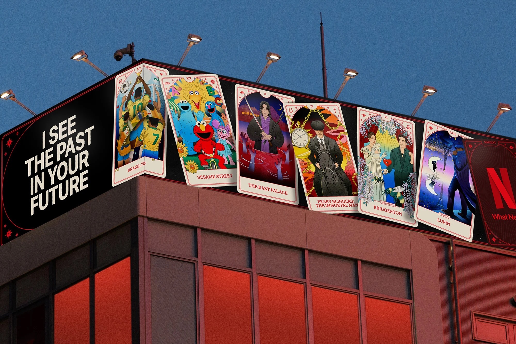
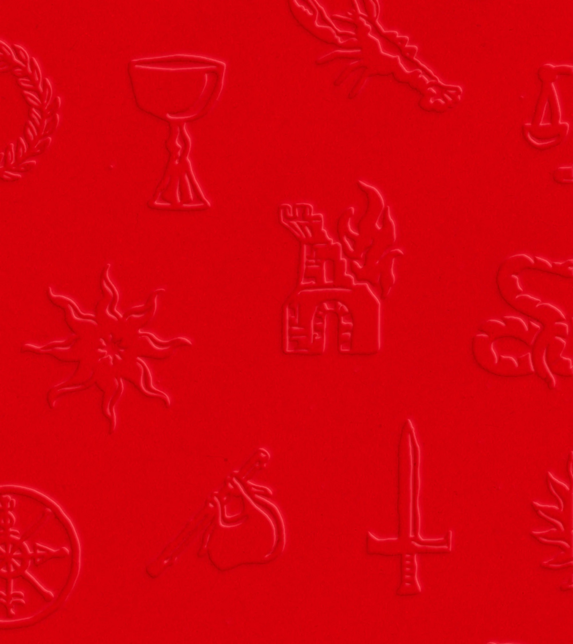
Each card merges the key art of a Netflix film or series with references to the Major Arcana, the 22 allegorical picture cards at the heart of the traditional tarot deck.1 Custom iconography blends motifs from individual shows with tarot symbolism, while a modular grid system carries the identity into motion design and typography.1 The result is a campaign architecture that can flex from a single social asset to an anamorphic 3D billboard without losing its visual logic.
Fortune telling as a content calendar
The tarot frame does conceptual work beyond decoration. A deck of cards that claims to reveal the future is a natural metaphor for a release calendar, and it lets Netflix present dozens of unrelated titles, from prestige drama to reality formats, inside one coherent pictorial world. The campaign name What's Next makes the connection explicit and echoes the phrasing Netflix has long used in its corporate communication, where its newsroom carries the See What's Next framing.2
Los York describes the identity as a system that is global in scale but intimate in detail.1 That tension is visible in the craft: the cards reward close reading, with show-specific props and characters hidden inside ornamental borders, while the overall system is engineered for recognition at freeway distance.
The choice of illustration over photography also solves a practical problem of slate marketing. Key art from 50 different productions arrives in 50 different visual styles, shot by different photographers under different art direction. Redrawing each title as a tarot card pulls that heterogeneous material into one illustrated register, so a Korean thriller, a British period drama, and an American reality show can sit side by side on a wall without visual friction. The deck becomes a leveling device as much as a decorative one.
Rollout across 30 languages
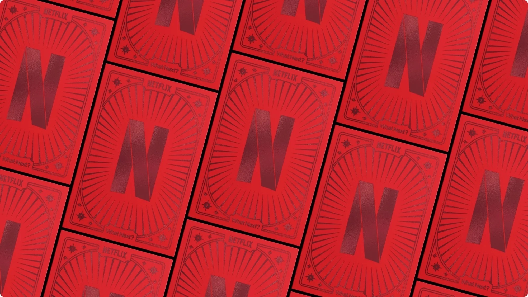
The identity rolls out in more than 30 languages across dozens of international markets, spanning out-of-home placements, paid social, and international platform surfaces.1, 3 In New York City and Los Angeles, the campaign appears as anamorphic 3D billboard animations, a format in which flat screens create the illusion of depth and objects appearing to leave the frame.1, 3 Physical tarot decks are produced for press and influencer kits, extending the identity into a collectible object that can circulate on social media on its own.1, 3
Localizing an illustration-led system into more than 30 languages is where the modular grid earns its place. Typography, card titles, and motion behaviors are defined as flexible components rather than fixed layouts, allowing local teams to swap language and title art without redrawing the system. The same discipline governs scale: the identity is specified from social story formats up to building-sized anamorphic screens.
The system also reaches into Netflix's own content marketing. Animated What's Next end-cards close out the 2026 film trailers, produced together with the advertising agency Wieden+Kennedy.1 The end-card placement turns every trailer into a carrier of the annual brand campaign, a mechanic that stitches individual title promotion into one continuous brand story.
Source: the-brandidentity.com
The identity layer above the titles
The campaign continues a pattern in how Netflix manages its brand. The service invests in a durable brand toolkit, from the Netflix Sans custom typeface to its sonic signature, and then layers annual campaign systems on top of it.4 What's Next sits in that second layer: it does not replace the core identity but wraps the year's output in a distinctive, time-limited visual world.
For a company whose catalogue changes weekly, that structure has a clear logic. Individual titles come and go, but the framing device stays consistent for a full year, giving retail-style campaign surfaces such as billboards and social feeds a recognizable Netflix look even when the advertised show is brand new. The tarot deck, with its promise that the next card is always about to be turned, gives that idea an unusually literal form.
Netflix has not communicated an end date for the system. Based on the campaign's framing as a 2026 identity, a refreshed approach can be expected for the following year, continuing the annual rhythm the company has established for its brand campaigns.
Source: the-brandidentity.com
Written with AI assistance, edited by a human. Find out more about our Use of AI.
1. LOS YORK, "The Art of What's Next: Netflix Unveils Tarot-Inspired Global Brand Identity for 2026", 13 January 2026, for the 13 January 2026 launch, the bespoke Tarot Card System of 50 custom-illustrated cards each acting as a visual portal into a Netflix title, the concept having originated at Netflix with LOS YORK bringing it to life at scale, the blending of key art with traditional Major Arcana references, the custom iconography merging show motifs with tarot symbolism and the global design toolkit built as a flexible grid system for motion, typography and layering, the rollout across more than 30 languages and dozens of international markets and its adaptation across out-of-home, paid social and international surfaces, the anamorphic 3D billboard animation in New York City and Los Angeles, the physical tarot decks made for influencer and press kits, the animated trailer end-cards produced with Wieden+Kennedy, and the description of the identity as "global in scale, but intimate in detail". https://losyork.tv/news/the-art-of-what-s-next-netflix-unveils-tarot-inspired-global-brand-identity-for-2026
2. Gretel, "Netflix, Global rebrand", undated case study, consulted on 18 September 2026, for "See What's Next" having been launched as Netflix's first company tagline during the Gretel-led global identity work of 2014 and 2015, which is the corporate phrasing the campaign name echoes. The note covers the tagline itself; the claim that the Netflix newsroom carries that framing is discussed in the retrofit notes. https://gretelny.com/netflix
3. The Brand Identity, "LOS YORK builds a tarot universe for Netflix's biggest global campaign", 12 March 2026, for independent confirmation of the thirty-plus languages, the 3D anamorphic billboards in New York and Los Angeles, and the tactile influencer kits, reported there without a named byline. https://the-brandidentity.com/project/los-york-builds-a-tarot-universe-for-netflixs-biggest-global-campaign
4. It's Nice That, Jenny Brewer, "Netflix unveils Netflix Sans, a new custom typeface developed with Dalton Maag", 21 March 2018, for Netflix Sans being a custom typeface commissioned from Dalton Maag and described by Netflix brand design lead Noah Nathan as an ownable and unique element of the brand's aesthetic. The note covers the typeface only, not the sonic signature named in the same sentence. https://www.itsnicethat.com/news/netflix-sans-typeface-dalton-maag-graphic-design-210318