An original typeface for an originals company
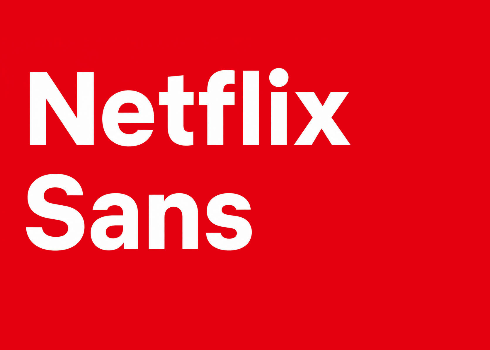
In March 2018, Netflix revealed Netflix Sans, its first custom typeface, developed by the company's in-house brand design team together with the London type foundry Dalton Maag. The typeface was designed to carry the brand across every surface it touches, from the streaming interface and mobile apps to billboards, trailers, and corporate communication, replacing the mix of licensed fonts the company had relied on until then.
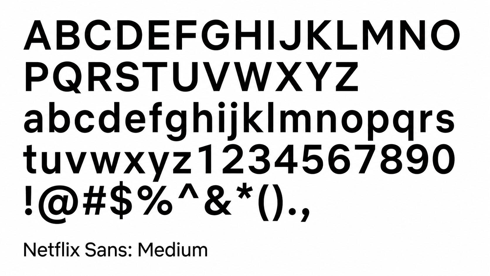
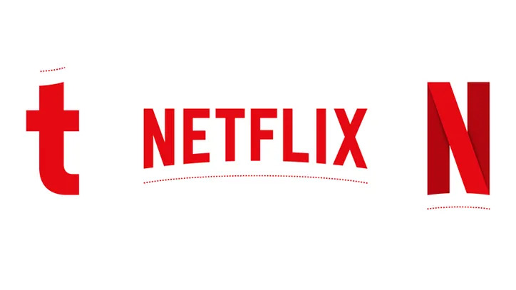
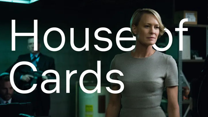
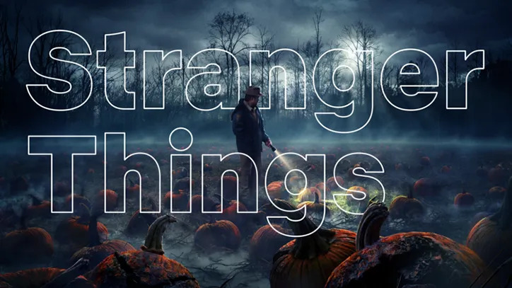
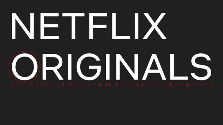
Netflix Sans is a grotesque sans serif drawn in a range of weights, engineered for legibility on screens of every size. Its most recognizable gestures live in the details: the lowercase t curves subtly at the foot, and the capital N nods to the company's logo. Noah Nathan, then brand design lead at Netflix, presented the typeface as both a creative and a practical asset, noting that the design carries a hint of the cinematic while remaining a workhorse for everyday interface use. The balance is characteristic of the genre: a custom corporate typeface must be distinctive enough to justify its existence and neutral enough to disappear behind ten thousand different pieces of content.
The economics of owning your letters
The business case was as prominent as the design story. Netflix had previously licensed Gotham, the widely used typeface by Hoefler&Co, and at Netflix's global scale the recurring licensing fees for web, app, and advertising use reportedly ran into millions of dollars per year. A custom typeface converts that recurring cost into a one-time investment: once commissioned, the fonts belong to the brand outright and can be deployed worldwide without per-use fees.
This calculation had already convinced other technology companies. Apple introduced San Francisco in 2015, Google developed Product Sans, Samsung commissioned SamsungOne, and IBM followed with Plex later in 2018. Dalton Maag itself had become a specialist in this category, with custom typefaces for Nokia and Amazon among its credits, and in the same year it delivered Airbnb Cereal. Netflix Sans placed the streaming service in that cohort, where owning a typeface is treated as basic brand infrastructure rather than a luxury.
Consistency across 190 countries
Beyond cost, the typeface addressed a consistency problem. Netflix operates in over 190 countries, and its brand appears in thousands of executions produced by internal teams, agencies, and partners. A single proprietary typeface gives all of them the same typographic voice, and its screen-first engineering matters for a brand whose primary canvas is a television, laptop, or phone display rather than a printed page. Rendering quality at small sizes, generous spacing for interface labels, and clear differentiation between easily confused characters are the unglamorous requirements that decide whether a typeface survives contact with a menu screen.
There is also a brand-story dimension that the name makes explicit. A company that built its reputation on original content now owned an original typeface, and the parallel was part of the announcement's appeal: Netflix Sans was reported in the design press less as a procurement decision than as the latest Netflix original.
The typeface slotted into a brand system that Netflix had been consolidating through the decade, alongside the red N mark and the ta-dum sonic signature introduced in 2015. Each asset follows the same logic: distinctive enough to be recognized instantly, simple enough to work at any size, and owned outright by the company.
A quiet asset with a long life
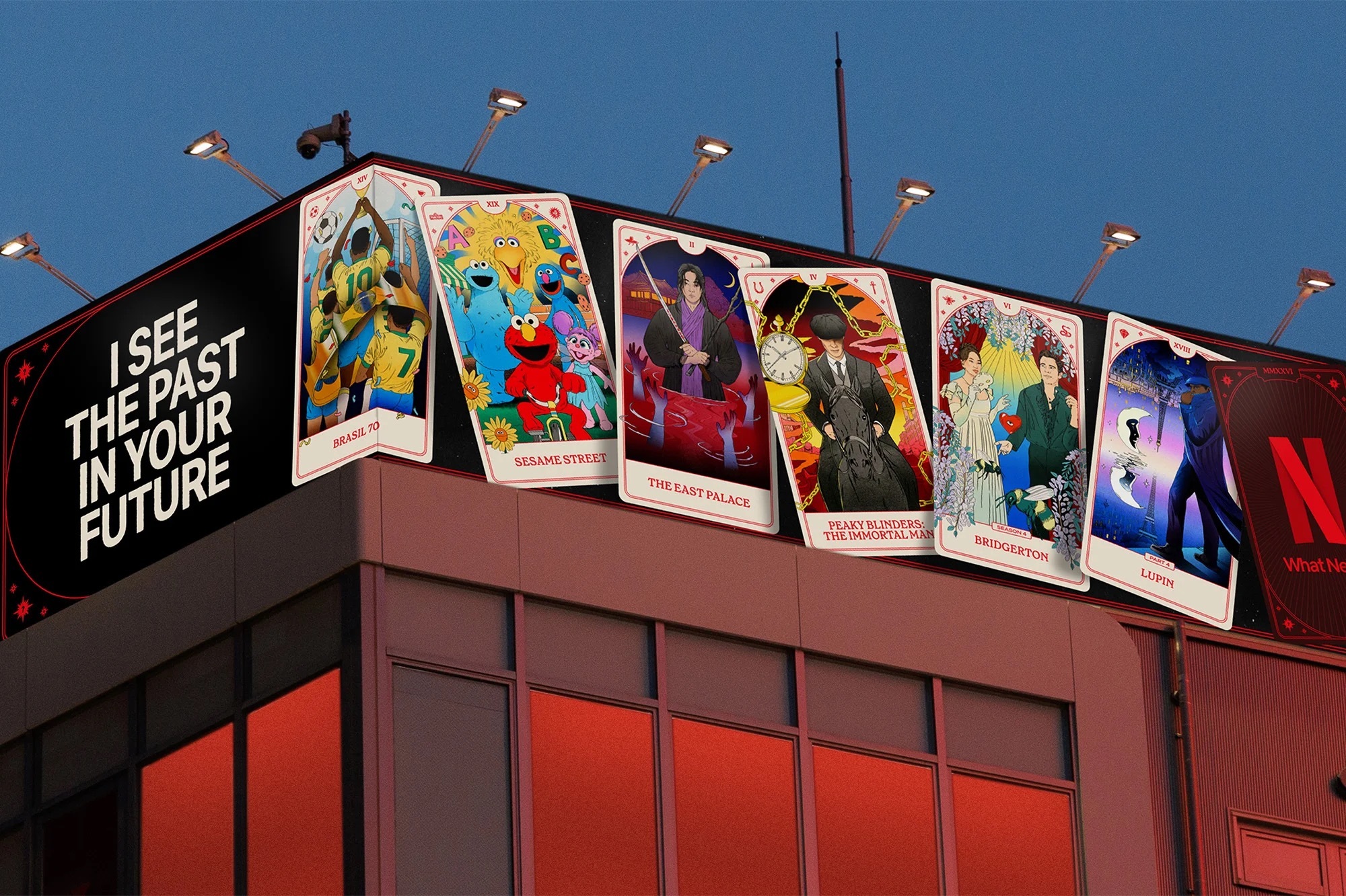
Netflix Sans rolled out gradually across the product and marketing landscape from 2018 onward, without a consumer-facing campaign. That is typical for typographic identity work: a typeface succeeds precisely when audiences stop noticing it, registering only that everything from a subtitle menu to a Times Square billboard feels like it comes from the same hand. The reveal itself traveled through the design press rather than through Netflix's own channels, with It's Nice That among the first to report the collaboration in March 2018.
The investment has proved durable. Netflix Sans remains in use across the service and its marketing years later, and it has become raw material for further brand work, appearing in specialized cuts such as the Ultra Condensed Black weight that anchored the identity of the company's Tudum fan event in 2023. For a piece of design commissioned partly to save money, the typeface has done long service as one of the brand's most visible, and least noticed, assets.
Written with AI assistance, edited by a human. Find out more about our Use of AI.