A garage sign in Remuera
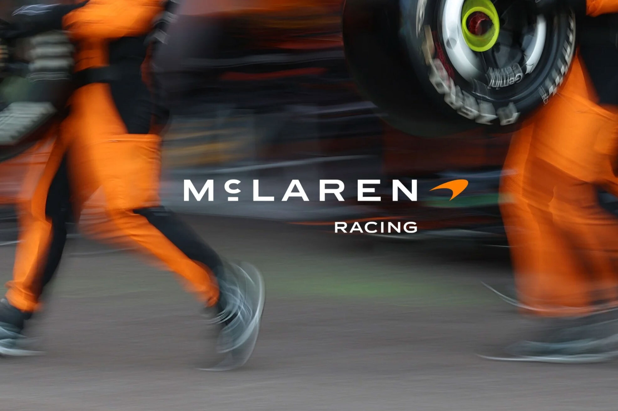
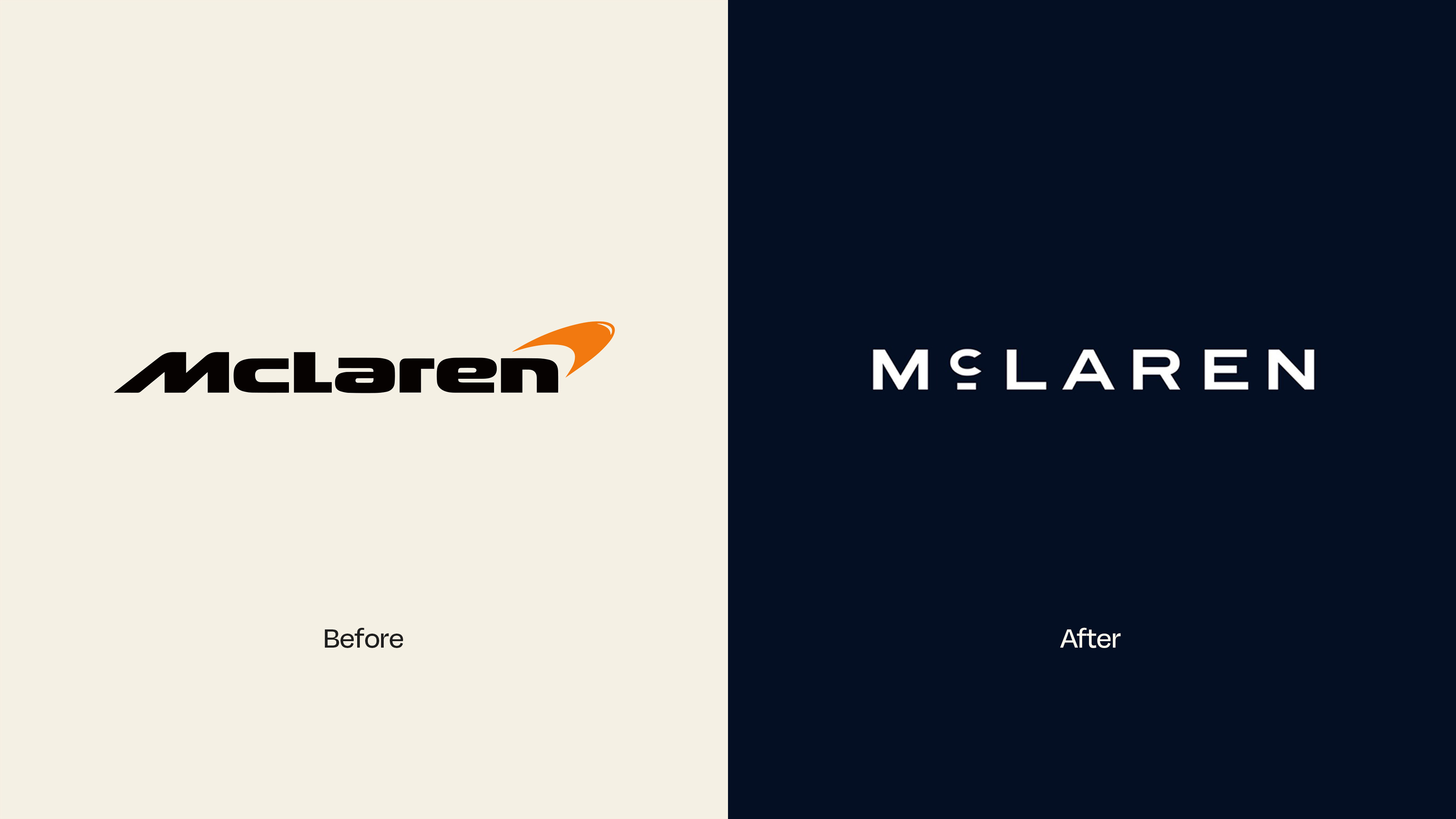
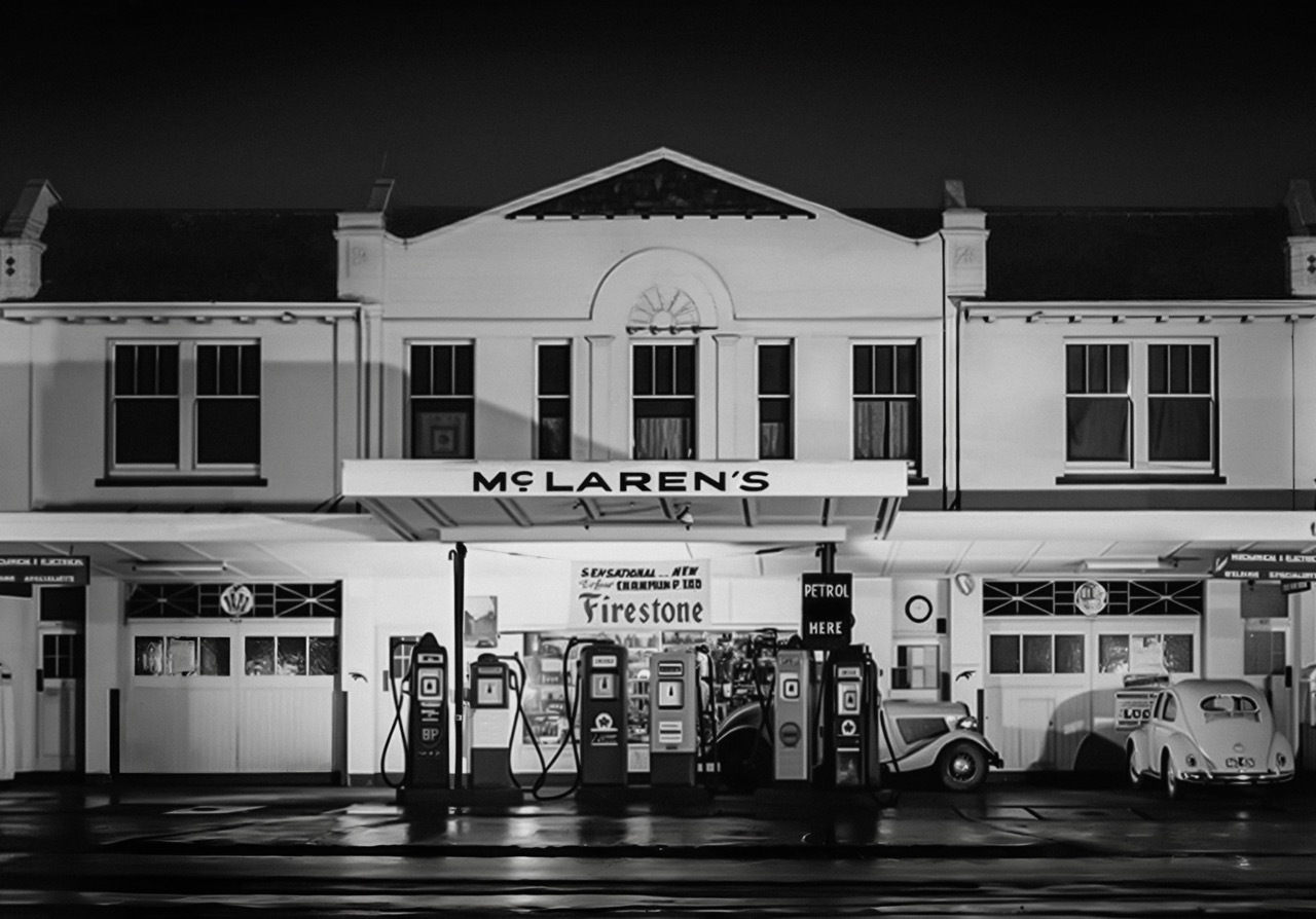
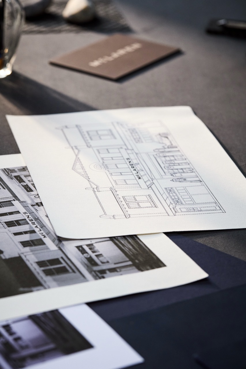
On 22 September 2026 McLaren presented an evolved visual identity for McLaren Automotive and for McLaren Racing across its Formula 1, IndyCar and World Endurance Championship programmes.1 According to press coverage, it is the first identity adopted by McLaren Automotive and the McLaren Formula 1 team at the same time.2 Its centrepiece is a new wordmark. McLaren says it draws on the sign above the family garage in Remuera, Auckland, a service station owned by Bruce McLaren's parents Les and Ruth McLaren, where Bruce built the car that took him to his first racing victory.1
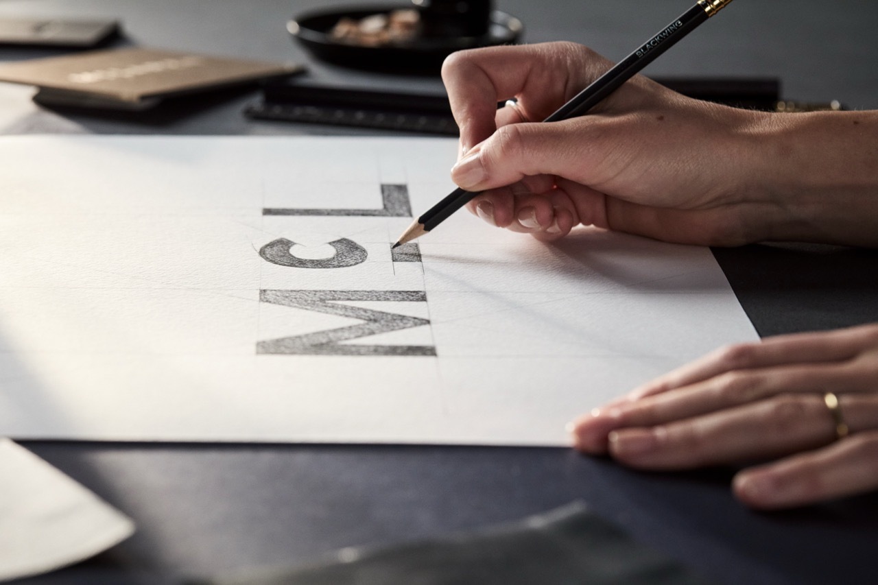
The wordmark is set in a custom typeface called McLaren Sans, with a horizontal line beneath the letter C, and it arrives with a palette of seven colours: Papaya, Ember, Midnight, Black, Anthracite, Colnbrook and Mist.3 In McLaren's own description, the Speedmark "remains at the heart of the brand", Papaya continues as a defining colour, and the Speedy Kiwi is retained in honour of the founder's New Zealand heritage.1
Grande Prêmio placed the reveal inside the debate about logo minimalism, the question of whether a redesign adds character or strips it out.4 The identity has since been read in two ways, and each reading rests on a different part of the work.
The heritage reading
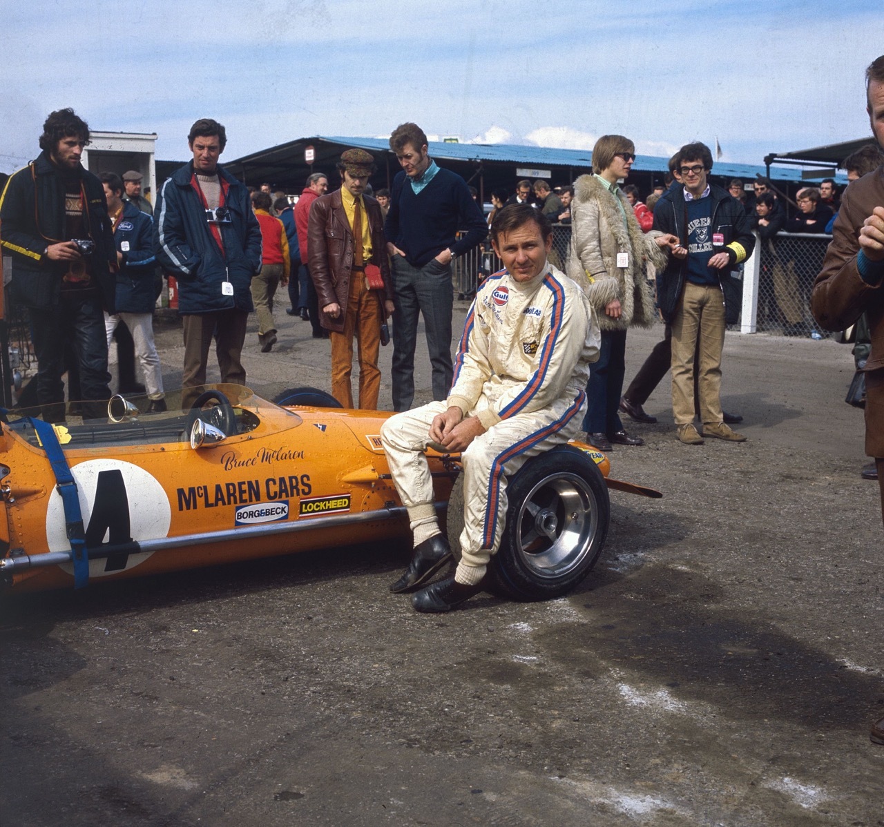
The heritage reading rests on where the new elements come from. The wordmark goes back to a family business in Auckland rather than to an earlier McLaren logo: the sign hung over a service station, not over a racing team. Carscoops reports that the seven colours were taken from a single photograph of Bruce McLaren sitting on the tyre of his single-seater.3 Colnbrook is named after the company's first base in the United Kingdom.2 McLaren's announcement itself describes the palette as inspired by pivotal moments in its history.1
Lou McEwen, Chief Marketing Officer of McLaren Racing, described the result in those terms: "This evolved identity perfectly bridges that proud heritage with our future ambition. It celebrates the symbols and stories our fans, partners and team mates already know and love, while giving us a more connected expression of where we're heading next."1
Victor Martins, writing for Grande Prêmio on the day of the reveal, found support for this reading in what McLaren kept. He called the update "more intelligent than many recent redesigns" and explained why: "It does not abandon the Speedmark or replace papaya with a fashionable neutral colour. Instead, it revises the visual system surrounding its strongest existing assets."4
The reduction reading
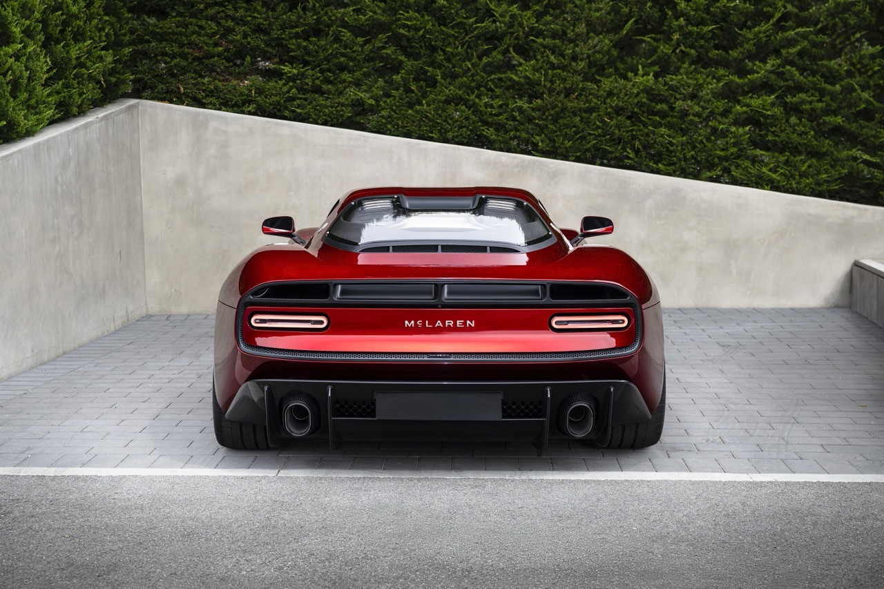
The critical reading rests on where the emphasis moves. Paultan.org reports that the swoosh which has fronted McLaren's road cars since 1997 survives, but is demoted to a secondary role, described as "a little identifier".2 Top Gear reports that the new wordmark takes precedence, and that Midnight, a navy blue, becomes the signature colour for the road cars while Papaya continues for the racing teams.5 On that account, a lettering moves ahead of a symbol, and a dark blue leads on the product side.
Martins also set out this half of the argument. "McLaren's existing symbols were neither outdated nor difficult to recognise," he wrote. He measured the identity against the colour schemes of Martini, Gulf and Lotus, and against McLaren's own papaya, all of which, in his words, "succeeded through confidence and immediate recognition".4 In his reading, the open question is whether a brand whose symbols already did that work needed a further layer.
Source: McLaren Automotive Youtube
What the evolution sits alongside
The identity arrives alongside a period of expansion. McLaren's announcement places it next to a £500 million programme of investment in manufacturing and engineering in the United Kingdom, a year in which the Formula 1 team reached its 1,000th Grand Prix, and the announcement of a Hypercar programme for the World Endurance Championship.1 A performance SUV is due before 2030.2 The same wordmark is intended to run across road cars, the racing teams and that new category.
David Woodhouse, Chief Creative Officer of McLaren Automotive, called the evolution "a reflection of the journey we are on as a company".1 McEwen pointed back the other way, to "how much of Bruce's original vision and spirit still runs through the business today".1
For the brand, the change adds a layer and reorders the ones it keeps. A new wordmark and six further colours sit alongside the Speedmark, Papaya and the Speedy Kiwi, while the swoosh, on the road cars at least, steps back. The heritage reading focuses on where the new layer comes from. The critical reading asks whether the existing symbols needed it.
Written with AI assistance, edited by a human. Find out more about our Use of AI.
1. McLaren, "McLaren marks the next chapter with the reveal of an evolved identity", press release, 22 September 2026, read 24 September 2026, for the date and scope of the identity across McLaren Automotive and McLaren Racing in Formula 1, IndyCar and the World Endurance Championship, for the wordmark's origin in the sign above the Remuera service station of Les and Ruth McLaren where Bruce built the car of his first racing victory, for the Speedmark remaining at the heart of the brand, Papaya continuing, the palette inspired by pivotal moments and the Speedy Kiwi retained, for the £500 million investment, the 1,000th Grand Prix and the Hypercar programme, and for the quotations from Lou McEwen, Chief Marketing Officer, McLaren Racing, and David Woodhouse, Chief Creative Officer, McLaren Automotive. https://www.mclaren.com/racing/2026/mclaren-announces-evolved-identity/
2. Paultan.org, "McLaren reveals new logo based on wordmark from Bruce McLaren's family garage sign", 23 September 2026, read 24 September 2026, for the first identity adopted by McLaren Automotive and the McLaren Formula 1 team simultaneously, for Colnbrook being named after the company's first UK base, for the swoosh that has fronted the road cars since 1997 being demoted to a secondary role as "a little identifier", and for the performance SUV due before 2030. https://paultan.org/2026/09/23/mclaren-reveals-new-logo-based-on-wordmark-from-bruce-mclarens-family-garage-sign/
3. Thanos Pappas, "McLaren's New Logo Is Inspired By An Old Garage Sign", Carscoops, 22 September 2026, read 24 September 2026, for the McLaren Sans typeface, the horizontal line under the letter C, the seven palette colours and their origin in a single photograph of Bruce McLaren. https://www.carscoops.com/2026/09/mclaren-new-logo/
4. Victor Martins, "McLaren's new identity avoids the worst of logo minimalism, but was it necessary?", Grande Prêmio, 22 September 2026, read 24 September 2026, for the framing within the minimalism debate and for the quotations from Martins. The original title carries a dash in place of the comma. https://grandepremio.com/en/f1/mclarens-new-identity-avoids-the-worst-of-logo-minimalism-but-was-it-necessary/
5. Greg Potts, "McLaren's new logo comes from the sign above Bruce's family service station", Top Gear, 22 September 2026, read 24 September 2026, for the new wordmark taking precedence and for Midnight as the signature colour for road cars with Papaya continuing for the racing teams. https://www.topgear.com/car-news/supercars/mclarens-new-logo-comes-sign-above-bruces-family-service-station