
Tesla
The electric vehicle company repositioning itself as an autonomous technology and robotics platform, with ambitions extending from mobility to humanoid automation.
Key-Facts

Brand Chronology
Tesla’s Master Plan Part 4: from sustainable energy to “sustainable abundance”
2025
"We, Robot": Tesla's Theatrical Reframing as a Technology and Robotics Brand
2024
Tesla’s Master Plan Part 3: a technical roadmap to a fully electrified world
2023
Tesla Introduces Optimus and Reframes Itself as a Robotics Company
2022
Tesla reveals the Cybertruck and an unintended brand moment
2019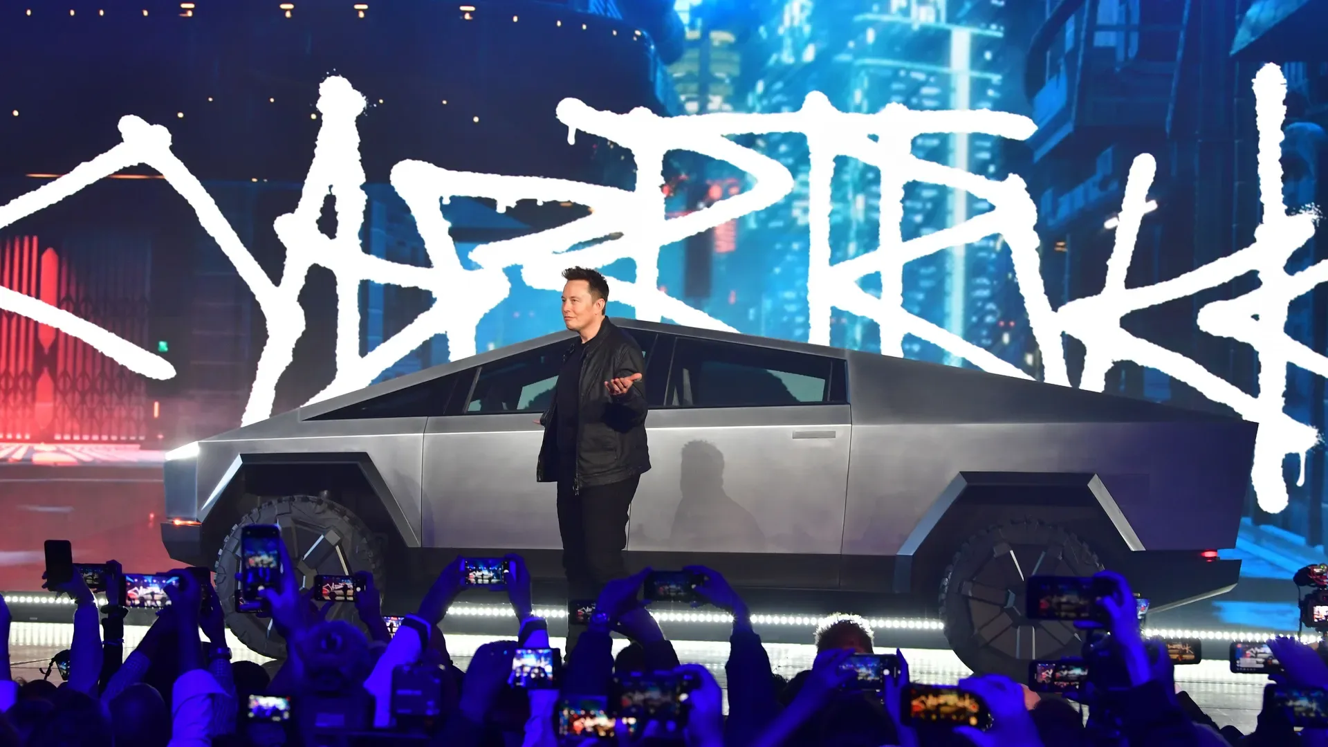
SpaceX, Starman and the Falcon Heavy spectacle
2018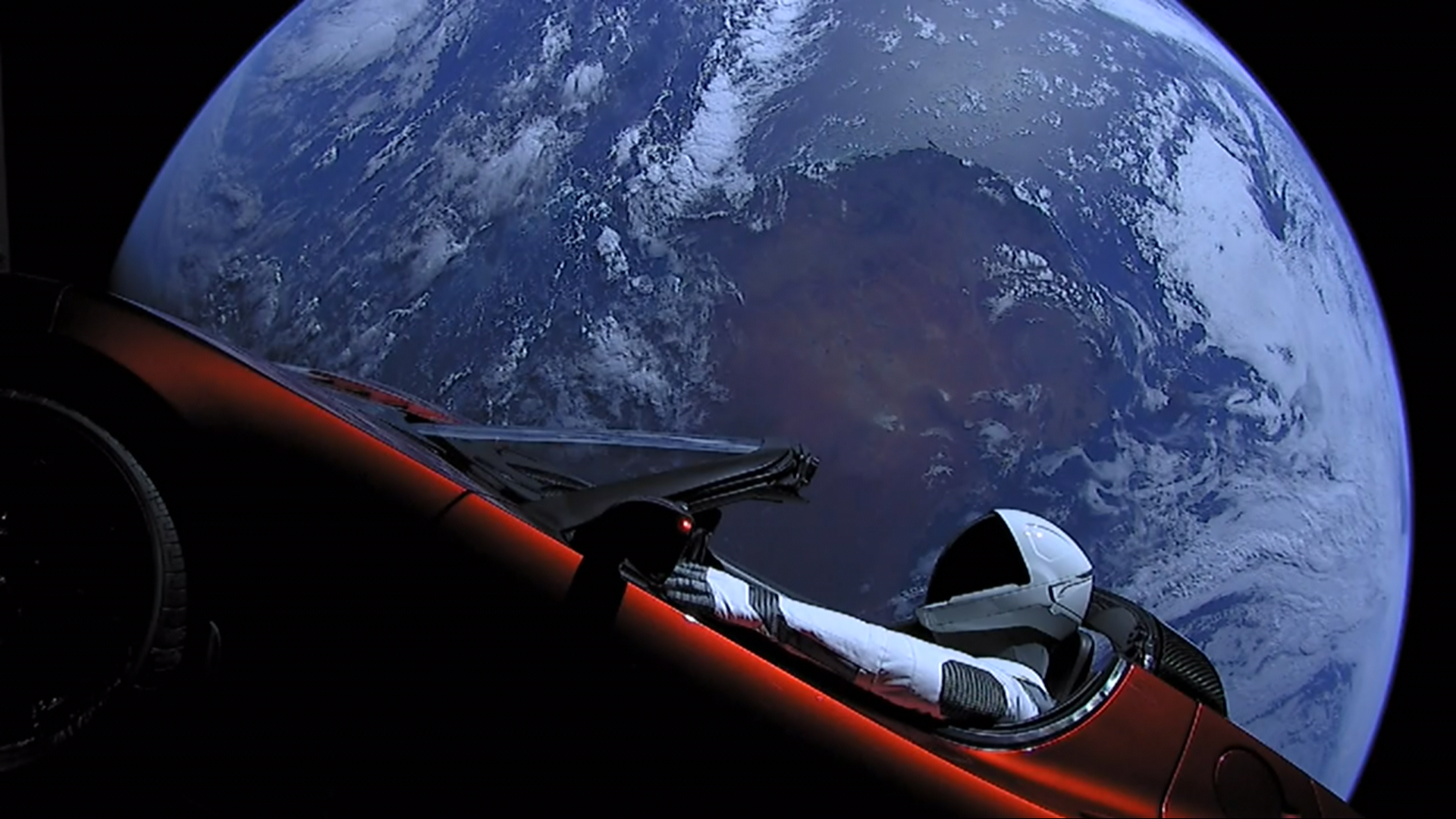
Logo Redesign
2017Tesla’s logo changed only slightly over time, with the most notable update in 2017 when the shield emblem was dropped. It shifted to a minimalist design featuring a stylized “T” and a refined wordmark.
The “T” consists of a curved top bar with tapered ends and a central vertical line that narrows to a point, giving it a technical, futuristic feel. Below it, the Tesla name appears in uppercase with a clean, reduced-stroke typeface sometimes referred to as Tesla Slab.
Tesla’s Master Plan Deux: expanding from electric cars to a full energy and mobility ecosystem
2016
Tesla’s Secret Master Plan Outlines an Electric Future Built Step by Step
2006
Logo Design
2004Tesla’s original logo was designed by RO Studio in New Jersey, which also worked on early branding for SpaceX. It featured a stylized “T” inside a metallic shield. Tesla’s chief designer, Franz von Holzhausen, did not create the logo but helped define the company’s broader visual and automotive design language. According to Elon Musk’s explanation, the logo references the structure of an electric motor: the vertical stroke represents a rotor pole, while the curved top element reflects part of the stator, linking the symbol directly to Tesla’s core technology.