

An Archive-Rooted Refresh
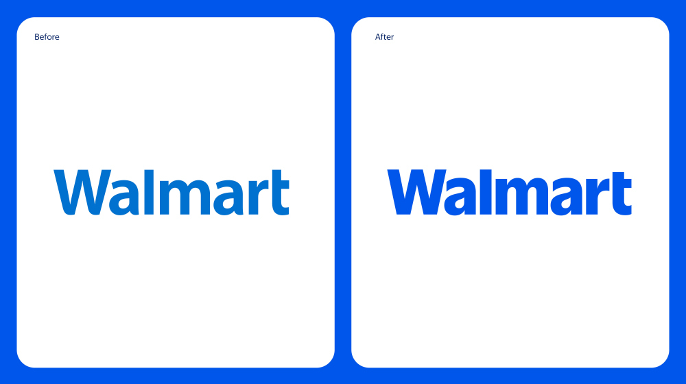
On 14 January 2025, Walmart unveiled its most significant visual update since 2008. Developed with Jones Knowles Ritchie alongside Walmart's in-house creative team, the rebrand revises the wordmark, the yellow "spark" motif, and the brand's core blue — the first time all three elements have been refreshed simultaneously in nearly 20 years.
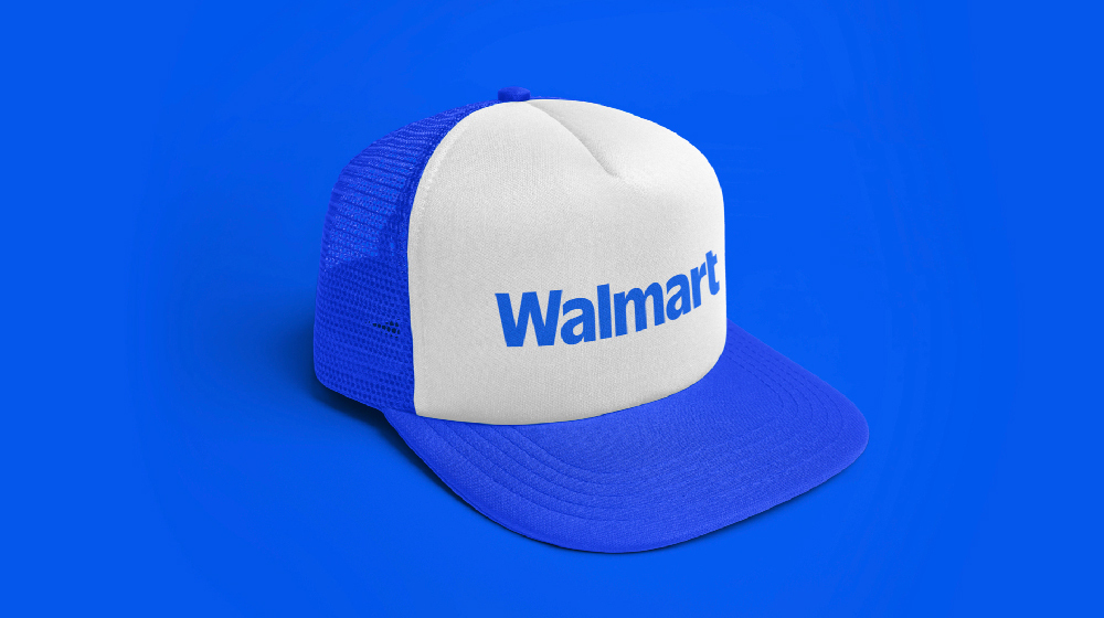
The creative direction was rooted in Walmart's own archive. JKR traced the brand back to the 1960s and 1970s, finding a photograph of founder Sam Walton wearing a trucker cap lettered in Antique Olive — a discovery that informed the redrawn wordmark's weight and character.
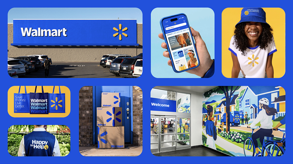

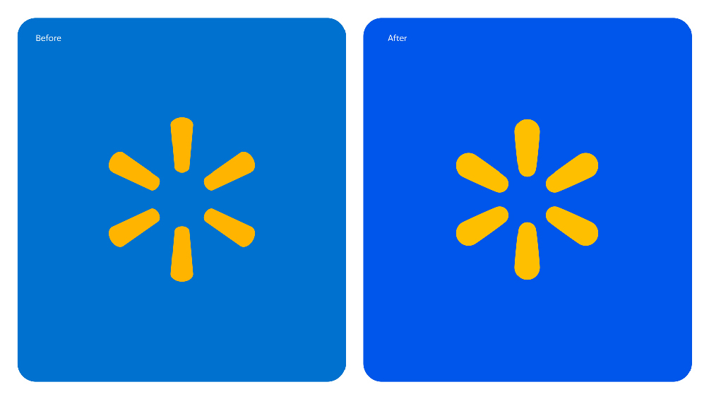

Spark and Colour
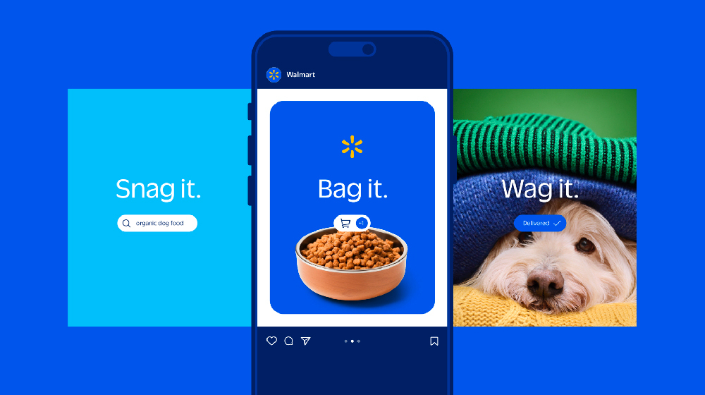
The yellow spark — Walmart's sunburst motif — has been made fuller, with individual rays gently rounded. The wordmark has been separated from the spark icon, giving both elements room to breathe and operate independently across applications. Backing the updated system is a brighter, more vivid blue, designed to read with greater confidence across physical and digital touchpoints.
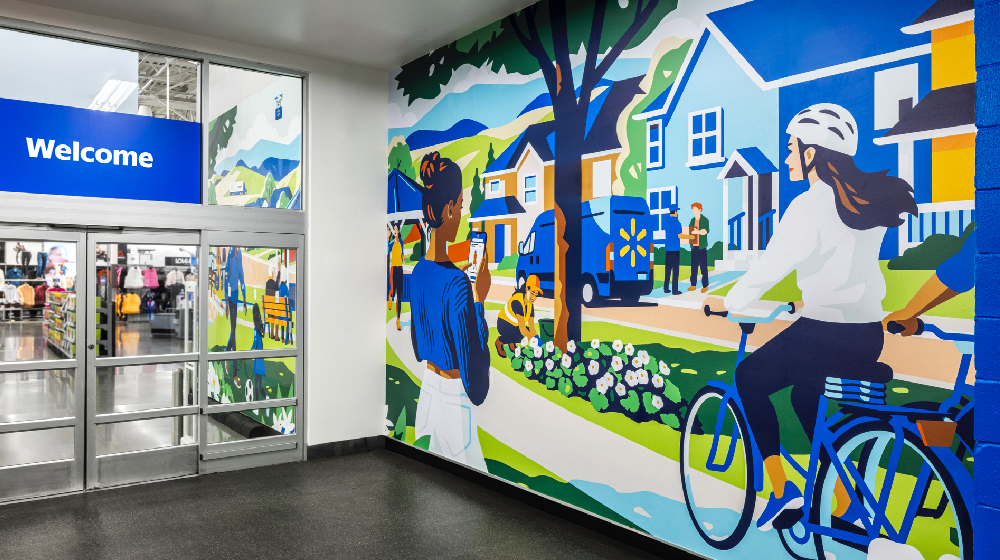
The rollout began in October 2024 at a Walmart store in Springdale, Arkansas. Digital platforms including the website and app were updated through 2025.