Refinement Over Revolution
Amazon's visual rebrand, which began rolling out gradually in spring 2024 and achieved full visibility by early 2025, represents the most comprehensive identity refresh since the recognizable Smile Arrow was introduced in 2000. Rather than wholesale replacement, the company pursued evolutionary refinement.
The orange Smile Arrow—the visual device that transforms the "A" and "Z" of the Amazon wordmark into a smile—became thicker and gained a more saturated orange tone. The adjustment is subtle yet decisive: the increased stroke weight strengthens the device's visual presence across digital and physical touchpoints while the color intensity projects greater confidence and energy.
Typography as Corporate Language
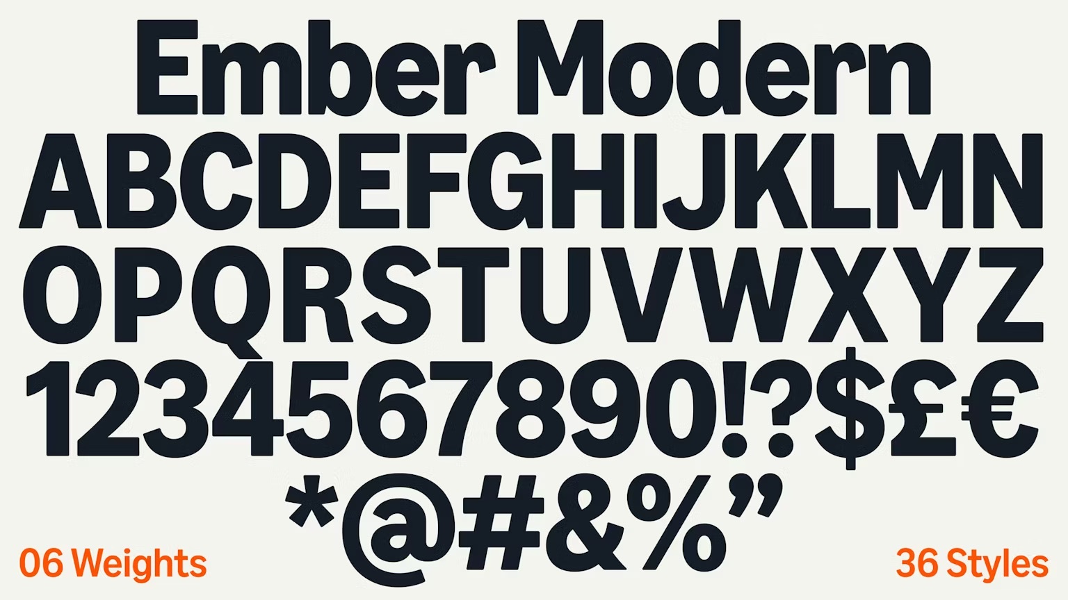
The more significant innovation is "Amazon Ember Modern," a custom typeface designed in-house to succeed the original Amazon Ember font, which was purpose-built for Kindle screens. Ember Modern evolved from its predecessor to function at scale across high-impact marketing applications: billboards, packaging, digital displays, and brand communications.
The typeface upgrade signals a strategic shift: Ember Modern serves not merely as a reading font but as a corporate voice—a personality embedded in letterforms. This distinction matters: typography becomes brand language, not merely utilitarian rendering of words.


Incremental Implementation, Systemic Change
Design agency Koto, cited by Creative Review, contributed to the strategy. The rollout was deliberate and incremental, with color, font, and logo adaptations cascading across sub-brands gradually rather than through a single announcement. This phased approach allows customer perception to settle, preventing the jarring effect of simultaneous visual overhaul.
The rebrand emphasizes Amazon's customer mission through renewed visual emphasis on the smile metaphor. Color, font, and emblem together reinforce a consistent message: smile recognition, digital ease, customer delight. The subtlety of the approach—avoiding proclamation in favor of gradual presence—reflects Amazon's design maturity as a global brand.