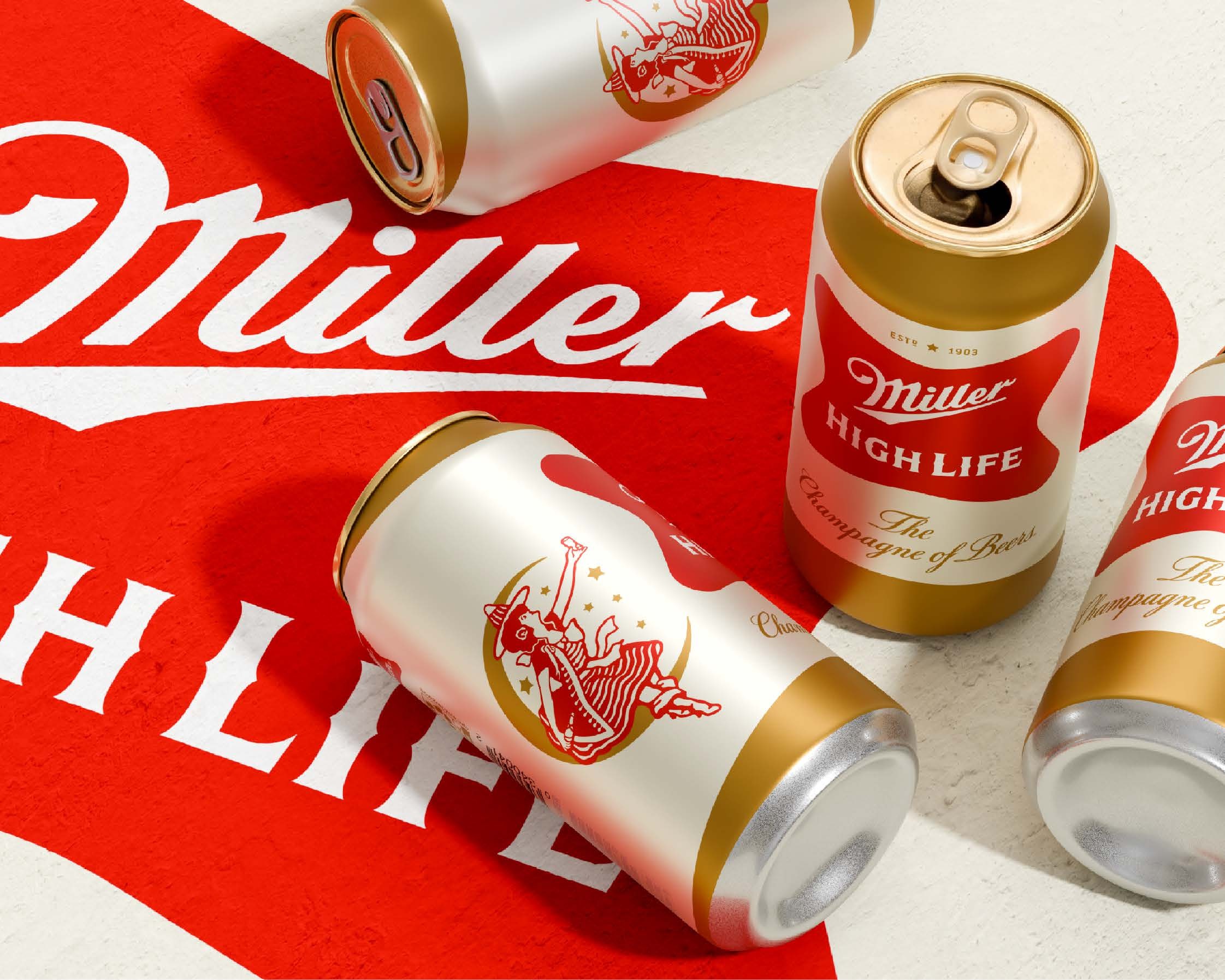
Soulsight refreshes Miller High Life and gives the Girl in the Moon center stage
Miller High Life, the oldest brand in Miller Brewing Company's portfolio, has received a refreshed visual identity from the CPG branding agency Soulsight.1, 2 The beer first appeared in 1903, when its high carbonation and champagne style bottle inspired the enduring tagline "The Champagne of Beers."1, 2 For much of its early life it was positioned as a premium lager, a perception the brewer moved away from around 1970 with the more populist "It's Miller Time."1 More than a century later, the brand occupies a different cultural position, familiar to a new generation as an affordable classic. The redesign, led by Molson Coors and executed by Soulsight, sets out to tidy the brand's appearance without disturbing what regular drinkers recognise and trust.1, 3
A heritage brand revisits its own archive
Soulsight's process began, fittingly, in the past. "Our creative journey started in a basement in Milwaukee, where Molson Coors keeps an impressive archive of Miller High Life's historical assets such as cans, bottles, packaging, barware, signage, and advertising," said Stephen Merlo, creative director at Soulsight.1 Reviewing 123 years of material, the team framed its role less as reinvention and more as stewardship, aiming to stay true to the brand's DNA with every adjustment.1 That mindset set the tone for a refresh built on restraint rather than reinvention.
A crisper palette and a simplified system
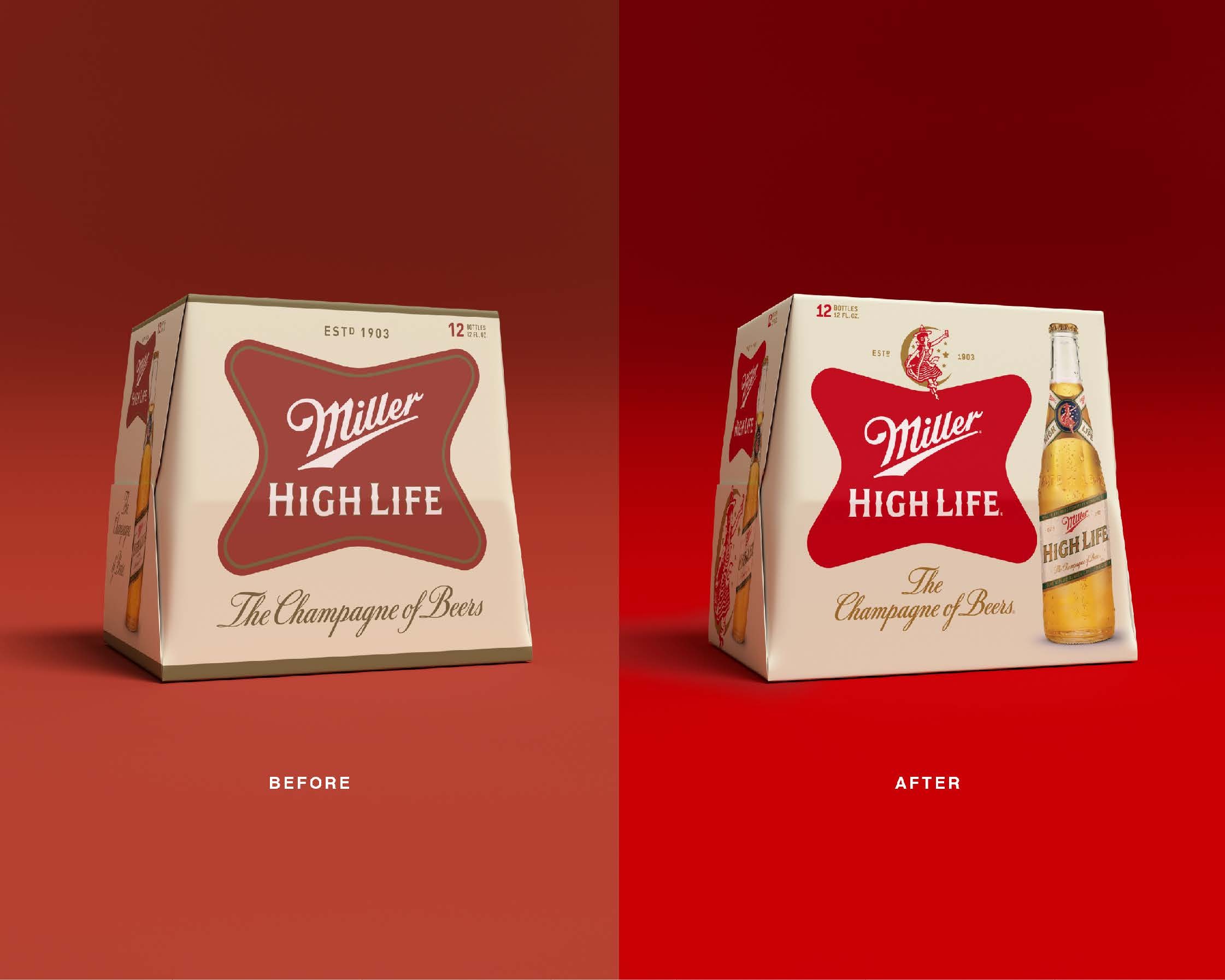
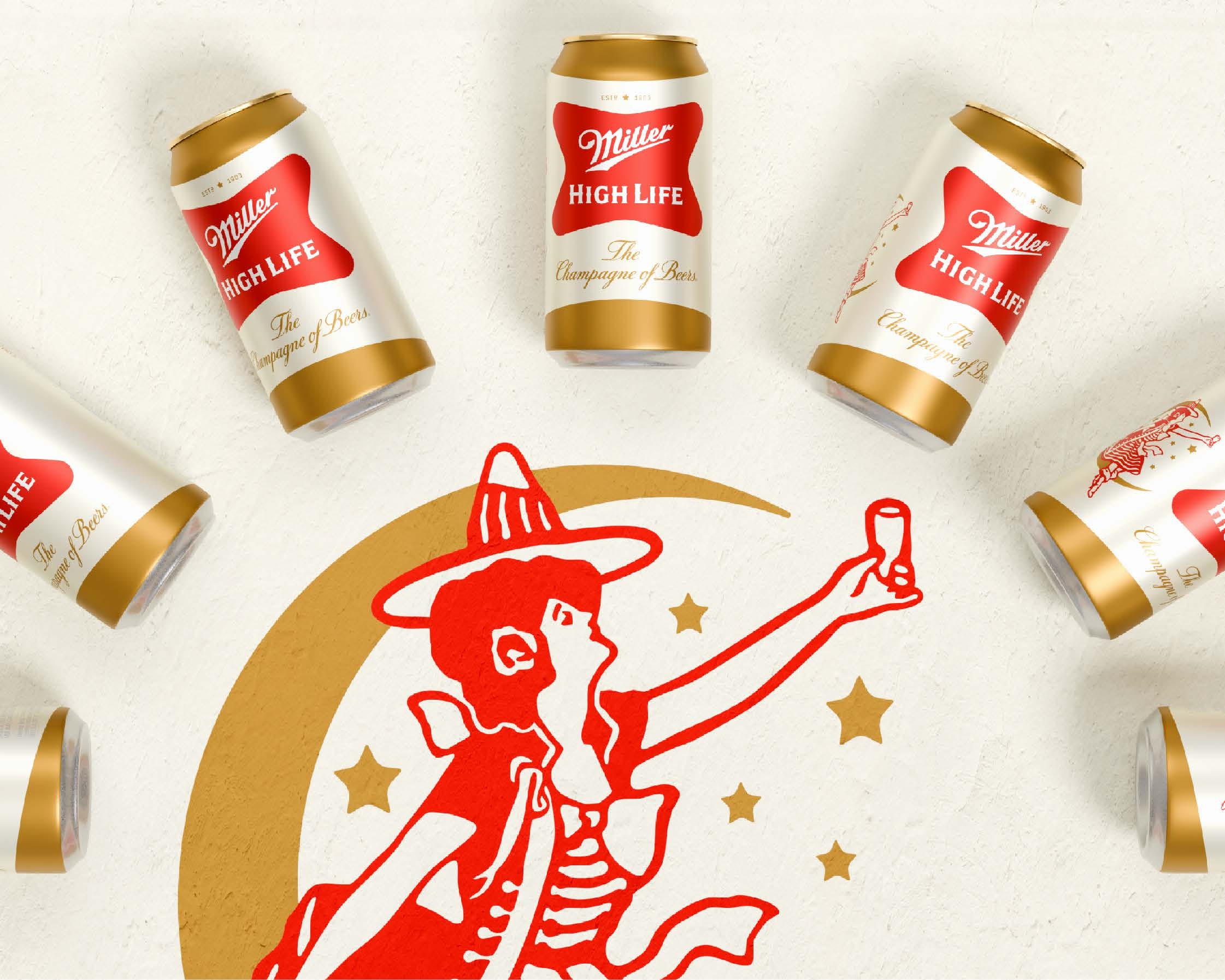
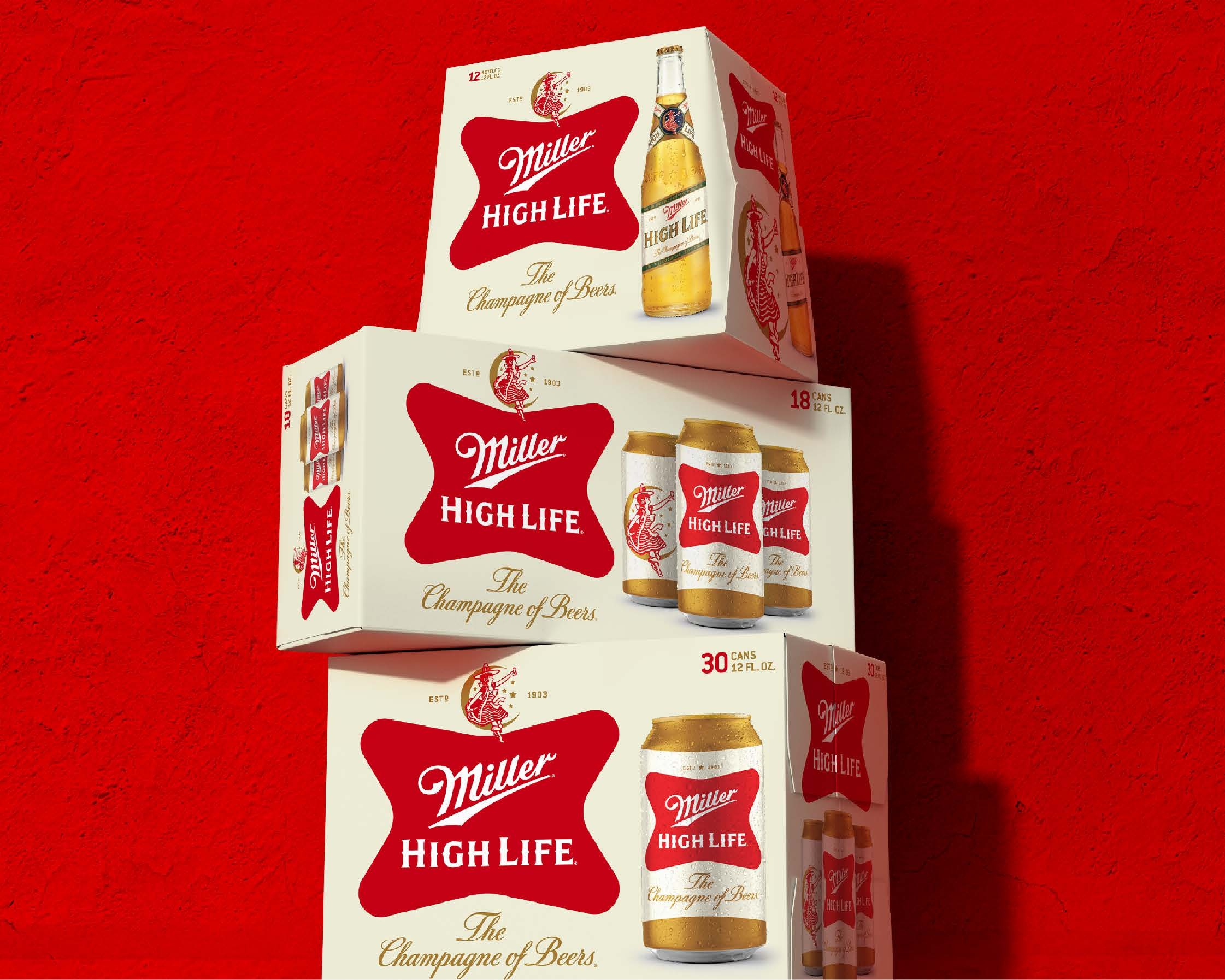
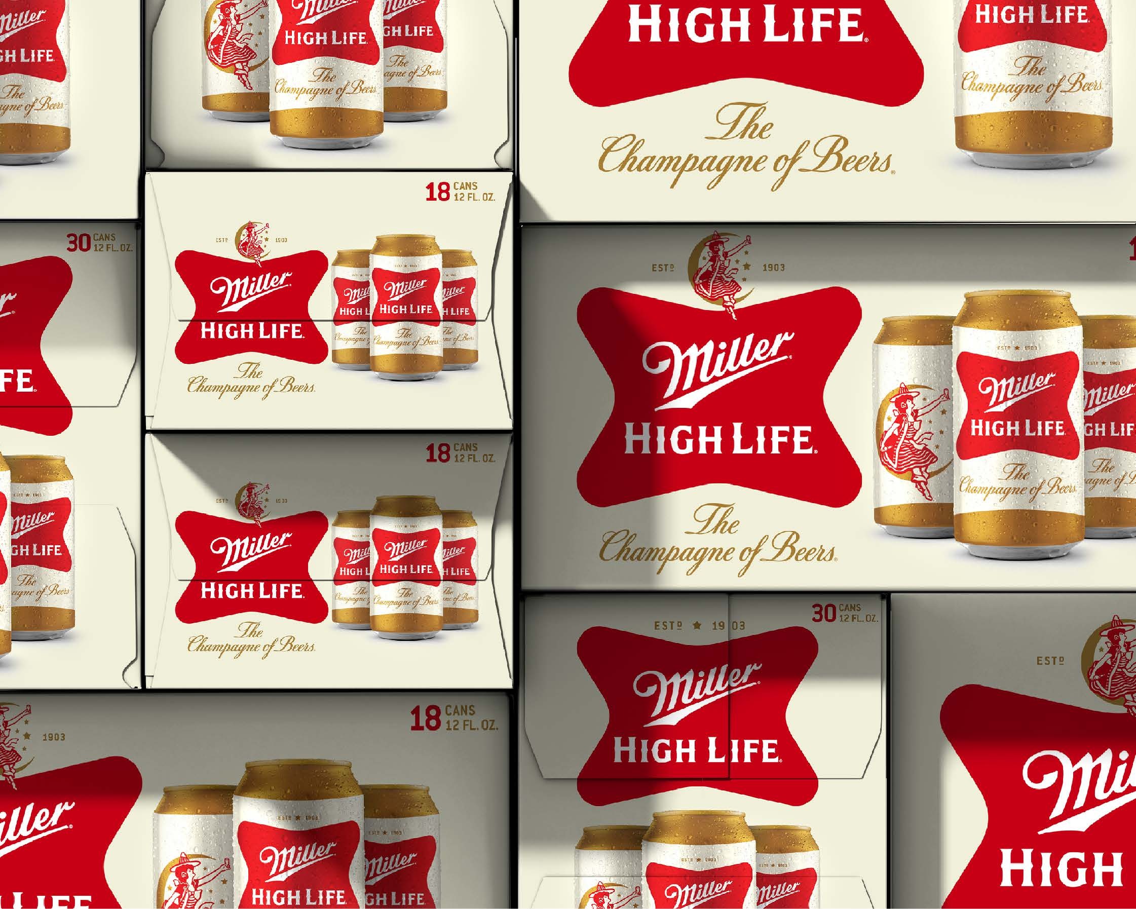
The most immediate changes appear on the cans. Soulsight retained the signature brand elements while crisping and simplifying the colour palette.1 The gold pinstripe has been removed from the soft cross logo, and the cans now read as lighter overall.1 The former green background has been replaced by a champagne like gold, a choice that quietly reconnects the packaging with the brand's original champagne of beers story.1 The white band running across the centre of the can labels has been brightened, sharpening the contrast and giving the design a cleaner presence on shelf.1
The outer boxes have been reworked as well. New packaging places the Girl in the Moon above a revised red soft cross, with an image of the updated bottle set to one side.1 The dark green stripe that previously ran along the bottom has been dropped, and that green is now repurposed for secondary text.1 The "Champagne of Beers" wordmark keeps a similar script but appears in a brighter yellow, another small move that lifts the overall palette.1
The Girl in the Moon takes center stage
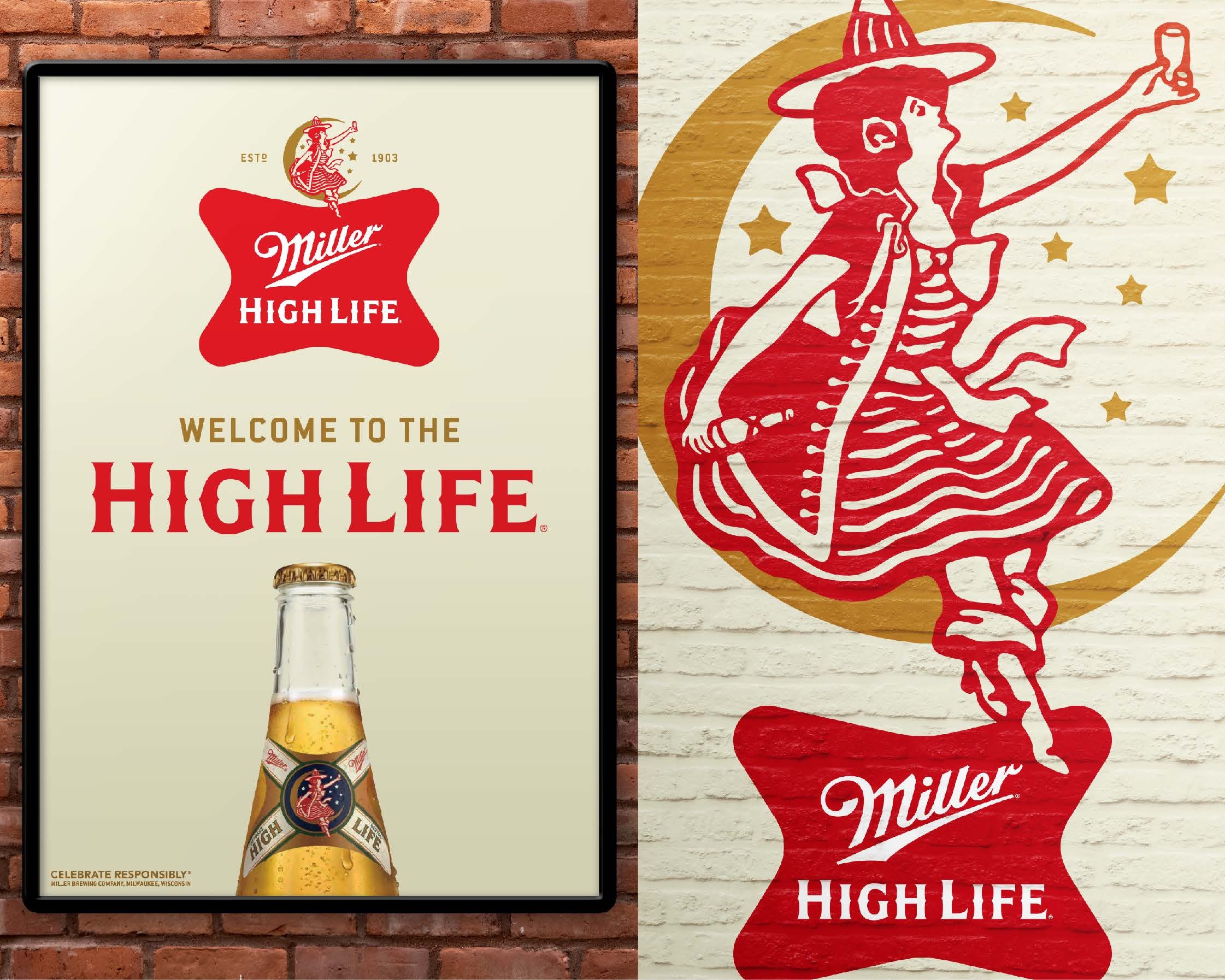
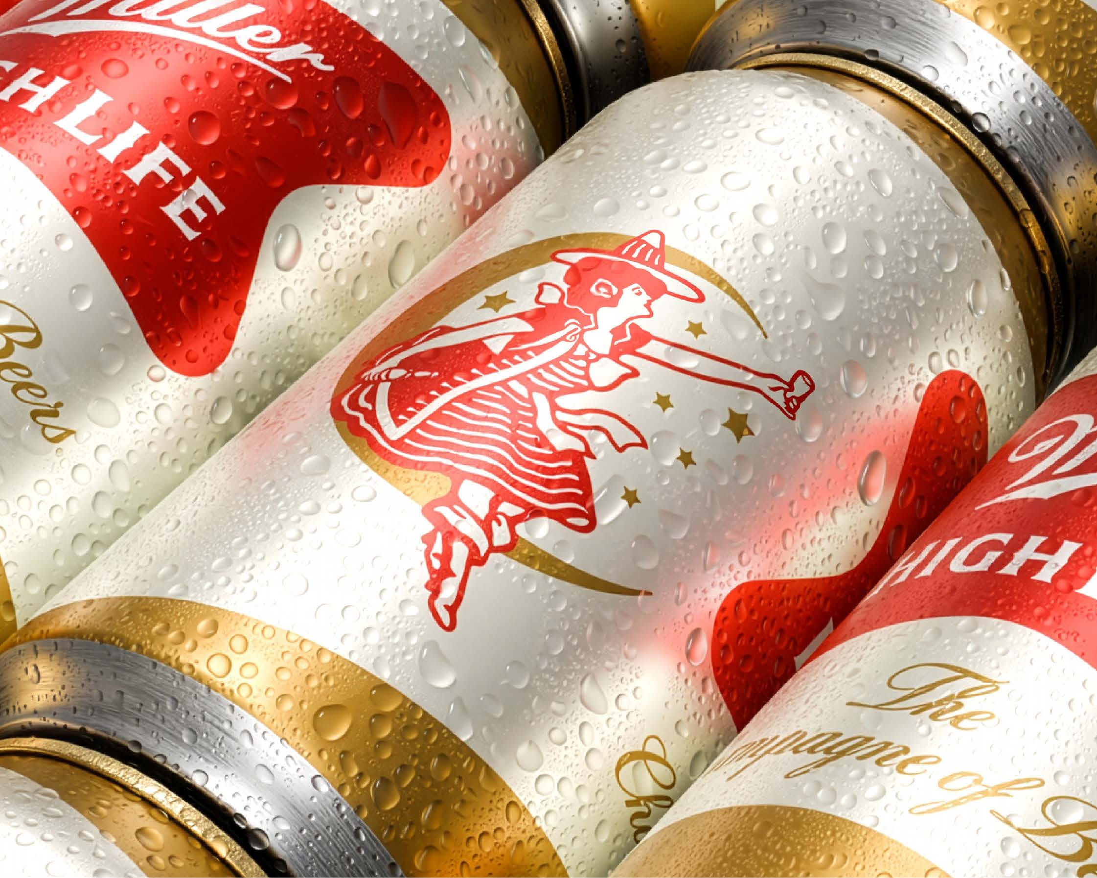
The clearest strategic decision is the elevated role of the Girl in the Moon, an asset the brand has used since 1907.1, 3 She has long been a point of connection for drinkers, appearing on the bottle neck and, for some loyal fans, on their skin as a tattoo.1, 3 Soulsight chose to amplify her across the wider packaging system rather than keep her confined to the bottle.1
"The Girl in the Moon has been a beloved asset of the brand for generations, whether that's brand loyalists getting her tattooed on their arms or serving as an icon of discovery for new consumers," Merlo said.1 "She has historically played a role on the iconic bottle, but we sought to bring more character to the brand packaging by amplifying this distinctive asset that consumers love."1 The decision reflects a familiar principle in heritage branding, that the most valuable equity often already exists within the brand and simply needs renewed emphasis.
Heritage curation over reinvention
Notably, the bottle itself was left unchanged.1, 3 Because the Girl in the Moon already sat in a prominent position on the bottle neck, that touchpoint arguably delivered the redesign's central idea before the project began.1 The result is a bottle that now sits a little apart from the refreshed cans and boxes, a reminder that heritage assets can constrain as much as they enable.
Merlo framed the wider challenge as one of restraint. "Redesigning an iconic heritage brand is an exercise in thoughtful curation," he said.1 "It's about uncovering opportunities to strategically refine the consumer experience while staying true to the brand's heritage, preserving its defining characteristics, amplifying long standing assets that deserve renewed emphasis, and making meaningful improvements where they matter most."1
A refresh timed to a difficult market
The update arrives at a demanding moment for beer. Category sales continue to soften as consumers drink less, and rising gas prices have weighed on purchases in the convenience stores attached to fuel stations.1, 4 Against that backdrop, the visibility of the FIFA World Cup this summer offers a rare tailwind, making it a sensible window to introduce a cleaner, more confident look.1 For Miller High Life, the refresh is less a reinvention than a careful polish, one designed to carry a 123 year old brand a little further without asking its audience to relearn it.1
Written with AI assistance, edited by a human. Find out more about our Use of AI.
1. The Dieline, Rudy Sanchez, "Soulsight Refreshes Miller High Life By Elevating One of the Brand's Most Iconic Assets", 10 July 2026, for Soulsight being the CPG branding agency behind the refresh and for the beermaker enlisting it to freshen up the brand while keeping what makes it special, for Miller High Life being the brewer's oldest brand, for the 1903 debut and the high carbonation and champagne like bottle shape behind the tagline "The Champagne of Beers", for the earlier premium perception and the brewer distancing itself from it around 1970 with "It's Miller Time", for the Milwaukee archive quotation and the job title of Stephen Merlo, Soulsight creative director, for the 123 years of history the team reviewed and its framing of itself as caretaker of the brand's DNA, for the retained signature elements, the crisped and simplified colour palette, the gold pinstripe removed from the soft cross logo, the lighter cans, the champagne like gold replacing the green background and the brightened white band at the centre of the can labels, for the new outer boxes carrying the Girl in the Moon above the revised red soft cross with the updated bottle to one side, the dark green bottom stripe dropped and its colour repurposed for secondary text and the "Champagne of Beers" script now in a brighter yellow, for the Girl in the Moon being in use since 1907 and for both Merlo quotations, the one on amplifying her across the packaging and the one on redesigning a heritage brand as thoughtful curation, for the bottle designs being left unchanged and for her already sitting in an elevated position on the bottle neck, and for the closing market context of sliding beer sales, consumers drinking less, rising gas prices and the FIFA World Cup. https://thedieline.com/soulsight-refreshes-miller-high-life-by-elevating-one-of-the-brands-most-iconic-assets/
2. Wikipedia, "Miller High Life", English edition as read on 17 September 2026, for High Life being an American style lager introduced in 1903 and the oldest brand in Miller Brewing's portfolio, and for the high level of carbonation, likened to champagne, behind the longtime slogan "The Champagne of Beers", used for corroboration of the heritage facts only. https://en.wikipedia.org/wiki/Miller_High_Life
3. Beverage Industry, Staff Beverage Industry, "Miller High Life refreshes packaging, logo", 12 June 2026, for the refresh being presented as a Molson Coors programme, quoting Chris Steele, senior director of value brands at Molson Coors Beverage Co., for the Girl in the Moon having been present since 1907 and for her standing with drinkers, who etch her into dive bar mirrors and have her tattooed, and for the High Life bottle itself remaining unchanged, off whitelist and used for corroboration only. https://www.bevindustry.com/articles/98435-miller-high-life-refreshes-packaging-logo
4. CNBC, Brandon Gomez, "Beer demand stumbles as gas prices surge, data shows", 13 May 2026, for beer, cider and flavored malt beverage volumes falling 6.3 percent year on year through the week ending 2 May 2026, for the declines being steeper at fuel stations and the convenience stores attached to them, and for sales falling furthest in the states where gas is most expensive. The CNBC page refused automated retrieval three times and the figures were confirmed against syndicated copies of the piece, page not reachable on 17 September 2026. https://www.cnbc.com/2026/05/13/beer-demand-stumbles-as-gas-prices-surge-data-show.html