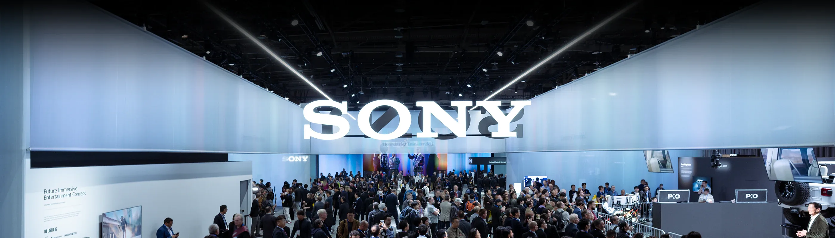
Sony
Global technology and entertainment group built on a Purpose of filling the world with emotion through the combined power of creativity and technology, organised across game, music, pictures, electronics, imaging, and financial businesses under the Sony Group Corporation holding.
Key-Facts
Brand Chronology
Sony presents It Happens on PS5 for the console's fifth anniversary
2025
PlayStation 4 launches with Greatness Awaits and a long-take by BBH
2013
PlayStation gathers its characters around Michael in Long Live Play
2011
Logo Redesign
2009The current PlayStation branding is highly minimalistic, using a simple black-and-white palette that preserves strong contrast and visual clarity. Its core geometric form and proportions remain consistent with earlier versions.
Series identifiers for consoles are still used, typically placed alongside the logo. The stylized “P” and “S” form a continuous, flowing shape with curved lines, while the specific console or game designation appears to the right in a clean, structured layout.
Sony Bravia closes the colour trilogy with Play-Doh by Fallon
2008
Sony Bravia paints a Glasgow tower block with 70,000 litres of colour
2006
Sony Bravia bounces 250,000 balls down the hills of San Francisco
2005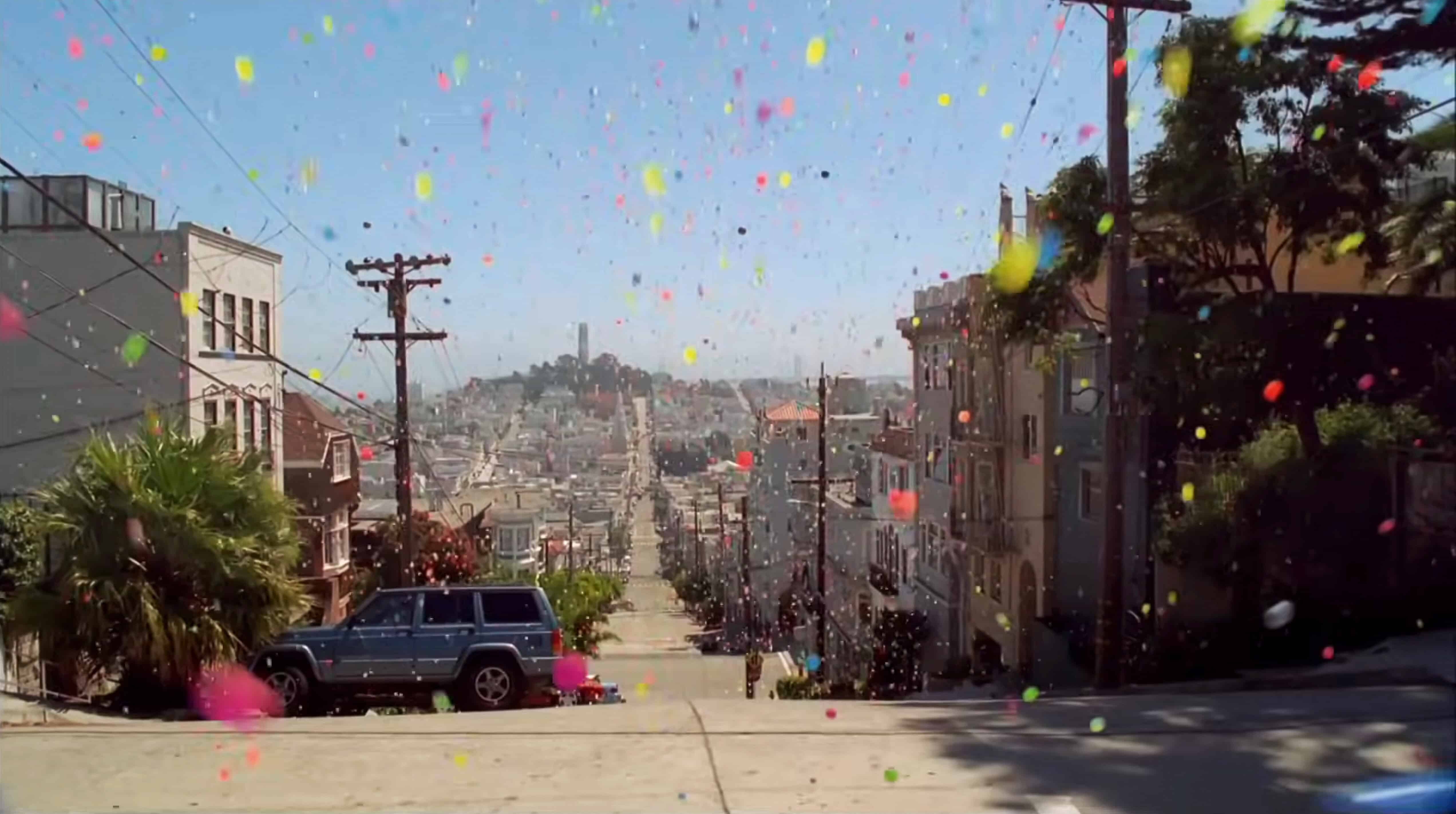
PlayStation 2 climbs Mountain by Frank Budgen for TBWA London
2003
PlayStation 2 launches in Europe with The Third Place by David Lynch
2000
PlayStation hides the games and runs Double Life instead
1999
Manabu Sakamoto draws the PlayStation mark and gives Sony a second house
1994Sony Walkman built a brand on freedom of movement
1988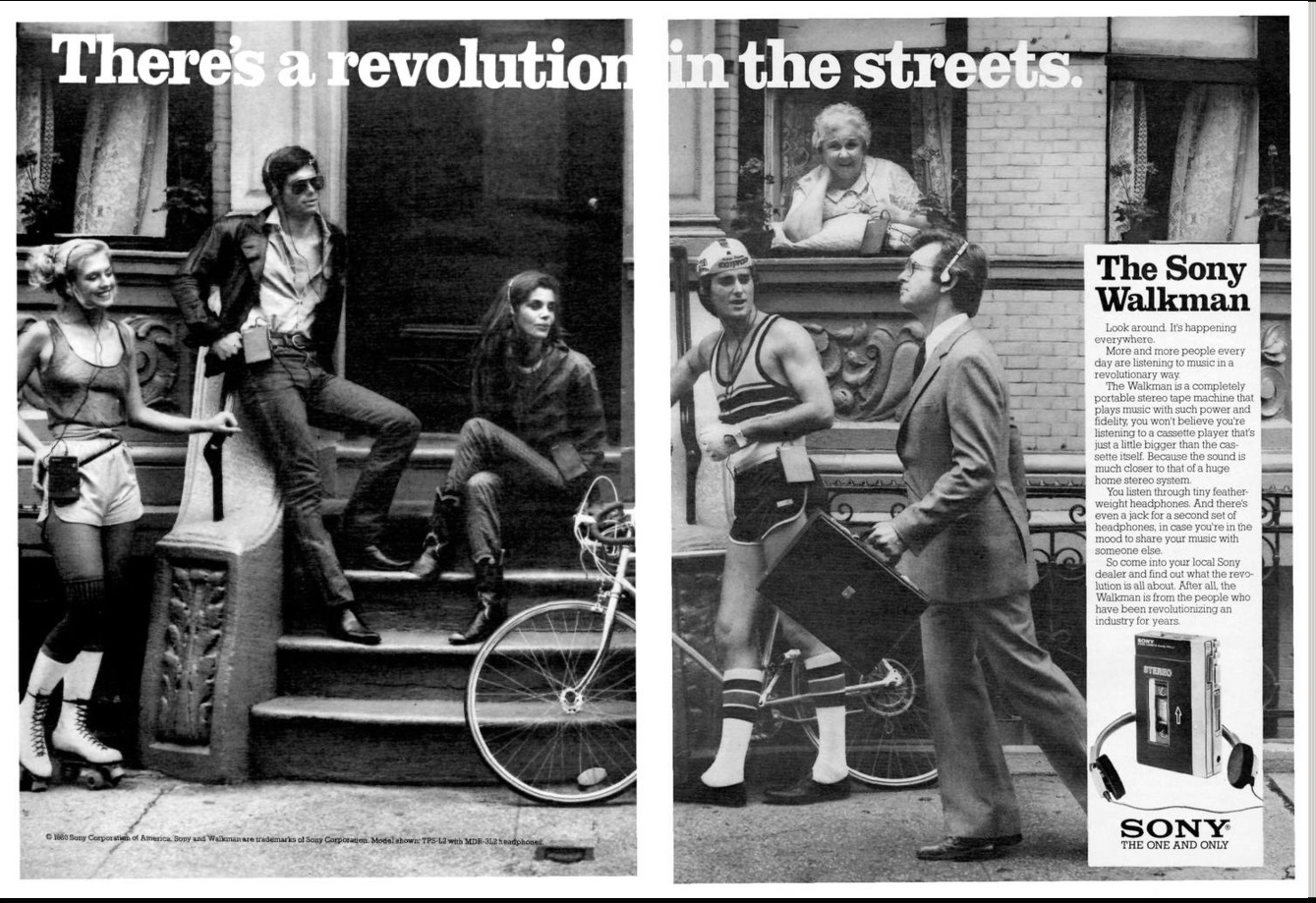
Logo Redesign
1973In 1973, Sony adopted a logo that satisfied executive Norio Ohga and aligned with the company’s refined corporate image.
The black wordmark on a white background conveyed elegance and simplicity, while the typeface resembled Clarendon with subtle modifications. Although Sony later explored redesigns—including a large contest for its 35th anniversary—none of the alternatives replaced the established logo.
Logo Redesign
1961Norio Ohga criticized the existing Sony logo and pushed for refinements. With support from Akio Morita, designer Yasuo Kuroki adjusted the lettering, slightly enlarging the “S” to balance the visual proportions of the wordmark.
The logo continued to undergo minor refinements, mainly involving letter weight and subtle typeface adjustments, until the final version was established.
Logo Redesign
1958In 1958, Sony renamed itself from Tokyo Tsushin Kogyo to Sony Corporation and introduced a new logo designed by Yasuo Kuroki.
The redesign removed the surrounding frame, leaving only the “Sony” wordmark in a bold serif typeface, emphasizing clarity, strength, and brand recognition.
Logo Redesign
1955In 1955, the Sony brand introduced its first “Sony” logo as an italic wordmark inside a rectangular frame. The elongated “S” and “y” gave the design a distinctive and elegant character.
Logo Design
1946In 1946, before becoming Sony, the company operated as Tokyo Tsushin Kogyo. Its early emblem centered on the letter “T” and featured an inverted trapezoid with a rhombus inside a black ring.
Founded
1946