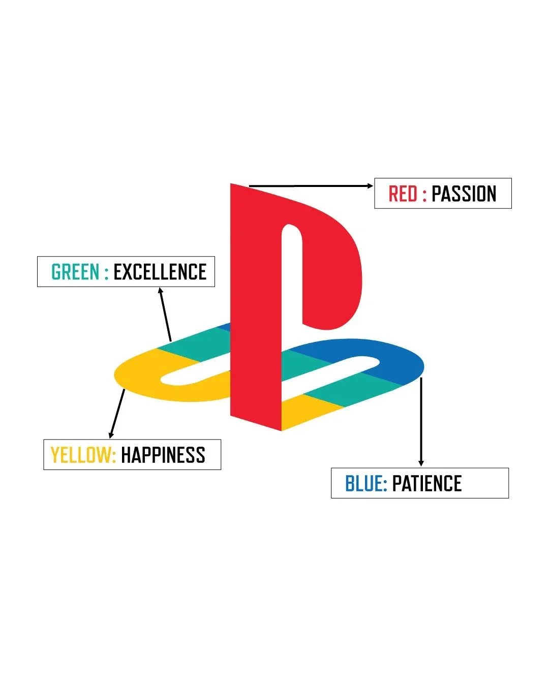
An overlapping P and S, drawn for three dimensions
On 3 December 1994, Sony Computer Entertainment released the original PlayStation in Japan at a retail price of 39,800 yen. The console launched alongside a logomark designed by Manabu Sakamoto, an in-house Sony graphic designer who had previously worked on identities for the VAIO line. The mark interlocked a red capital P on top of a layered S whose horizontal strokes faded through yellow, green, and blue. It was abstract, typographically restrained, and built for screen as much as for print.
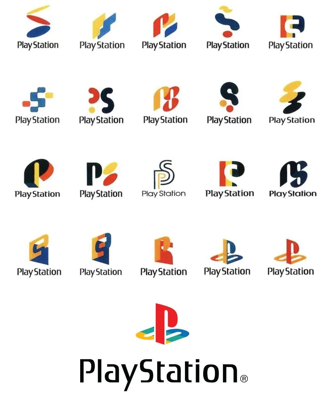
Sakamoto produced more than 20 alternative treatments before the final mark was selected. His brief was to evoke the console's defining technical claim, three dimensional graphics, without resorting to a literal depiction of polygons or perspective lines. The chosen solution used the optical illusion of overlapping letterforms standing above a horizon line. The orange P appeared to float forward, while the multicolour S receded into space. The geometry recalled the impossible architecture of M. C. Escher more than the cartoon vocabulary of mid-1990s gaming.
A separate house under the Sony roof
The decision to give the new console its own visual identity, rather than wrap it inside the existing Sony wordmark, was a calculated piece of brand architecture. Sony Computer Entertainment had been founded in November 1993 as a joint venture between Sony Corporation and the music subsidiary Sony Music Entertainment Japan. The new entity was deliberately positioned at arm's length from the parent company. Ken Kutaragi, the engineer who had pushed the console programme through internal opposition, wanted PlayStation to read as its own brand, with its own audience, its own retail presence, and its own creative voice.
Sakamoto's mark made that separation visible. The PlayStation logo carried no Sony lettering. The two identities sat on the same hardware but held different visual registers. Sony, in 1994, still meant Trinitron televisions, Walkman cassette players, and the corporate authority of a 36 year old wordmark. PlayStation, by contrast, looked like nothing else in Sony's portfolio. The brand could speak to teenagers and adult gamers without dragging the whole consumer electronics catalogue with it.
The shape symbols on the controller
The logomark did not exist in isolation. The original PlayStation controller, designed by Teiyu Goto, carried four geometric shape symbols on its right hand buttons: triangle, circle, cross, and square. Goto chose the symbols deliberately to avoid the alphabetical or numerical labels used by competing controllers. The triangle stood for viewpoint, the square for menus, the circle for yes, and the cross for no. The four marks echoed the optical character of Sakamoto's logomark: abstract, geometric, and culturally neutral enough to translate across markets.
Together the logomark and the controller shapes formed a coherent identity system. The brand vocabulary was visual rather than verbal, which made it portable into territories where the English word "PlayStation" carried no meaning. The shapes appeared on packaging, in advertising, and on hardware for the next three decades, eventually becoming a shorthand for the entire console category.


Three decades without revision
The 1994 logomark proved unusually durable. It survived the launch of the PlayStation 2 in March 2000, the PlayStation 3 in November 2006, the PlayStation 4 in November 2013, and the PlayStation 5 in November 2020. Sony refined typography, palette, and supporting graphics across each generation, but the core PS device, the interlocked P over a striped S, was never replaced. Compared to the visual fashion swings inside consumer electronics over the same period, including the flat redesigns of the 2010s and the gradient revivals of the early 2020s, the consistency is unusual.
Part of the reason is that the mark refuses to argue with the product. It does not depict a console, a controller, or a game. It reads as a piece of typographic architecture rather than a fashion statement, and abstract marks age more slowly than literal ones. The other reason is brand discipline at Sony Group, which has consistently treated PlayStation as a long term equity rather than a campaign-period identity to be reinvented every five years.
What the longevity says
Sakamoto's mark sits in a small set of consumer brand identities that have survived more than three decades without major revision. Coca-Cola's Spencerian script, Levi's red Tab, and the FedEx wordmark all belong to the same category. What links them is the willingness of the parent company to leave the visual asset alone while the world around it changes.
For Sony, the PlayStation logomark is also a structural asset in a portfolio strategy. Sony Group Corporation today operates across six business segments, and the PlayStation brand is one of the few that carries genuine independent equity outside the Sony parent. The logomark Sakamoto drew in 1994 made that independence possible at the very start. It was, in retrospect, one of the most consequential acts of brand architecture in late twentieth century consumer electronics.
Written with AI assistance, edited by a human. Find out more about our Use of AI.