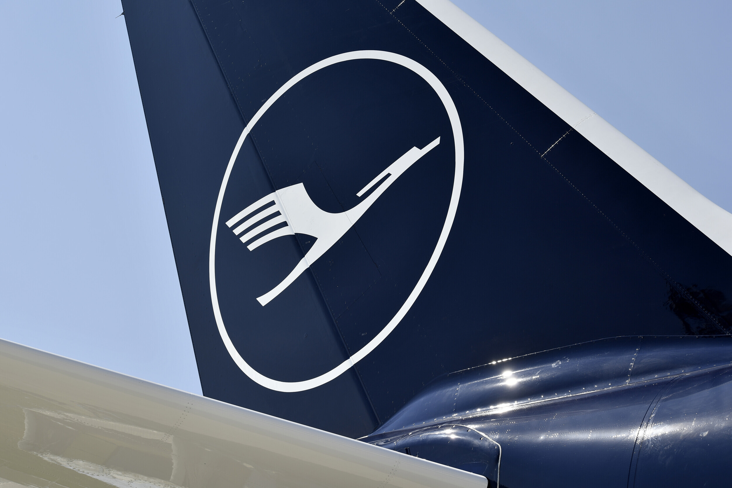
Lufthansa
Image Source: medialounge.lufthansagroup.com - Alex Tino Friedel ATF Pictures

Lufthansa

German flag carrier and Europe's largest airline group, recognized for the Otto Firle crane, the Ulm corporate design system, and a contemporary premium identity.

Key-Facts

Founded 1926
Logo
Industry Aviation
Headquarters Germany
Current claim "Say yes to the world"
Color #05164d

Brand Chronology

Lufthansa flies a giant crane to mark 100 years (2025)

Lufthansa flies a giant crane to mark 100 years

2025
Lufthansa flies a giant crane to mark 100 years
Dark blue Lufthansa Boeing 787-9 in the 100-years super crane livery at sunset
For its 2026 centenary, Lufthansa puts a giant crane on a deep-blue Boeing 787-9, the first of six aircraft in a special anniversary livery.
Read Article →
Lufthansa reduces its claim to a single 'Yes' (2024)

Lufthansa reduces its claim to a single 'Yes'

2024

Lufthansa reduces its claim to a single 'Yes'
Still from the 2024 Lufthansa Yes campaign film carrying the line Every seat has a story. Image Source: newsroom.lufthansagroup.com
Lufthansa distils 'Say yes to the world' to a single 'Yes' in a 2024 Serviceplan campaign film built on passengers' own stories.
lufthansa campaign news new positioning
Read Article →
Lufthansa moves to 'Say yes to the world' (2020)

Lufthansa moves to 'Say yes to the world'

2020
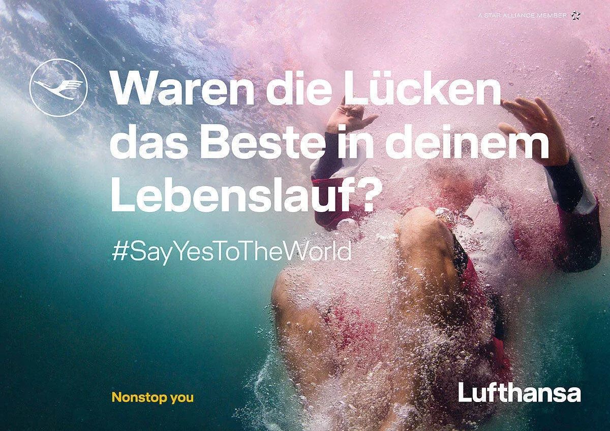
Lufthansa moves to 'Say yes to the world'
Lufthansa campaign imagery carrying the Say yes to the world claim
Lufthansa frames the 2020s around 'Say yes to the world', a claim built on openness and individual travel stories.
lufthansa campaign news new positioning
Read Article →
Lufthansa sharpens its premium identity in 2018 (2018)

Lufthansa sharpens its premium identity in 2018

2018
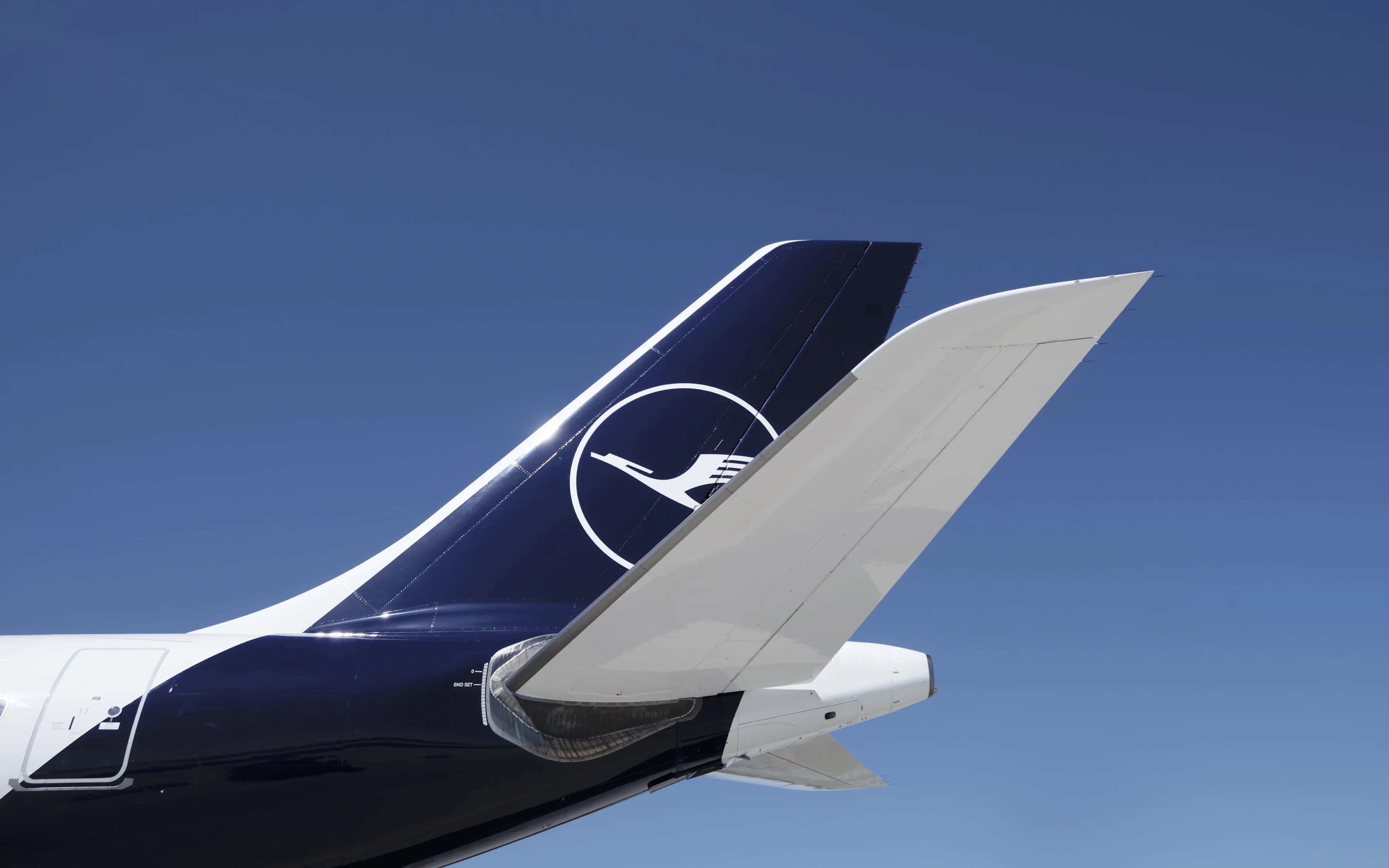
Lufthansa sharpens its premium identity in 2018
Lufthansa aircraft tail in the 2018 deeper blue with the refined crane in a circle. Image Source: martinetkarczinski.de
For the crane's centenary, Lufthansa took on a deeper blue, reduced yellow to an accent and rebuilt its identity with Martin et Karczinski.
lufthansa news rebranding
Read Article →
Logo Redesign (2018)

Logo Redesign

2018

This version of the Lufthansa logo returned to the brand’s classic design, combining a wordmark with the iconic crane symbol inside a circle. The crane, shown in dark blue, represented elegance, lightness, and flight, while the circular frame conveyed balance and completeness. Compared with earlier versions, the lines became thinner and more refined, and the blue tone was darkened. The wordmark was also updated with narrower letterforms, including the removal of the lower serif on the “a.” The typeface was created by Hannes von Döhren, while the logo redesign was led by Ronald Wild.

lufthansa logo redesign
Lufthansa adopts 'Nonstop you' as its claim (2012)

Lufthansa adopts 'Nonstop you' as its claim

2012

Lufthansa adopts 'Nonstop you' as its claim
Lufthansa advertising carrying the Nonstop you claim introduced in 2012
In 2012 Kolle Rebbe replaced Lufthansa's elite-sounding claim with 'Nonstop you', putting the customer at the centre.
lufthansa campaign news new positioning
Read Article →
Lufthansa's 'There's no better way to fly' era (2000)

Lufthansa's 'There's no better way to fly' era

2000
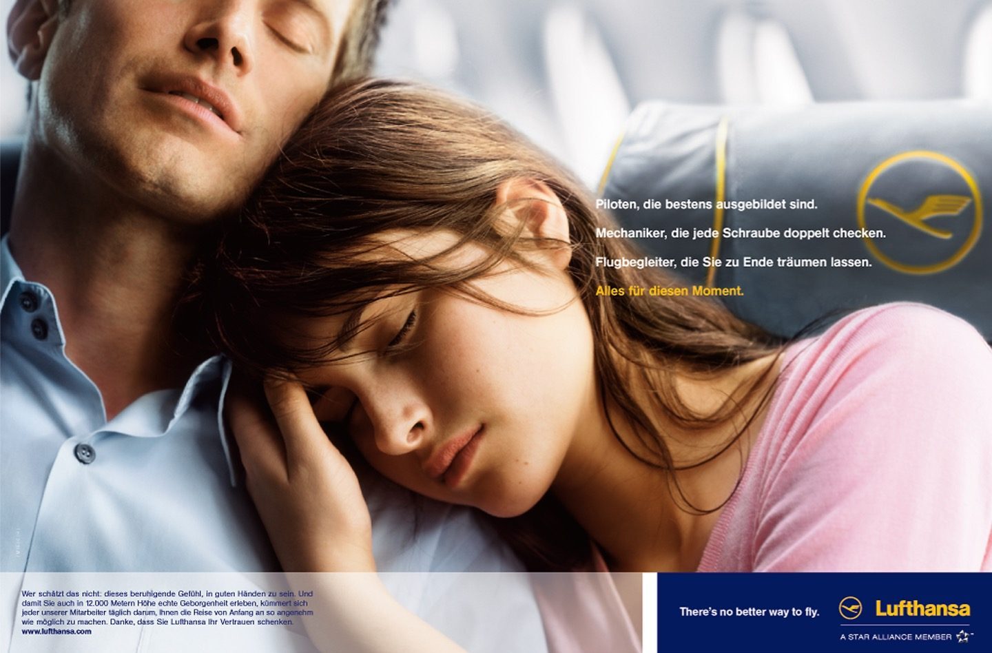
Lufthansa's 'There's no better way to fly' era
Lufthansa advertising carrying the English claim There's no better way to fly
McCann Erickson gave Lufthansa 'There's no better way to fly', its English claim from around 2000 until 2012.
lufthansa campaign news new positioning
Read Article →
Lufthansa's 1988 warm-up and the flying canary (1988)

Lufthansa's 1988 warm-up and the flying canary

1988
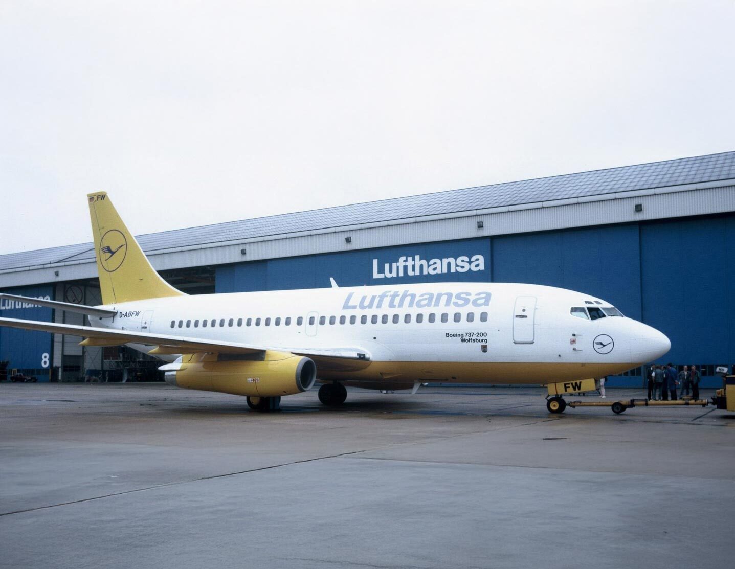
Lufthansa's 1988 warm-up and the flying canary
Lufthansa aircraft with a strongly yellow tail, the disputed warmer identity of the late 1980s. Image Source: lufthansa.com
A 1988 study found Lufthansa seen as a cool business airline, prompting a warmer, yellower identity that staff nicknamed the flying canary.
lufthansa news branding rebranding
Read Article →
Logo Redesign (1963)

Logo Redesign

1963

In 1963, Lufthansa redesigned its logo by enclosing its iconic bird symbol within a circle. The bird was placed at the center of the emblem, and the lines were made bolder and more prominent. The circular icon appeared to the left of the Lufthansa wordmark, while all elements adopted a deep blue color, creating a cleaner and more unified corporate identity.

lufthansa logo redesign
Otl Aicher turns the crane into a design system (1962)

Otl Aicher turns the crane into a design system

1962
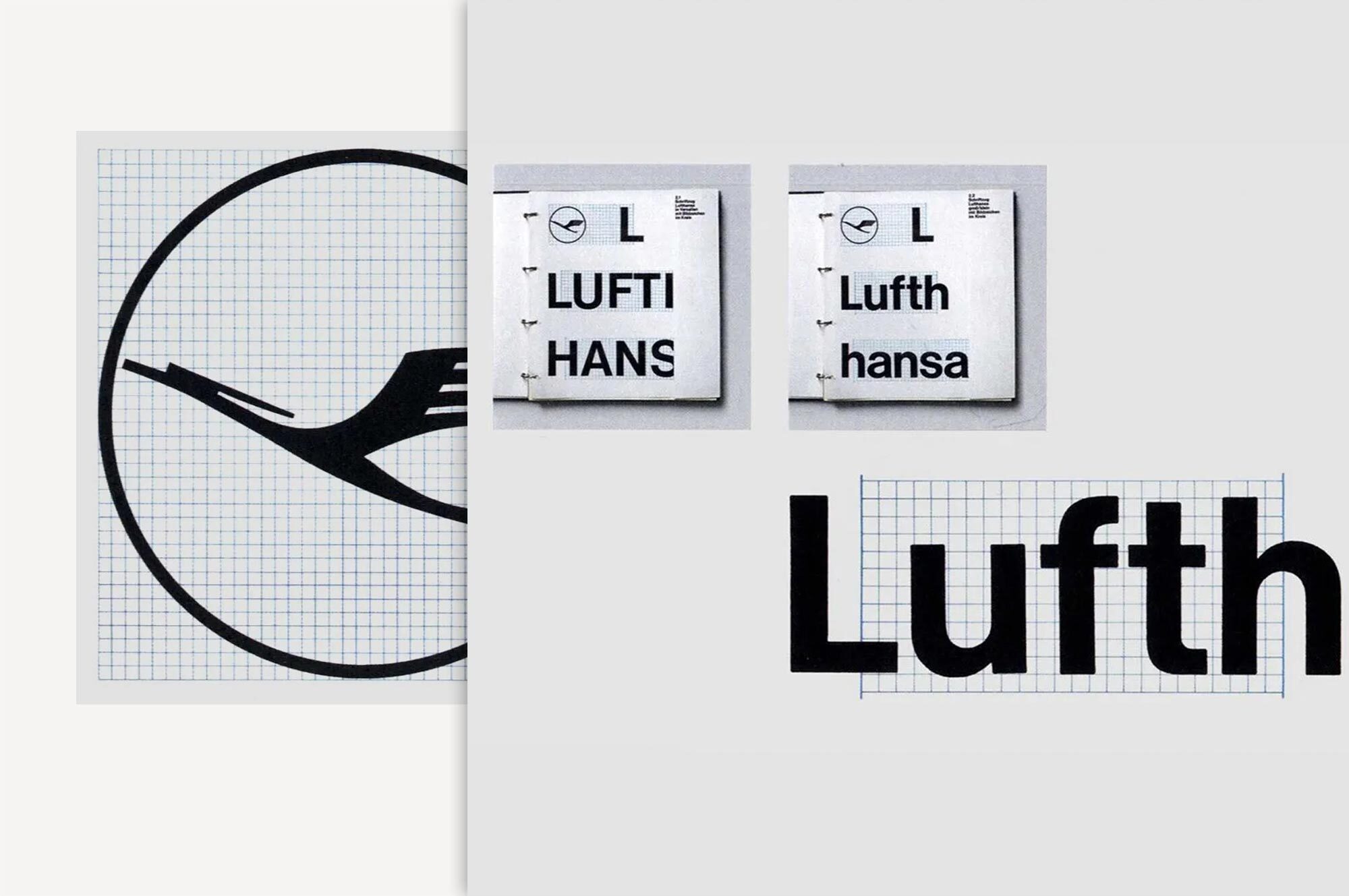
Otl Aicher turns the crane into a design system
In 1962 Otl Aicher and Entwicklungsgruppe 5 rebuilt the Lufthansa crane into one of Europe's first corporate design systems.
lufthansa news rebranding
Read Article →
Wir sprechen überall Ihre Sprache (1960)

Wir sprechen überall Ihre Sprache

1960
Wir sprechen überall Ihre Sprache
Source: lufthansa.com

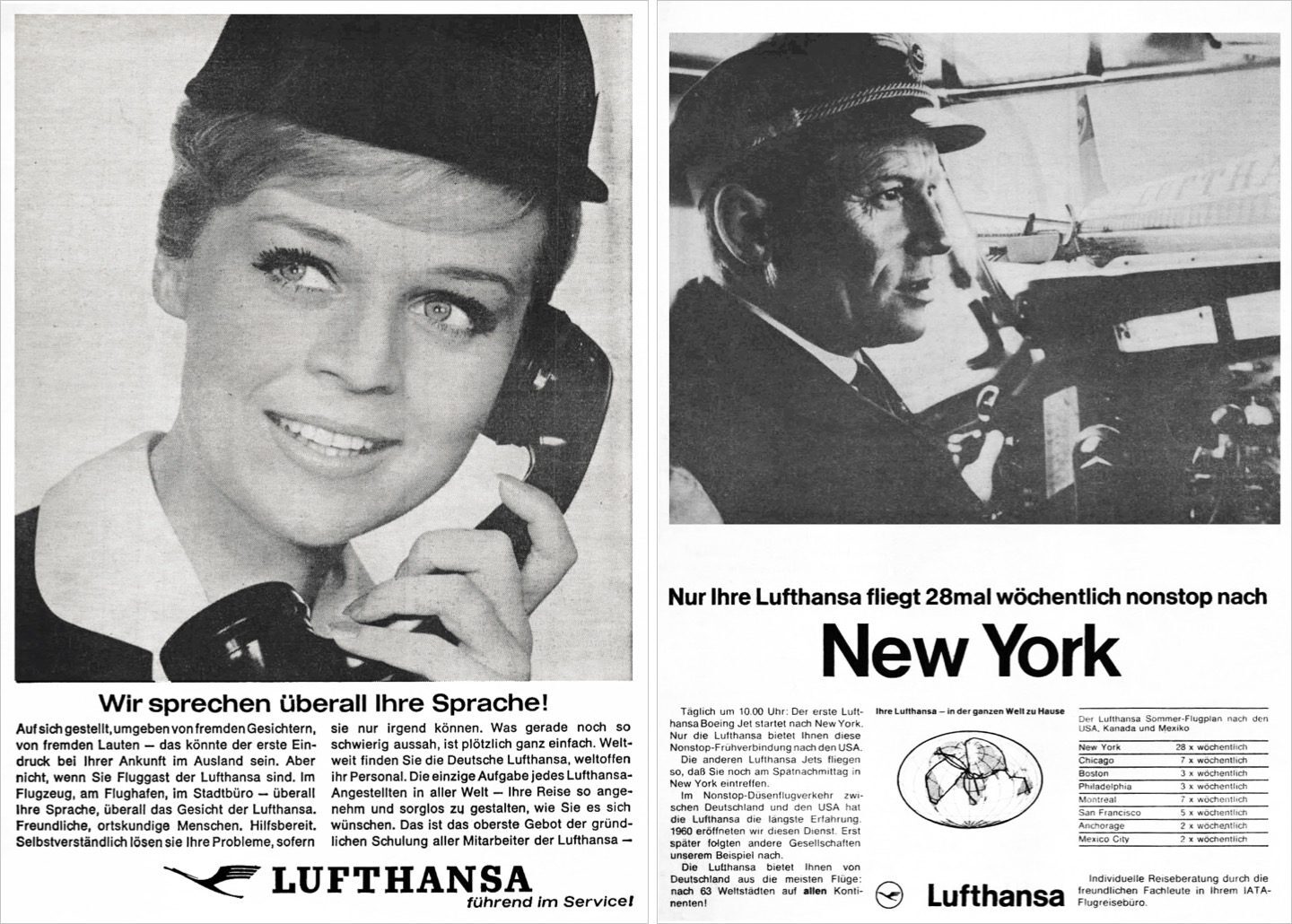
The campaign emphasized Lufthansa’s commitment to being “a leader in service.” The slogan “We speak your language everywhere” reassured passengers that they would be well cared for, no matter where they were in the world.

Reflecting the reading habits of the time, lengthy newspaper copy was used to reinforce and explain the service promise expressed in the headline. Alongside striking illustrations, the growing use of photography led to the inclusion of real images of pilots and flight attendants, helping to build trust and strengthen the airline’s image.

lufthansa ad campaign
Logo Redesign (1953)

Logo Redesign

1953

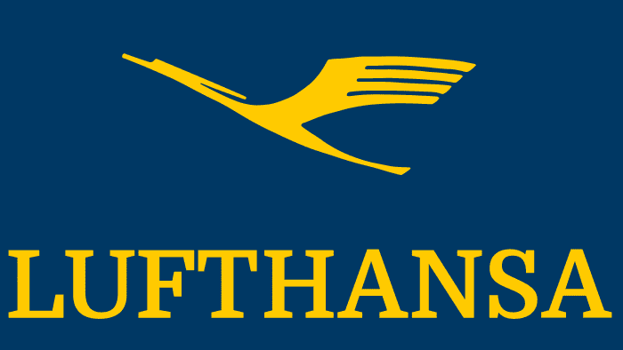
The original logo featured a stylized flying bird resembling a stork, crane, or heron, symbolizing the company’s aviation focus. With its long neck, legs, and outstretched wings, the bird conveyed motion, freedom, and an aspiration toward the sky. Beneath the figure appeared the company name in large lettering, while all elements were set within a blue rectangular frame.

lufthansa logo redesign
Fly to the Seaside Resorts (1940)

Fly to the Seaside Resorts

1940
Fly to the Seaside Resorts
Source: lufthansa.com

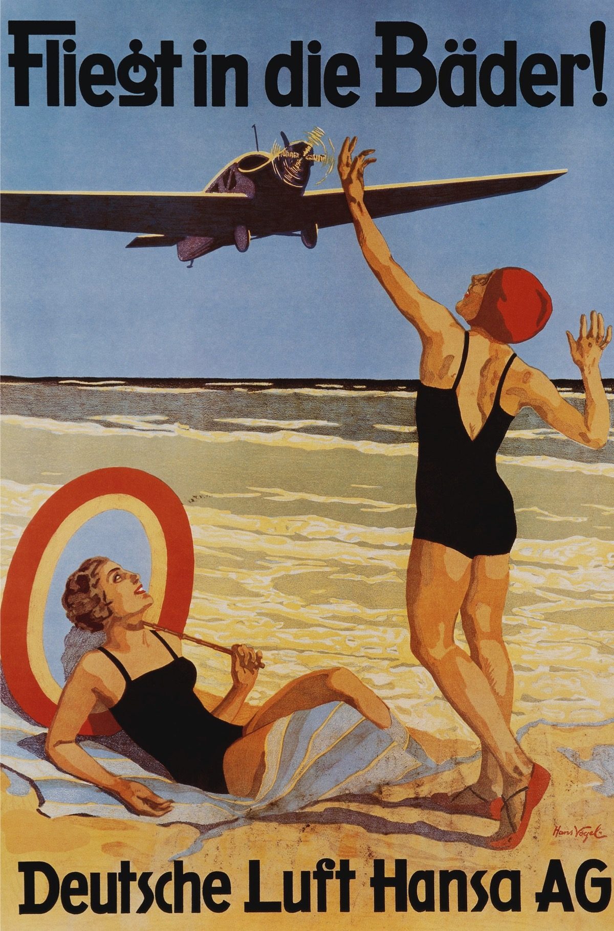
At the time, scheduled flights operated by Lufthansa primarily served destinations within Europe. One of the era’s most iconic campaigns, “Fly to the Seaside Resorts” (“Fliegt in die Bäder”), promoted regular flights to spa and beach destinations.

Although the slogan may seem plain by modern standards, it worked effectively alongside hand-drawn beach scenes to inspire dreams of summer vacations. For many people, who rarely traveled at the time, the advertisements evoked the allure of a relaxing holiday on the North Sea or Baltic Sea coasts.

lufthansa ad campaign
How Otto Firle's crane became the Lufthansa mark (1918)

How Otto Firle's crane became the Lufthansa mark

1918

How Otto Firle's crane became the Lufthansa mark
Image Source: lufthansa.com
In 1918 the architect Otto Firle drew a stylised crane for Deutsche Luft-Reederei, the mark that would carry Lufthansa for a century.
lufthansa news foundation
Read Article →

Founded

1926
Deutsche Luft Hansa AG formed in Berlin in 1926 from the merger of Deutscher Aero Lloyd and Junkers Luftverkehr, taking the crane and the colours blue and yellow.