
A brand seen as efficient but cold
By the late 1980s the Lufthansa crane was secure. The mark and its system, established at Ulm in the 1960s, had given the airline one of the most disciplined identities in aviation. But discipline had a cost. In 1988 a wide-ranging study found that Lufthansa was perceived above all as a cool, efficient business airline. The carrier was respected, yet it felt distant. For a brand competing for leisure travellers as well as corporate ones, being admired but not warmly liked was a strategic problem.
The response was a deliberate effort to make the appearance more emotional without touching the symbol at its centre. The crane in its ring was not up for discussion. What could change was the stage around it: the colours, the materials and the atmosphere that audiences experienced when they encountered the brand.
Yellow as a point of difference
The lever Lufthansa reached for was its own yellow. Most competitors used identities dominated by blue, so pushing yellow forward offered a clear way to stand apart on a crowded apron. A brighter, warmer presentation promised both differentiation and a friendlier tone. The plan called for yellower tails, more yellow inside the cabin and yellow-accented communications, turning a colour the brand already owned into its signal of warmth.
This was a question of positioning, the strategic work of shaping how a brand is perceived relative to its rivals, pursued through colour rather than slogan. Lufthansa was not trying to become a different airline. It was trying to be felt differently, to soften the impression of cool competence with something more approachable.
When the canary appeared
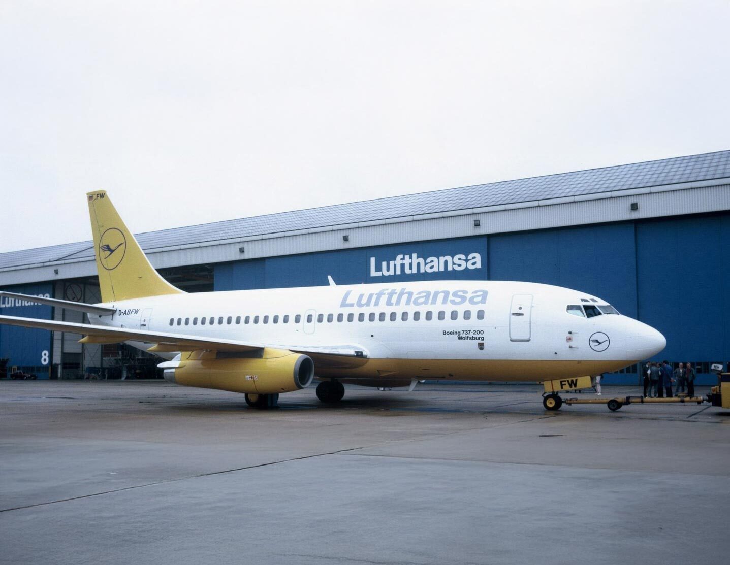
Some of the proposals pushed the idea a long way. Aircraft rendered with strongly yellow tails and bodies looked, to many inside the company, less like a refinement of the brand and more like a different animal altogether. The internal reaction was sharp. Among employees the heavily yellow concept earned a nickname that stuck: the flying canary.
The nickname was affectionate and critical at once. It captured a real tension in any brand refresh, the line between warming an identity and overwhelming it. A Boeing 737 in the most saturated yellow scheme became the emblem of how far was too far. The crane could survive a brighter setting, but if the yellow shouted loudly enough, the calm authority that the mark had always signalled risked being lost.
The resistance was instructive precisely because it came from inside. Employees who lived with the brand every day were quick to sense when an identity strayed from itself, and their reaction acted as an informal check on the project. A colour that worked as an accent could read as a costume when it covered an entire aircraft, and the people closest to the brand recognised the difference before any external audience had the chance to.
Continuity wins the argument
In the end the airline chose evolution over rupture. The line of continuity prevailed: the crane in its circle stayed exactly what it had always been, the quiet and reliable centre of the brand. Around it, colours, materials and staging were adjusted to feel closer, warmer and more contemporary, but without endangering the mark's character. Yellow was strengthened as an accent rather than allowed to dominate, and the boldest canary schemes did not enter service.
The episode is a useful case in how heritage brands manage change. Lufthansa had identified a genuine weakness, the perception of coldness, and was willing to act on it. Yet it also understood that its most valuable asset was the consistency of the crane, built up over decades of unwavering use. The discipline that made the brand feel cool was the same discipline that made it trusted, and the company was not prepared to trade one for the other.
The compromise it reached, a warmer atmosphere around an unchanged symbol, set the pattern for how Lufthansa would handle later identity questions. When the brand was modernised again in 2018, the logic was recognisably similar. The crane was kept, while the surrounding colour language was rebalanced, this time in the opposite direction, with yellow stepping back and a deeper blue taking the lead. In both cases the brand changed its mood without changing its mark.
The flying canary never flew in its loudest form, but the debate it provoked was productive. It forced Lufthansa to decide what was truly fixed in its identity and what was open to adjustment. The answer, then as later, was that the crane was permanent and everything around it was negotiable, a distinction that has kept the brand both recognisable and adaptable across generations.
Written with AI assistance, edited by a human. Find out more about our Use of AI.