A new identity for the crane's hundredth year
In February 2018 Lufthansa presented the most significant refresh of its identity in decades. The timing was deliberate. The crane that Otto Firle had drawn in 1918 was turning one hundred, and the airline used the anniversary to bring its appearance into line with how it wanted to be seen: as a contemporary premium brand. The change was substantial in tone, but it was careful with the heritage it inherited. The crane stayed at the centre, refined rather than replaced.
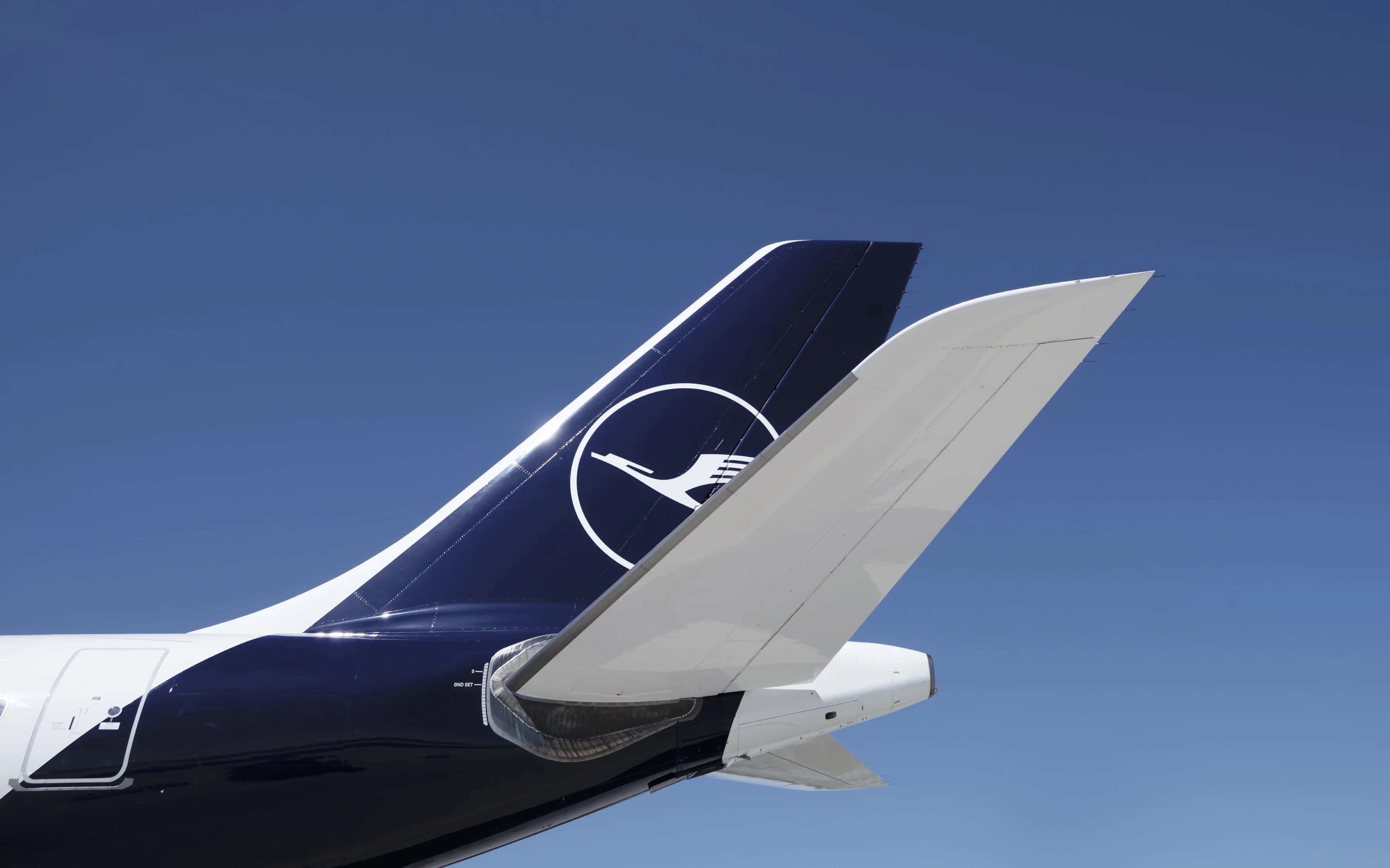
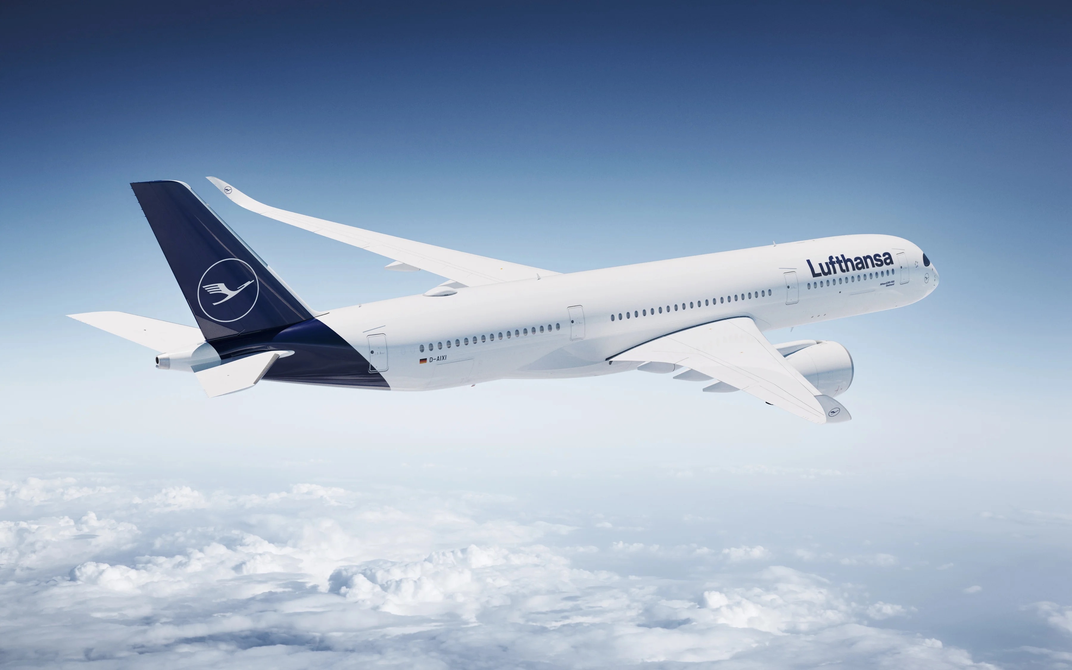
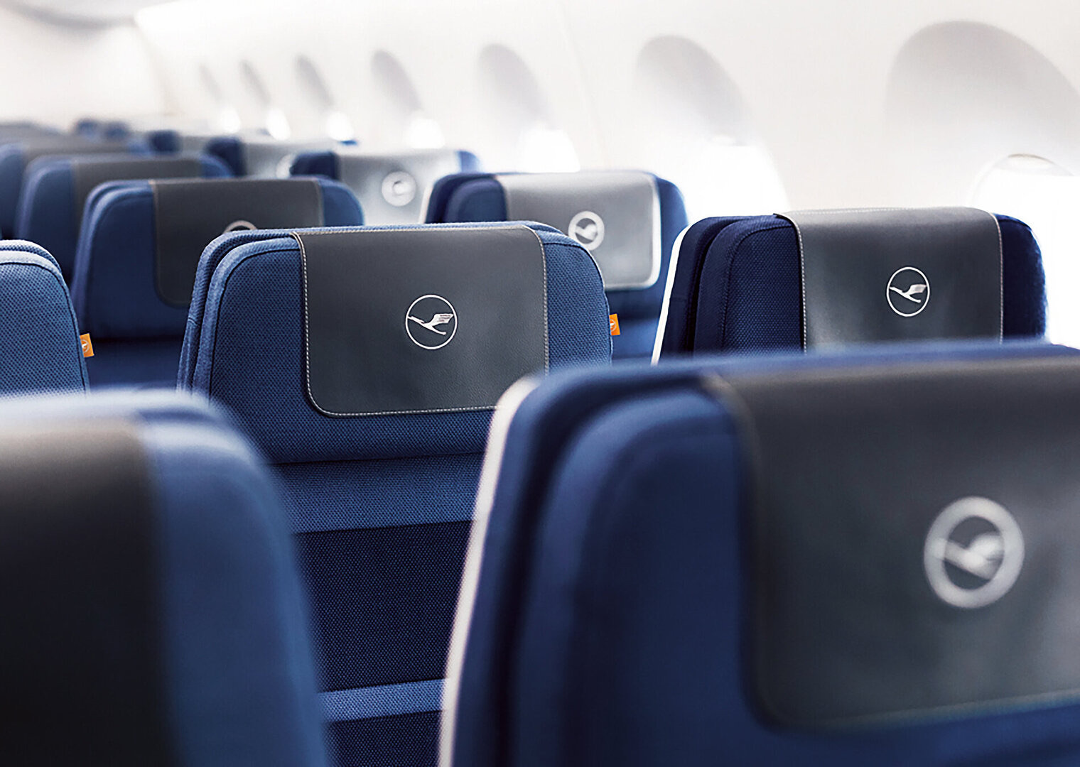
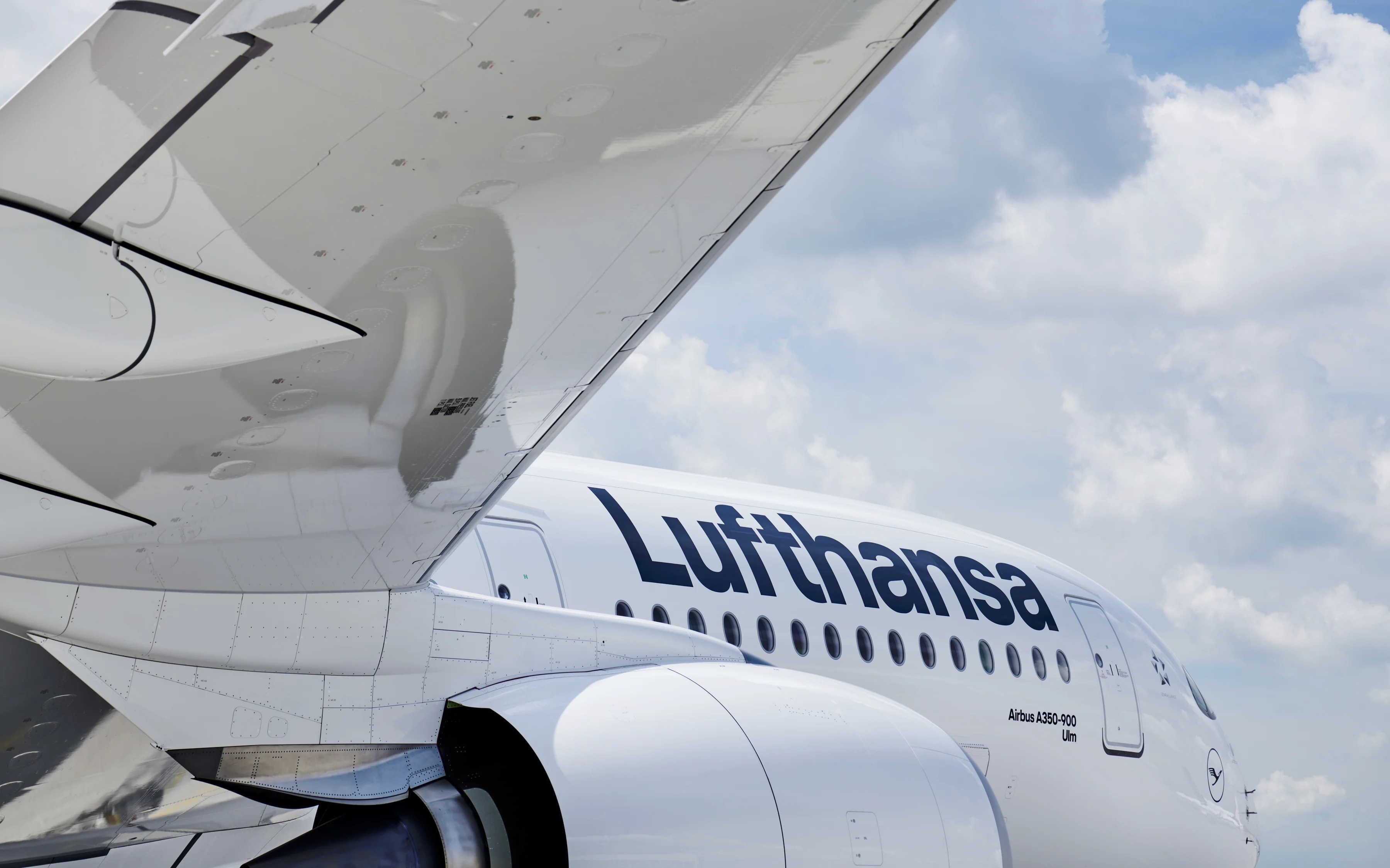
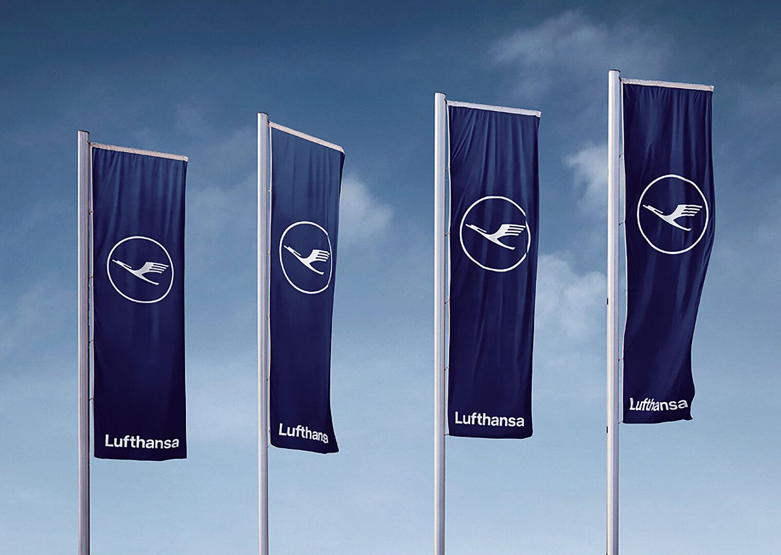
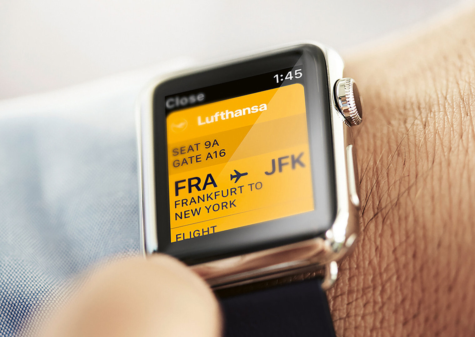
The most visible change was colour. For the first time the historic yellow stepped back. The deep blue that had always shared the identity with yellow became the dominant colour, and the bright, almost egg-yolk yellow disappeared from the aircraft. Yellow was not abolished. It was kept for more personal and surprising moments, such as the welcome sign passengers meet when they board, where a flash of the old colour still signals the brand.
Why the blue changed
The livery work was led by the designer David Hedley Noble, who had shaped Lufthansa aircraft looks for years. His aim was to make the airline's modern, premium self-understanding more tangible through a clearer colour language. The new blue was developed to look richer and almost three-dimensional in the way it caught the light, holding up in fog and in bright sun alike. Removing the strong yellow from the fuselage and tail was part of the same logic: a calmer, deeper palette that read as more expensive and more current.
According to Noble, aircraft design should never follow trends and must last at least 20 to 30 years, with the real skill lying in maximum reduction and in what is left out.
That principle connected the 2018 work directly to the brand's history. Noble has pointed to Otto Firle as the model, a designer who, more than a hundred years earlier, created a streamlined and highly stylised crane that still looked modern. The refresh was framed not as a break from the heritage but as a return to its discipline.
Building the system with Martin et Karczinski
Behind the visible changes sat a larger programme. Lufthansa developed its new brand identity with the Munich agency Martin et Karczinski, which described the task as building a brand identity system and, from it, a complete brand experience. The agency's starting point was that the world was changing quickly through digitalisation, globalisation and rising complexity, and that Lufthansa had to renew itself as a company and a brand in order to stay relevant.
The system was designed to absorb future change rather than freeze a single look. Two ideas sat at its centre: a contemporary premium claim, and empathy for the people in their respective situations, both employees and passengers. Combined with the functional and reduced appearance drawn from the brand's heritage, the result was intended to be a convincingly timeless design rather than a fashionable one. The work extended across the brand experience, from the corporate typeface and colour system to the way the identity appeared at the many points where travellers meet the airline.
Continuity as the strategy
What makes the 2018 programme instructive is how little it disturbed the brand's core. The crane remained, the circle remained, and the basic architecture established at Ulm in the 1960s was respected. The changes were concentrated where they could modernise perception without eroding recognition: a deeper blue, a quieter role for yellow, a refreshed type and a consistent system across touchpoints. This was a brand refresh in the precise sense, a lighter-touch modernisation rather than a wholesale overhaul.
The decision echoed earlier moments in the brand's history. In the late 1980s Lufthansa had debated pushing yellow forward to feel warmer, and had pulled back to protect the crane. In 2018 it moved the colour balance in the opposite direction, toward a cooler and more premium blue, while again leaving the symbol itself essentially intact. In both cases the airline treated the crane as fixed and the surrounding system as adjustable.
The 2018 identity became the platform for everything that followed, including the special liveries created for the brand's centenary in 2026. By establishing a premium colour world and a flexible system, the refresh gave Lufthansa room to stage anniversary designs and new expressions without starting from scratch. A century after Firle's first drawing, the brand had once again modernised its appearance while keeping faith with the bird at its heart.
Source: martinetkarczinski.de