
A bird drawn from a few lines in a Berlin studio
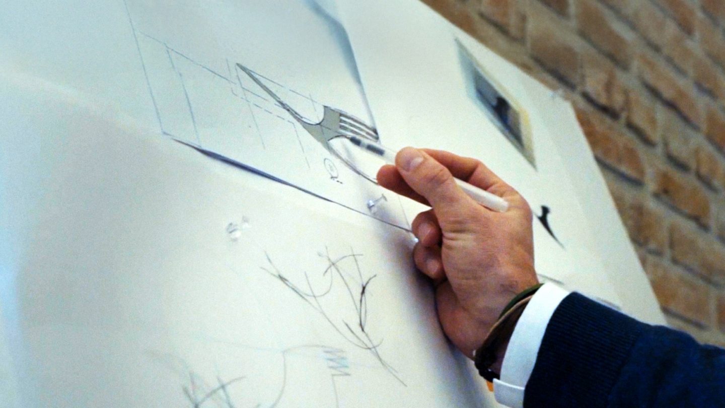
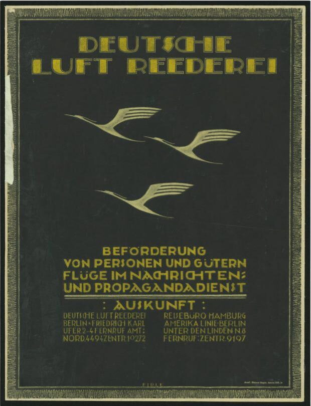
In 1918, in a Berlin studio, the architect and graphic designer Otto Firle drew a crane reduced to a few clean lines. The mark was commissioned by the Deutsche Luft-Reederei, one of the earliest German air transport companies, and it was meant to express two ideas at once: the movement of flight and the precision of the machines that made it possible. The result was an ascending bird that stood for progress, elegance and the new freedom of air travel. What began as a simple signet proved strong enough to carry a brand across more than a hundred years.
The crane belongs to a small group of brand marks that have stayed recognisable through repeated political, commercial and design upheavals. It is among the oldest continuously used symbols in aviation, and it predates the airline most people associate it with. Lufthansa did not yet exist when Firle drew the bird. The mark found its way to the carrier later, after a sequence of mergers that reshaped the early German aviation industry.
From Deutsche Luft-Reederei to the first Lufthansa
The crane moved with the companies that owned it. In 1923 it passed to Deutsche Aero Lloyd, and in 1926 it reached its lasting home. That year the merger of Deutsche Aero Lloyd and Junkers Luftverkehr created Deutsche Luft Hansa AG, the first carrier to use the Lufthansa name. The crane, already a decade old, became the new airline's recognition mark.
From Junkers the new company also took the colours blue and yellow. The pairing of the crane with that colour combination would soon become inseparable from the idea of flying made in Germany. There was no strict corporate design in the modern sense, no rulebook governing how the mark could be used. What stayed constant was the crane itself: a compact, memorable sign with strong recognition at a distance, the quality that mattered most on an aircraft tail or a printed timetable.
A mark in service through the 1920s and 1930s
As civil aviation expanded in the 1920s and 1930s, the crane became a constant companion of the first Lufthansa. It appeared on aircraft, posters, timetables and brochures. The visual world around it was not yet systematic, but the bird gave the young airline a stable anchor that audiences could learn and remember.
That period also carried a darker chapter. During the 1930s the first Lufthansa was increasingly drawn into the National Socialist regime and was involved in propaganda, rearmament and the war economy. Free commercial design development came to a halt. The crane remained the company's sign, but it was now put to propagandistic use. The mark's later survival into the post-war era therefore sits alongside a history that Lufthansa itself documents rather than avoids.
Why the crane endured
After the war and the re-establishment of Lufthansa in the 1950s, the company deliberately reconnected with the visual heritage of the pre-war years. The crane stayed, and so did blue and yellow. On the first Convair aircraft and the Lockheed Super Constellations, fuselage and tail again carried the colours and the familiar, curving bird. In form it still showed the hand of the 1920s, with a buoyant, art-nouveau contour and organic curves that suited the streamlined aircraft of the era.
The reasons for keeping the mark were practical as much as sentimental. A symbol that audiences already recognised was an asset worth preserving, particularly for a carrier trying to rebuild trust and re-enter international markets. The crane signalled continuity and reliability at a moment when both were in short supply. It allowed the new Lufthansa to present itself as a return rather than a start from zero.
Firle's design also had a structural advantage. Because it was reduced to essentials from the beginning, it could be redrawn, tightened and standardised without losing its identity. The later modernisation of the mark by Otl Aicher and Entwicklungsgruppe 5 at the Hochschule für Gestaltung in Ulm, in the early 1960s, worked precisely because there was a clear, simple form to refine rather than a decorative illustration to discard. The 1918 crane gave every subsequent generation of designers a stable core to build on.
More than a century after it was first drawn, the crane remains the through-line of the Lufthansa brand. Colours, typography and layouts have changed many times, and the airline has moved through several distinct identity systems. The bird that Otto Firle sketched for a company that no longer exists has outlasted all of them, which is the clearest measure of how well the original mark was made.
Written with AI assistance, edited by a human. Find out more about our Use of AI.