
From a decorative bird to a working system
By the early 1960s the Lufthansa crane was more than forty years old, and it was beginning to show its age. The mark itself remained strong, but the world around it was inconsistent. Posters, brochures and advertisements used different illustration styles, colours and layouts, and the crane appeared sometimes decoratively, sometimes almost in passing. As the airline expanded into international markets in the jet age, it became clear that a strong symbol needed an equally strong framework around it. That recognition led to one of the most influential commissions in European brand history.
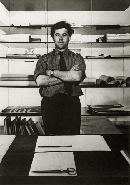
In 1962 Otl Aicher, working with Entwicklungsgruppe 5 at the Hochschule für Gestaltung in Ulm, began the redesign of the Lufthansa appearance under the internal name Projekt 1400. Aicher did not treat the crane as a nostalgic motif. He analysed it as a functional sign and carried it into the clear, rational language of a fully considered corporate design, the comprehensive visual and verbal system that governs how a company presents itself everywhere it appears.
The Ulm method
Entwicklungsgruppe 5, usually shortened to E5, was the visual communication unit Aicher led at Ulm. It was organised like a small company inside the school and already handled commissions for firms such as Braun and Pfaff. That structure mattered. The Lufthansa work was not a single designer's gesture but a systematic, almost engineering-led process, the same approach the Ulm school applied to product design.
Aicher's guiding principle was that appearance and identity were inseparable. He expressed it in a sentence that became closely associated with his work:
"Man ist so, wie man sich zeigt, und wie man sich zeigt, so ist man." (One is as one shows oneself, and how one shows oneself, so one is.)
For Lufthansa this meant that the design system was not decoration applied after the fact. It was a statement of what the airline was: precise, reliable and matter-of-fact, the qualities it wanted to project in the jet era.
What the redesign changed
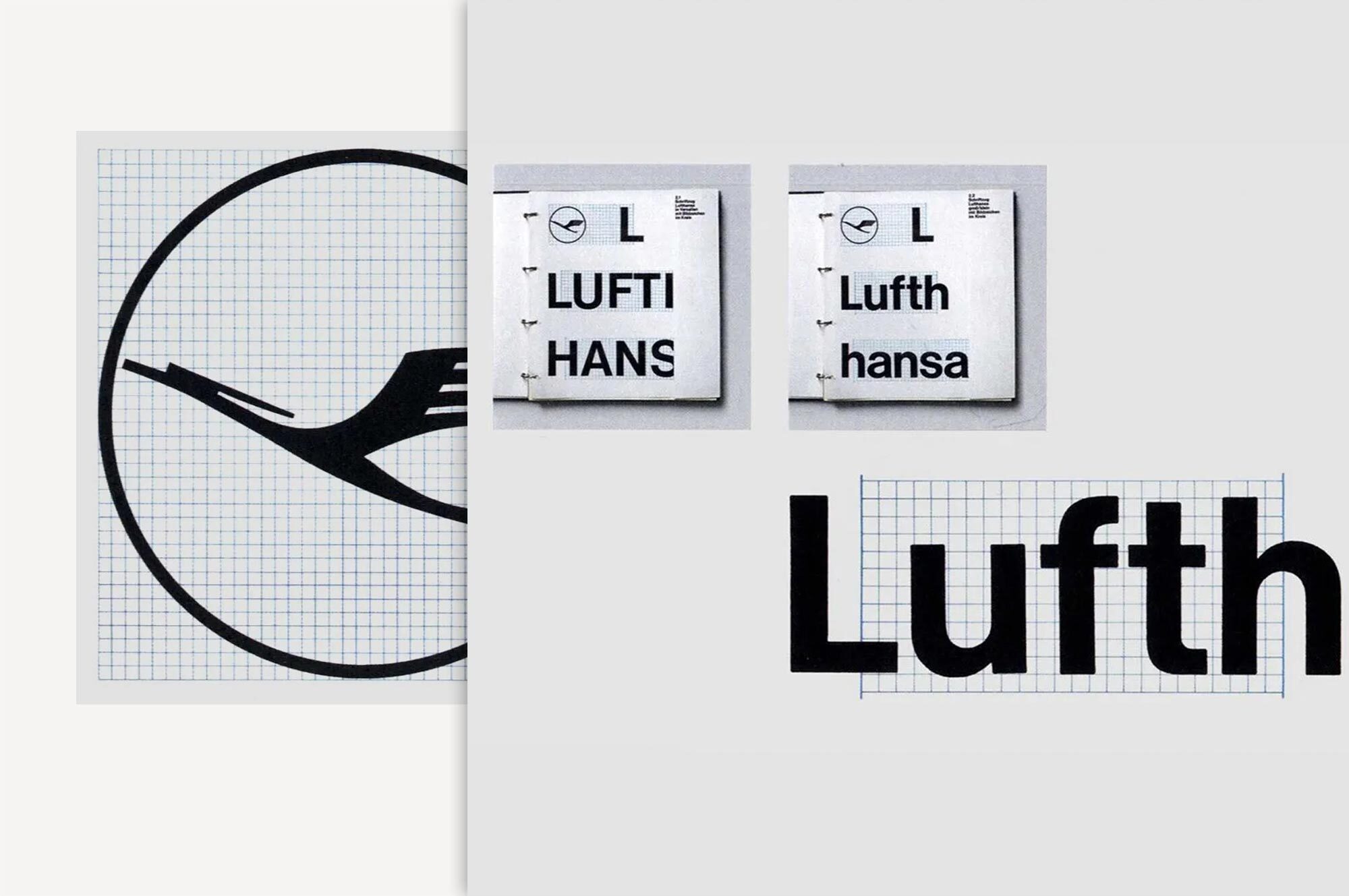
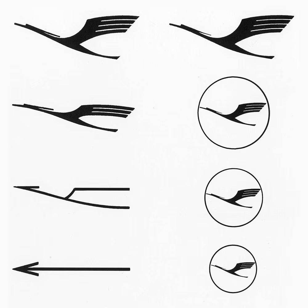
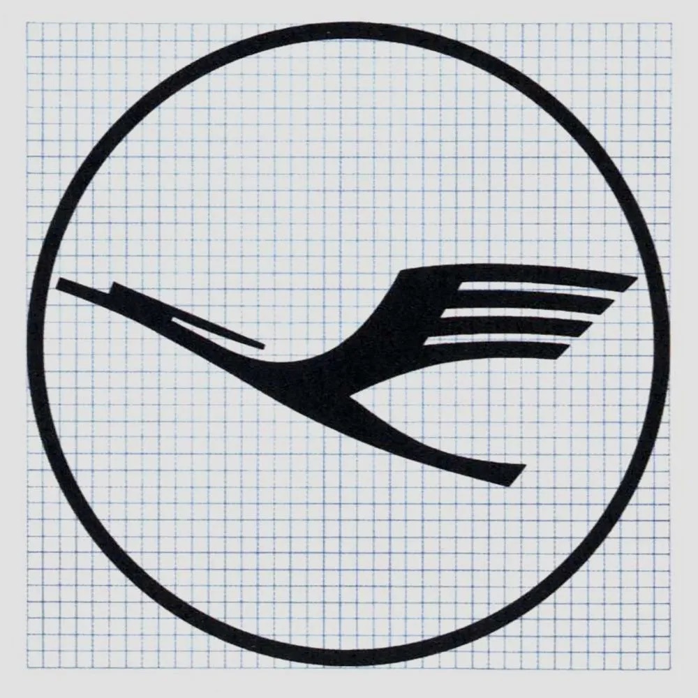
The work reshaped the crane and everything around it. The buoyant curves of the older drawing were reduced, the contour was made more precise, and the bird was enclosed in a clearly defined circle to form a compact signet. The colours blue and yellow, inherited from Junkers in the 1920s, were kept, giving the new system continuity with the brand's history.
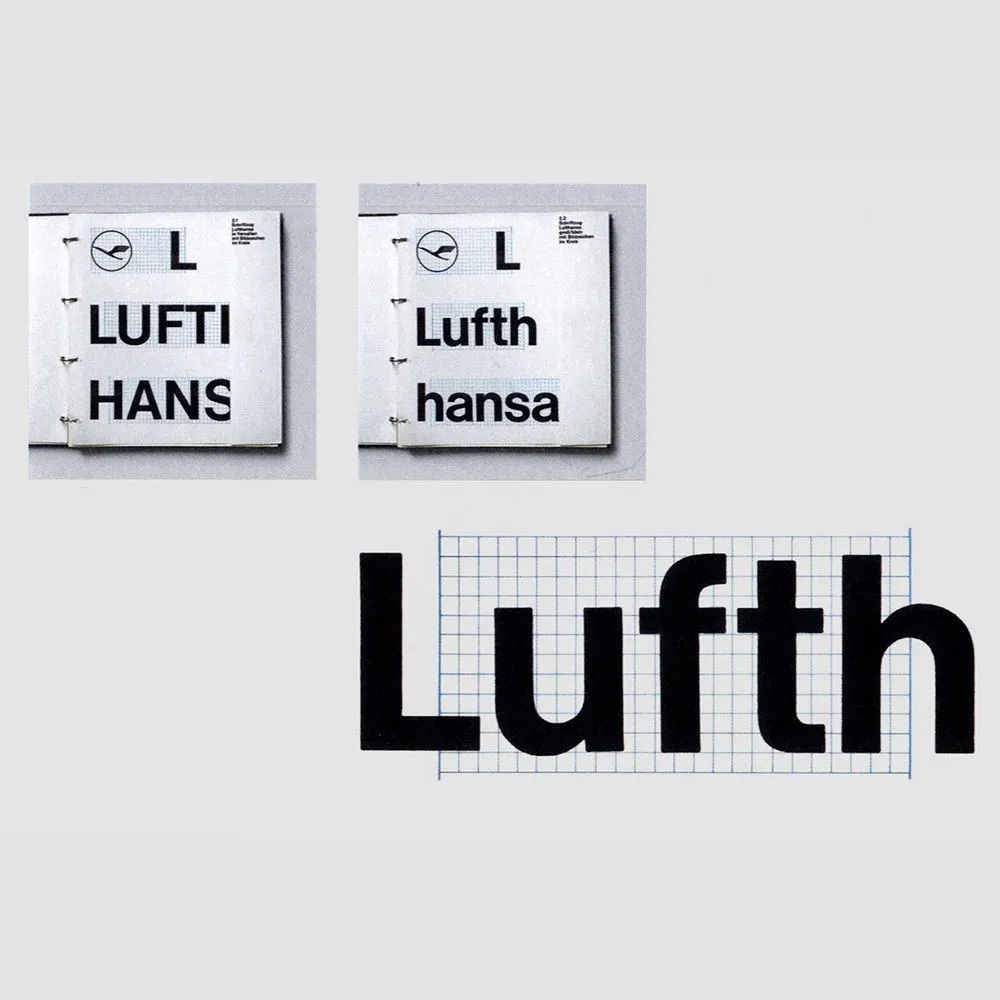
Typography changed decisively. The classical Aicher solution used Helvetica, the clear and functional Swiss typeface, which replaced the Shadow Antiqua used previously. Helvetica gave the whole system a neutral, legible and international voice that matched the redrawn crane. The result was documented in the first Lufthansa corporate design manual, produced from 1963, which set out how the elements were to be combined.
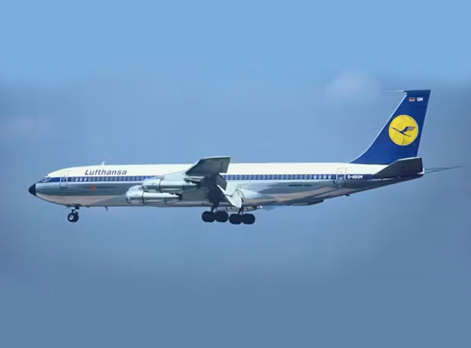
With the Ulm redesign the crane finally became a system rather than a single image. It received fixed proportions, defined colours and clear rules of use. By the mid-1960s the picture that would become known worldwide took shape on the fleet: a blue tail with a yellow circle and a blue crane. The manual also specified how the mark was to appear on tickets, luggage tags and in architecture, always unchanged, never distorted or decoratively reworked.
A standard that held
The discipline of the system extended even to the exact colour values. In 1978 Lufthansa introduced its own standardised shades for the emblem, RAL 1028 melon yellow and RAL 5022 night blue, so that the crane would appear identical anywhere in the world. This was the logical endpoint of the Ulm approach: a brand mark defined so precisely that it could be reproduced consistently across countries, suppliers and decades.
The Ulm work is now regarded as one of the earliest and most complete corporate design programmes in Europe, and it shaped how later generations of companies thought about visual identity. Its influence on Aicher's own career was equally significant. The same rational, sign-based thinking he applied to the crane reappeared in his pictograms for the 1972 Munich Olympic Games, work that made his name internationally.
For Lufthansa, the value of Projekt 1400 lay in its longevity. The redesign did not replace the crane that Otto Firle had drawn in 1918; it clarified it and gave it a structure that could survive changing aircraft, markets and tastes. The blue crane in its ring remained the calm, reliable centre of the brand for decades, and even the contemporary Lufthansa identity continues to build on the form that Aicher and Entwicklungsgruppe 5 established in Ulm.

Written with AI assistance, edited by a human. Find out more about our Use of AI.