A framework rather than a redesign
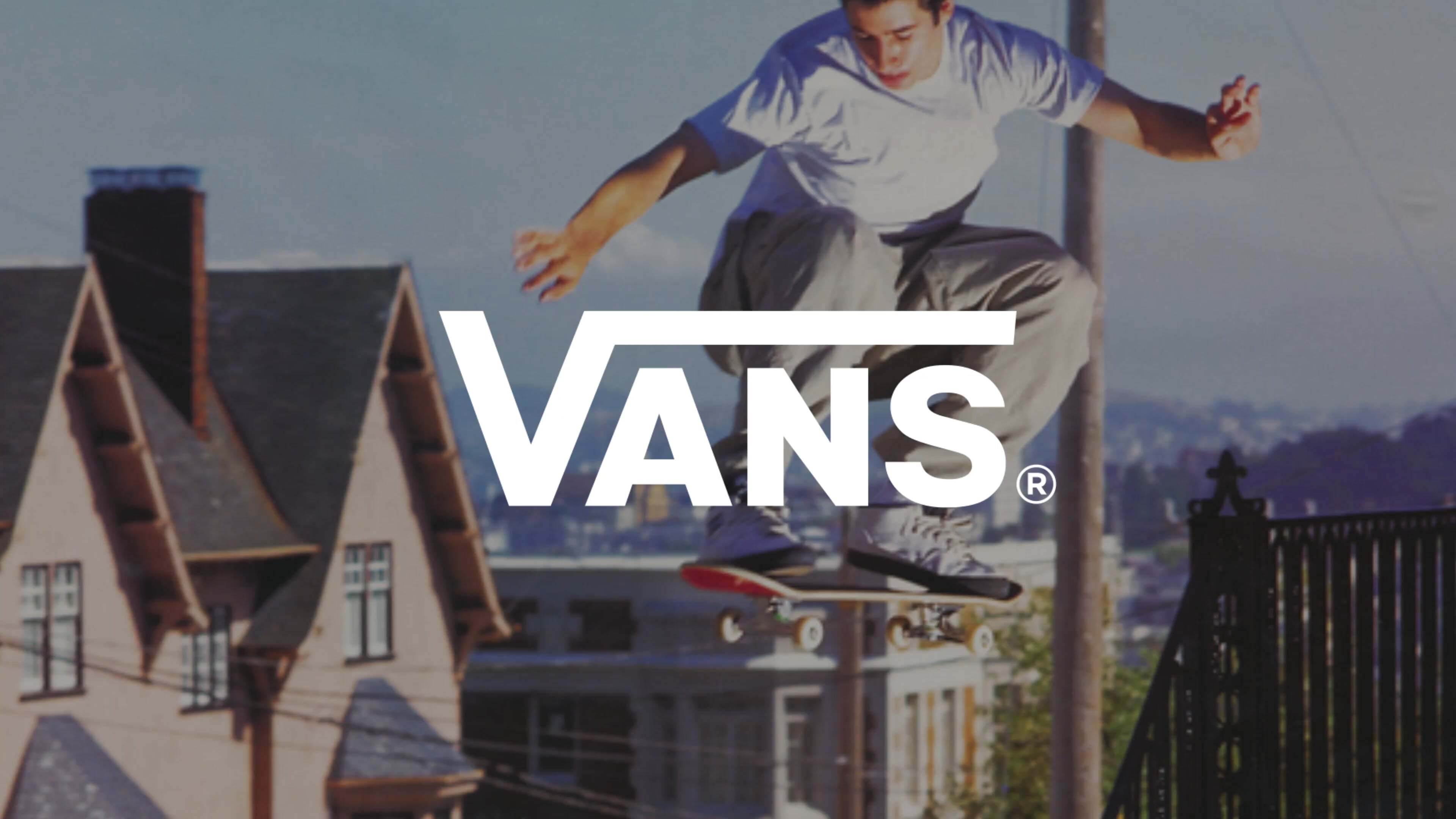
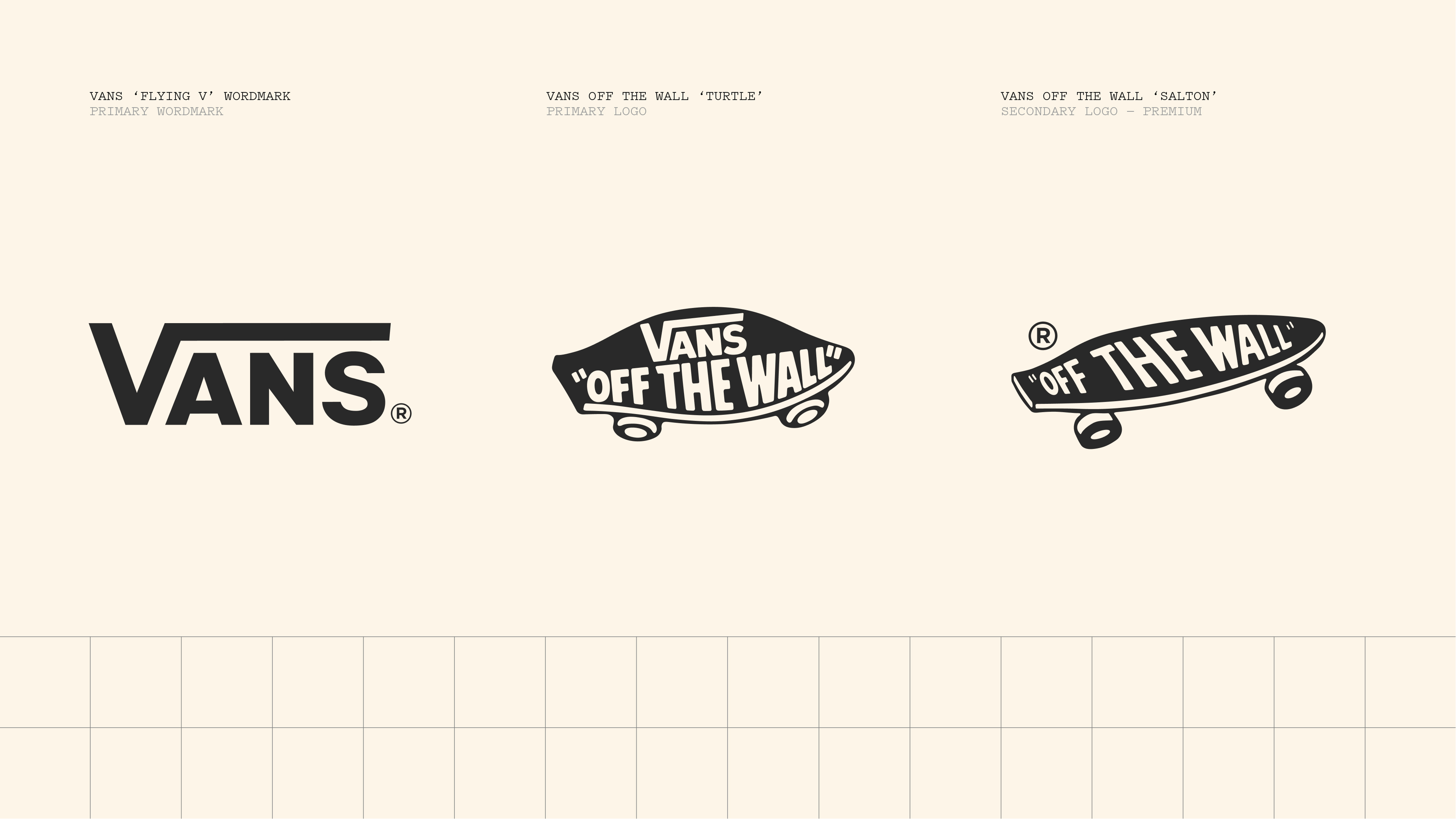
Vans, the American footwear brand owned by VF Corporation, has rebuilt the system that governs its visual identity. The work comes from Accept & Proceed, the London studio whose previous clients include Dickies and Nike, and was first shown publicly in late July 2026. It is not a rebrand in the sense of a new logo. The wordmark, the side stripe and the Off The Wall lockup survive largely as they were. What changes is the structure around them.
The problem the studio was asked to solve is one that accumulates quietly in brands of a certain age. Vans is 60 years old, has passed through several ownership structures, and operates across skateboarding, surf, snow, music, art and mainstream lifestyle retail. Each of those territories had developed its own typographic habits, its own colour behaviour and its own way of applying the marks. The assets were consistent. The system holding them was not.
Our Canvas. Your Way.
Accept & Proceed anchored the work to a single organising line, "Our Canvas. Your Way." The phrase does two jobs at once. It refers literally to the canvas upper that has carried the brand since the Van Doren Rubber Company opened at 704 East Broadway in Anaheim in March 1966, and it names the relationship Vans has always had with the people who wear the shoes. The checkerboard, now among the most recognisable p atterns in footwear, was not designed by the company. Skaters drew it onto the rubber midsoles themselves, and Vans adopted it afterwards.
Stephen Heath, creative director at Accept & Proceed, describes the reframing that made the rest of the work possible.
The breakthrough came when we stopped thinking about Vans as a skate brand and started thinking about it as a brand built around a spirit of creative possibility.

Two layers, fixed and flexible
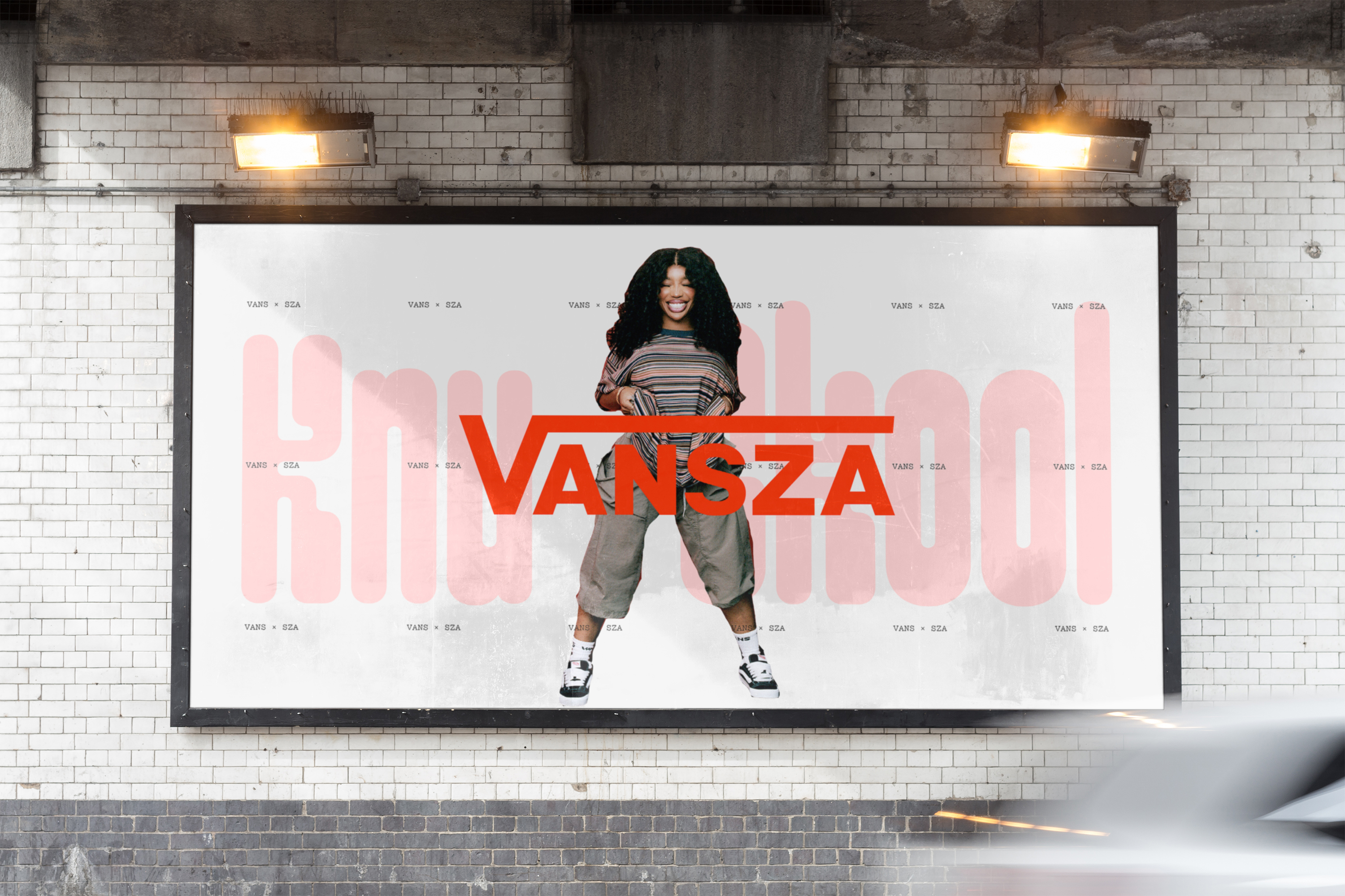
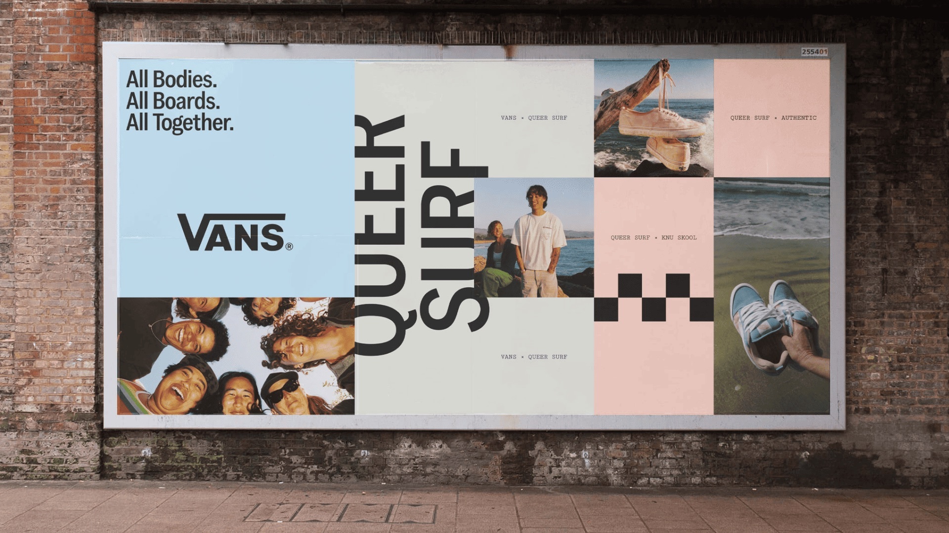
The central mechanic of the system is a separation between what must never move and what is free to. Accept & Proceed ran a portfolio audit across the brand's categories, then sorted every asset into one of two layers. The first holds the elements that carry recognition and are locked: the wordmark, the side stripe, the red. The second holds the elements that are meant to shift by category, by market and by season, including illustration, photography treatment and secondary typography.
Rather than replacing the brand's existing assets, we created a simple two-layer framework. It stays true to the origins of Vans while giving future teams freedom to express it relevantly.
The distinction matters commercially as much as visually. A brand that licenses, collaborates and sub-brands as heavily as Vans does needs a rule for who may change what. The work is accompanied by product branding standards and guidelines, which is where a system of this kind either holds or quietly falls apart.
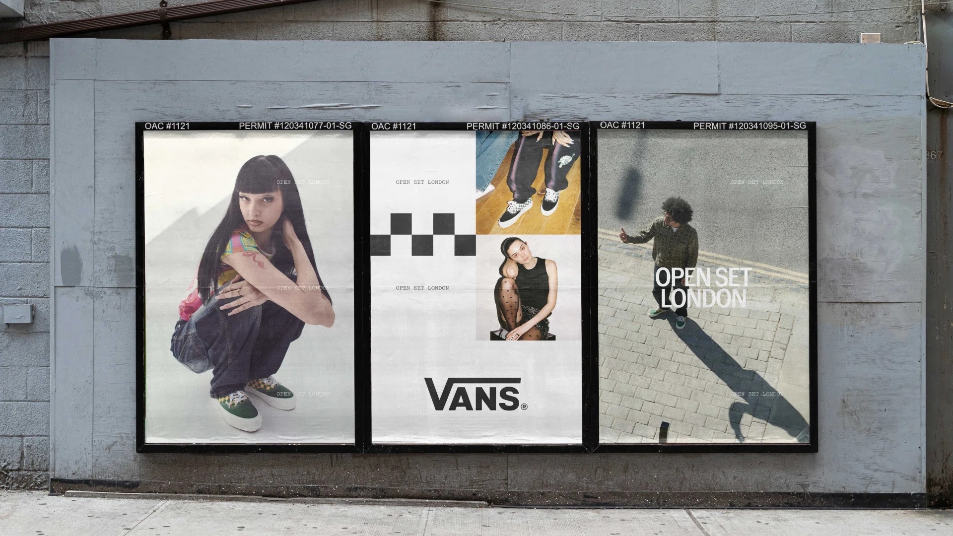
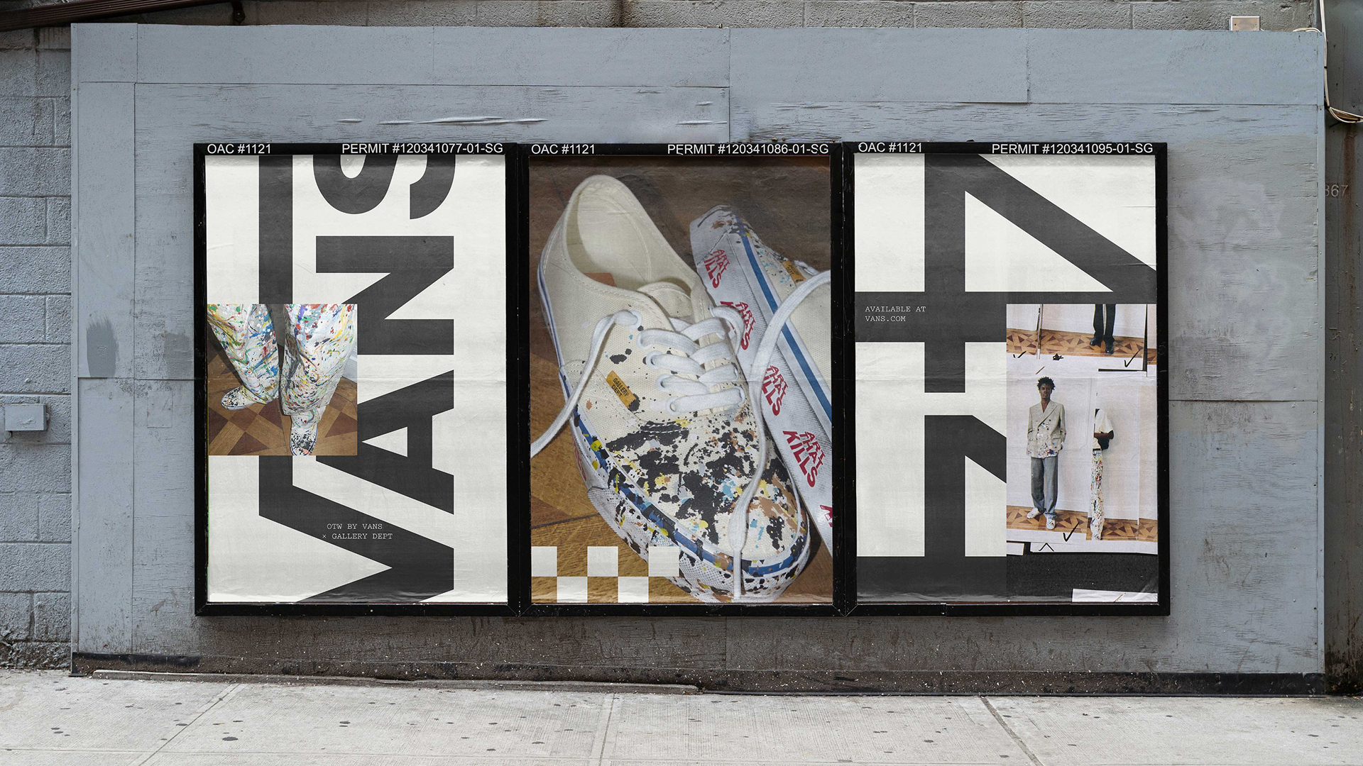
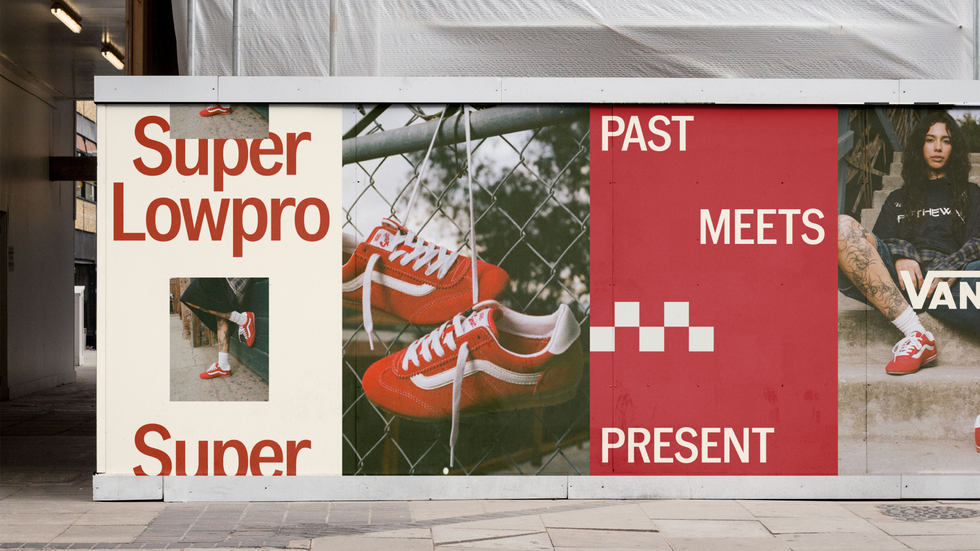
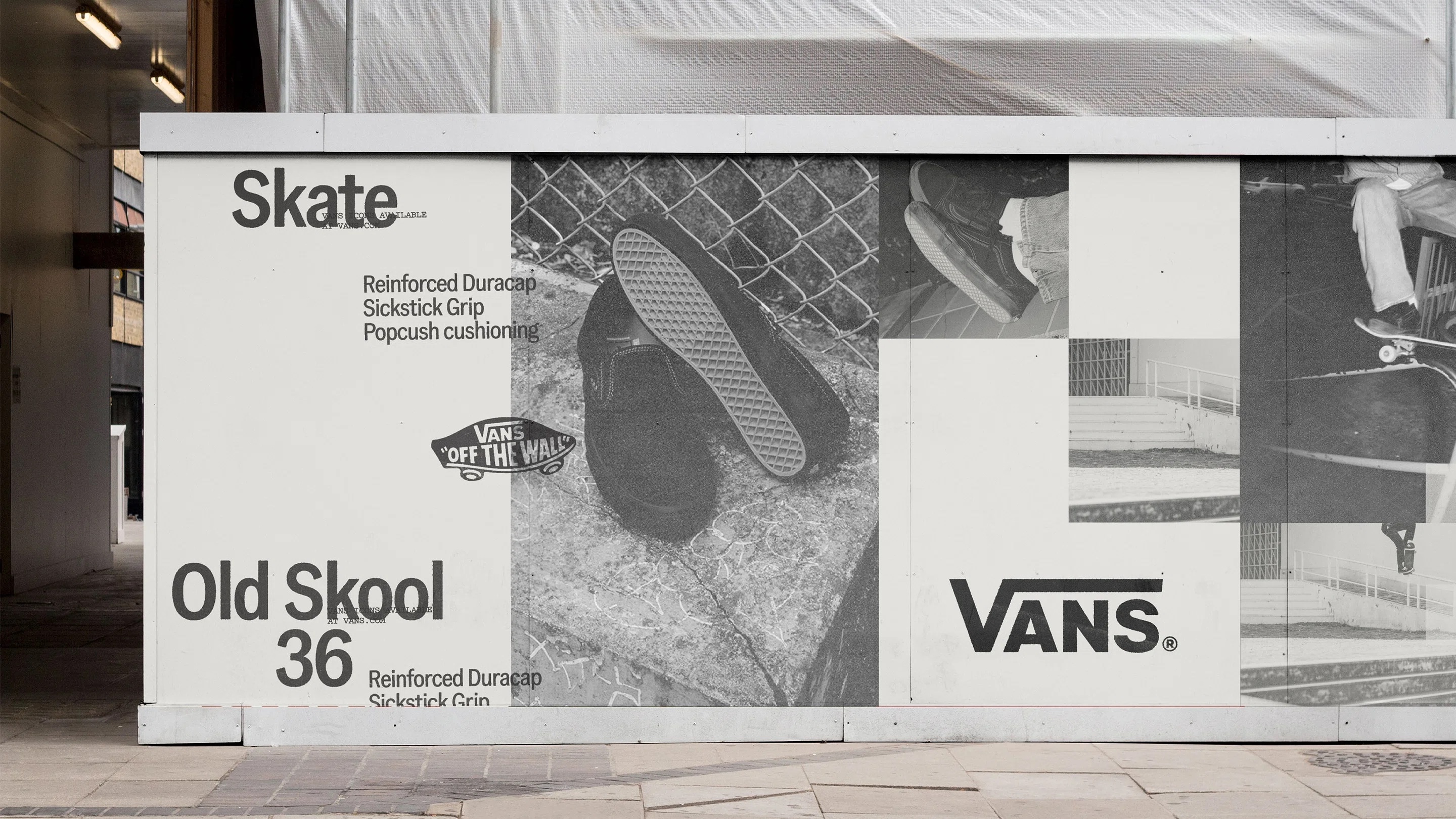
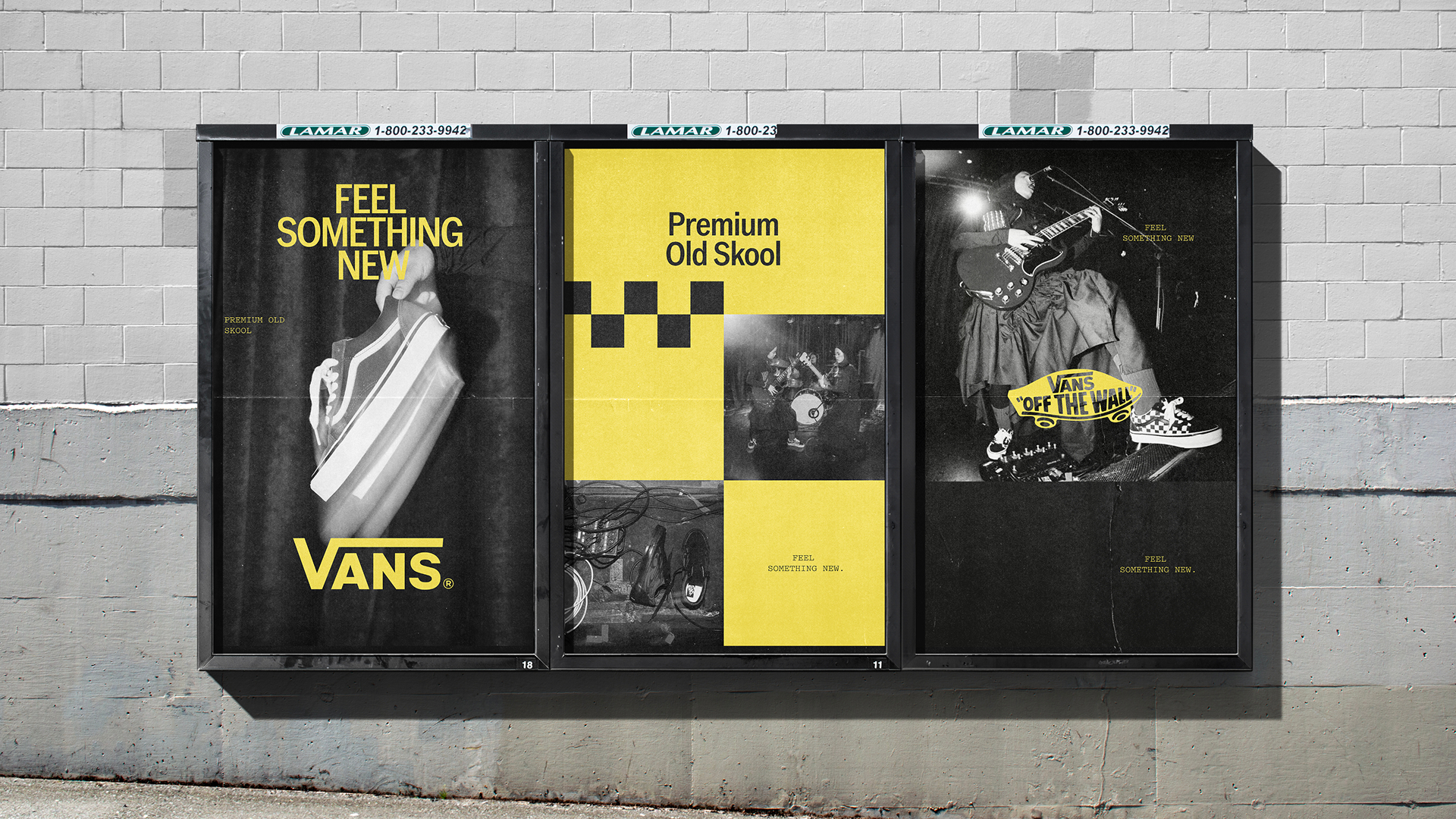
What the system looks like
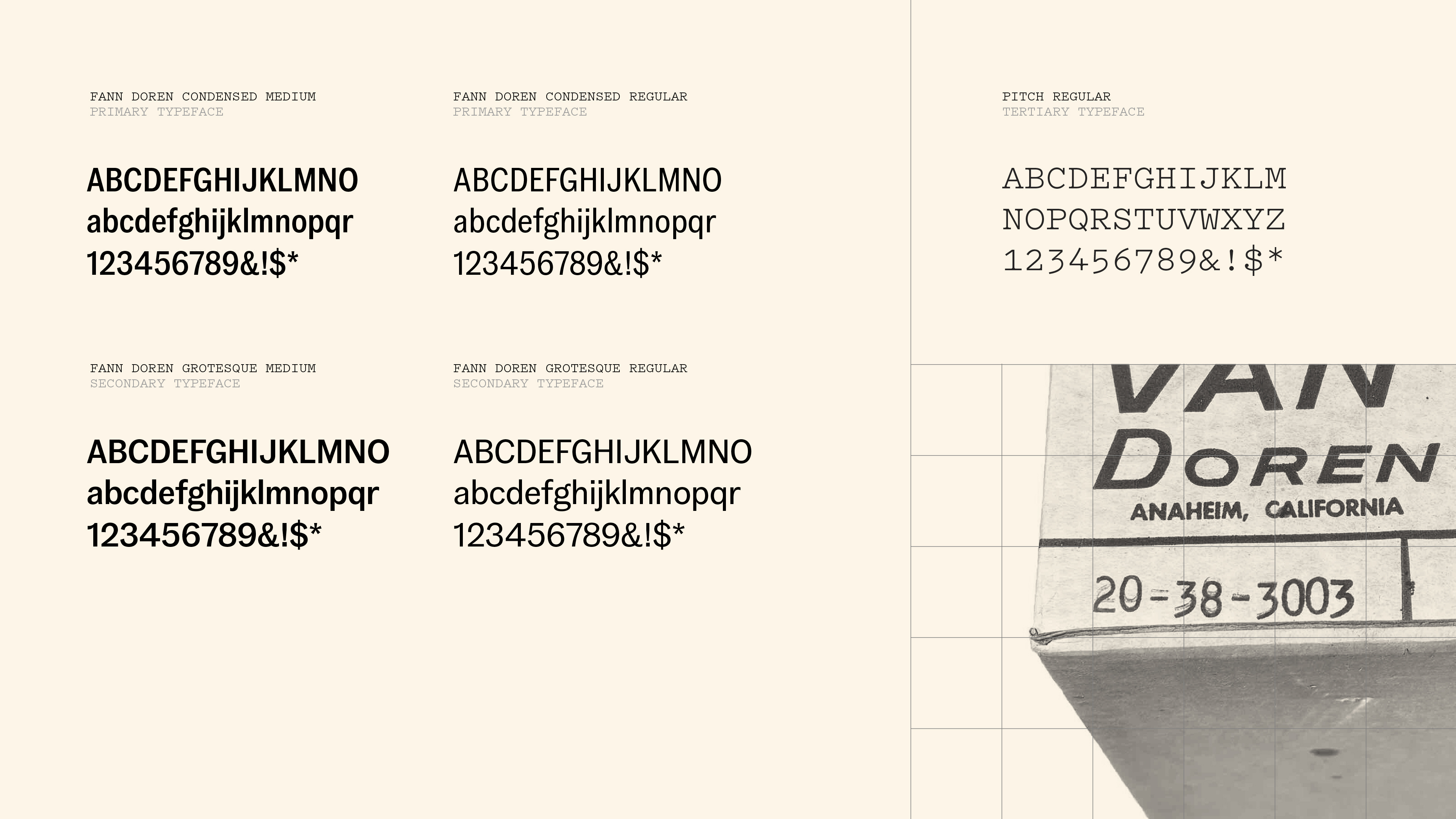
Typography is handled by addition rather than replacement. The existing grotesque family stays as the primary voice, with condensed styles emphasised for consistency across headlines and packaging. Alongside it sits Pitch from the Klim Type Foundry, a typewriter-derived design whose slightly mechanical character gives labels, sizing information and functional copy a register of their own.
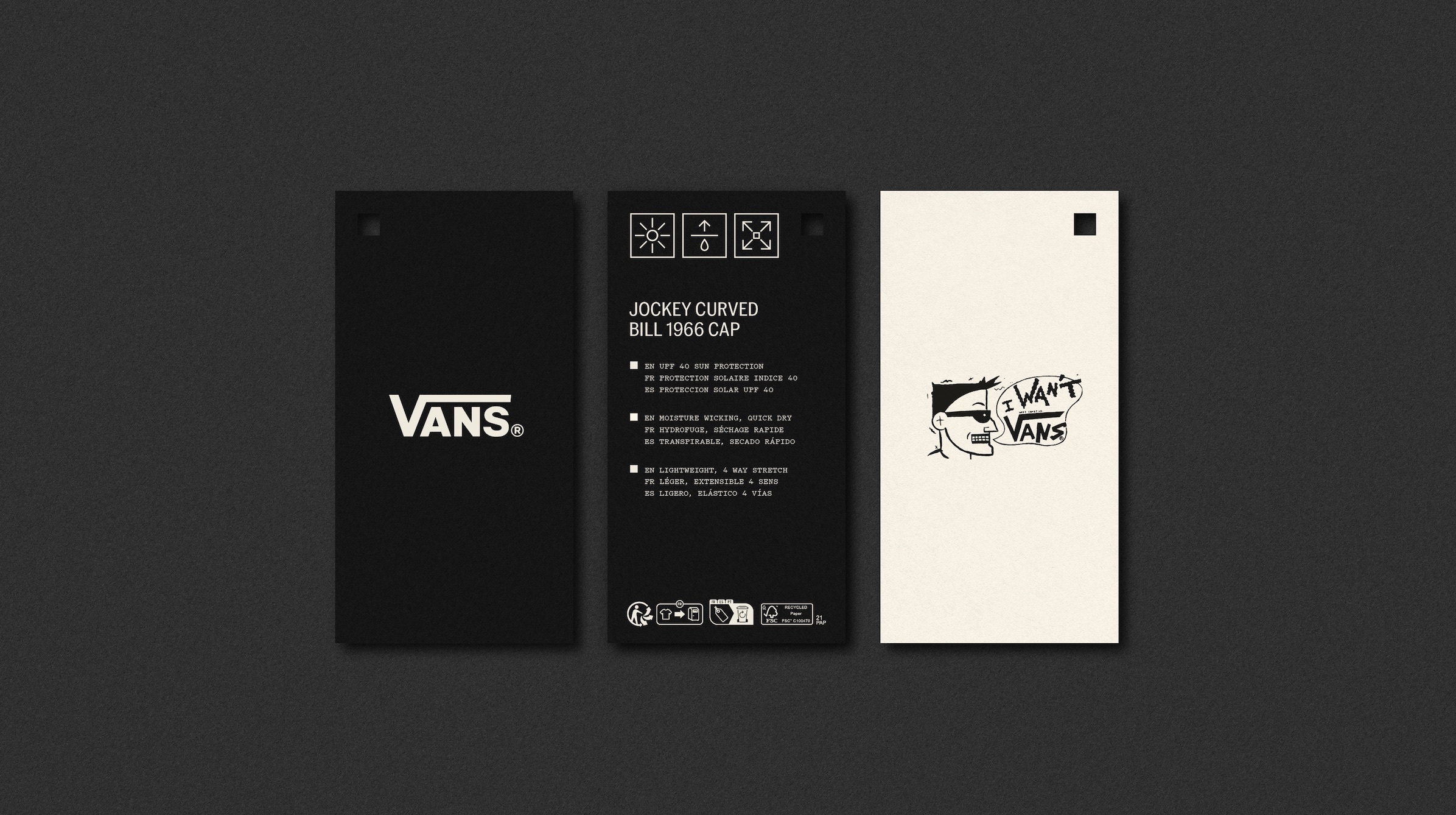
The colour palette moves toward a more neutral base of beige, black and white, with the Vans red retained as the signature. The effect is to reduce the brand's reliance on two-tone and checkerboard styling as its default expression, and to give the pattern back its status as a deliberate choice rather than an automatic one.
Illustration carries most of the personality. The system uses thick black linework with a deliberately unpolished quality, closer to a sticker drawn in a skate shop than to a corporate icon library. A chunky pennyboard recurs throughout, working both as an illustrated motif and as a framing device around the logo. A minimal monochrome icon suite covers the functional applications, from packaging to in-store signage.
Sixty years of borrowed authorship
What makes the framing defensible is that it matches how the brand actually grew. The Old Skool side stripe of 1976 arrived alongside the Off The Wall motto, drawn from a term skaters used for riding out of a pool. The slip-on reached a mainstream audience in 1982 when Sean Penn wore a checkerboard pair in Fast Times at Ridgemont High, a piece of cultural placement the company did not orchestrate. VF Corporation acquired Vans in 2004 for 396 million United States dollars, and the brand has spent the two decades since balancing that inherited authorship against the demands of global scale.
Accept & Proceed's answer is to write the flexibility into the rules instead of treating it as a problem to be tidied away. The clarity gained is structural, not stylistic. For a brand whose most valuable graphic asset was invented by its customers, that is a reasonable place to draw the line.
Source: acceptandproceed.com
Written with AI assistance, edited by a human. Find out more about our Use of AI.