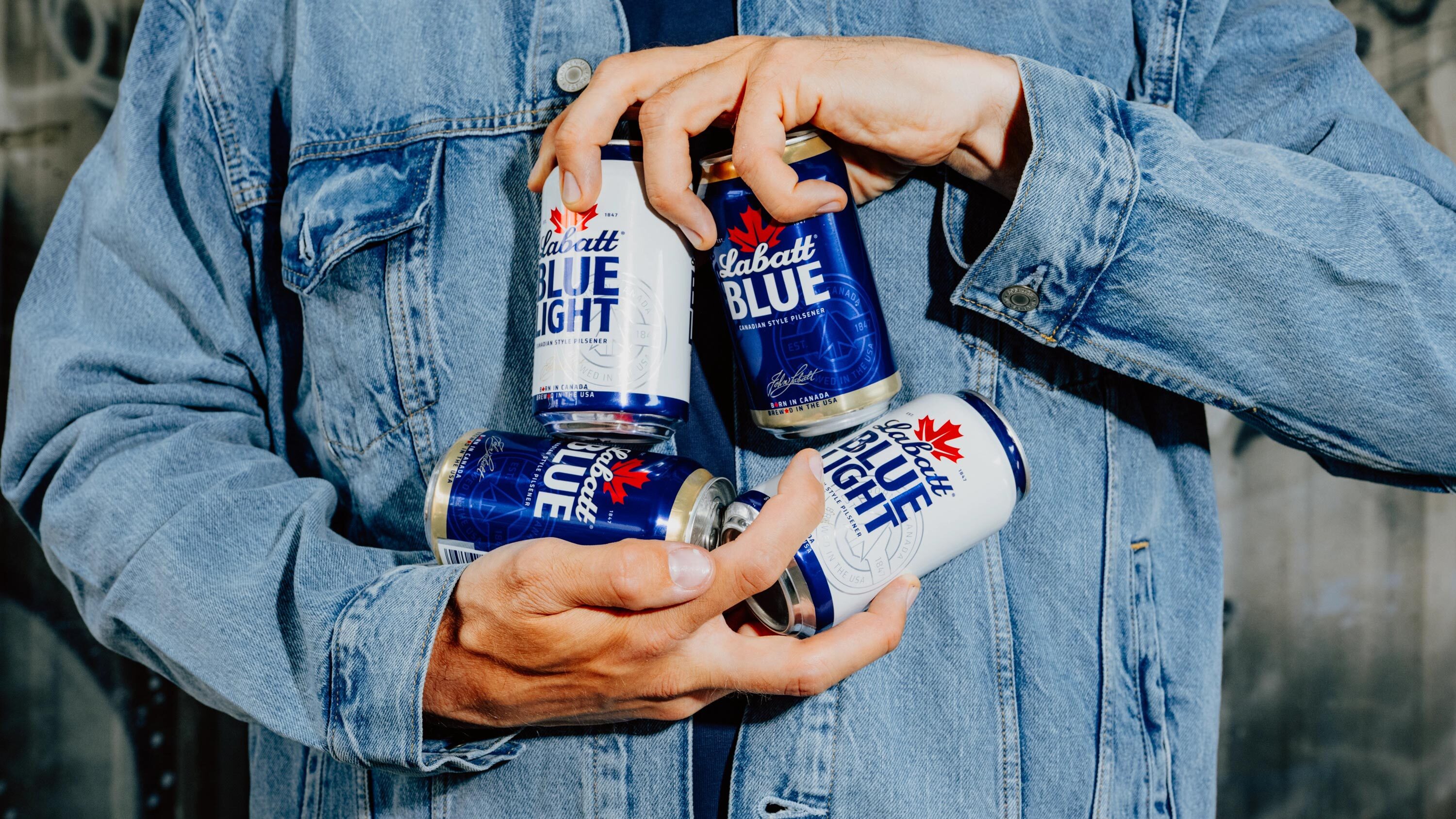
Sister Mary redraws Labatt for the US beer aisle
Labatt has unveiled a new US packaging system and brand identity developed with New York agency Sister Mary, the beermaker's first significant visual overhaul in the American market in years.1, 2 The refresh leans into Labatt's Canadian origins and its long history alongside the United States, using the brand's position as what Sister Mary calls a "dual citizen" to differentiate it in a domestic beer category dominated by blue-heavy packaging.1
A brewery built on crossing the border
Labatt was founded in 1847 in London, Ontario, by Irish immigrant John Kinder Labatt, who partnered with Samuel Eccles before taking full control of the business in 1854.3 The brewery grew into Canada's largest, but its ties to the United States run almost as deep as its history at home.3 When Canadian provincial prohibition laws took hold in the early twentieth century, Labatt kept its operations running by exporting full-strength beer to the US, a trade that helped the company survive the overlapping temperance years in both countries between 1920 and 1927.1, 4 Labatt beer is brewed in the US in Rochester, New York, and the brand's American business has been owned by FIFCO USA, also based in Rochester, since 2009, independent of Labatt's Canadian and global parent, Anheuser-Busch InBev.1, 3, 5
Too much blue in the cooler
Blue carries its own history for Labatt. The brewery's pilsner lager, launched in 1951, earned the nickname "Blue" for the color of its label and the brand's sponsorship of the Winnipeg Blue Bombers football team, and the nickname eventually became the product's official name.3 By 1979, Labatt Blue was Canada's best-selling beer, a title it has held for much of the past half-century even as leadership has shifted between Labatt and rival Molson Canadian.3 That heritage made the design problem more delicate than a simple color swap: the brand needed to stand out in a blue-saturated US category without giving up the color that defines it at home.
Sister Mary's brief centered on a straightforward shelf problem: the US domestic beer aisle is saturated with blue packaging, and Labatt Blue, the brand's flagship lager, risked disappearing into that sea of similar-looking bottles and cans.1 Rather than move away from blue, the agency sharpens the brand's Canadian identity around it and builds a more distinct visual language on top of the existing color equity.1
Friendly rivalry as the creative anchor
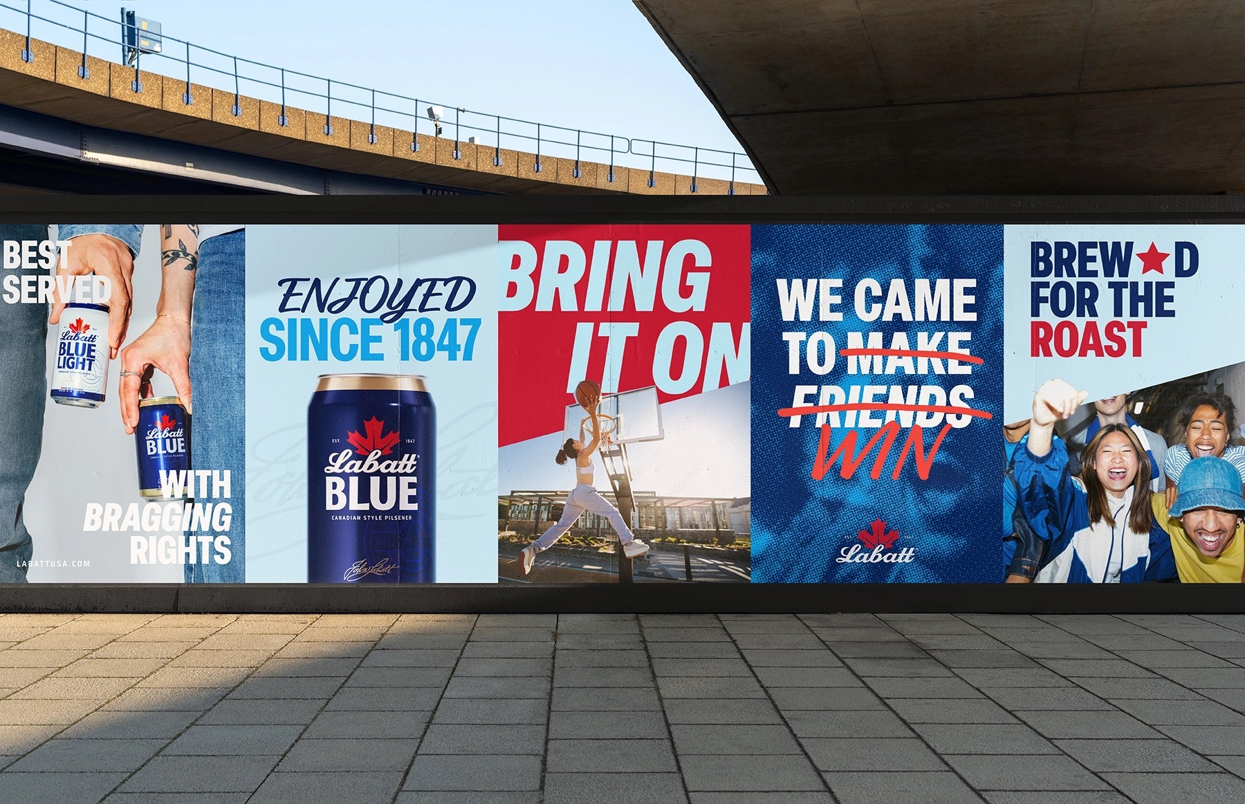
"Friendly rivalry became the unlock for the entire brand," says Emily Cristoforis, head of strategy at Sister Mary, in a press release announcing the refresh.1 "As a kind of dual citizen, the brand has permission to champion the epic relationship between the U.S. and Canada, while fuelling the friendly rivalries that bring people together across all walks of life."1 The strategy reframes Labatt's cross-border status as a cultural asset rather than a fact to manage, giving the brand license to play with the good-natured competitiveness that runs through much of the US-Canada relationship, from sports rivalries to backyard debates at the grill.
An identity rebuilt around heritage details
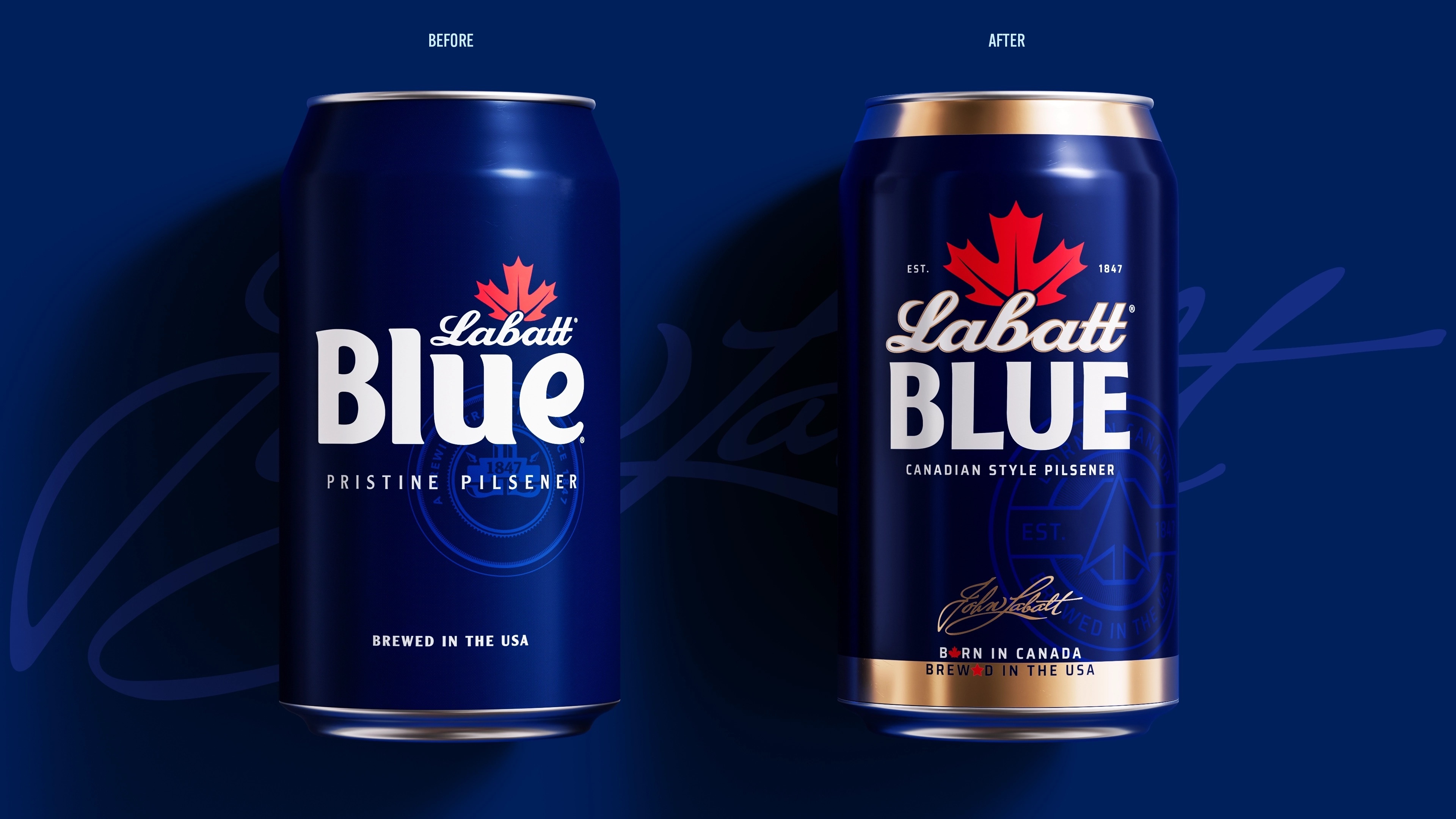
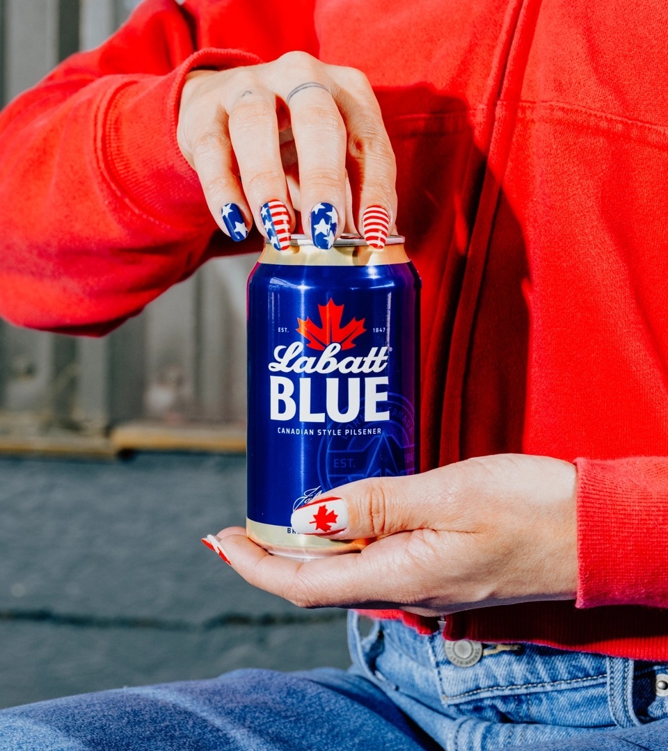
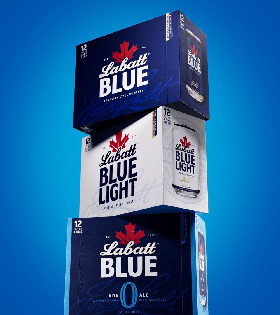
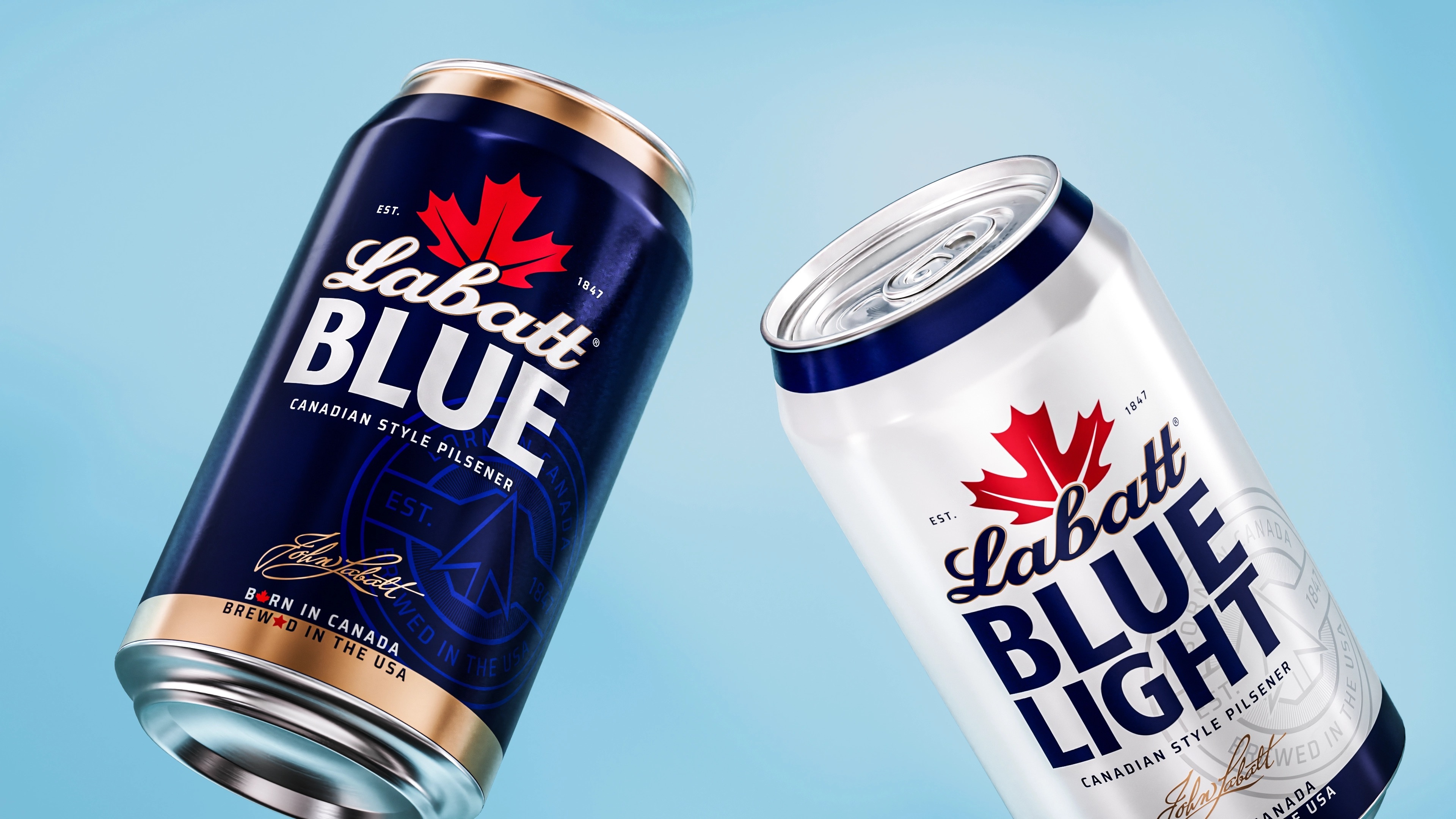
The visual system enlarges the Labatt wordmark and the brand's maple leaf, and introduces the signature of founder John Labatt as a new mark of authenticity across the packaging.1, 6 Typography has been refined throughout, and gold detailing has been added as a point of contrast against the category's blue backdrop, giving Labatt Blue a lift toward a more premium register without abandoning its core color.1, 6 A new diagonal graphic device, drawn from the italic angle already present in the logo, runs across the packaging as what Sister Mary describes as "a subtle expression of borders, contrast, and connection."1, 6 On pack, the words "Labatt" and "Blue" are separated by that same diagonal line, a device the agency uses to represent both the border between the two countries and the connection it creates.1
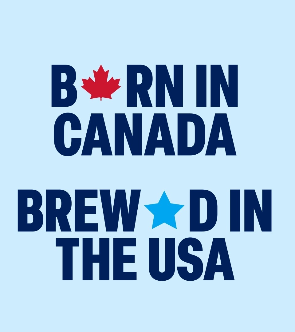
"We elevated the prominence of the Labatt name across packaging and the wider identity system, while embracing the brand's position as a dual citizen," says Leigh Chandler, founder and executive creative director at Sister Mary.1 "That came to life through graphic devices inspired by borders, contrast, and connection, alongside a more playful and provocative tone of voice that reflected the dynamic between Canada and the U.S.A."1 The packaging also carries new "Born in Canada" copy alongside the existing "Brewed in the USA" line, pairing the brand's origin story with its manufacturing presence in New York state.1
A category test for cross-border branding
The refresh puts Labatt among a small group of import-coded beer brands trying to convert national origin into shelf differentiation without confusing US buyers about where their beer is actually made. For a brand that has moved between Canadian, Belgian, Brazilian and American ownership over the past century and now runs its US business separately from its global parent, the new identity gives Labatt a single clear story to tell at the point of sale: brewed close to home in New York, but unmistakably Canadian at heart.3, 5
Source: Sister Mary
Written with AI assistance, edited by a human. Find out more about our Use of AI.
1. The Dieline, Bill McCool, "Born in Canada, Redesigned for the US: Sister Mary Unveils Labatt Refresh", 9 July 2026, for Labatt commissioning Sister Mary to refresh its US packaging system and brand identity, for the survival of Canadian prohibition by selling full strength beer across the border and the 1920 to 1927 overlap of the two countries' temperance laws, for Labatt being brewed in Rochester and sold in the US as part of FIFCO USA's stable of brands, for the diagnosis that the US domestic market carried far too much blue, for the quoted words and job title of Emily Cristoforis, Head of Strategy at Sister Mary, and the attribution of both agency quotations to a press release, for the enlarged Labatt name and maple leaf, the added signature the piece calls that of "Labatt's founder, John Labatt", the refined typography and the gold detailing set against the "blue beer" cooler, for the diagonal graphic device drawn from the italic angle of the logo and the phrase "a subtle expression of borders, contrast, and connection", for the split of "Labatt" and "Blue" on pack as a barrier mirroring the border and a device for what the two nations share, for the quoted words and job title of Leigh Chandler, founder and executive creative director at Sister Mary, and for "Born in Canada" being the new line while "brewed in the USA" was already part of the previous look. The piece does not date Labatt's last US visual overhaul. https://thedieline.com/born-in-canada-redesigned-for-the-us-sister-mary-refreshes-labatts/
2. Sister Mary, agency website, accessed 17 September 2026, for the agency being "an independent New York brand design and innovation agency specializing in brand strategy, visual identity and packaging for beverage, alcohol and consumer brands", with its office at 689 Myrtle Avenue, Brooklyn, New York. The site carried no Labatt case study on that date. https://www.sistermary.nyc/
3. Wikipedia, "Labatt Brewing Company", accessed 17 September 2026, for the founding in 1847 in London, Canada West, now Ontario, by the Irish immigrant John Kinder Labatt, for the partnership with Samuel Eccles and Labatt taking over Eccles's stake in 1854, for Labatt being the largest brewer in Canada, for the pilsner lager launched in 1951 and nicknamed "Blue" after the colour of its label and the company's support of Winnipeg's Blue Bombers, for Labatt Blue taking the top of the Canadian beer market in 1979 and losing it to Molson Canadian in the late eighties before regaining it periodically, and for the ownership succession behind the closing sentence, from the 1995 purchase by the Belgian brewer Interbrew through the 2004 merger with AmBev to form InBev and the 2008 merger with Anheuser-Busch. The same page records the 2009 sale of the US business to "FIFCO USA of Rochester, New York" as a divestiture ordered by the US Department of Justice after that merger. The page also states that Budweiser took the top of the Canadian market in 2004, pushing Blue to third, and that the founder was John Kinder Labatt, whose son John took over in 1866. https://en.wikipedia.org/wiki/Labatt_Brewing_Company
4. Labatt USA, "1915 to 1927" history page and the Labatt USA home page, accessed 17 September 2026, for Labatt surviving Canadian prohibition by producing full strength beer for export south of the border while selling two temperance ales in Ontario, for the ban ending in 1927, and for Labatt USA's own statement that it is owned by FIFCO USA. https://www.labattusa.com/history/1915-1927/ https://www.labattusa.com/
5. Wikipedia, "FIFCO USA", accessed 17 September 2026, for the Rochester, New York headquarters of the company that owns Labatt's US business and for its place in the ownership succession. The page dates the arrangement differently from the body: it records the company as established in 2009 as North American Breweries by the New York investment firm KPS Capital Partners, buying Labatt USA that same year under the Department of Justice divestiture, passing to the Costa Rican Florida Ice and Farm Co. in December 2012 and taking the name FIFCO USA only in 2018. https://en.wikipedia.org/wiki/FIFCO_USA
6. Packaging of the World, "Labatt's Refreshed Identity by Sister Mary", 14 July 2026, off whitelist and used for corroboration only, for the greater prominence given to the Labatt name while retaining the equity of the existing assets, for the "refined typography, gold detailing, the John Labatt signature, and a more deliberate use of red and maple leaf symbolism", and for the "diagonal graphic device, inspired by the italic angle of the Labatt logo" running through the wider system as "a subtle expression of borders, contrast, and connection". https://packagingoftheworld.com/2026/07/labatts-refreshed-identity-by-sister-mary.html