A script wordmark carries the refresh
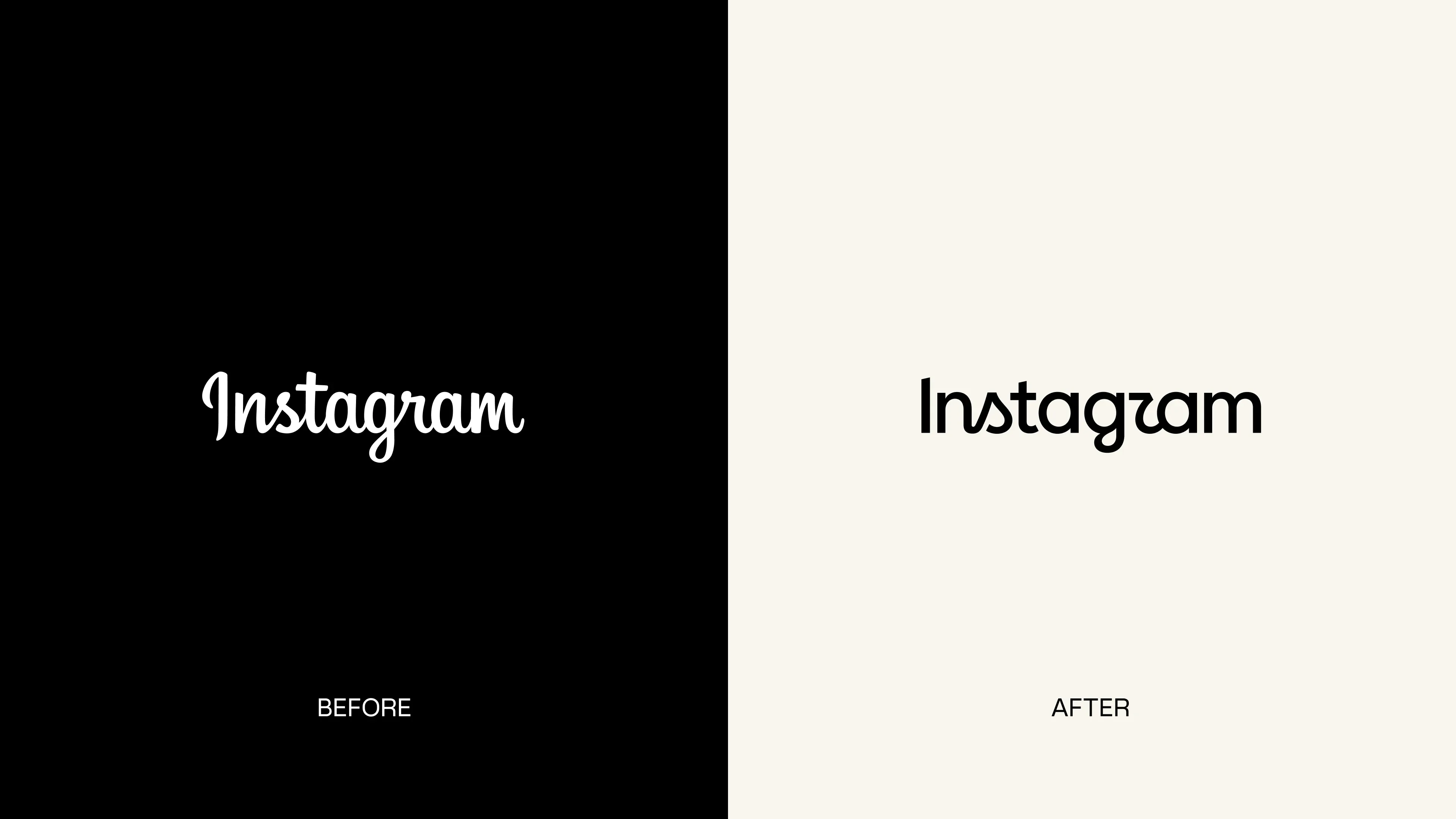
Instagram introduces a comprehensive refresh of its brand identity, the platform's first major visual update since 2016. Meta announced the new system on August 13, 2026 through its Design at Meta blog under the title "Built to celebrate creativity". The refresh centers on a redrawn script wordmark, an expanded typeface family and a more restrained use of the signature gradient. The wordmark is rolling out globally now, with the full identity system following through 2026 and beyond.
The wordmark remains a script, and that continuity is a deliberate decision. According to It's Nice That, whose feature on the project was produced in partnership with Meta, the design team explored sans serif alternatives during the process but found that users no longer recognized them as Instagram. The team returned to the signature and redrew it with more confidence and restraint, keeping the cursive character the platform has carried since its earliest years while simplifying the letterforms.
"Script reflects individuality, so referencing that felt right. The new wordmark is bolder and simpler, with touches of unexpectedness. It cues individual expression, a personal voice, both of which have always been core to Instagram," says Jasmine Probst, director of product design at Instagram.
Three typefaces and a quieter gradient
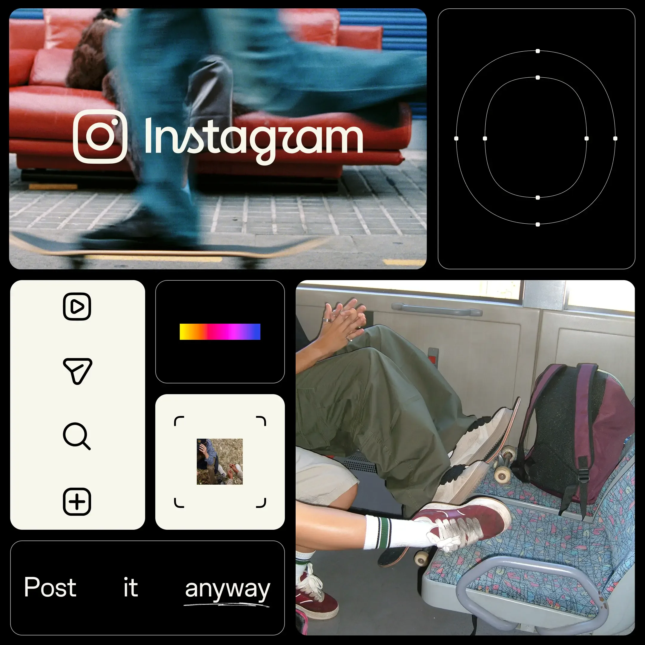
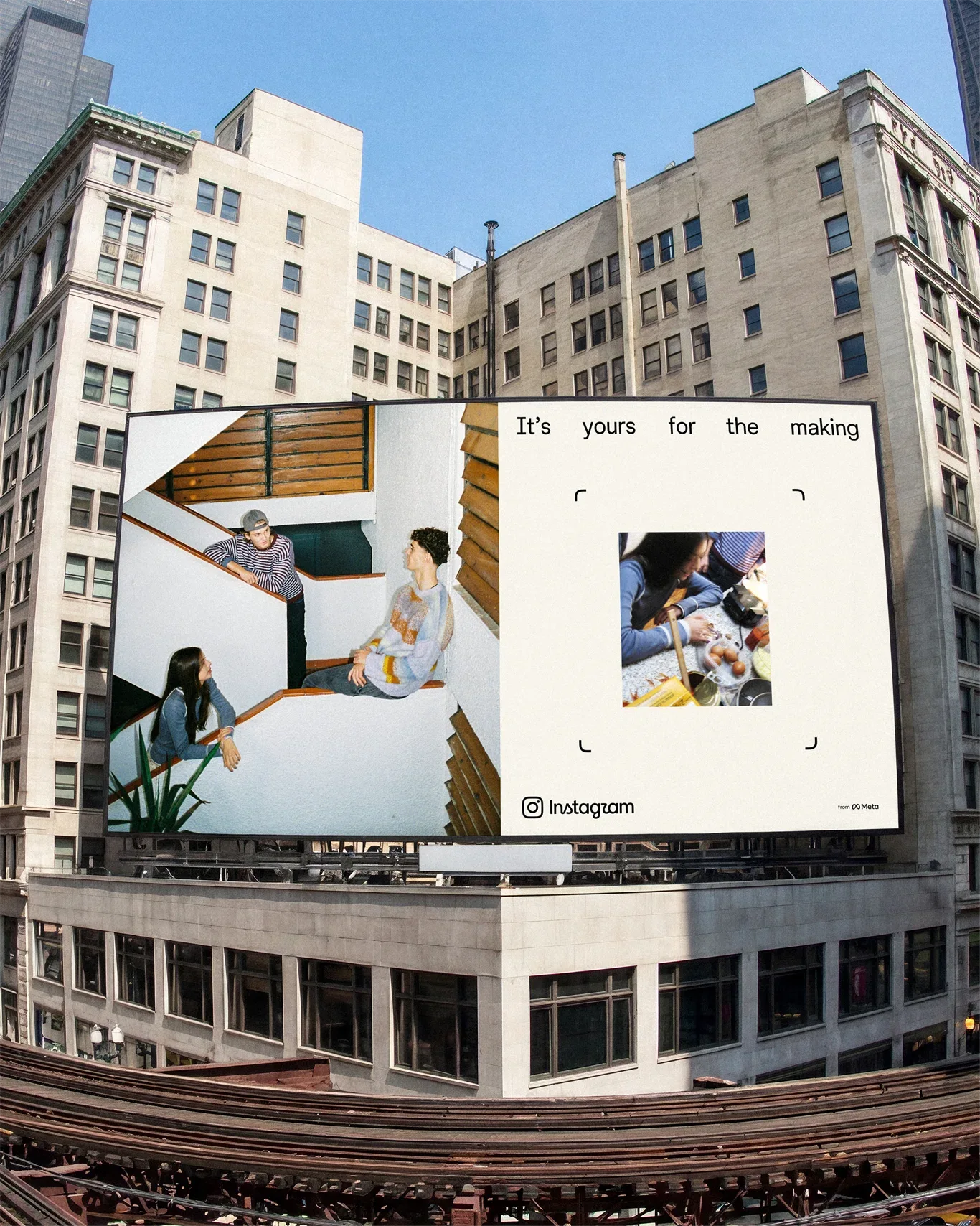
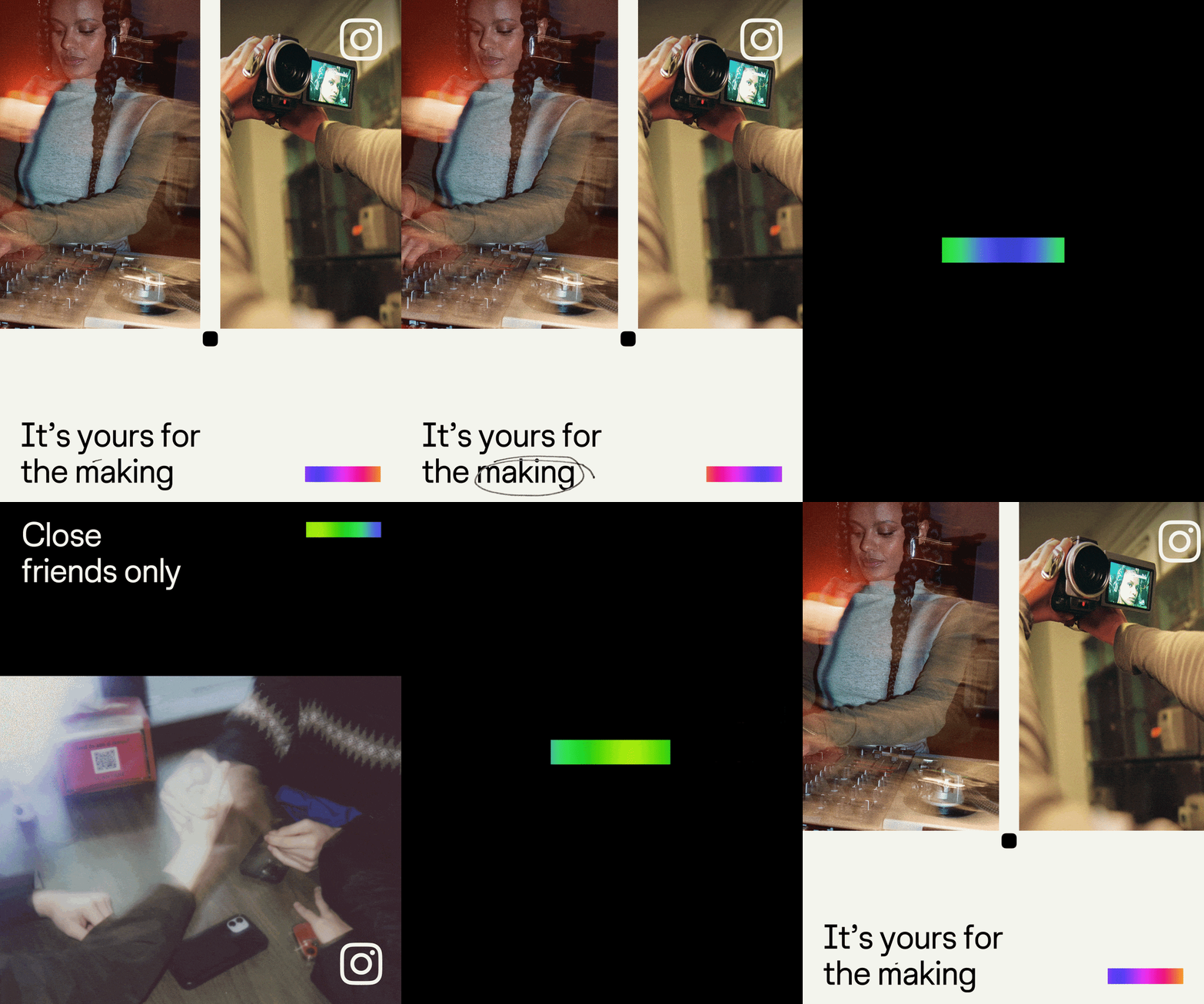
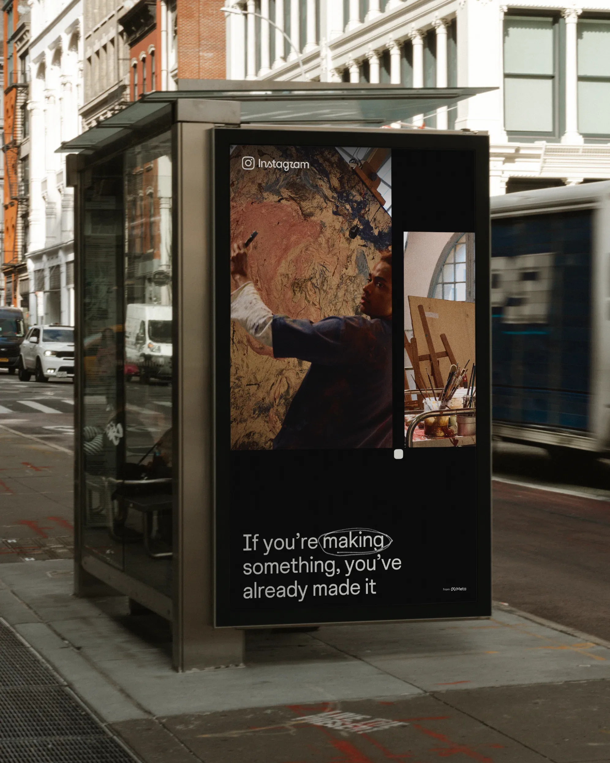
Typography carries much of the new system. Instagram Sans, the custom typeface introduced in 2022, has been updated with wider proportions and smoother curves. Two additions extend the family: Instagram Mono, a monospaced companion, and Instagram Pen, a handwriting typeface the team developed by testing a range of physical writing instruments. Together the three styles give the brand a typographic range that spans product interface, editorial voice and personal annotation.
The sunset gradient, the most recognizable element of the 2016 identity, does not disappear but steps back. It now appears more selectively, reinterpreted as a light leak that washes over imagery rather than filling every surface. For deeper layers of the product, the team adds an inverted gradient of green and blue on black. The stated goal is breathing room: motion, layout and interface elements are recalibrated so that community content, not brand decoration, provides the visual energy. In practice that means the gradient marks moments rather than surfaces, appearing where the brand wants emphasis and retreating everywhere else.
The work was developed internally by the brand design teams at Instagram and Meta rather than by an external agency. In the It's Nice That feature, Cynthia Pratomo, director of brand design at Instagram, explains the thinking behind the broader system: "Growing up means acknowledging there are more sides to Instagram now." Christy Silva, creative director of brand design and creative marketing at Instagram, summarizes the typographic ambition in a single line: "Good typography is often felt, not noticed." The refresh treats type as infrastructure, present everywhere but rarely announcing itself.
Photography as a design language
Alongside the wordmark and typography, the system introduces a viewfinder device derived from the camera glyph, a nod to the app icon that remains the brand's most familiar asset. Supporting elements borrow from the vocabulary of photography, including contact sheets, registration marks and annotations. The references tie the refreshed identity back to the platform's origin as a photo sharing app while framing the work of creators as the centerpiece.
"The refreshed brand system puts our community's creativity and self-expression front and center. It's designed to spark courageous action and give people the confidence to create and show up as themselves, freely and fully," says May Hartono, director of brand design at Meta.
A decade after the gradient
The refresh closes a long chapter. Instagram launched in 2010 as a photo app built by Kevin Systrom and Mike Krieger and was acquired by Facebook in 2012. Designer Mackey Saturday redrew the original Billabong style logotype into the custom script wordmark in 2013, and the 2016 redesign under then head of design Ian Spalter replaced the skeuomorphic camera icon with the gradient glyph that has represented the app ever since. That 2016 system, controversial at launch, became one of the most imitated identities in digital branding.
Adam Mosseri, head of Instagram, describes the new wordmark as sharper and more modern while staying simple and referencing the original design, as reported by TechCrunch. The announcement itself does not address the app icon, which keeps its current form as the wordmark rollout begins. For a platform that says it now reaches billions of people, the refresh reads as an evolution rather than a break: the script stays, the gradient recedes, and the identity makes room for the creativity it hosts.
Written with AI assistance, edited by a human. Find out more about our Use of AI.