A single global visual identity
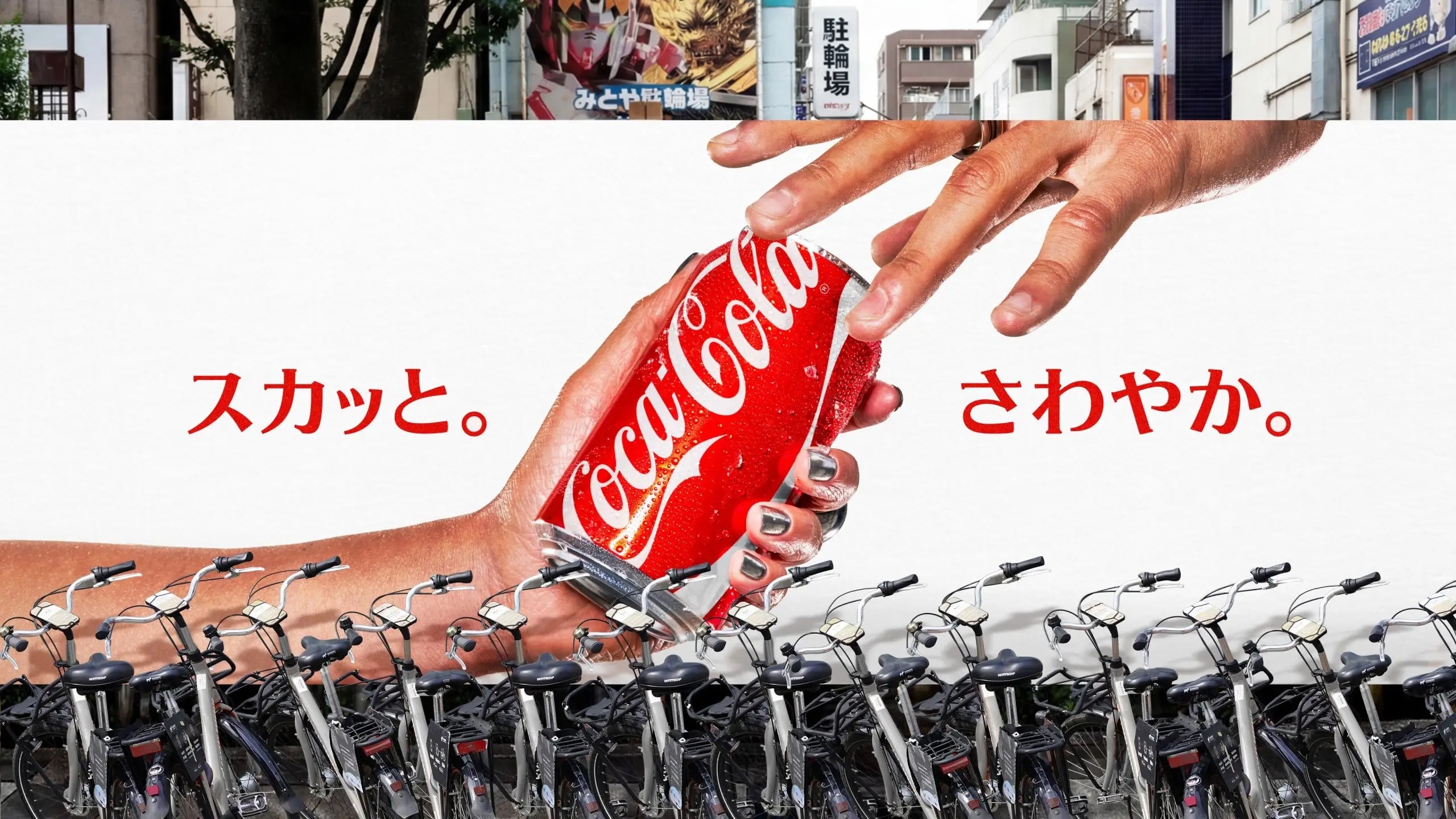
On 20 July 2026, The Coca-Cola Company introduced a new global visual identity system, describing it as a refresh built to keep the brand instantly recognisable while giving it a more consistent and scalable presence. The guiding principle is deliberately narrow: make every Coca-Cola execution look and feel unmistakably Coca-Cola. Internally the team reduced that ambition to a single phrase, "make Coca-Cola more Coca-Cola", and used it as the test for every design decision. The system is rolling out across more than 200 markets and signals what the company calls a new era of brand consistency and standout.
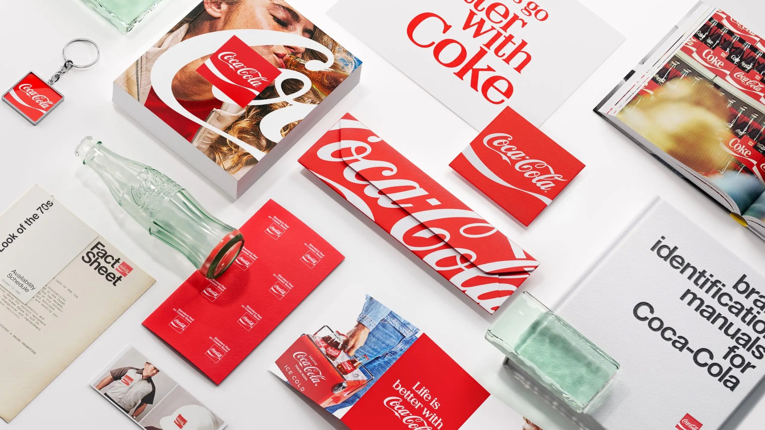
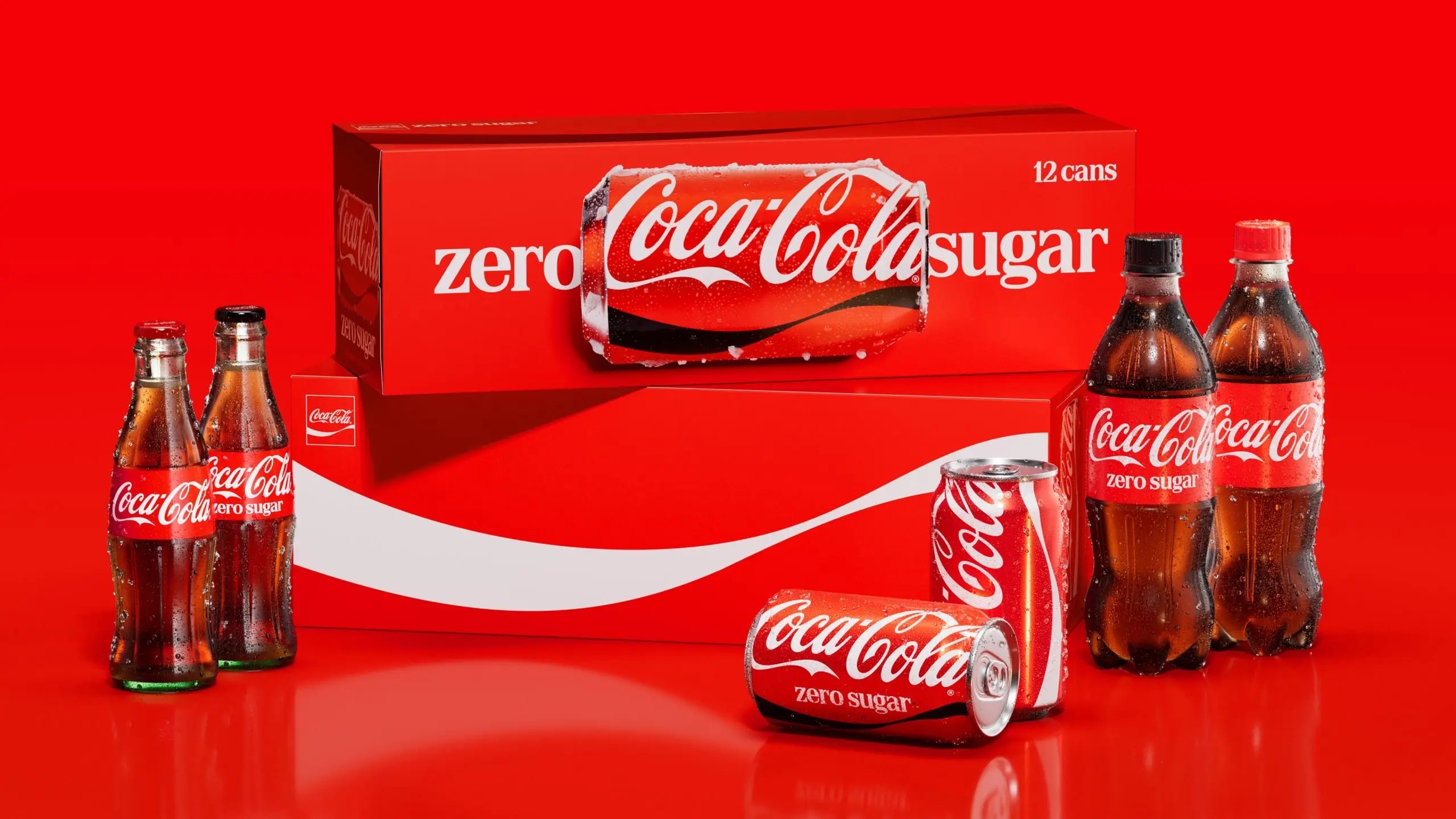
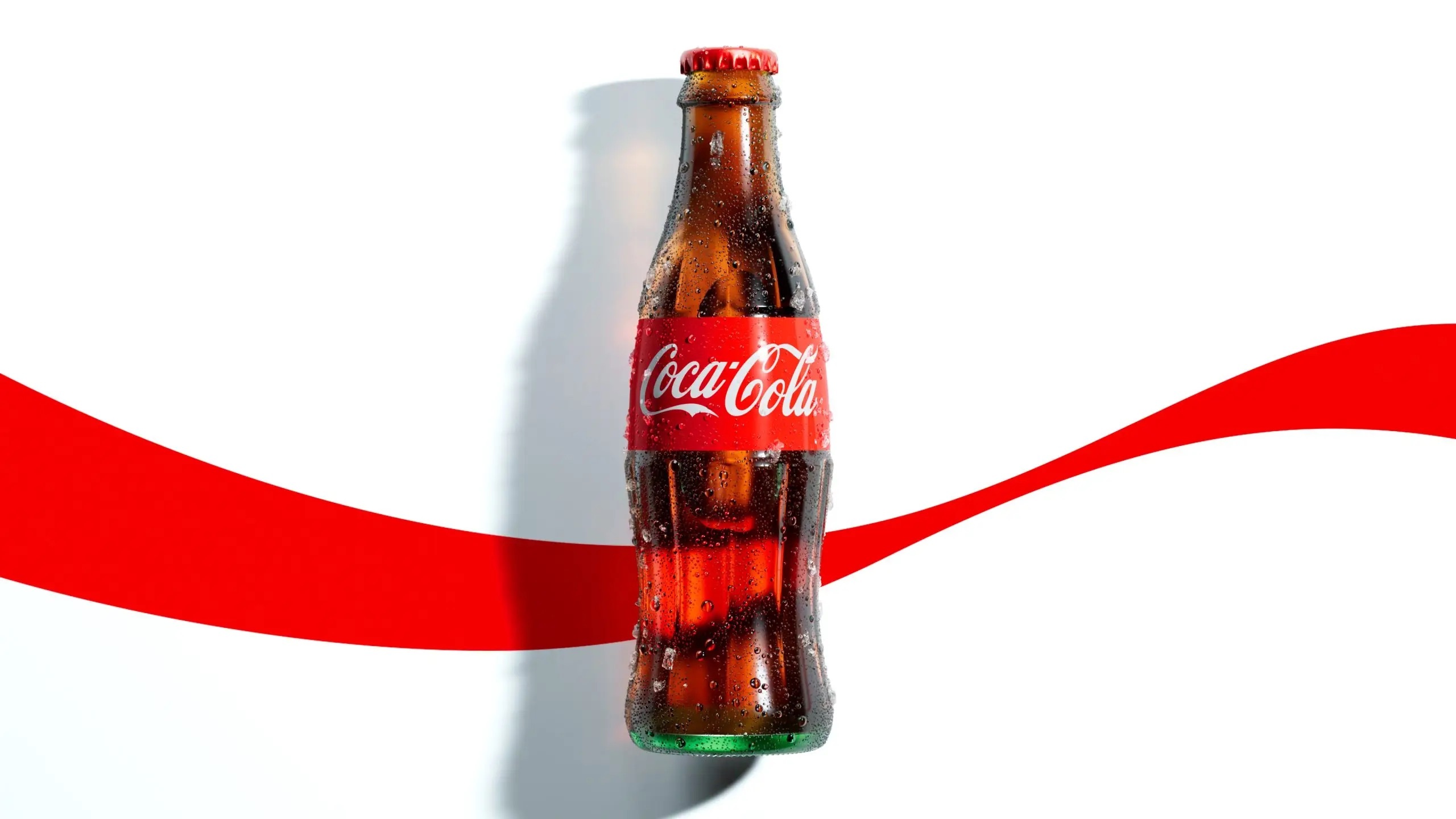
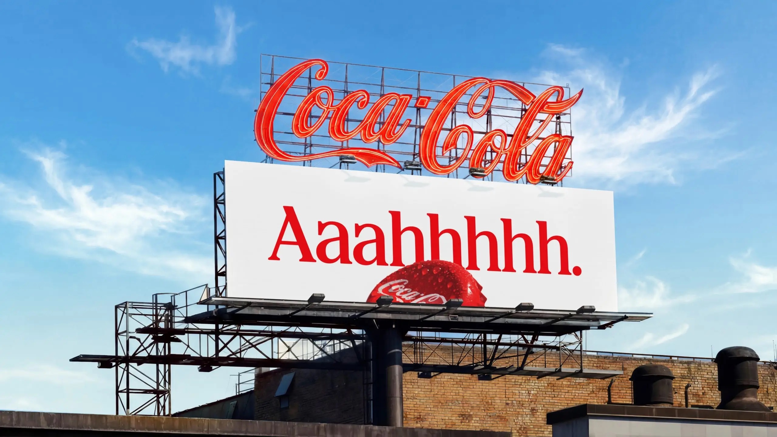
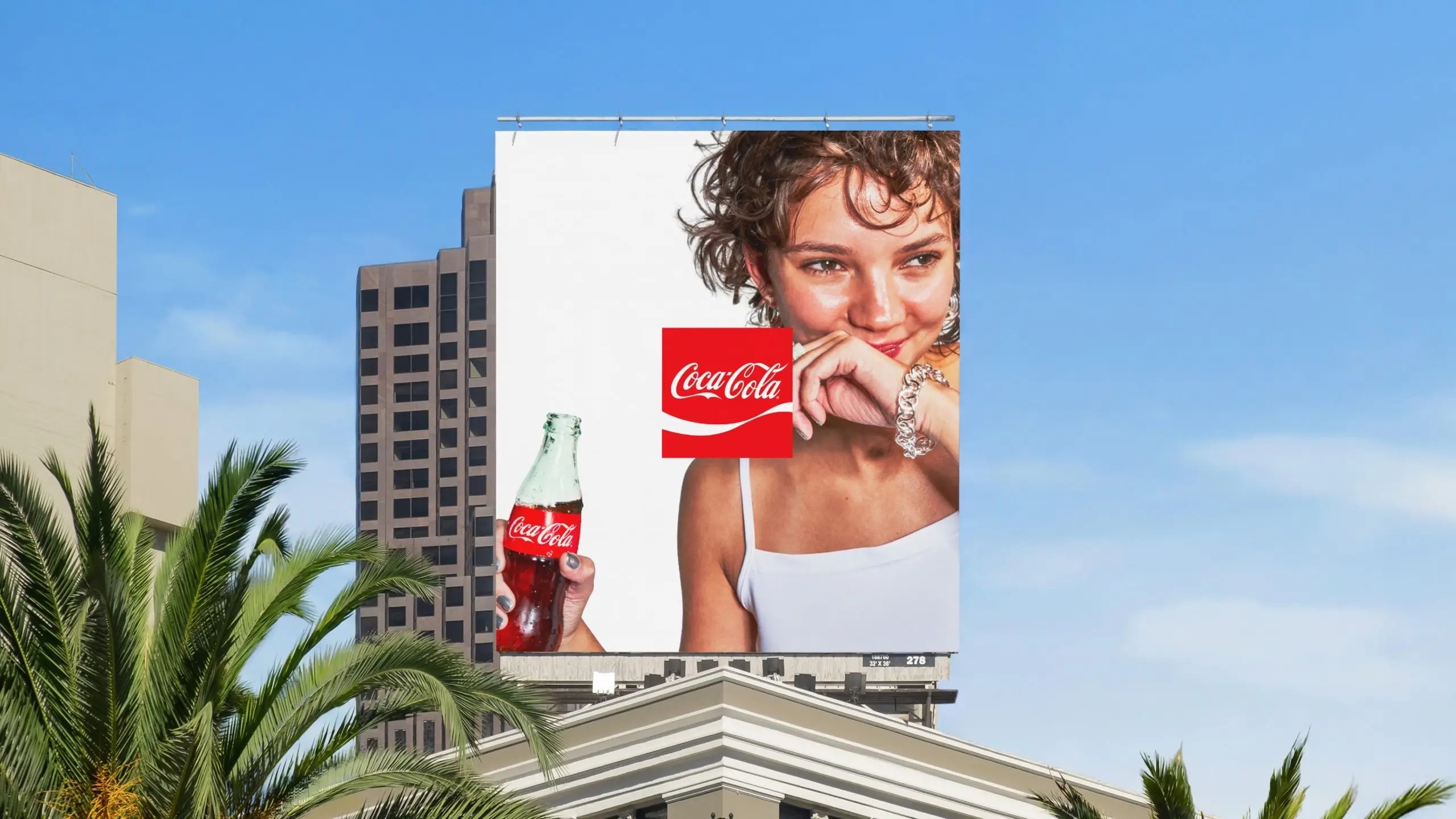
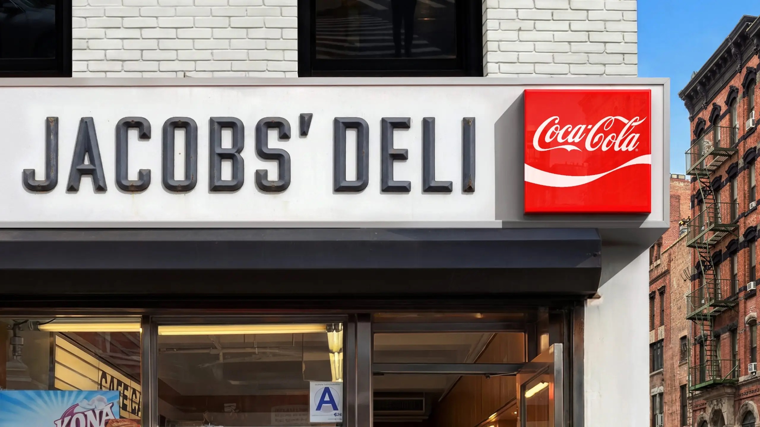
The refresh does not touch the wordmark or invent new symbols. Instead it amplifies the assets the brand already owns. The bold red and white palette, the Dynamic Ribbon, the Arden Square and the Spencerian script become more prominent across packaging, retail environments, equipment and digital experiences. Coca-Cola frames the move as an evolution that celebrates its legacy while preparing the identity for the future, rather than a break with it.
Doubling down on familiar assets
Rapha Abreu, Global Vice President of Design at The Coca-Cola Company, positions the work as reinforcement rather than reinvention.
When people think about Coca-Cola, a handful of memorable brand assets immediately come to mind: the iconic red, the Spencerian Script, the Dynamic Ribbon, the Contour Bottle, even the product itself. Our ambition was to double down on those distinctive assets and make them even more iconic.
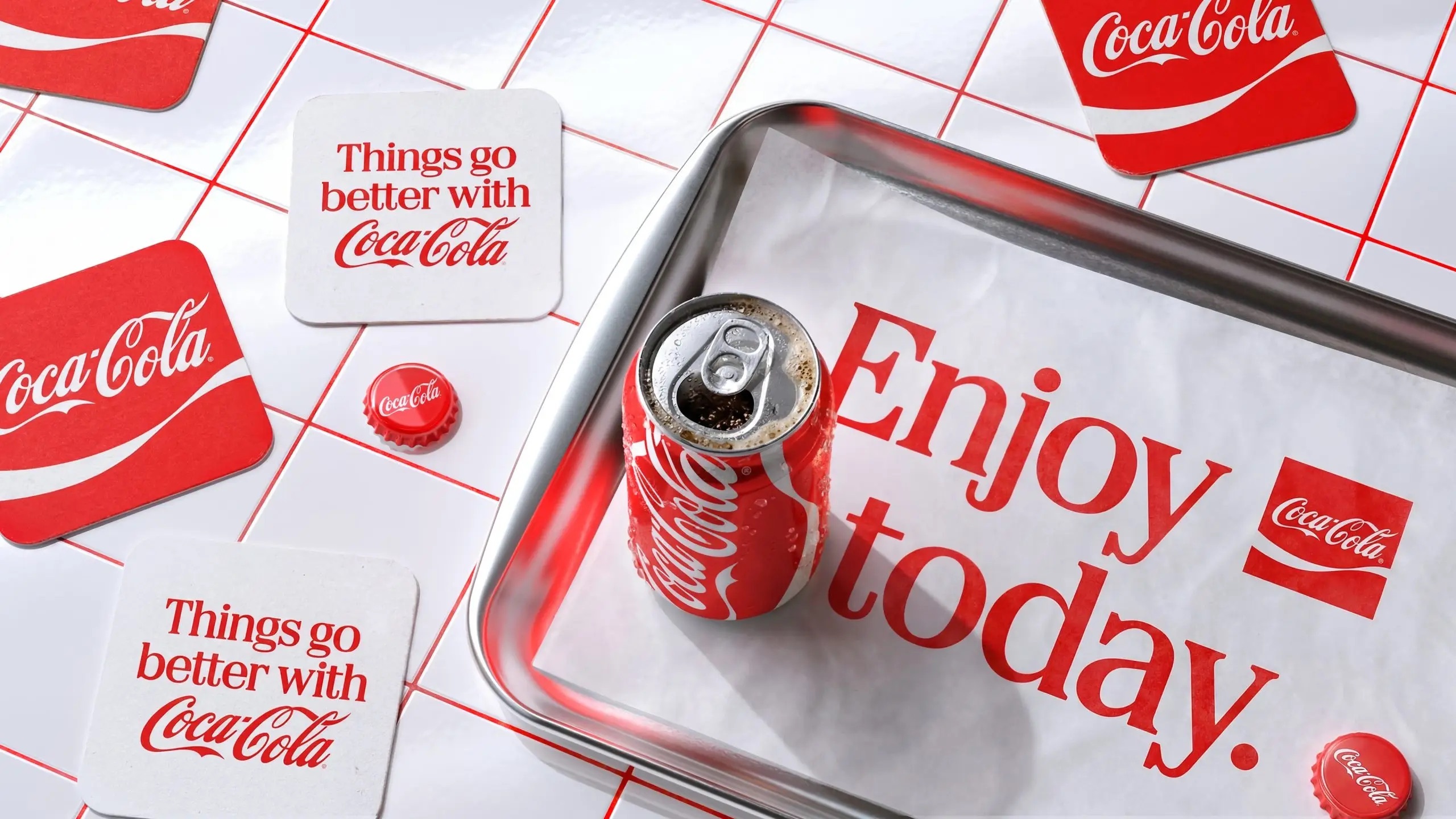
One returning element is the Arden Square, the framed lockup first designed in 1969 by Lippincott and Margulies, now Lippincott, during an earlier period of rapid expansion. Its reintroduction ties the current system back to a recognised chapter of the brand's design history.
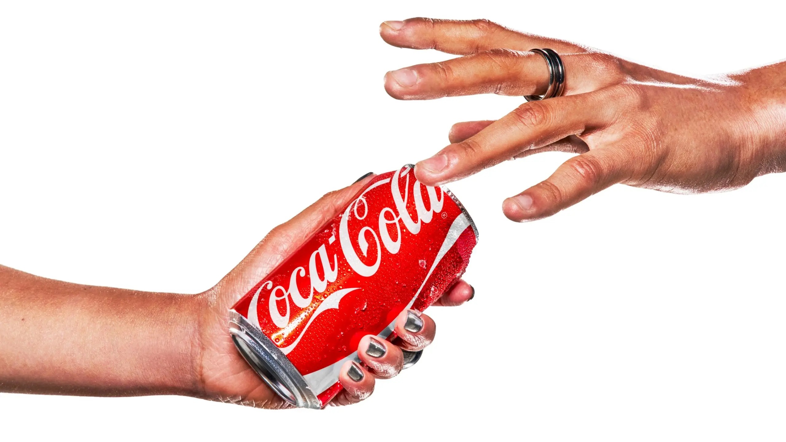
What changes on the pack
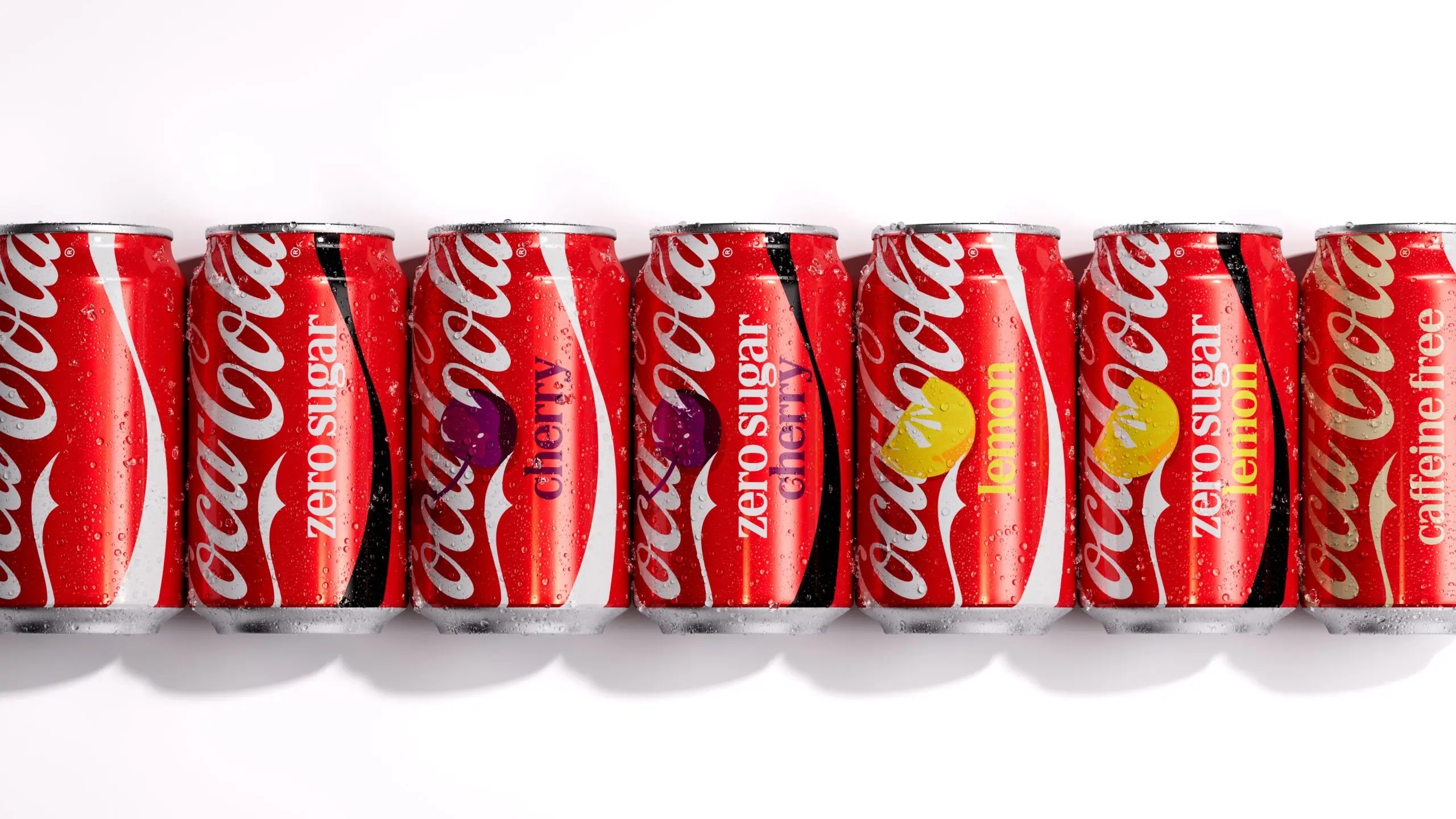
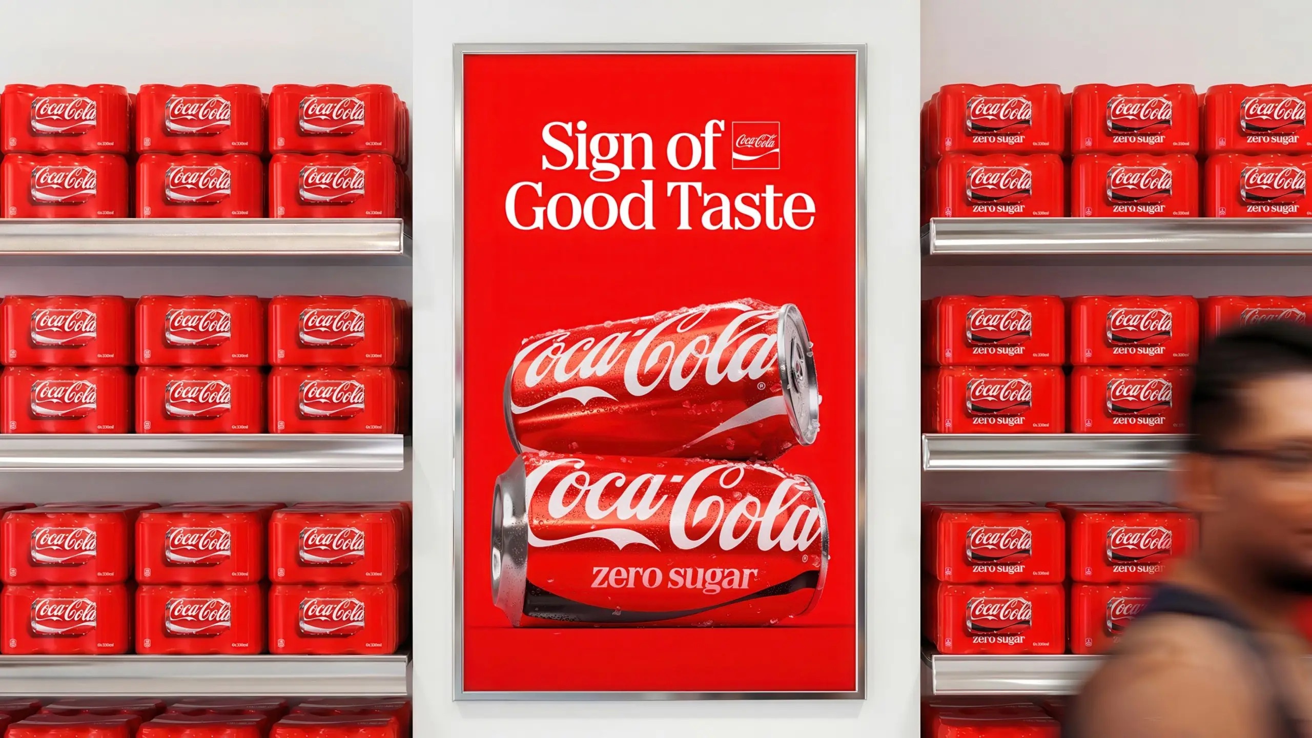
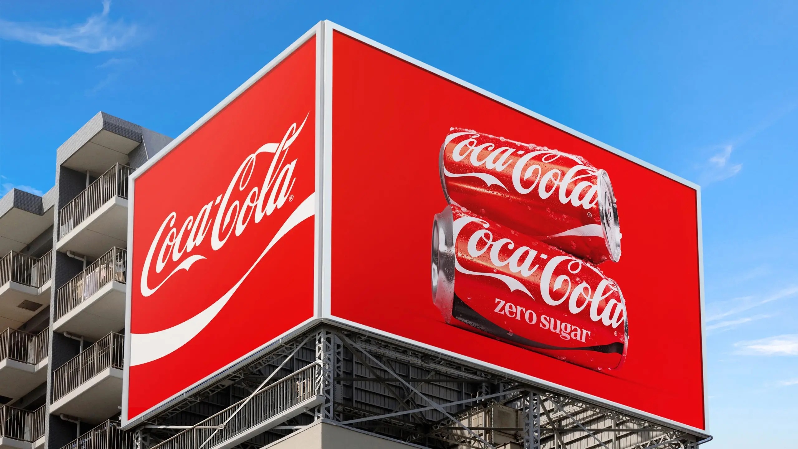
The most visible shift appears on cans, where the wordmark returns to a vertical orientation after a horizontal spell. Multipacks drop the stretched wordmark that once ran across the box in favour of a single can shown on its side, with the Dynamic Ribbon given a full panel and the Arden Square set in the upper corner. The changes are compositional rather than typographic, a rearrangement of known elements into a tighter hierarchy.
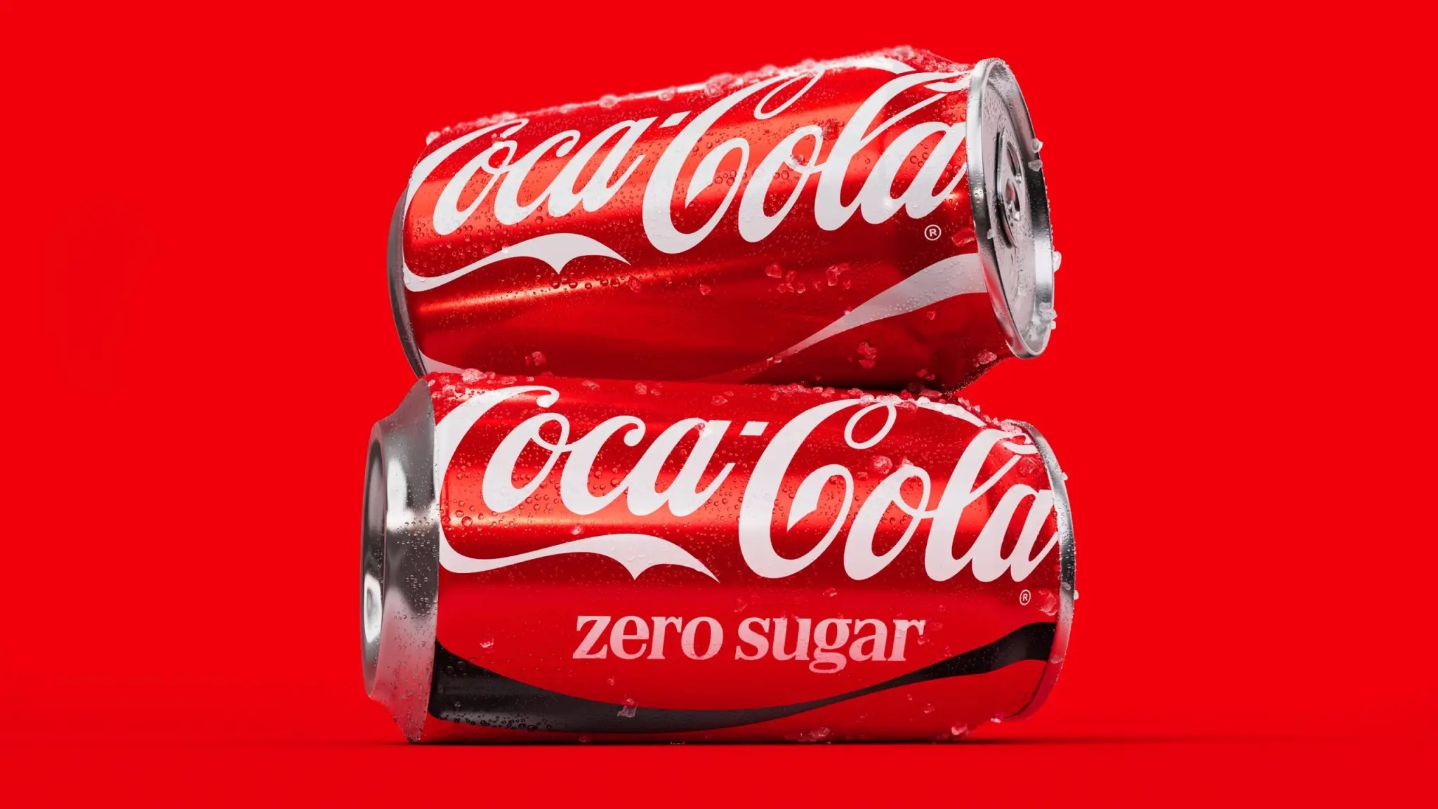
Coca-Cola Zero Sugar receives its own treatment while drawing more openly on the master brand's heritage. The variant sheds most of its black, retaining it only for the bottle cap and a prominent black Dynamic Ribbon on cans. The logo now appears in white, and an enlarged "Zero Sugar" descriptor is set in a serif typeface, giving the sub-brand clearer cues of its own within the unified family.
The partners behind the system
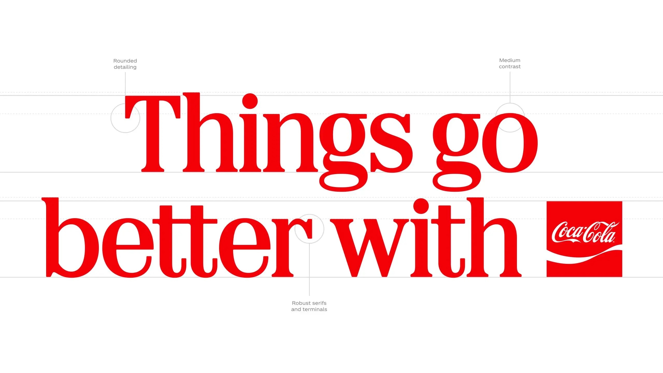
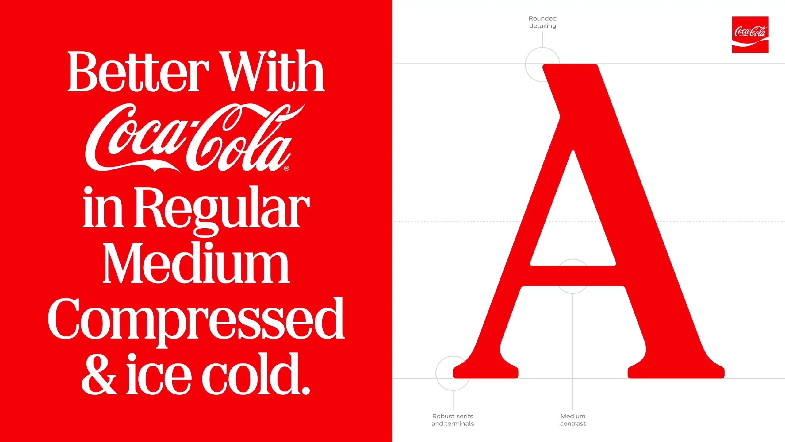
The identity was developed with a network of specialist studios. JKR led the global brand identity, The Superultrarare built the global packaging system and Brody Associates handled typography, while new photography standards were set by Guy Aroch, Anna Palma and Martin Wonnacott. Dave Balsamello, creative director at JKR, notes that the scope grew during the project.
The original brief was to create a platform identity for a new campaign. Pretty quickly, we all realised there was something bigger to solve. It had been nearly a decade since Coca-Cola had set standards for its brand.
That gap is central to the rationale. Much of the brand's recent guidance had been organised around individual campaigns and platforms rather than a single reference, which the company says left room for inconsistency across markets. The last comparable brand-wide simplification came in 2021, when Coca-Cola stripped back its cans with Kenyon Weston, building on the One Brand system introduced in 2016.
Built for governance at scale
To manage consistency across its global network, Coca-Cola has launched an immersive Brand Center that it treats as the brand's digital home. Marketers, designers and agency partners can use it to access core design assets and principles spanning packaging, equipment, retail and fleet standards from one place. Alongside it sit tech-powered Design Intelligence tools, developed with Adobe and known as Project Fizzion, with AI models trained on the brand's archives to support craft, governance and scale.
A staged global rollout
The new look is arriving first in selected markets across Europe, the Middle East and India, with Latin America and Asia to follow. North America and the remainder of the world are scheduled for 2027. Arnab Roy, President of Coca-Cola Global Category, frames the exercise as a responsibility that comes with recognition.
This refresh is about being clearer and more consistent in how we show up, wherever people experience our brand. By building on the things people already know and love, we're creating a stronger foundation for growth while staying unmistakably Coca-Cola.
Written with AI assistance, edited by a human. Find out more about our Use of AI.