The Can, Stripped Back
Coca-Cola rolls out a new packaging design system across its core trademark, marking the brand's first visual update since the "One Brand" unification launched in 2016. The redesign is developed in collaboration between Coca-Cola's in-house global design team, based in Atlanta, Georgia, and the design firm Kenyon Weston.
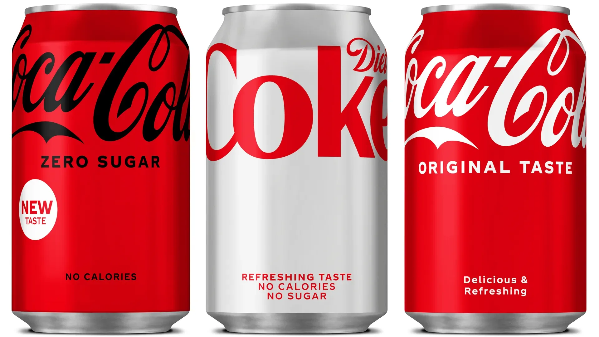
The new system removes several legacy graphic elements from the can's surface: the red disc and the wave line, both longstanding secondary marks, are discontinued. The Coca-Cola logotype, rendered in the brand's iconic script typeface, is repositioned toward the upper area of the can, an arrangement intended to evoke an uplifting quality. Increased negative space across the surface reinforces this reading.
Uniform Across the Trademark Range
The system applies uniformly across Coca-Cola, Coca-Cola Zero Sugar, and Diet Coke. For Coke Zero Sugar, the change is particularly visible: the variant shifts from its previous black-dominant packaging to a red can with black typography, aligning more closely with the master brand. Full conversion across all variants is planned for completion by 2022.
The redesign reflects a wider direction in consumer goods packaging toward minimal, uncluttered surfaces that perform clearly in both physical retail and digital commerce contexts.