Coca-Cola
Coca-Cola is the world's best-known soft drink brand, built on universal values of happiness, sharing, and refreshment.
Key-Facts
Brand Chronology
Coca-Cola upgrades its “Holidays Are Coming” campaign with generative AI
2025
Coca-Cola refreshes Share a Coke to engage Gen Z through personalised and digital experiences
2025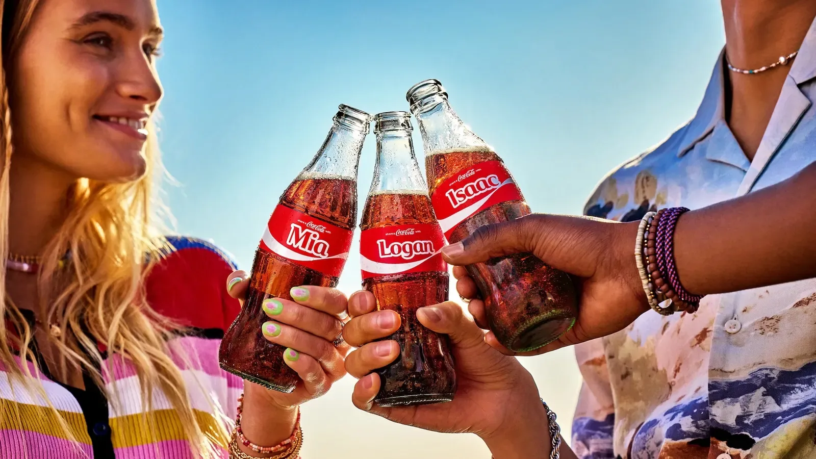
Coca-Cola Simplifies Its Packaging System for the First Time Since 2016
2021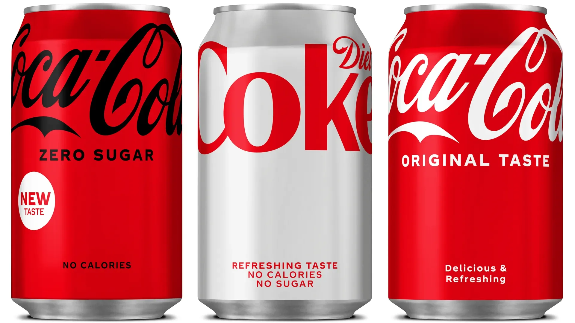
Coca-Cola rebrands Coke Zero as Coca-Cola Zero Sugar to clarify its positioning
2016
Share a Coke turned Coca-Cola packaging into personalised social experiences
2011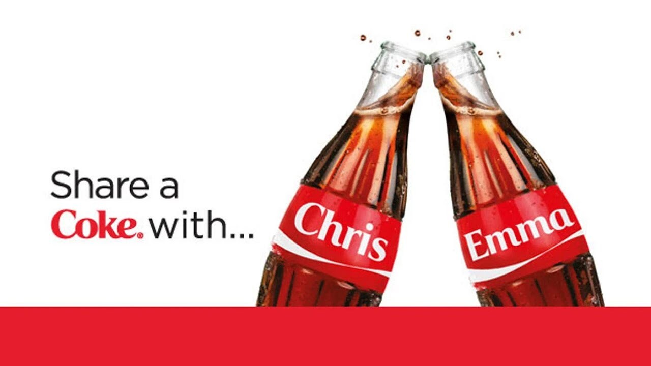
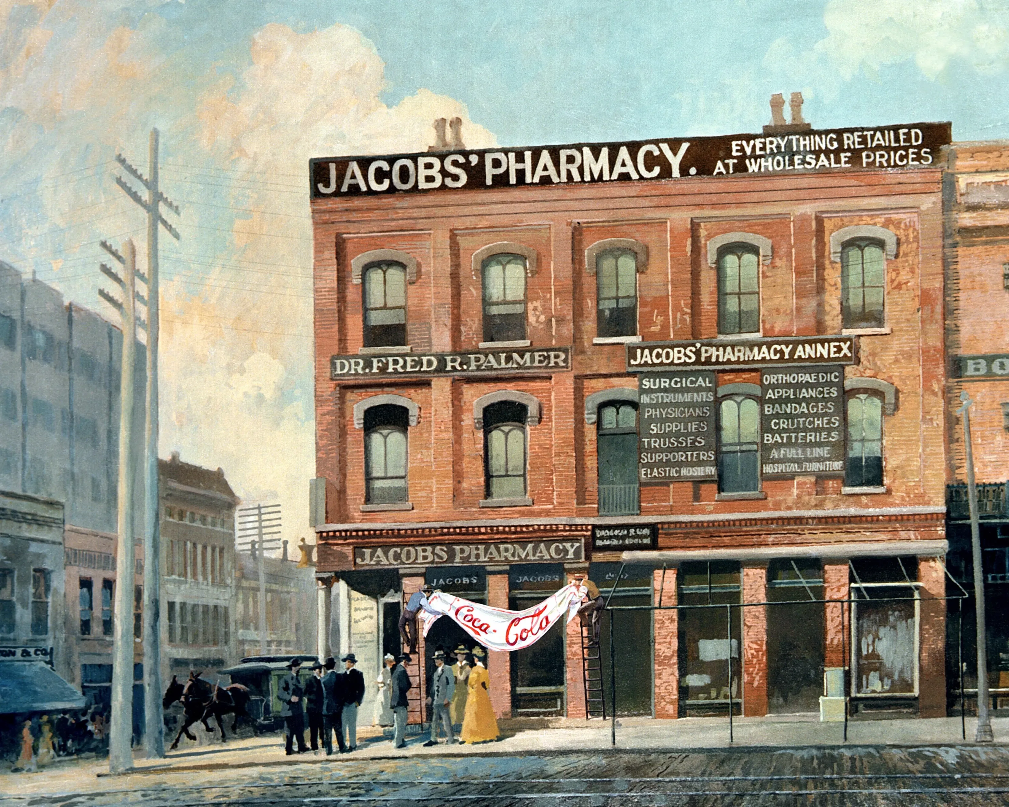
Coca-Cola Turned a Simple Truck Convoy Into the Most Recognisable Christmas Campaign in the World
1995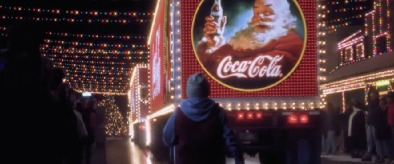
Diet Coke flips advertising's gaze with the 1994 break commercial
1994
Coca-Cola brings its polar bears to life in 1993 with Northern Lights
1993
Mean Joe Greene and Coca-Cola redefine the sports commercial
1979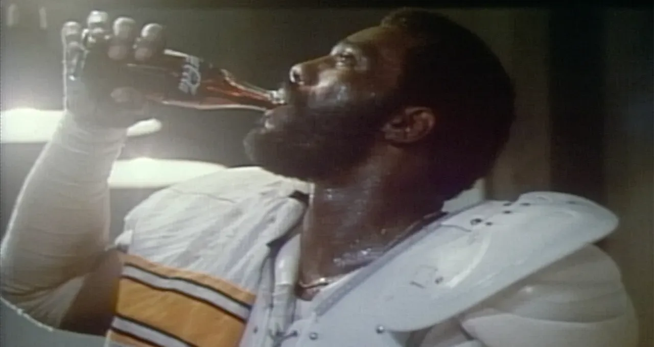
Coca-Cola Turned “I’d Like to Buy the World a Coke” Into A Global Anthem of Unity
1971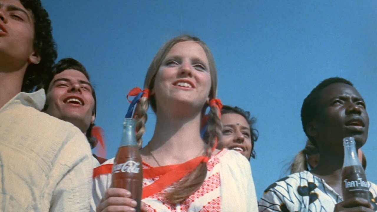
Logo Redesign
1946In 1946, Coca-Cola introduced a refined logo style developed by Raymond Loewy Associates. Alongside broader design updates, the company standardized its script, giving the lettering a slight slant and more balanced proportions.
The result was a cleaner, more compact, and elegant wordmark. The letters became thinner while retaining their signature curves and decorative flow, strengthening brand recognition. This version proved highly enduring—remaining largely unchanged since then and becoming one of the most iconic logos in design history.
Logo Redesign
1934During this period, Coca-Cola officially adopted a bright scarlet red for its logo—likely for the first time, as no earlier confirmed use exists. The lettering itself remained unchanged, preserving its flowing script, elegant curls, and contrast between thin and thicker strokes. The update was so subtle that it’s barely noticeable without direct comparison, essentially giving the familiar logo a bold new color rather than altering its form.
The Coca-Cola Santa illustrations helped define the modern global image of Santa Claus.
1931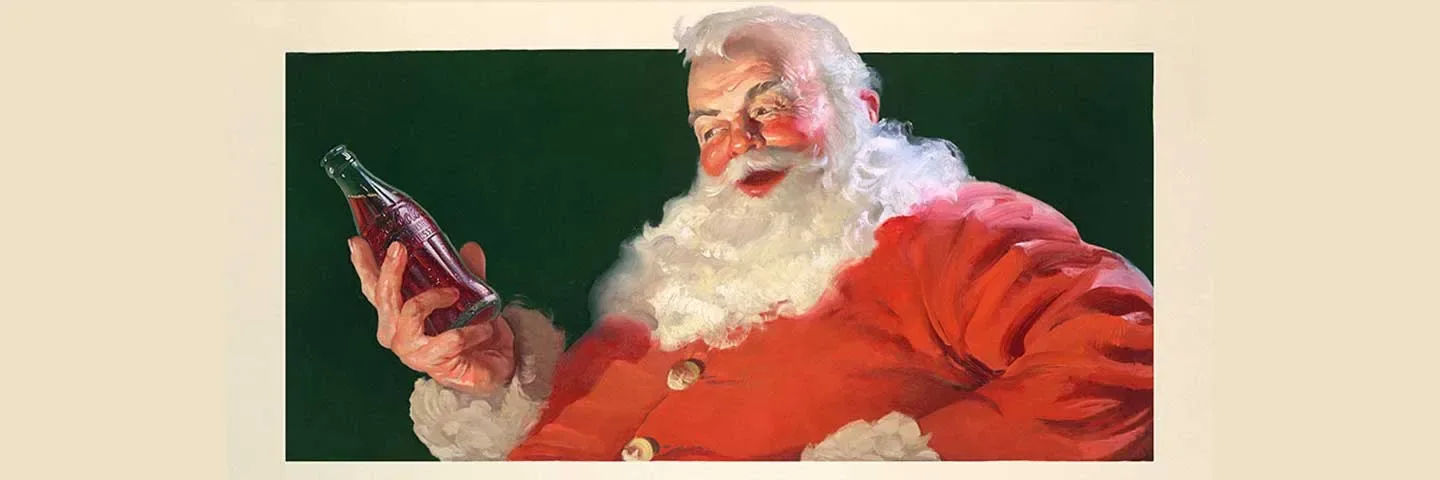
Logo Redesign
1903At the start of the 20th century, Coca-Cola streamlined its visual identity, moving away from multiple typefaces toward a single, consistent logo. The design changed only slightly, with letters becoming a bit thicker while retaining the classic Spencerian script style. At the same time, the company refined its formula, removing trace amounts of cocaine that had originally been present due to the use of coca leaves.
Logo Redesign
1899A later version of the Coca-Cola logo appeared that was almost identical to the 1890 design. The typeface and overall style remained the same, making differences hard to notice.
Changes were minimal: a slight adjustment to the letter slant and subtle thinning of certain strokes. The classic flowing script and curved forms were preserved, with only minor refinements to proportions and angle.
Overall, the update had little impact on the familiar look consumers already recognized.
Logo Redesign
1893In the late 19th century, Coca-Cola introduced a lighter variation of its script for advertising. First seen in January 1893, it featured the brand name with a “TRADE MARK” insert.
The lettering followed American Spencerian Script but in a more restrained form. The initial “C” was bold and rounded, tapering into a flowing stroke that extended into a ribbon containing “TRADE MARK” in white capital letters on a dark background.
This style balanced elegance with readability, simplifying the typically ornate Spencerian script. The addition of “TRADE MARK” also emphasized authenticity at a time of increasing competition in the soft drink market.
Logo Redesign
1890In 1890, Coca-Cola refined its typeface, moving closer to the recognizable script style associated with the brand today. By this time, the drink was already linked to red through the use of red barrels for syrup transport, helping inspectors distinguish it from alcoholic products.
The logo appeared as a flowing calligraphic wordmark with “Coca” and “Cola” connected by a short hyphen. It was written in a Spencerian Script style, characterized by elegant curves, elongated strokes, and strong contrast between thick and thin lines.
Notable details included a prominent upper loop on the “C” and sweeping flourishes that connected letters into a continuous ribbon-like form, giving the wordmark a distinctive, fluid appearance.
Logo Design
1887In June 1887, Coca-Cola introduced the script style that would define its global identity. Frank Mason Robinson created a new wordmark in Spencerian Script, an elegant cursive style that became the basis for the brand’s visual language.
Early usage varied across advertisements, but the 1887 version became the most widely adopted and heavily replicated. Later refinements appeared in the 1890s and early 1900s, but the core design remained consistent.
From this point onward, Coca-Cola established a stable visual identity that has remained largely consistent, with only minor refinements over time.
Founded
1886