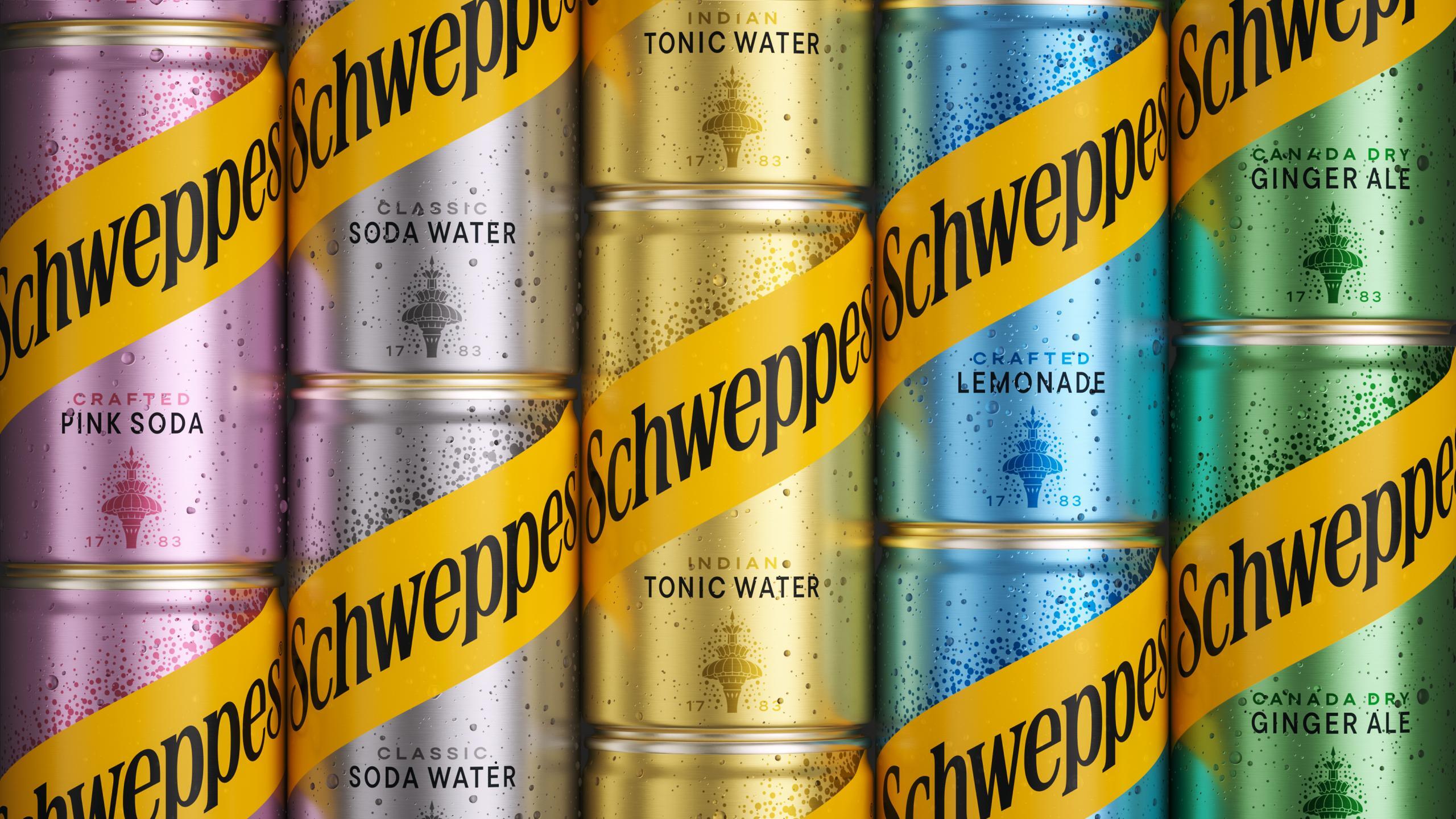
With Time Comes Taste: Schweppes leans back into its heritage
Schweppes presents the most substantial brand refresh in generations, developed by JKR with sister studios Studio.One and Mischief for The Coca-Cola Company. The platform, With Time Comes Taste, anchors the new identity in the idea that great taste is built over time rather than rushed to market, a framing that aligns with the brand's 1783 founding by Jacob Schweppe and the launch of Indian Tonic Water in 1870. The refresh begins rollout across the United Kingdom and South Africa in June 2026, with further launches scheduled for Latin America, Eastern Europe and Asia through the rest of the year.
The brief: a heritage brand in a craft category
The strategic frame for the work is set out by Joshua Schwarber, senior global design director at The Coca-Cola Company. Schwarber notes that Schweppes had drifted toward mass-market accessibility through the 2010s while a generation of challenger mixer brands, including Fever-Tree, Three Cents and East Imperial, claimed the craft and premium territory the category had built around tonic water. The refresh is positioned as a recovery of ground rather than a reinvention. Santiago Iturralde, president of Sparkling Flavours at Coca-Cola, frames the platform as a response to growing consumer demand for premium non-alcoholic options and moderation-friendly drinks that still feel occasion-worthy.
The competitive question matters because Schweppes is older than the category it now competes inside. Jacob Schweppe perfected the first commercially viable carbonation process in Geneva in 1783, moved the operation to Drury Lane in London in 1792, and supplied carbonated mineral water to a public that consumed it for its perceived restorative qualities. Indian Tonic Water in 1870 effectively defined the mixer category, and a Royal Warrant cemented the brand's reputation for quality. The refresh treats those facts as latent assets rather than as marketing copy and asks the design system to surface them.
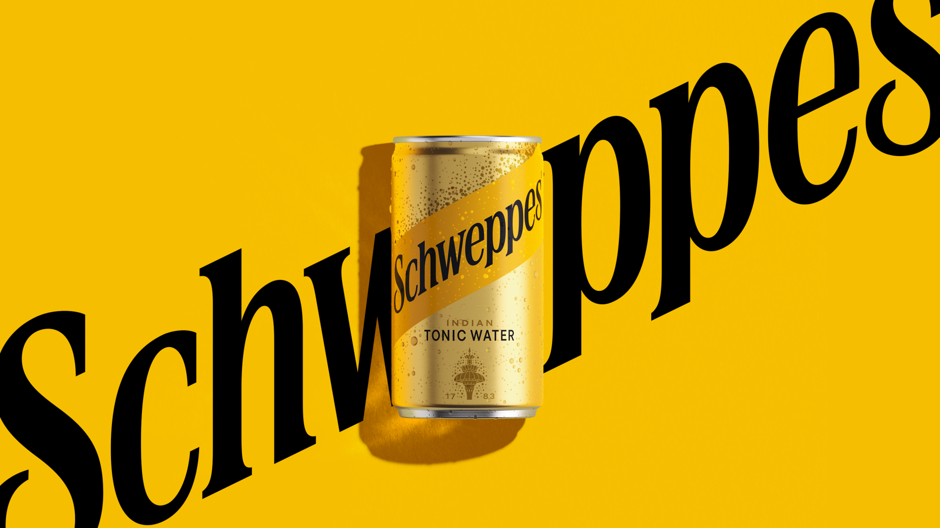
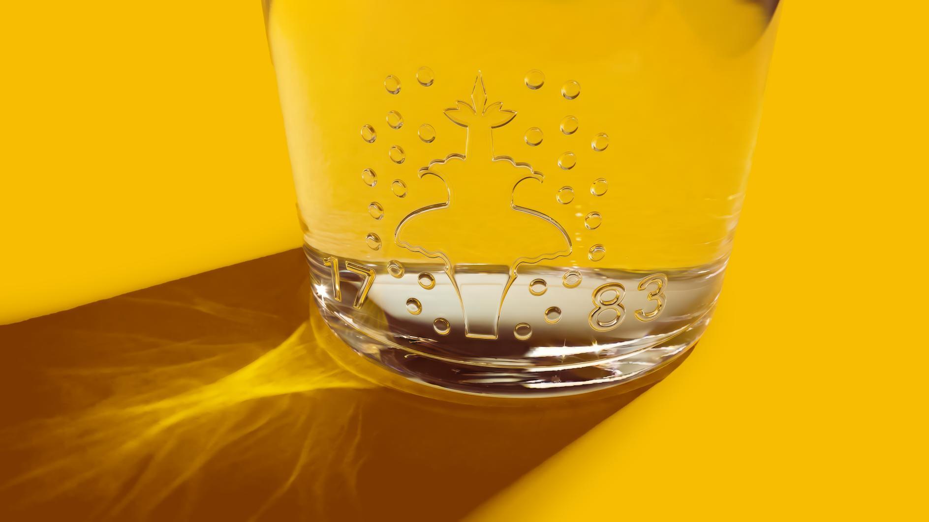
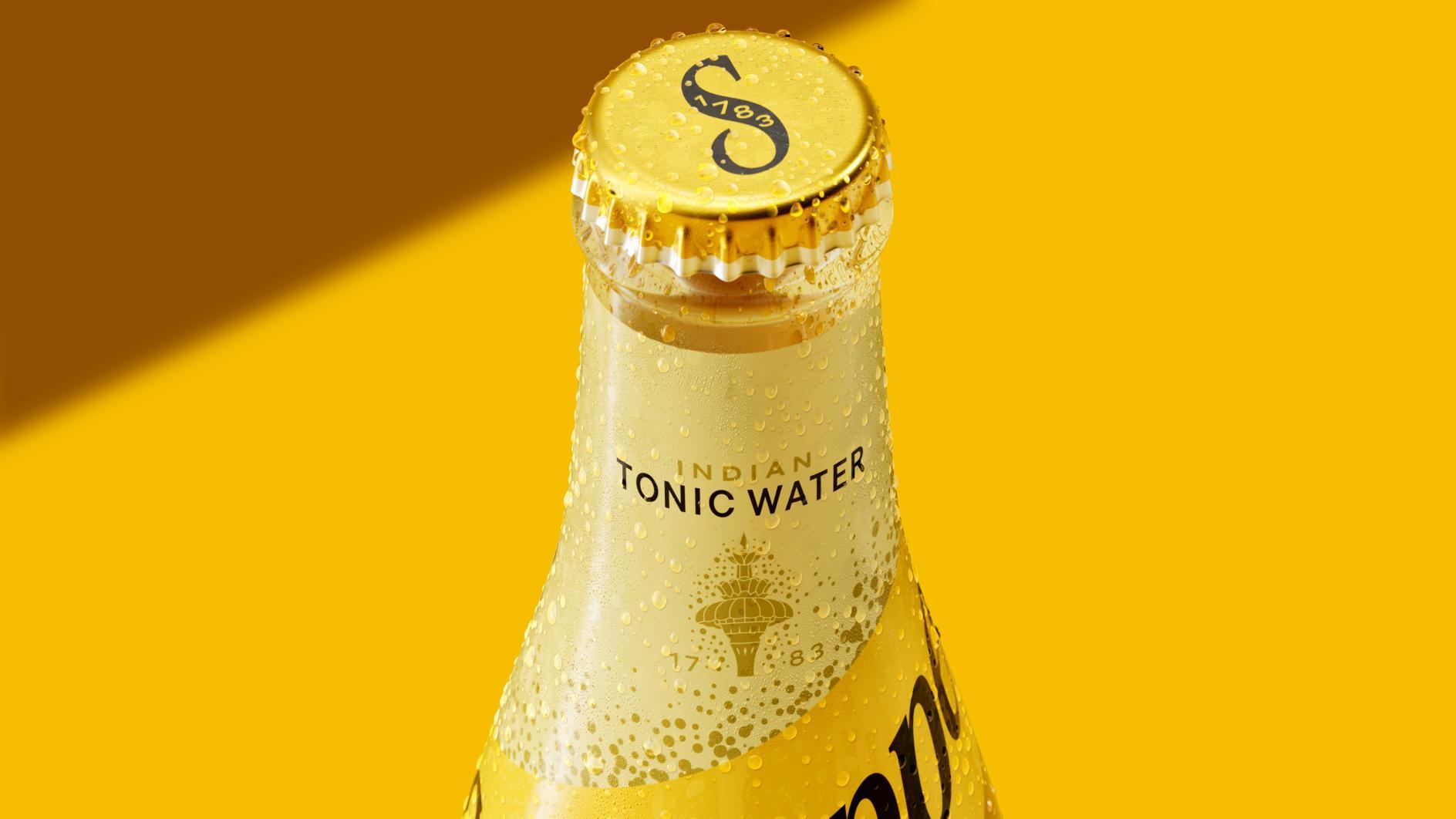
An identity built on the archive
The new visual identity draws directly from the Schweppes archive. The updated logotype takes cues from eighteenth-century serif lettering and is paired with a redrawn fountain symbol that references the brand's appearance at the Great Exhibition of 1851. The colour palette is anchored on a bold saffron yellow, named in launch materials as the unifying global colour across the portfolio, and is complemented by decorative patterns, monograms and ornate detailing applied across packaging and out-of-home assets. Photography for the platform is bathed in warm golden-hour light, distancing the brand world from the cooler, retail-aisle look of the previous identity and bringing it closer to the codes of premium spirits.
Studio.One leads the packaging and pack architecture work, with structural cues that emphasise the bottle silhouette as a brand mnemonic alongside the logotype and fountain. Mischief takes responsibility for the broader campaign expression, including outdoor, film and event activations. JKR holds the overall identity system and the platform line, providing the connective tissue across the three workstreams.
Clive the Leopard returns to the front of the brand
The most visible character in the refresh is Clive the Leopard, a brand mascot first introduced in 1999 advertising to embody the drink's distinctive "bite". Clive has been reimagined for a new era and is positioned as the face of the activation Schweppes is calling the Summer of Schweppes. Clive's modern debut is scheduled for the screens of Piccadilly Circus in London later this month, with further appearances planned at Royal Ascot and the Queen's Club Championships through the summer. The decision to recover an existing brand asset rather than introduce a new character is consistent with the platform's wider argument: that Schweppes already has more distinctive equity than the category gives it credit for, and that the refresh is about resurfacing that equity rather than manufacturing new signifiers.
The activation calendar is structured around the British summer season. Royal Ascot in mid-June, the Queen's Club Championships at the end of June and a series of curated cultural pop-ups are intended to associate the brand with the kind of grown-up, occasion-based drinking the platform argument requires. The refreshed identity has already begun rolling out across packaging in the United Kingdom and South Africa, with further launches across Latin America, Eastern Europe and Asia scheduled through 2026.
What the refresh signals for the category
The Schweppes refresh sits in a wider correction brands are making after the long blanding wave of the 2010s. Pepsi's 2023 globe return, Mercedes-Benz's flat star reintroduction in April 2025 and the Lacoste identity refresh of April 2026 form part of the same pattern, brands recovering distinctive archive assets rather than continuing to compete on minimalist symmetry. For Schweppes the move is more legible than for most, because the brand's archive is unusually deep and unusually well-documented. The work asks the system to do what most heritage brand refreshes assume the system already does: behave like a brand that has been confident for more than two centuries.
Written with AI assistance, edited by a human. Find out more about our Use of AI.